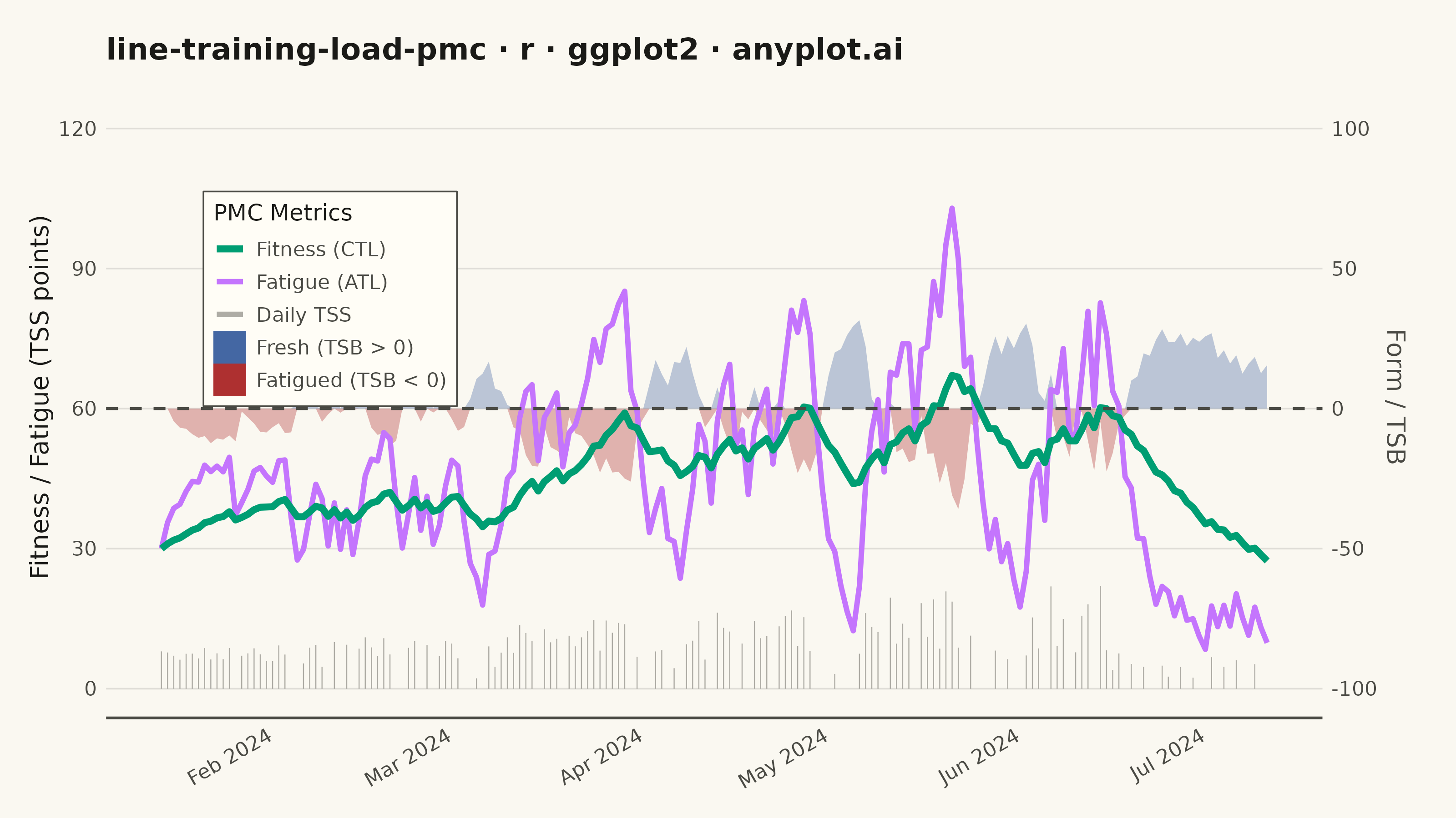
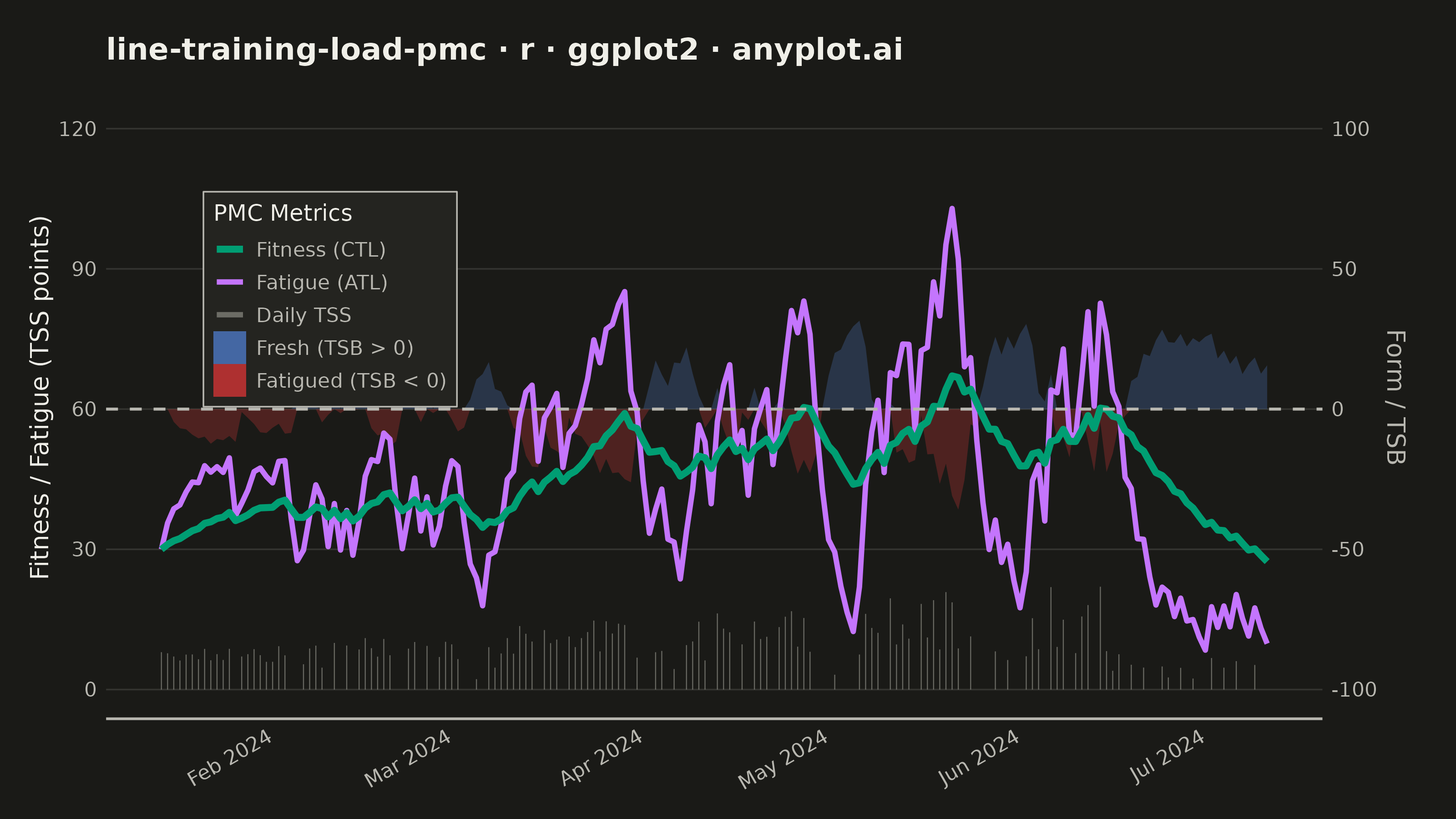
A Performance Management Chart (PMC), popularized by TrainingPeaks, summarizes an endurance athlete's training history on a single shared time axis. Two exponentially-smoothed lines track Chronic Training Load (CTL, "fitness", ~42-day time constant) and Acute Training Load (ATL, "fatigue", ~7-day time constant), while a filled area or band shows Training Stress Balance (TSB, "form" = CTL − ATL) above and below a zero baseline. Daily Training Stress Score (TSS) values appear as points or thin vertical bars, giving the raw workout intensity behind the smoothed trends. The chart reveals whether an athlete is building fitness, accumulating fatigue, or freshening up (positive form) for a target event.
#' anyplot.ai
#' line-training-load-pmc: Training Load Performance Management Chart
#' Library: ggplot2 3.5.1 | R 4.4.1
#' Quality: 88/100 | Created: 2026-06-13

library(ggplot2)
library(ragg)

set.seed(42)

# Theme tokens
THEME       <- Sys.getenv("ANYPLOT_THEME", "light")
PAGE_BG     <- if (THEME == "light") "#FAF8F1" else "#1A1A17"
ELEVATED_BG <- if (THEME == "light") "#FFFDF6" else "#242420"
INK         <- if (THEME == "light") "#1A1A17" else "#F0EFE8"
INK_SOFT    <- if (THEME == "light") "#4A4A44" else "#B8B7B0"
INK_MUTED   <- if (THEME == "light") "#6B6A63" else "#A8A79F"
GRID_COLOR  <- adjustcolor(INK, alpha.f = 0.12)

# Imprint palette — hybrid-v3 canonical order
IMPRINT_PALETTE <- c(
  "#009E73",  # 1 — brand green (CTL / Fitness)
  "#C475FD",  # 2 — lavender (ATL / Fatigue)
  "#4467A3",  # 3 — blue (positive TSB / Fresh)
  "#BD8233",  # 4 — ochre
  "#AE3030"   # 5 — matte red (negative TSB / Fatigued)
)

# Data — 180-day cyclist build season (Jan–Jul 2024)
n_days <- 180
dates  <- seq(as.Date("2024-01-15"), by = "day", length.out = n_days)

# Daily TSS with phased training structure
tss_raw <- numeric(n_days)
for (i in seq_len(n_days)) {
  week <- ceiling(i / 7)
  if (week %% 4 == 0) {
    # Recovery week — lower load, more rest days
    tss_raw[i] <- if (runif(1) < 0.45) 0 else runif(1, 15, 65)
  } else if (week > 22) {
    # Taper — reduced volume before target event
    tss_raw[i] <- if (runif(1) < 0.35) 0 else runif(1, 20, 55)
  } else {
    # Build / intensity block — progressive overload
    max_load    <- min(50 + week * 5, 155)
    tss_raw[i]  <- if (runif(1) < 0.18) 0 else runif(1, 40, max_load)
  }
}

# Compute EWMA: CTL (42-day fitness) and ATL (7-day fatigue)
ctl_k  <- 2 / (42 + 1)
atl_k  <- 2 / (7 + 1)
ctl    <- numeric(n_days)
atl    <- numeric(n_days)
tsb    <- numeric(n_days)
ctl[1] <- 30
atl[1] <- 30
tsb[1] <- 0

for (i in 2:n_days) {
  ctl[i] <- ctl[i - 1] + ctl_k * (tss_raw[i] - ctl[i - 1])
  atl[i] <- atl[i - 1] + atl_k * (tss_raw[i] - atl[i - 1])
  tsb[i] <- ctl[i - 1] - atl[i - 1]
}

# Scale TSS for display at bottom of chart (0–22 range)
tss_display <- tss_raw * 22 / max(tss_raw, na.rm = TRUE)

# TSB secondary axis: TSB=0 maps to primary y=60, scale factor=0.6
# Primary break 30 → TSB -50; break 60 → TSB 0; break 90 → TSB 50
tsb_center <- 60
tsb_factor <- 0.6

df <- data.frame(
  date         = dates,
  tss_display  = tss_display,
  ctl          = ctl,
  atl          = atl,
  tsb          = tsb,
  tsb_pos_ymin = tsb_center,
  tsb_pos_ymax = tsb_center + pmax(tsb * tsb_factor, 0),
  tsb_neg_ymin = tsb_center + pmin(tsb * tsb_factor, 0),
  tsb_neg_ymax = tsb_center
)

title_str <- "line-training-load-pmc · r · ggplot2 · anyplot.ai"

# Plot
p <- ggplot(df, aes(x = date)) +
  # TSB ribbons — two-toned; fill hardcoded so only color drives the single legend
  geom_ribbon(
    aes(ymin = tsb_neg_ymin, ymax = tsb_neg_ymax, color = "Fatigued (TSB < 0)"),
    fill = IMPRINT_PALETTE[5], alpha = 0.35, linewidth = 0
  ) +
  geom_ribbon(
    aes(ymin = tsb_pos_ymin, ymax = tsb_pos_ymax, color = "Fresh (TSB > 0)"),
    fill = IMPRINT_PALETTE[3], alpha = 0.35, linewidth = 0
  ) +
  # Daily TSS segments — raw load at bottom, mapped to color for legend entry
  geom_segment(
    aes(xend = date, y = 0, yend = tss_display, color = "Daily TSS"),
    linewidth = 0.2, alpha = 0.55
  ) +
  # ATL line — fatigue, faster-reacting to recent training
  geom_line(aes(y = atl, color = "Fatigue (ATL)"), linewidth = 1.0) +
  # CTL line — fitness, slowly built over ~42 days
  geom_line(aes(y = ctl, color = "Fitness (CTL)"), linewidth = 1.3) +
  # TSB = 0 reference: above = fresh, below = fatigued
  geom_hline(
    yintercept = tsb_center,
    color = INK_SOFT, linewidth = 0.55, linetype = "dashed"
  ) +
  scale_color_manual(
    name   = "PMC Metrics",
    values = c(
      "Fitness (CTL)"      = IMPRINT_PALETTE[1],
      "Fatigue (ATL)"      = IMPRINT_PALETTE[2],
      "Daily TSS"          = INK_MUTED,
      "Fresh (TSB > 0)"    = IMPRINT_PALETTE[3],
      "Fatigued (TSB < 0)" = IMPRINT_PALETTE[5]
    ),
    breaks = c("Fitness (CTL)", "Fatigue (ATL)", "Daily TSS",
               "Fresh (TSB > 0)", "Fatigued (TSB < 0)"),
    guide = guide_legend(
      override.aes = list(
        fill      = c(NA, NA, NA,
                      adjustcolor(IMPRINT_PALETTE[3], alpha.f = 0.35),
                      adjustcolor(IMPRINT_PALETTE[5], alpha.f = 0.35)),
        linewidth = c(1.3, 1.0, 1.0, 0, 0),
        alpha     = c(1, 1, 0.55, 1, 1)
      )
    )
  ) +
  scale_x_date(date_breaks = "1 month", date_labels = "%b %Y") +
  scale_y_continuous(
    name   = "Fitness / Fatigue (TSS points)",
    limits = c(0, 125),
    breaks = c(0, 30, 60, 90, 120),
    sec.axis = sec_axis(
      ~ (. - tsb_center) / tsb_factor,
      name   = "Form / TSB",
      labels = function(x) round(x)
    )
  ) +
  labs(title = title_str, x = NULL) +
  theme_minimal(base_size = 8) +
  theme(
    plot.background    = element_rect(fill = PAGE_BG, color = PAGE_BG),
    panel.background   = element_rect(fill = PAGE_BG, color = NA),
    panel.grid.major.y = element_line(color = GRID_COLOR, linewidth = 0.3),
    panel.grid.major.x = element_blank(),
    panel.grid.minor   = element_blank(),
    axis.title         = element_text(color = INK, size = 10),
    axis.title.y.right = element_text(color = INK_SOFT, size = 10),
    axis.text          = element_text(color = INK_SOFT, size = 8),
    axis.text.x        = element_text(angle = 30, hjust = 1),
    axis.text.y.right  = element_text(color = INK_SOFT, size = 8),
    axis.line.x        = element_line(color = INK_SOFT, linewidth = 0.5),
    plot.title         = element_text(color = INK, size = 12, face = "bold"),
    legend.background  = element_rect(fill = ELEVATED_BG, color = INK_SOFT,
                                      linewidth = 0.3),
    legend.text        = element_text(color = INK_SOFT, size = 8),
    legend.title       = element_text(color = INK, size = 9),
    legend.position        = "inside",
    legend.position.inside = c(0.08, 0.82),
    legend.justification   = c(0, 1),
    legend.key.size    = unit(0.9, "lines"),
    legend.box         = "vertical",
    axis.ticks         = element_blank(),
    plot.margin        = margin(15, 20, 10, 12)
  )

# Save
ggsave(
  filename = sprintf("plot-%s.png", THEME),
  plot     = p,
  device   = ragg::agg_png,
  width    = 8,
  height   = 4.5,
  units    = "in",
  dpi      = 400
)
Runnable source as JSON, for any HTTP client: https://api.anyplot.ai/specs/line-training-load-pmc/ggplot2/code. Any spec id and library id listed in llms-full.txt fit the same URL shape; every URL below is complete and callable.
{
  "spec_id": "line-training-load-pmc",
  "language": "r",
  "library": "ggplot2",
  "page": "https://anyplot.ai/line-training-load-pmc/r/ggplot2",
  "hub": "https://anyplot.ai/line-training-load-pmc",
  "code_json": "https://api.anyplot.ai/specs/line-training-load-pmc/ggplot2/code",
  "spec_json": "https://api.anyplot.ai/specs/line-training-load-pmc",
  "render_light_png": "https://storage.googleapis.com/anyplot-images/plots/line-training-load-pmc/r/ggplot2/plot-light.png",
  "render_dark_png": "https://storage.googleapis.com/anyplot-images/plots/line-training-load-pmc/r/ggplot2/plot-dark.png",
  "quality_score": 88.0,
  "license": "MIT",
  "guide": "https://anyplot.ai/llms.txt"
}
Part of Training Load Performance Management Chart on anyplot.ai.