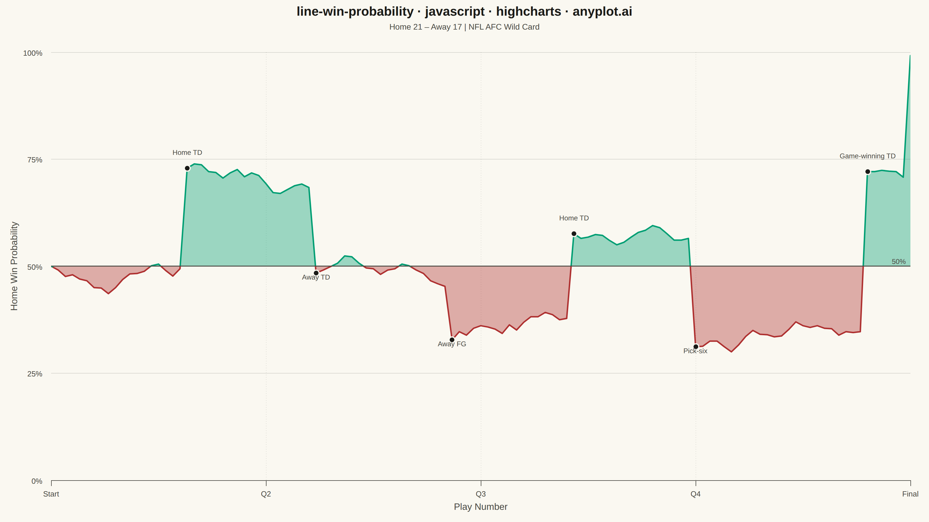
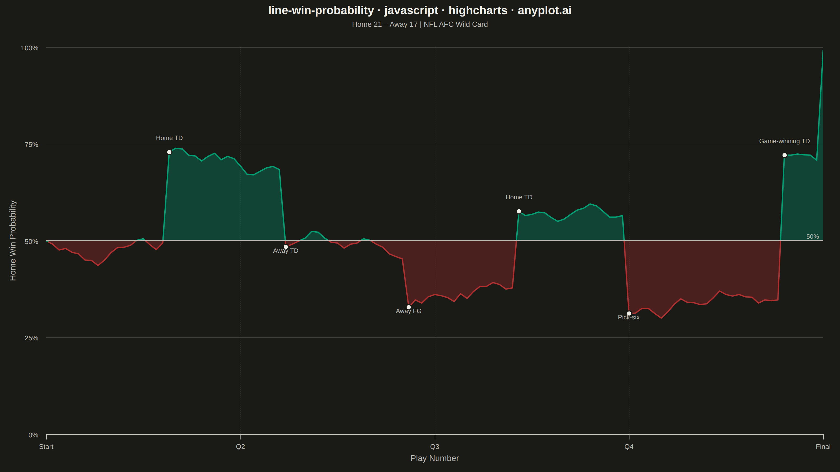
The same plot in 14 other libraries — JavaScript: Chart.js, D3.js, Apache ECharts, MUI X Charts; Python: Altair, Bokeh, lets-plot, Matplotlib, Plotly, plotnine, Pygal, Seaborn; R: ggplot2; Julia: Makie.jl. Compare all 15 side by side: Win Probability Chart in Python, R, Julia and JavaScript.
A win probability chart shows how each team's likelihood of winning evolves over the course of a game. The line starts near 50% and fluctuates based on scoring events, ultimately reaching 100% or 0% at game end. The area above and below the 50% baseline is filled with team colors to convey momentum at a glance. This visualization is widely used across major sports for post-game analysis and live broadcasting.
// anyplot.ai
// line-win-probability: Win Probability Chart
// Library: highcharts 12.6.0 | JavaScript 22.22.3
// Quality: 87/100 | Created: 2026-06-21

//# anyplot-orientation: landscape

const t = window.ANYPLOT_TOKENS;
const THEME = window.ANYPLOT_THEME;

// Deterministic LCG for reproducible play-by-play data
function lcg(seed) {
  let s = seed >>> 0;
  return () => {
    s = (Math.imul(s, 1664525) + 1013904223) >>> 0;
    return s / 0x100000000;
  };
}

const rand = lcg(42);

// Key scoring plays: [playNumber, wpDelta, shortLabel]
const keyPlays = [
  [18,  0.22, "Home TD"],
  [36, -0.20, "Away TD"],
  [55, -0.14, "Away FG"],
  [72,  0.21, "Home TD"],
  [89, -0.27, "Pick-six"],
  [113, 0.38, "Game-winning TD"],
];

// Build play-by-play win probability (120 plays, NFL AFC Wild Card)
const TOTAL_PLAYS = 120;
let wp = 0.50;
const seriesData = Array.from({ length: TOTAL_PLAYS + 1 }, (_, i) => ({ x: i, y: 0 }));

for (let i = 0; i <= TOTAL_PLAYS; i++) {
  seriesData[i].y = parseFloat((wp * 100).toFixed(1));
  if (i < TOTAL_PLAYS) {
    const play = keyPlays.find(p => p[0] === i);
    const eventDelta = play ? play[1] : 0;
    const noise = (rand() - 0.5) * 0.036;
    const meanRevert = (0.50 - wp) * 0.018;
    wp = Math.min(0.99, Math.max(0.01, wp + eventDelta + noise + meanRevert));
  }
}
// Home team wins: drive to 99%
seriesData[TOTAL_PLAYS].y = 99.2;

// Annotate key plays: marker at play+1 so wp has already updated
for (const [playNum, , label] of keyPlays) {
  const markerIdx = Math.min(playNum + 1, TOTAL_PLAYS);
  const point = seriesData[markerIdx];
  point.marker = {
    enabled: true,
    radius: 5,
    fillColor: t.ink,
    lineWidth: 2,
    lineColor: t.pageBg,
  };
  point.dataLabels = {
    enabled: true,
    useHTML: false,
    format: label,
    style: {
      color: t.inkSoft,
      fontSize: "12px",
      fontWeight: "normal",
      textOutline: "none",
    },
    y: point.y > 50 ? -16 : 18,
    align: "center",
  };
}

// Quarter boundary dotted lines (no label — x-axis formatter already shows Q2/Q3/Q4)
const quarterLines = [30, 60, 90].map((q) => ({
  value: q,
  color: t.grid,
  dashStyle: "dot",
  width: 1,
  zIndex: 2,
}));

Highcharts.chart("container", {
  chart: {
    type: "area",
    backgroundColor: "transparent",
    animation: false,
    style: { fontFamily: "inherit" },
    marginTop: 90,
    marginBottom: 72,
    marginLeft: 88,
    marginRight: 32,
  },
  credits: { enabled: false },
  colors: t.palette,
  title: {
    text: "line-win-probability · javascript · highcharts · anyplot.ai",
    style: { color: t.ink, fontSize: "22px", fontWeight: "600" },
  },
  subtitle: {
    text: "Home 21 – Away 17  |  NFL AFC Wild Card",
    style: { color: t.inkSoft, fontSize: "14px" },
  },
  xAxis: {
    min: 0,
    max: TOTAL_PLAYS,
    tickPositions: [0, 30, 60, 90, 120],
    title: {
      text: "Play Number",
      style: { color: t.inkSoft, fontSize: "16px" },
    },
    lineColor: t.inkSoft,
    tickColor: t.inkSoft,
    labels: {
      style: { color: t.inkSoft, fontSize: "13px" },
      formatter() {
        const map = { 0: "Start", 30: "Q2", 60: "Q3", 90: "Q4", 120: "Final" };
        return map[this.value] !== undefined ? map[this.value] : String(this.value);
      },
    },
    plotLines: quarterLines,
  },
  yAxis: {
    min: 0,
    max: 100,
    tickInterval: 25,
    title: {
      text: "Home Win Probability",
      style: { color: t.inkSoft, fontSize: "16px" },
    },
    gridLineColor: t.grid,
    labels: {
      format: "{value}%",
      style: { color: t.inkSoft, fontSize: "13px" },
    },
    plotLines: [{
      value: 50,
      color: t.inkSoft,
      width: 1.5,
      zIndex: 5,
      label: {
        text: "50%",
        align: "right",
        x: -8,
        style: { color: t.inkSoft, fontSize: "12px" },
      },
    }],
  },
  legend: { enabled: false },
  tooltip: { enabled: false },
  plotOptions: {
    series: { animation: false },
    area: {
      threshold: 50,
      color: t.palette[0],          // Brand green — home team leading
      negativeColor: t.palette[4],  // Matte red — home team trailing
      fillOpacity: THEME === "dark" ? 0.32 : 0.38,
      lineWidth: 2.5,
      dataLabels: { enabled: false },
      marker: {
        enabled: false,
        states: { hover: { enabled: false } },
      },
    },
  },
  series: [{
    name: "Home Win Probability",
    data: seriesData,
  }],
});
Runnable source as JSON, for any HTTP client: https://api.anyplot.ai/specs/line-win-probability/highcharts/code. Any spec id and library id listed in llms-full.txt fit the same URL shape; every URL below is complete and callable.
{
  "spec_id": "line-win-probability",
  "language": "javascript",
  "library": "highcharts",
  "page": "https://anyplot.ai/line-win-probability/javascript/highcharts",
  "hub": "https://anyplot.ai/line-win-probability",
  "code_json": "https://api.anyplot.ai/specs/line-win-probability/highcharts/code",
  "spec_json": "https://api.anyplot.ai/specs/line-win-probability",
  "render_light_png": "https://storage.googleapis.com/anyplot-images/plots/line-win-probability/javascript/highcharts/plot-light.png",
  "render_dark_png": "https://storage.googleapis.com/anyplot-images/plots/line-win-probability/javascript/highcharts/plot-dark.png",
  "interactive_light_html": "https://storage.googleapis.com/anyplot-images/plots/line-win-probability/javascript/highcharts/plot-light.html",
  "interactive_dark_html": "https://storage.googleapis.com/anyplot-images/plots/line-win-probability/javascript/highcharts/plot-dark.html",
  "quality_score": 87.0,
  "license": "MIT",
  "guide": "https://anyplot.ai/llms.txt"
}
Part of Win Probability Chart on anyplot.ai.