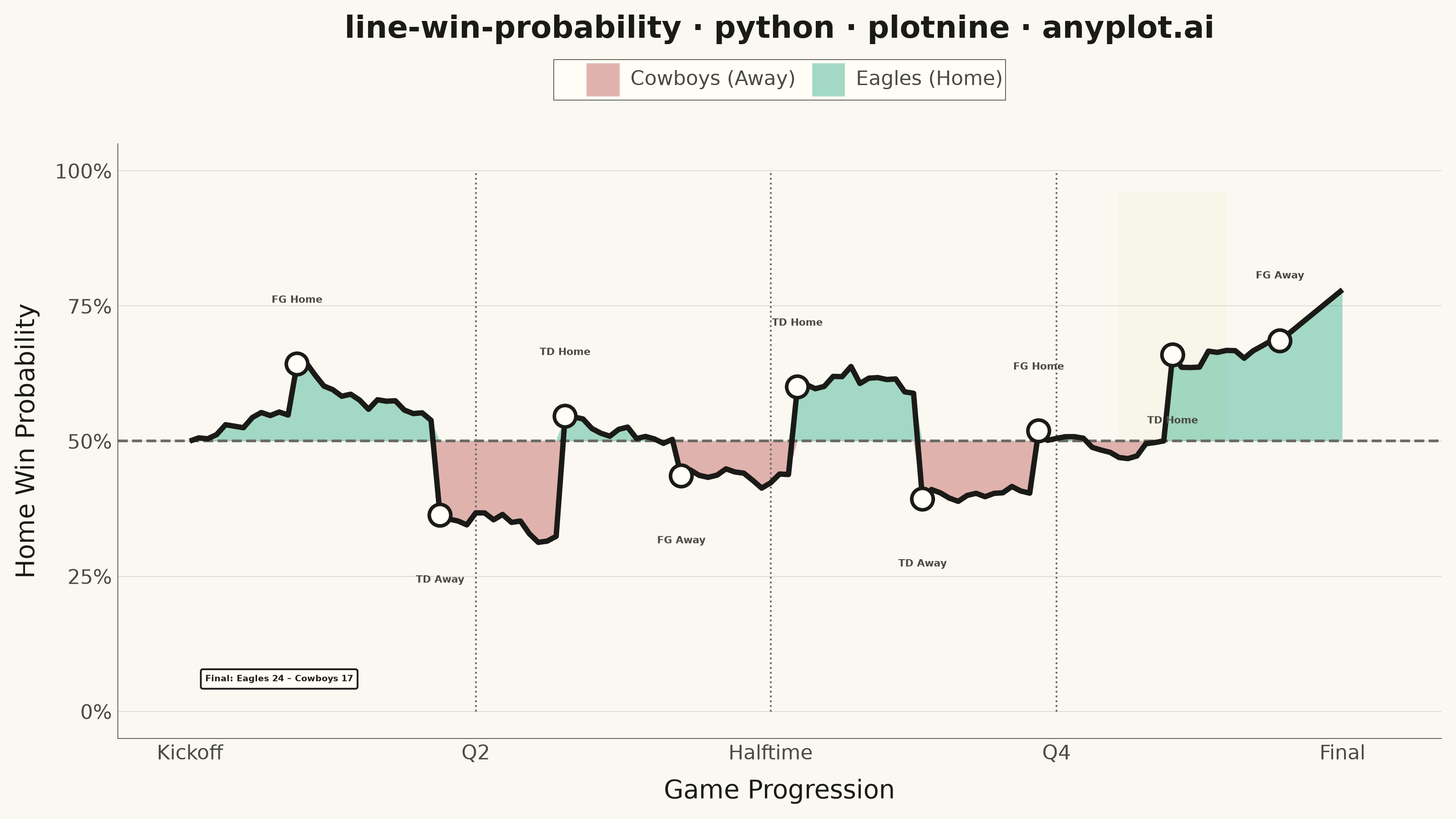
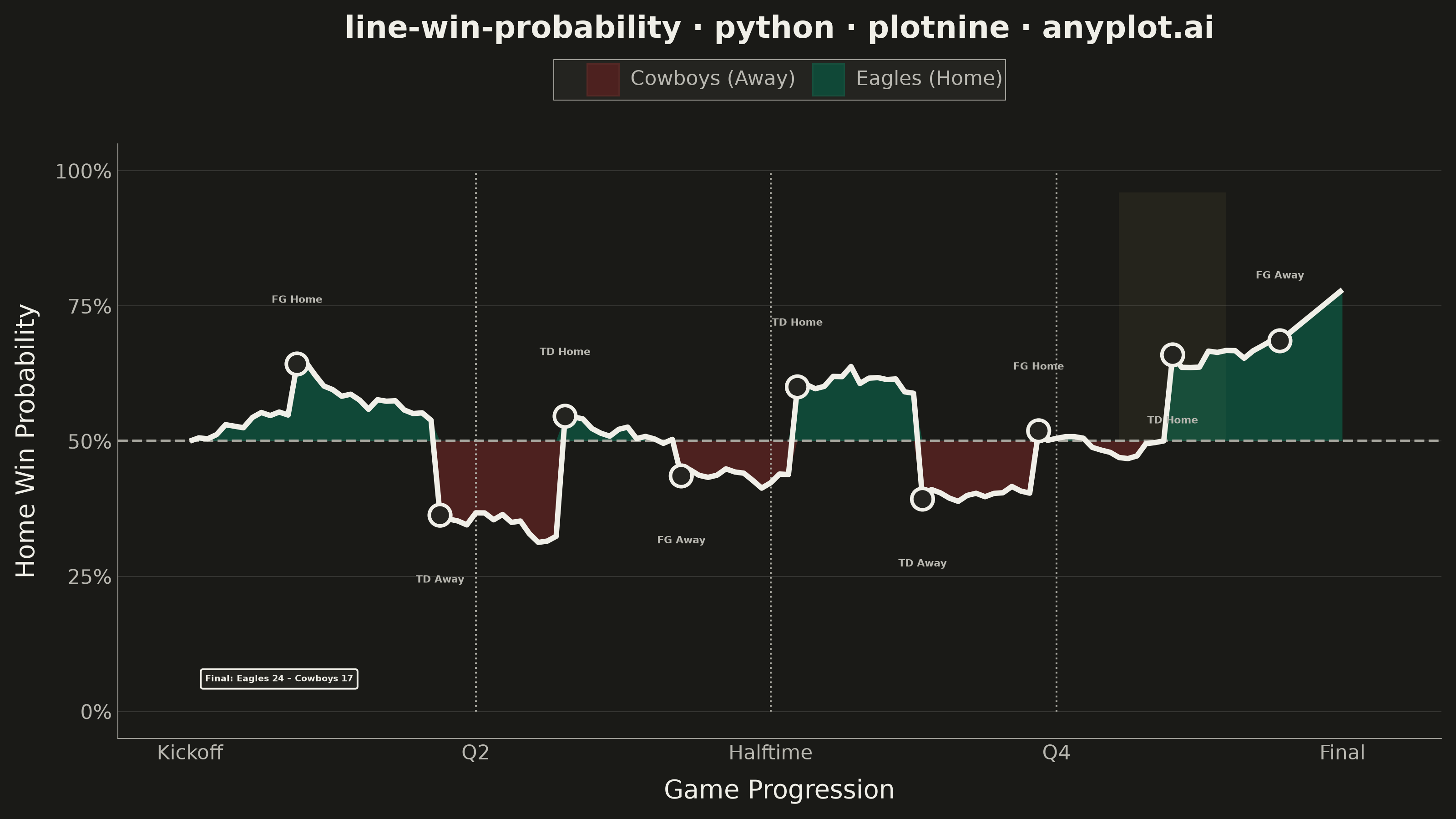
A win probability chart shows how each team's likelihood of winning evolves over the course of a game. The line starts near 50% and fluctuates based on scoring events, ultimately reaching 100% or 0% at game end. The area above and below the 50% baseline is filled with team colors to convey momentum at a glance. This visualization is widely used across major sports for post-game analysis and live broadcasting.
""" anyplot.ai
line-win-probability: Win Probability Chart
Library: plotnine 0.15.7 | Python 3.13.14
Quality: 89/100 | Updated: 2026-06-21
"""

import os
import sys


# Prevent this file from shadowing the plotnine library
sys.path = [p for p in sys.path if os.path.abspath(p or ".") != os.path.dirname(os.path.abspath(__file__))]

import numpy as np
import pandas as pd
from plotnine import (
    aes,
    annotate,
    coord_cartesian,
    element_blank,
    element_line,
    element_rect,
    element_text,
    geom_hline,
    geom_line,
    geom_point,
    geom_rect,
    geom_ribbon,
    geom_segment,
    geom_text,
    ggplot,
    labs,
    scale_alpha_identity,
    scale_fill_manual,
    scale_x_continuous,
    scale_y_continuous,
    theme,
    theme_minimal,
)


# Theme tokens
THEME = os.getenv("ANYPLOT_THEME", "light")
PAGE_BG = "#FAF8F1" if THEME == "light" else "#1A1A17"
ELEVATED_BG = "#FFFDF6" if THEME == "light" else "#242420"
INK = "#1A1A17" if THEME == "light" else "#F0EFE8"
INK_SOFT = "#4A4A44" if THEME == "light" else "#B8B7B0"
INK_MUTED = "#6B6A63" if THEME == "light" else "#A8A79F"
ANYPLOT_AMBER = "#DDCC77"

# Data
np.random.seed(42)

n_plays = 130
plays = np.arange(n_plays)
win_prob = np.zeros(n_plays)
win_prob[0] = 0.50

scoring_plays = {
    12: ("FG Home", 0.10),
    28: ("TD Away", -0.18),
    42: ("TD Home", 0.22),
    55: ("FG Away", -0.08),
    68: ("TD Home", 0.15),
    82: ("TD Away", -0.20),
    95: ("FG Home", 0.12),
    110: ("TD Home", 0.16),
    122: ("FG Away", -0.05),
}

events = {}
for i in range(1, n_plays):
    drift = np.random.normal(0, 0.012)
    if i in scoring_plays:
        label, shift = scoring_plays[i]
        win_prob[i] = win_prob[i - 1] + shift + drift
        events[i] = label
    else:
        win_prob[i] = win_prob[i - 1] + drift

win_prob = np.clip(win_prob, 0.04, 0.96)

for i in range(n_plays - 8, n_plays):
    t = (i - (n_plays - 8)) / 7.0
    win_prob[i] = win_prob[n_plays - 9] * (1 - t) + 0.78 * t

home_fill = np.maximum(win_prob, 0.5)
away_fill = np.minimum(win_prob, 0.5)

df = pd.DataFrame({"play": plays, "win_prob": win_prob})

df_home = pd.DataFrame({"play": plays, "ymin": 0.5, "ymax": home_fill, "team": "Eagles (Home)"})
df_away = pd.DataFrame({"play": plays, "ymin": away_fill, "ymax": 0.5, "team": "Cowboys (Away)"})
df_ribbon = pd.concat([df_home, df_away], ignore_index=True)

event_df = pd.DataFrame(
    {"play": list(events.keys()), "win_prob": [win_prob[p] for p in events.keys()], "label": list(events.values())}
)

# Annotation positioning: alternate offset direction for closely-spaced events
sorted_plays = sorted(events.keys())
y_offsets = {}
for i, play in enumerate(sorted_plays):
    prob = win_prob[play]
    base = 0.12 if prob > 0.5 else -0.12
    if i > 0:
        prev_play = sorted_plays[i - 1]
        if abs(play - prev_play) < 22:
            prev_y = y_offsets[prev_play]
            if (prev_y > win_prob[prev_play]) == (base > 0):
                base = -base
    y_offsets[play] = float(np.clip(prob + base, 0.07, 0.93))
event_df["label_y"] = [y_offsets[p] for p in event_df["play"]]

highlight_df = pd.DataFrame({"xmin": [104], "xmax": [116], "ymin": [0.50], "ymax": [0.96], "alpha": [0.06]})
quarter_df = pd.DataFrame({"x": [32, 65, 97], "ymin": [0.0] * 3, "ymax": [1.0] * 3})

# Plot
quarter_breaks = [0, 32, 65, 97, 129]
quarter_labels = ["Kickoff", "Q2", "Halftime", "Q4", "Final"]

title = "line-win-probability · python · plotnine · anyplot.ai"
title_fontsize = round(12 * (67 / len(title))) if len(title) > 67 else 12

plot = (
    ggplot()
    # Decisive moment highlight zone (golden background)
    + geom_rect(
        aes(xmin="xmin", xmax="xmax", ymin="ymin", ymax="ymax", alpha="alpha"),
        data=highlight_df,
        fill=ANYPLOT_AMBER,
        inherit_aes=False,
    )
    + scale_alpha_identity()
    # Team-colored area fills above/below 50%
    + geom_ribbon(aes(x="play", ymin="ymin", ymax="ymax", fill="team"), data=df_ribbon, alpha=0.35)
    # 50% reference line
    + geom_hline(yintercept=0.5, color=INK_MUTED, size=0.6, linetype="dashed")
    # Quarter boundary markers
    + geom_segment(
        aes(x="x", xend="x", y="ymin", yend="ymax"),
        data=quarter_df,
        color=INK_MUTED,
        size=0.4,
        linetype="dotted",
        inherit_aes=False,
    )
    # Win probability trace
    + geom_line(aes(x="play", y="win_prob"), data=df, color=INK, size=1.2)
    # Scoring event markers
    + geom_point(aes(x="play", y="win_prob"), data=event_df, color=INK, fill=ELEVATED_BG, size=4, stroke=0.8, shape="o")
    # Event annotation labels (size in mm; 4mm ≈ 11pt — visibly larger than tick labels)
    + geom_text(aes(x="play", y="label_y", label="label"), data=event_df, size=4, fontweight="bold", color=INK_SOFT)
    # Scales
    + scale_fill_manual(values={"Eagles (Home)": "#009E73", "Cowboys (Away)": "#AE3030"})
    + scale_x_continuous(breaks=quarter_breaks, labels=quarter_labels, expand=(0.03, 2))
    + scale_y_continuous(
        labels=lambda lst: [f"{int(v * 100)}%" for v in lst], limits=(0, 1), breaks=[0, 0.25, 0.5, 0.75, 1.0]
    )
    + coord_cartesian(xlim=(-2, 134))
    + labs(x="Game Progression", y="Home Win Probability", title=title, fill="")
    # Final score callout box
    + annotate(
        "label",
        x=10,
        y=0.06,
        label="Final: Eagles 24 – Cowboys 17",
        size=3.5,
        fill=ELEVATED_BG,
        color=INK,
        fontweight="bold",
        label_padding=0.5,
    )
    # Theme — canvas 8×4.5 in @ 400 dpi → 3200×1800 px
    + theme_minimal()
    + theme(
        figure_size=(8, 4.5),
        plot_background=element_rect(fill=PAGE_BG, color=PAGE_BG),
        panel_background=element_rect(fill=PAGE_BG),
        plot_title=element_text(size=title_fontsize, weight="bold", color=INK),
        axis_title_x=element_text(size=10, color=INK),
        axis_title_y=element_text(size=10, color=INK),
        axis_text=element_text(size=8, color=INK_SOFT),
        legend_text=element_text(size=8, color=INK_SOFT),
        legend_title=element_text(size=8, color=INK),
        legend_position="top",
        legend_background=element_rect(fill=ELEVATED_BG, color=INK_SOFT, size=0.3),
        legend_key_size=14,
        panel_grid_major_x=element_blank(),
        panel_grid_minor=element_blank(),
        panel_grid_major_y=element_line(color=INK, size=0.3, alpha=0.15),
        axis_line=element_line(color=INK_SOFT, size=0.3),
    )
)

# Save
plot.save(f"plot-{THEME}.png", dpi=400, width=8, height=4.5, units="in", verbose=False)
Runnable source as JSON, for any HTTP client: https://api.anyplot.ai/specs/line-win-probability/plotnine/code. Any spec id and library id listed in llms-full.txt fit the same URL shape; every URL below is complete and callable.
{
  "spec_id": "line-win-probability",
  "language": "python",
  "library": "plotnine",
  "page": "https://anyplot.ai/line-win-probability/python/plotnine",
  "hub": "https://anyplot.ai/line-win-probability",
  "code_json": "https://api.anyplot.ai/specs/line-win-probability/plotnine/code",
  "spec_json": "https://api.anyplot.ai/specs/line-win-probability",
  "render_light_png": "https://storage.googleapis.com/anyplot-images/plots/line-win-probability/python/plotnine/plot-light.png",
  "render_dark_png": "https://storage.googleapis.com/anyplot-images/plots/line-win-probability/python/plotnine/plot-dark.png",
  "quality_score": 89.0,
  "license": "MIT",
  "guide": "https://anyplot.ai/llms.txt"
}
Part of Win Probability Chart on anyplot.ai.