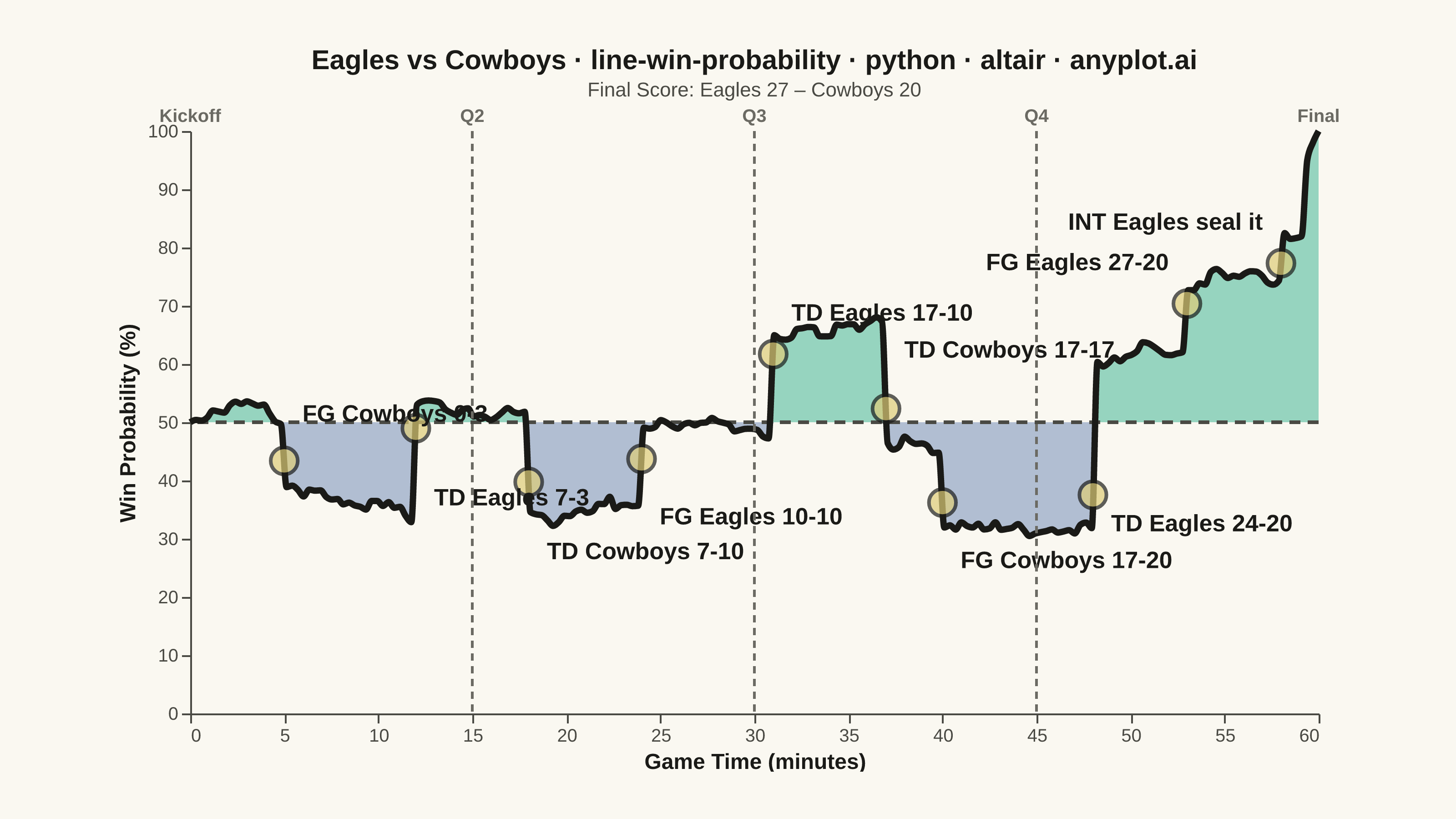
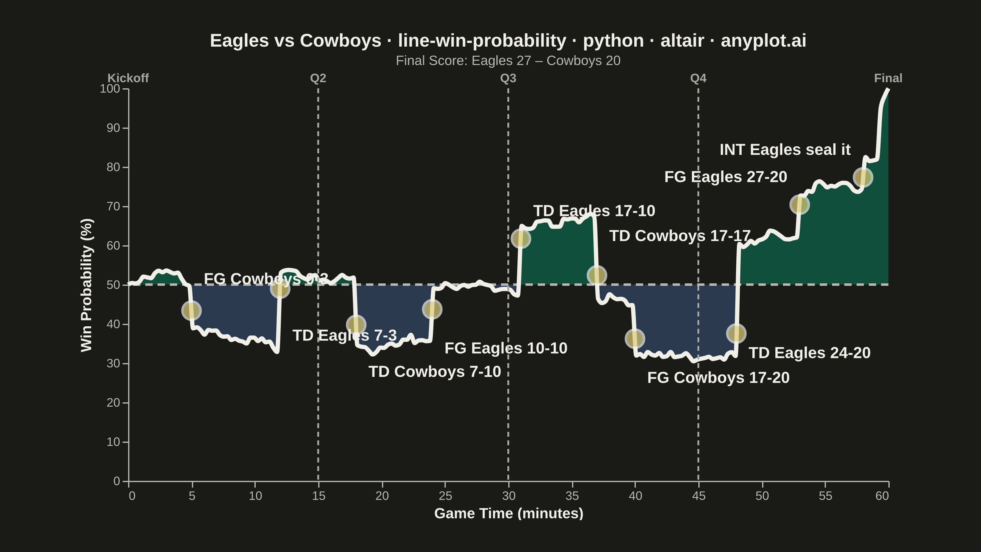
A win probability chart shows how each team's likelihood of winning evolves over the course of a game. The line starts near 50% and fluctuates based on scoring events, ultimately reaching 100% or 0% at game end. The area above and below the 50% baseline is filled with team colors to convey momentum at a glance. This visualization is widely used across major sports for post-game analysis and live broadcasting.
""" anyplot.ai
line-win-probability: Win Probability Chart
Library: altair 6.2.1 | Python 3.13.14
Quality: 92/100 | Updated: 2026-06-21
"""

import importlib
import os
import sys


# Remove script dir from sys.path so `altair` resolves to the package, not this file
sys.path[:] = [p for p in sys.path if os.path.abspath(p or ".") != os.path.dirname(os.path.abspath(__file__))]
alt = importlib.import_module("altair")
pd = importlib.import_module("pandas")
np = importlib.import_module("numpy")
Image = importlib.import_module("PIL.Image")

# Theme tokens — Imprint palette (prompts/default-style-guide.md)
THEME = os.getenv("ANYPLOT_THEME", "light")
PAGE_BG = "#FAF8F1" if THEME == "light" else "#1A1A17"
ELEVATED_BG = "#FFFDF6" if THEME == "light" else "#242420"
INK = "#1A1A17" if THEME == "light" else "#F0EFE8"
INK_SOFT = "#4A4A44" if THEME == "light" else "#B8B7B0"
INK_MUTED = "#6B6A63" if THEME == "light" else "#A8A79F"

# Team fill colors — Imprint positions with semantic home/away weight
HOME_COLOR = "#009E73"  # Imprint pos 1 brand green — Eagles home area
AWAY_COLOR = "#4467A3"  # Imprint pos 3 blue — Cowboys away area
EVENT_COLOR = "#DDCC77"  # Imprint amber anchor — key scoring event markers

# Data — Simulated NFL game: Eagles vs Cowboys
np.random.seed(42)

quarters = [0, 15, 30, 45, 60]
quarter_labels = ["Kickoff", "Q2", "Q3", "Q4", "Final"]

plays = np.linspace(0, 60, 200)
prob = np.full_like(plays, 0.5)
events = []

scoring_plays = [
    (5, -0.10, "FG Cowboys 0-3"),
    (12, 0.20, "TD Eagles 7-3"),
    (18, -0.18, "TD Cowboys 7-10"),
    (24, 0.15, "FG Eagles 10-10"),
    (31, 0.18, "TD Eagles 17-10"),
    (37, -0.22, "TD Cowboys 17-17"),
    (40, -0.12, "FG Cowboys 17-20"),
    (48, 0.28, "TD Eagles 24-20"),
    (53, 0.10, "FG Eagles 27-20"),
    (58, 0.08, "INT Eagles seal it"),
]

for i in range(1, len(plays)):
    drift = 0.0
    for event_time, shift, label in scoring_plays:
        if plays[i - 1] < event_time <= plays[i]:
            drift += shift
            events.append((event_time, label))
    noise = np.random.normal(0, 0.008)
    prob[i] = np.clip(prob[i - 1] + drift + noise, 0.01, 0.99)

prob[-1] = 1.0
prob[-2] = 0.98
prob[-3] = 0.95

df = pd.DataFrame({"minute": plays, "win_prob": prob})
df["win_pct"] = df["win_prob"] * 100
df["above_50"] = df["win_pct"].clip(lower=50)
df["below_50"] = df["win_pct"].clip(upper=50)

df_events = pd.DataFrame(events, columns=["minute", "label"])
df_events["win_pct"] = [np.interp(m, df["minute"], df["win_pct"]) for m in df_events["minute"]]

# Label y-offsets tuned per event to minimise overlap while staying near each data point
# TD Eagles 24-20 (index 7): nudge reduced from -14 to -5 to close the visual gap
label_nudges = [8, -12, -12, -10, 7, 10, -10, -5, 7, 7]
df_events["label_y"] = np.clip(df_events["win_pct"] + label_nudges, 5, 97)

df_events_left = df_events[df_events["minute"] <= 50].copy()
df_events_right = df_events[df_events["minute"] > 50].copy()

df_quarters = pd.DataFrame({"minute": quarters, "label": quarter_labels})

# Title — length-scaled fontSize (67-char baseline → 16px; see plot-generator.md)
title_text = "Eagles vs Cowboys · line-win-probability · python · altair · anyplot.ai"
n = len(title_text)
title_fs = max(11, round(16 * 67 / n)) if n > 67 else 16

# Plot layers
base = alt.Chart(df)

baseline = base.mark_rule(strokeDash=[6, 4], strokeWidth=2, color=INK_SOFT).encode(y=alt.datum(50))

area_home = base.mark_area(interpolate="monotone", opacity=0.4, color=HOME_COLOR).encode(
    x=alt.X("minute:Q", title="Game Time (minutes)", scale=alt.Scale(domain=[0, 60])),
    y=alt.Y("above_50:Q", title="Win Probability (%)", scale=alt.Scale(domain=[0, 100])),
    y2=alt.datum(50),
)

area_away = base.mark_area(interpolate="monotone", opacity=0.4, color=AWAY_COLOR).encode(
    x="minute:Q", y=alt.Y("below_50:Q", scale=alt.Scale(domain=[0, 100])), y2=alt.datum(50)
)

line = base.mark_line(interpolate="monotone", strokeWidth=3.5, color=INK).encode(
    x="minute:Q",
    y=alt.Y("win_pct:Q"),
    tooltip=[
        alt.Tooltip("minute:Q", title="Minute", format=".1f"),
        alt.Tooltip("win_pct:Q", title="Win Prob %", format=".1f"),
    ],
)

# Interactive crosshair selection (visible in HTML; PNG captures final static state)
nearest = alt.selection_point(nearest=True, on="pointerover", fields=["minute"], empty=False)

selectors = base.mark_point(size=1, opacity=0).encode(x="minute:Q").add_params(nearest)

crosshair_rule = base.mark_rule(color=INK_SOFT, strokeWidth=1, strokeDash=[3, 3]).encode(
    x="minute:Q", opacity=alt.condition(nearest, alt.value(0.7), alt.value(0))
)

highlight_dot = base.mark_circle(size=180, color=INK, stroke=PAGE_BG, strokeWidth=2).encode(
    x="minute:Q", y="win_pct:Q", opacity=alt.condition(nearest, alt.value(1), alt.value(0))
)

# Scoring event markers — amber anchor for contrast against both team fills
event_points = (
    alt.Chart(df_events)
    .mark_circle(size=220, color=EVENT_COLOR, stroke=INK, strokeWidth=2)
    .encode(
        x="minute:Q",
        y="win_pct:Q",
        tooltip=[alt.Tooltip("label:N", title="Event"), alt.Tooltip("minute:Q", title="Minute", format=".0f")],
    )
)

event_labels_left = (
    alt.Chart(df_events_left)
    .mark_text(fontSize=13, fontWeight="bold", align="left", dx=10, color=INK)
    .encode(x="minute:Q", y="label_y:Q", text="label:N")
)

event_labels_right = (
    alt.Chart(df_events_right)
    .mark_text(fontSize=13, fontWeight="bold", align="right", dx=-10, color=INK)
    .encode(x="minute:Q", y="label_y:Q", text="label:N")
)

quarter_rules = (
    alt.Chart(df_quarters[1:-1]).mark_rule(strokeDash=[4, 3], strokeWidth=1.5, color=INK_MUTED).encode(x="minute:Q")
)

quarter_text = (
    alt.Chart(df_quarters)
    .mark_text(fontSize=10, fontWeight="bold", dy=-8, color=INK_MUTED)
    .encode(x="minute:Q", y=alt.datum(100), text="label:N")
)

chart = (
    (
        area_home
        + area_away
        + baseline
        + line
        + event_points
        + event_labels_left
        + event_labels_right
        + quarter_rules
        + quarter_text
        + selectors
        + crosshair_rule
        + highlight_dot
    )
    .properties(
        width=620,
        height=320,
        background=PAGE_BG,
        padding={"left": 0, "right": 0, "top": 0, "bottom": 0},
        title=alt.Title(
            title_text,
            fontSize=title_fs,
            subtitle="Final Score: Eagles 27 – Cowboys 20",
            subtitleFontSize=11,
            subtitleColor=INK_SOFT,
        ),
    )
    .configure_view(fill=PAGE_BG, strokeWidth=0)
    .configure_axis(
        labelFontSize=10,
        titleFontSize=12,
        domainColor=INK_SOFT,
        tickColor=INK_SOFT,
        labelColor=INK_SOFT,
        titleColor=INK,
        grid=False,
    )
    .configure_title(color=INK)
)

# Save — theme-suffixed filenames required by pipeline
TW, TH = 3200, 1800

chart.save(f"plot-{THEME}.png", scale_factor=4.0)
chart.save(f"plot-{THEME}.html")

# Pad to exact target canvas (altair.md canvas rule — do NOT crop)
_img = Image.open(f"plot-{THEME}.png").convert("RGB")
_w, _h = _img.size
if _w > TW or _h > TH:
    raise SystemExit(
        f"altair vl-convert produced {_w}×{_h}, exceeds target {TW}×{TH}. "
        f"Shrink chart .properties(width=, height=) values and re-render."
    )
if _w < TW or _h < TH:
    _canvas = Image.new("RGB", (TW, TH), PAGE_BG)
    _canvas.paste(_img, ((TW - _w) // 2, (TH - _h) // 2))
    _canvas.save(f"plot-{THEME}.png")
Runnable source as JSON, for any HTTP client: https://api.anyplot.ai/specs/line-win-probability/altair/code. Any spec id and library id listed in llms-full.txt fit the same URL shape; every URL below is complete and callable.
{
  "spec_id": "line-win-probability",
  "language": "python",
  "library": "altair",
  "page": "https://anyplot.ai/line-win-probability/python/altair",
  "hub": "https://anyplot.ai/line-win-probability",
  "code_json": "https://api.anyplot.ai/specs/line-win-probability/altair/code",
  "spec_json": "https://api.anyplot.ai/specs/line-win-probability",
  "render_light_png": "https://storage.googleapis.com/anyplot-images/plots/line-win-probability/python/altair/plot-light.png",
  "render_dark_png": "https://storage.googleapis.com/anyplot-images/plots/line-win-probability/python/altair/plot-dark.png",
  "interactive_light_html": "https://storage.googleapis.com/anyplot-images/plots/line-win-probability/python/altair/plot-light.html",
  "interactive_dark_html": "https://storage.googleapis.com/anyplot-images/plots/line-win-probability/python/altair/plot-dark.html",
  "quality_score": 92.0,
  "license": "MIT",
  "guide": "https://anyplot.ai/llms.txt"
}
Part of Win Probability Chart on anyplot.ai.