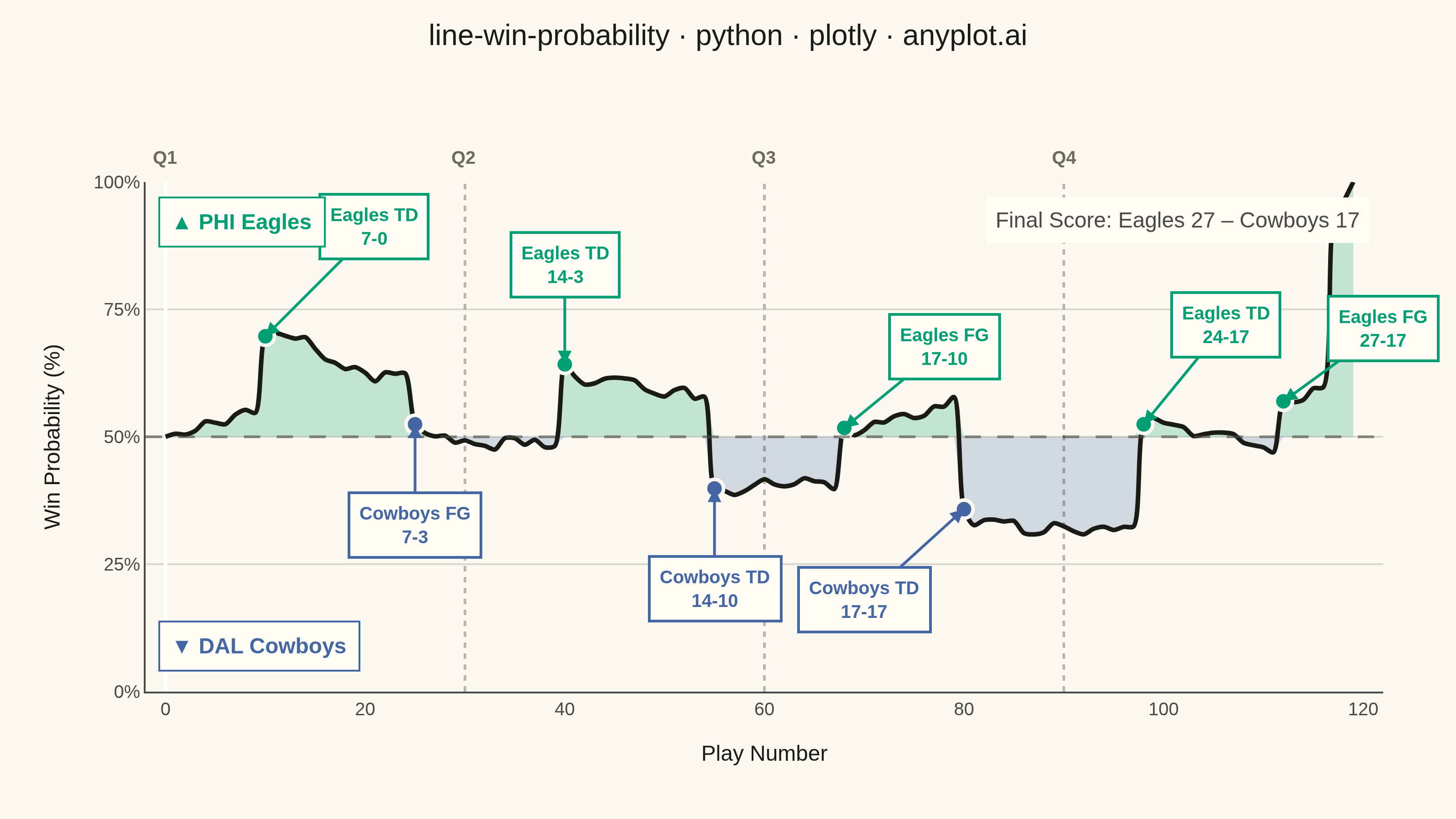
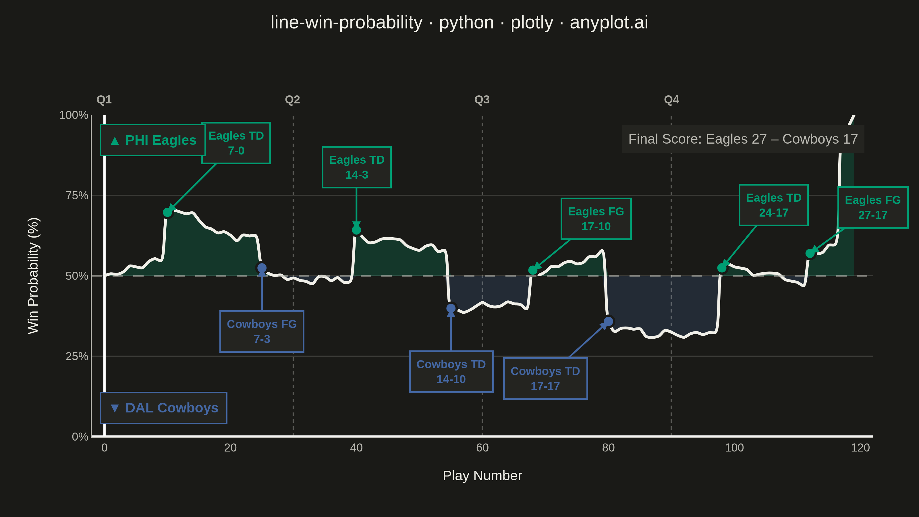
A win probability chart shows how each team's likelihood of winning evolves over the course of a game. The line starts near 50% and fluctuates based on scoring events, ultimately reaching 100% or 0% at game end. The area above and below the 50% baseline is filled with team colors to convey momentum at a glance. This visualization is widely used across major sports for post-game analysis and live broadcasting.
""" anyplot.ai
line-win-probability: Win Probability Chart
Library: plotly 6.8.0 | Python 3.13.14
Quality: 91/100 | Updated: 2026-06-21
"""

import os

import numpy as np
import plotly.graph_objects as go


# Theme-adaptive chrome (Imprint palette)
THEME = os.getenv("ANYPLOT_THEME", "light")
PAGE_BG = "#FAF8F1" if THEME == "light" else "#1A1A17"
ELEVATED_BG = "#FFFDF6" if THEME == "light" else "#242420"
INK = "#1A1A17" if THEME == "light" else "#F0EFE8"
INK_SOFT = "#4A4A44" if THEME == "light" else "#B8B7B0"
INK_MUTED = "#6B6A63" if THEME == "light" else "#A8A79F"
GRID = "rgba(26,26,23,0.15)" if THEME == "light" else "rgba(240,239,232,0.15)"
GRID_RULE = "rgba(26,26,23,0.30)" if THEME == "light" else "rgba(240,239,232,0.30)"

# Team colors — semantic exception: football teams carry strong real-world color identity.
# Eagles (PHI) → Imprint brand green; Cowboys (DAL) → Imprint blue.
HOME_COLOR = "#009E73"  # Imprint position 1 — Eagles green
AWAY_COLOR = "#4467A3"  # Imprint position 3 — Cowboys blue
HOME_FILL = "rgba(0,158,115,0.22)"
AWAY_FILL = "rgba(68,103,163,0.22)"

# Data — simulated NFL game: Eagles vs Cowboys
np.random.seed(42)

play_count = 120
plays = np.arange(play_count)

win_prob = np.zeros(play_count)
win_prob[0] = 0.50

q1_end, q2_end, q3_end = 30, 60, 90

# Key scoring events (play_index, prob_shift, label)
events = [
    (10, 0.15, "Eagles TD\n7-0"),
    (25, -0.10, "Cowboys FG\n7-3"),
    (40, 0.16, "Eagles TD\n14-3"),
    (55, -0.18, "Cowboys TD\n14-10"),
    (68, 0.12, "Eagles FG\n17-10"),
    (80, -0.22, "Cowboys TD\n17-17"),
    (98, 0.20, "Eagles TD\n24-17"),
    (112, 0.10, "Eagles FG\n27-17"),
]

event_plays = {e[0]: e[1] for e in events}

for i in range(1, play_count):
    if i in event_plays:
        drift = event_plays[i]
    else:
        drift = np.random.normal(0, 0.012)
    win_prob[i] = np.clip(win_prob[i - 1] + drift, 0.03, 0.97)

win_prob[-1] = 1.0
win_prob[-2] = 0.96
win_prob[-3] = 0.92

win_pct = win_prob * 100

# Plot
fig = go.Figure()

# Fill above 50% — home team (Eagles)
win_above = np.clip(win_pct, 50, 100)
fig.add_trace(go.Scatter(x=plays, y=win_above, mode="lines", line={"width": 0}, showlegend=False, hoverinfo="skip"))
fig.add_trace(
    go.Scatter(
        x=plays,
        y=np.full(play_count, 50),
        mode="lines",
        line={"width": 0},
        fill="tonexty",
        fillcolor=HOME_FILL,
        showlegend=False,
        hoverinfo="skip",
    )
)

# Fill below 50% — away team (Cowboys)
win_below = np.clip(win_pct, 0, 50)
fig.add_trace(go.Scatter(x=plays, y=win_below, mode="lines", line={"width": 0}, showlegend=False, hoverinfo="skip"))
fig.add_trace(
    go.Scatter(
        x=plays,
        y=np.full(play_count, 50),
        mode="lines",
        line={"width": 0},
        fill="tonexty",
        fillcolor=AWAY_FILL,
        showlegend=False,
        hoverinfo="skip",
    )
)

# Main win probability line
fig.add_trace(
    go.Scatter(
        x=plays,
        y=win_pct,
        mode="lines",
        line={"width": 2.5, "color": INK, "shape": "spline", "smoothing": 0.8},
        name="Win Probability",
        hovertemplate="Play %{x}<br>Win Prob: %{y:.1f}%<extra></extra>",
    )
)

# 50% reference line
fig.add_hline(y=50, line_dash="dash", line_color=INK_SOFT, line_width=1.5, opacity=0.6)

# Quarter dividers and labels
for q_play, q_label in [(q1_end, "Q2"), (q2_end, "Q3"), (q3_end, "Q4")]:
    fig.add_vline(x=q_play, line_dash="dot", line_color=GRID_RULE, line_width=1.5)
    fig.add_annotation(
        x=q_play, y=100, text=f"<b>{q_label}</b>", showarrow=False, font={"size": 10, "color": INK_MUTED}, yshift=14
    )

fig.add_annotation(x=0, y=100, text="<b>Q1</b>", showarrow=False, font={"size": 10, "color": INK_MUTED}, yshift=14)

# Scoring event markers and annotations
for play_idx, _, label in events:
    label_clean = label.replace("\n", "<br>")
    is_home = "Eagles" in label
    marker_color = HOME_COLOR if is_home else AWAY_COLOR
    y_val = win_pct[play_idx]

    fig.add_trace(
        go.Scatter(
            x=[play_idx],
            y=[y_val],
            mode="markers",
            marker={"size": 10, "color": marker_color, "line": {"color": PAGE_BG, "width": 2}},
            showlegend=False,
            hovertemplate=f"{label_clean}<br>Play {play_idx}<br>Win Prob: {y_val:.1f}%<extra></extra>",
        )
    )

    ay_offset = -55 if y_val > 55 else 55
    ax_offset = 0
    if play_idx == 10:
        ax_offset = 60  # steer right to avoid PHI Eagles legend in upper-left
        ay_offset = -60
    elif play_idx == 68:
        ax_offset = 55
        ay_offset = -45
    elif play_idx == 80:
        ax_offset = -55
        ay_offset = 50
    elif play_idx == 98:
        ax_offset = 45
        ay_offset = -55
    elif play_idx == 112:
        ax_offset = 55
        ay_offset = -40

    fig.add_annotation(
        x=play_idx,
        y=y_val,
        text=f"<b>{label_clean}</b>",
        showarrow=True,
        arrowhead=2,
        arrowwidth=1.5,
        arrowcolor=marker_color,
        ax=ax_offset,
        ay=ay_offset,
        font={"size": 10, "color": marker_color},
        bgcolor=ELEVATED_BG,
        bordercolor=marker_color,
        borderwidth=1.5,
        borderpad=5,
    )

# Team legend
fig.add_annotation(
    x=0.01,
    y=0.97,
    xref="paper",
    yref="paper",
    text="<b>▲ PHI Eagles</b>",
    showarrow=False,
    font={"size": 12, "color": HOME_COLOR},
    bgcolor=ELEVATED_BG,
    bordercolor=HOME_COLOR,
    borderwidth=1,
    borderpad=6,
)
fig.add_annotation(
    x=0.01,
    y=0.04,
    xref="paper",
    yref="paper",
    text="<b>▼ DAL Cowboys</b>",
    showarrow=False,
    font={"size": 12, "color": AWAY_COLOR},
    bgcolor=ELEVATED_BG,
    bordercolor=AWAY_COLOR,
    borderwidth=1,
    borderpad=6,
)

# Final score — upper right corner inside the plot
fig.add_annotation(
    x=0.99,
    y=0.97,
    xref="paper",
    yref="paper",
    xanchor="right",
    yanchor="top",
    text="Final Score: Eagles 27 – Cowboys 17",
    showarrow=False,
    font={"size": 12, "color": INK_SOFT},
    bgcolor=ELEVATED_BG,
    borderpad=5,
)

# Layout
fig.update_layout(
    autosize=False,
    title={
        "text": "line-win-probability · python · plotly · anyplot.ai",
        "font": {"size": 16, "color": INK},
        "x": 0.5,
        "xanchor": "center",
        "y": 0.97,
    },
    paper_bgcolor=PAGE_BG,
    plot_bgcolor=PAGE_BG,
    font={"color": INK},
    xaxis={
        "title": {"text": "Play Number", "font": {"size": 12, "color": INK}},
        "tickfont": {"size": 10, "color": INK_SOFT},
        "showline": True,
        "linewidth": 1,
        "linecolor": INK_SOFT,
        "showgrid": False,
        "range": [-2, play_count + 2],
    },
    yaxis={
        "title": {"text": "Win Probability (%)", "font": {"size": 12, "color": INK}},
        "tickfont": {"size": 10, "color": INK_SOFT},
        "tickvals": [0, 25, 50, 75, 100],
        "ticktext": ["0%", "25%", "50%", "75%", "100%"],
        "range": [0, 100],
        "showline": True,
        "linewidth": 1,
        "linecolor": INK_SOFT,
        "showgrid": True,
        "gridwidth": 1,
        "gridcolor": GRID,
    },
    showlegend=False,
    margin={"l": 80, "r": 40, "t": 100, "b": 70},
    hovermode="x unified",
)

fig.update_xaxes(showspikes=True, spikecolor=INK_SOFT, spikethickness=1, spikedash="dot")

# Save — landscape 3200×1800 (width=800, height=450, scale=4)
fig.write_image(f"plot-{THEME}.png", width=800, height=450, scale=4)
fig.write_html(f"plot-{THEME}.html", include_plotlyjs="cdn")
Runnable source as JSON, for any HTTP client: https://api.anyplot.ai/specs/line-win-probability/plotly/code. Any spec id and library id listed in llms-full.txt fit the same URL shape; every URL below is complete and callable.
{
  "spec_id": "line-win-probability",
  "language": "python",
  "library": "plotly",
  "page": "https://anyplot.ai/line-win-probability/python/plotly",
  "hub": "https://anyplot.ai/line-win-probability",
  "code_json": "https://api.anyplot.ai/specs/line-win-probability/plotly/code",
  "spec_json": "https://api.anyplot.ai/specs/line-win-probability",
  "render_light_png": "https://storage.googleapis.com/anyplot-images/plots/line-win-probability/python/plotly/plot-light.png",
  "render_dark_png": "https://storage.googleapis.com/anyplot-images/plots/line-win-probability/python/plotly/plot-dark.png",
  "interactive_light_html": "https://storage.googleapis.com/anyplot-images/plots/line-win-probability/python/plotly/plot-light.html",
  "interactive_dark_html": "https://storage.googleapis.com/anyplot-images/plots/line-win-probability/python/plotly/plot-dark.html",
  "quality_score": 91.0,
  "license": "MIT",
  "guide": "https://anyplot.ai/llms.txt"
}
Part of Win Probability Chart on anyplot.ai.