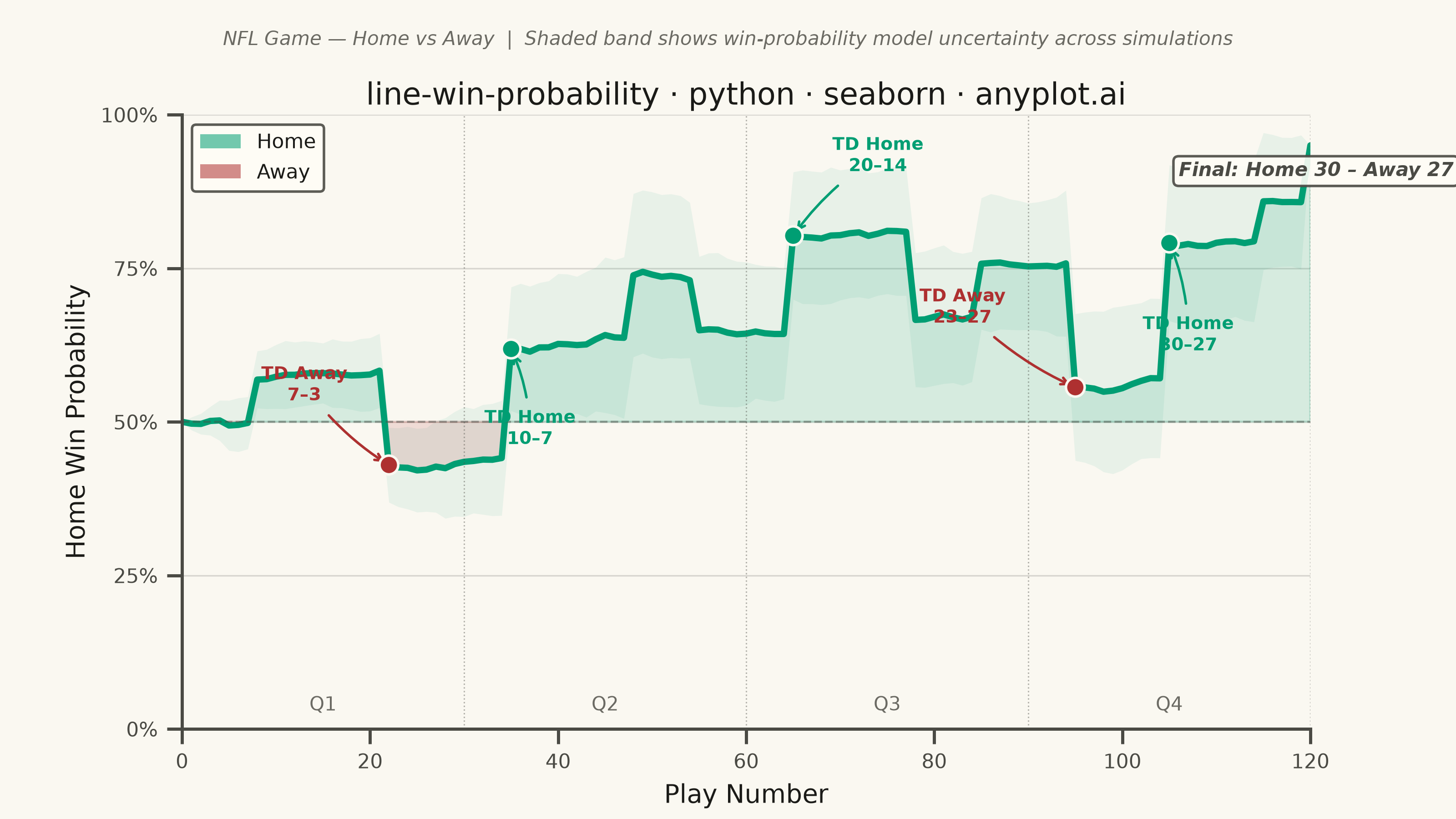
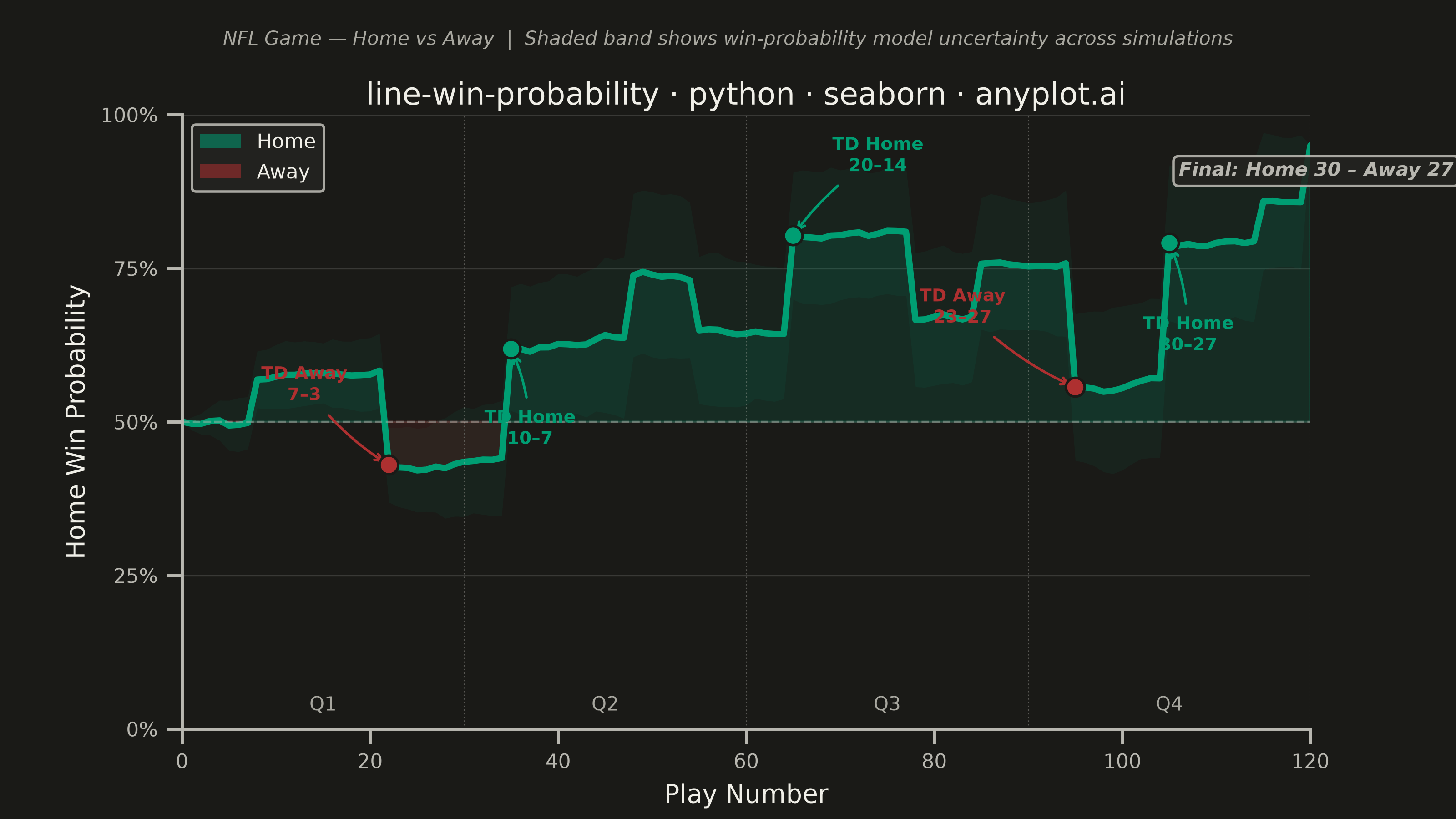
A win probability chart shows how each team's likelihood of winning evolves over the course of a game. The line starts near 50% and fluctuates based on scoring events, ultimately reaching 100% or 0% at game end. The area above and below the 50% baseline is filled with team colors to convey momentum at a glance. This visualization is widely used across major sports for post-game analysis and live broadcasting.
""" anyplot.ai
line-win-probability: Win Probability Chart
Library: seaborn 0.13.2 | Python 3.13.14
Quality: 91/100 | Updated: 2026-06-21
"""

import os

import matplotlib.patches as mpatches
import matplotlib.pyplot as plt
import numpy as np
import pandas as pd
import seaborn as sns


# Theme tokens
THEME = os.getenv("ANYPLOT_THEME", "light")
PAGE_BG = "#FAF8F1" if THEME == "light" else "#1A1A17"
ELEVATED_BG = "#FFFDF6" if THEME == "light" else "#242420"
INK = "#1A1A17" if THEME == "light" else "#F0EFE8"
INK_SOFT = "#4A4A44" if THEME == "light" else "#B8B7B0"
INK_MUTED = "#6B6A63" if THEME == "light" else "#A8A79F"

# Imprint palette — semantic: green=Home (winning/positive), matte red=Away (opponent/loss)
HOME_COLOR = "#009E73"  # Imprint position 1 — brand green
AWAY_COLOR = "#AE3030"  # Imprint position 5 — matte red (semantic: loss / away team)

sns.set_theme(
    style="ticks",
    rc={
        "figure.facecolor": PAGE_BG,
        "axes.facecolor": PAGE_BG,
        "axes.edgecolor": INK_SOFT,
        "axes.labelcolor": INK,
        "text.color": INK,
        "xtick.color": INK_SOFT,
        "ytick.color": INK_SOFT,
        "grid.color": INK,
        "grid.alpha": 0.15,
        "legend.facecolor": ELEVATED_BG,
        "legend.edgecolor": INK_SOFT,
        "font.family": "sans-serif",
    },
)

# Data — build multiple Monte Carlo runs so seaborn's native errorbar can show model uncertainty
plays = np.arange(0, 121)

scoring_events = {
    8: 0.07,
    22: -0.15,
    35: 0.18,
    48: 0.10,
    55: -0.08,
    65: 0.16,
    78: -0.14,
    85: 0.09,
    95: -0.20,
    105: 0.22,
    115: 0.08,
}

runs = []
for seed in range(42, 62):  # 20 simulations for stable CI band
    rng = np.random.default_rng(seed)
    wp = np.full(len(plays), 0.50)
    for i in range(1, len(plays)):
        noise = rng.normal(0, 0.015)
        shift = scoring_events.get(i, 0.0)
        wp[i] = np.clip(wp[i - 1] + shift + noise, 0.02, 0.98)
    wp[-1] = 0.95  # game ends with home win
    runs.append(pd.DataFrame({"play": plays, "win_probability": wp, "run": seed}))

df_sim = pd.concat(runs, ignore_index=True)

# Mean line for fills and annotation anchors
win_prob_mean = df_sim.groupby("play")["win_probability"].mean().values

# Plot — landscape 3200×1800 px (figsize × dpi, no bbox_inches)
fig, ax = plt.subplots(figsize=(8, 4.5), dpi=400)
fig.subplots_adjust(top=0.86)  # reserve headroom for title + subtitle
ax.set_facecolor(PAGE_BG)

# Seaborn lineplot with native errorbar — uses seaborn's statistical aggregation across 20 runs
# to display the mean win-probability line with a ±1 SD uncertainty band
sns.lineplot(
    data=df_sim,
    x="play",
    y="win_probability",
    color=HOME_COLOR,
    linewidth=2.5,
    errorbar="sd",
    err_kws={"alpha": 0.07, "linewidth": 0},
    ax=ax,
)

# Fills between mean line and 50% reference
ax.fill_between(plays, win_prob_mean, 0.5, where=(win_prob_mean >= 0.5), color=HOME_COLOR, alpha=0.14, interpolate=True)
ax.fill_between(plays, win_prob_mean, 0.5, where=(win_prob_mean < 0.5), color=AWAY_COLOR, alpha=0.14, interpolate=True)

# 50% reference line
ax.axhline(y=0.5, color=INK_SOFT, linewidth=0.8, linestyle="--", alpha=0.45)

# Key event annotations — scored on the mean trajectory
key_events = {
    22: ("TD Away\n7–3", AWAY_COLOR),
    35: ("TD Home\n10–7", HOME_COLOR),
    65: ("TD Home\n20–14", HOME_COLOR),
    95: ("TD Away\n23–27", AWAY_COLOR),
    105: ("TD Home\n30–27", HOME_COLOR),
}
annotation_offsets = {22: (-9, 0.13), 35: (2, -0.13), 65: (9, 0.13), 95: (-12, 0.13), 105: (2, -0.15)}

for play_num, (label, color) in key_events.items():
    y_val = win_prob_mean[play_num]
    x_off, y_off = annotation_offsets[play_num]
    ax.annotate(
        label,
        xy=(play_num, y_val),
        xytext=(play_num + x_off, y_val + y_off),
        fontsize=7,
        fontweight="bold",
        color=color,
        ha="center",
        va="center",
        arrowprops={"arrowstyle": "->", "color": color, "lw": 1.0, "connectionstyle": "arc3,rad=0.1"},
    )

# Event marker dots via seaborn scatter
sns.scatterplot(
    x=list(key_events),
    y=[win_prob_mean[p] for p in key_events],
    color=[key_events[p][1] for p in key_events],
    s=55,
    zorder=5,
    edgecolor=PAGE_BG,
    linewidth=1.0,
    ax=ax,
    legend=False,
)

# Quarter boundary markers — Q4 label kept at bottom left of its quarter to avoid top-right clutter
for q, label in [(30, "Q1"), (60, "Q2"), (90, "Q3"), (120, "Q4")]:
    ax.axvline(x=q, color=INK_SOFT, linewidth=0.55, linestyle=":", alpha=0.4)
    ax.text(q - 15, 0.03, label, fontsize=7.5, color=INK_MUTED, ha="center")

# Final score callout — top right, away from Q4 bottom label
ax.text(
    106,
    0.90,
    "Final: Home 30 – Away 27",
    fontsize=7.5,
    ha="left",
    color=INK_SOFT,
    fontweight="semibold",
    fontstyle="italic",
    bbox={"boxstyle": "round,pad=0.28", "facecolor": ELEVATED_BG, "edgecolor": INK_SOFT, "alpha": 0.9},
)

# Axes styling
ax.set_xlabel("Play Number", fontsize=10, color=INK)
ax.set_ylabel("Home Win Probability", fontsize=10, color=INK)
ax.set_title("line-win-probability · python · seaborn · anyplot.ai", fontsize=12, fontweight="medium", pad=4, color=INK)
# subtitle in figure coordinates — sits above the axes title without overlapping
fig.text(
    0.5,
    0.945,
    "NFL Game — Home vs Away  |  Shaded band shows win-probability model uncertainty across simulations",
    ha="center",
    fontsize=7.5,
    color=INK_MUTED,
    fontstyle="italic",
)
ax.tick_params(axis="both", labelsize=8, colors=INK_SOFT)
ax.set_ylim(0, 1)
ax.set_xlim(0, 120)
ax.set_yticks([0, 0.25, 0.5, 0.75, 1.0])
ax.set_yticklabels(["0%", "25%", "50%", "75%", "100%"])

sns.despine(ax=ax)
ax.yaxis.grid(True, alpha=0.15, linewidth=0.6)

# Legend — Home/Away fill patches
home_patch = mpatches.Patch(facecolor=HOME_COLOR, alpha=0.55, label="Home", edgecolor="none")
away_patch = mpatches.Patch(facecolor=AWAY_COLOR, alpha=0.55, label="Away", edgecolor="none")
ax.legend(
    handles=[home_patch, away_patch],
    fontsize=8,
    loc="upper left",
    frameon=True,
    facecolor=ELEVATED_BG,
    edgecolor=INK_SOFT,
    framealpha=0.9,
)

# Save — no bbox_inches so figsize × dpi gives exact 3200×1800 px
plt.savefig(f"plot-{THEME}.png", dpi=400, facecolor=PAGE_BG)
plt.close()
Runnable source as JSON, for any HTTP client: https://api.anyplot.ai/specs/line-win-probability/seaborn/code. Any spec id and library id listed in llms-full.txt fit the same URL shape; every URL below is complete and callable.
{
  "spec_id": "line-win-probability",
  "language": "python",
  "library": "seaborn",
  "page": "https://anyplot.ai/line-win-probability/python/seaborn",
  "hub": "https://anyplot.ai/line-win-probability",
  "code_json": "https://api.anyplot.ai/specs/line-win-probability/seaborn/code",
  "spec_json": "https://api.anyplot.ai/specs/line-win-probability",
  "render_light_png": "https://storage.googleapis.com/anyplot-images/plots/line-win-probability/python/seaborn/plot-light.png",
  "render_dark_png": "https://storage.googleapis.com/anyplot-images/plots/line-win-probability/python/seaborn/plot-dark.png",
  "quality_score": 91.0,
  "license": "MIT",
  "guide": "https://anyplot.ai/llms.txt"
}
Part of Win Probability Chart on anyplot.ai.