The same plot in 14 other libraries — Python: Altair, Bokeh, lets-plot, Matplotlib, Plotly, plotnine, Pygal, Seaborn; R: ggplot2; JavaScript: Chart.js, D3.js, Apache ECharts, Highcharts, MUI X Charts. Compare all 15 side by side: Win Probability Chart in Python, R, Julia and JavaScript.
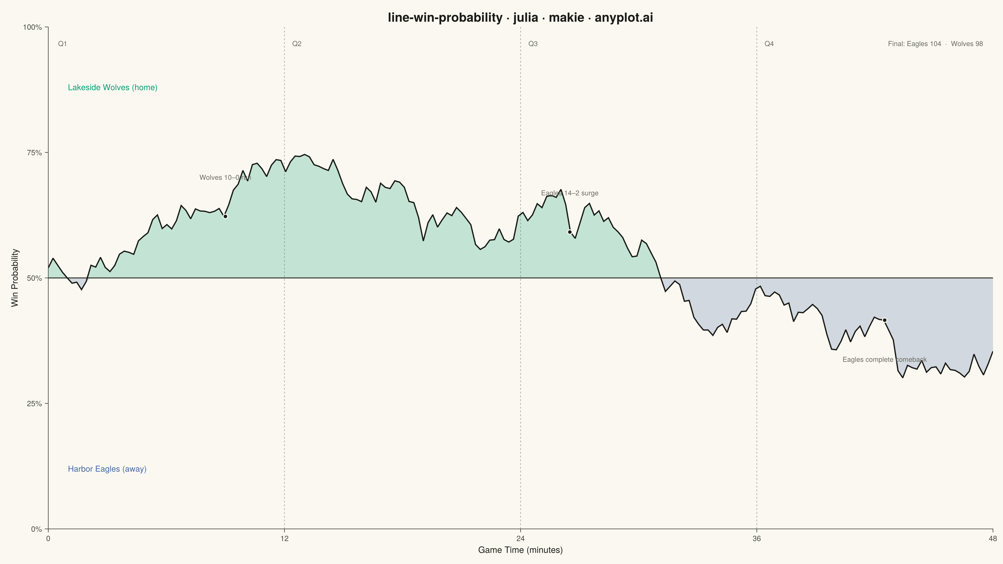
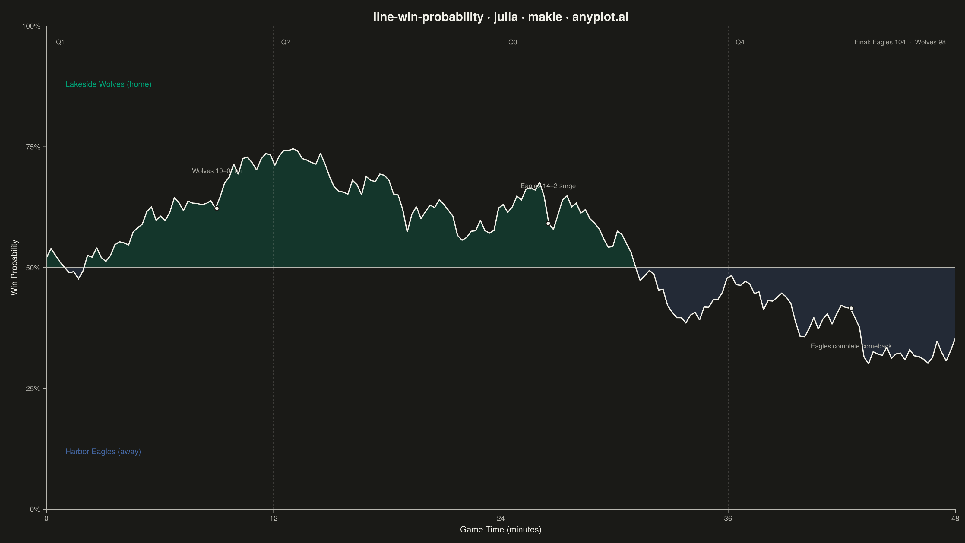
A win probability chart shows how each team's likelihood of winning evolves over the course of a game. The line starts near 50% and fluctuates based on scoring events, ultimately reaching 100% or 0% at game end. The area above and below the 50% baseline is filled with team colors to convey momentum at a glance. This visualization is widely used across major sports for post-game analysis and live broadcasting.
# anyplot.ai
# line-win-probability: Win Probability Chart
# Library: makie 0.22.10 | Julia 1.11.9
# Quality: 88/100 | Created: 2026-06-21

using CairoMakie
using Colors
using Random

Random.seed!(42)

# Theme tokens (Imprint palette, theme-adaptive chrome)
const THEME       = get(ENV, "ANYPLOT_THEME", "light")
const PAGE_BG     = THEME == "light" ? colorant"#FAF8F1" : colorant"#1A1A17"
const ELEVATED_BG = THEME == "light" ? colorant"#FFFDF6" : colorant"#242420"
const INK         = THEME == "light" ? colorant"#1A1A17" : colorant"#F0EFE8"
const INK_SOFT    = THEME == "light" ? colorant"#4A4A44" : colorant"#B8B7B0"
const INK_MUTED   = THEME == "light" ? colorant"#6B6A63" : colorant"#A8A79F"

# Imprint palette — home uses position 1 (brand green, first-series rule), away uses position 3
const HOME_COLOR = colorant"#009E73"  # Imprint position 1 — Lakeside Wolves (home)
const AWAY_COLOR = colorant"#4467A3"  # Imprint position 3 — Harbor Eagles (away); skip pos 2 (lavender) — blue reads as adversarial contrast to home green

# Data: NBA playoff game, 200 play-by-play win-probability snapshots over 48 minutes
n_points   = 200
game_time  = collect(range(0.0, 48.0, length=n_points))
win_prob   = zeros(n_points)
win_prob[1] = 0.52  # slight home-court advantage at tip-off

for i in 2:n_points
    t = (i - 1) / (n_points - 1)
    # Q1: home builds early lead; Q2: home extends; Q3: Eagles surge; Q4: Wolves hold
    if t < 0.25
        drift = 0.0035
    elseif t < 0.50
        drift = 0.0010
    elseif t < 0.75
        drift = -0.0028
    else
        drift = 0.0018
    end
    win_prob[i] = clamp(win_prob[i-1] + drift + randn() * 0.020, 0.04, 0.96)
end

# Quarter-boundary times (minute 12 = end of Q1, 24 = end of Q2, 36 = end of Q3)
quarter_times  = [12.0, 24.0, 36.0]
quarter_labels = ["Q2", "Q3", "Q4"]

# Key scoring events to annotate
event_times  = [9.0, 26.5, 42.5]
event_descs  = ["Wolves 10–0 run", "Eagles 14–2 surge", "Eagles complete comeback"]
event_idx    = [round(Int, t / 48.0 * (n_points - 1)) + 1 for t in event_times]
event_probs  = win_prob[event_idx]

# Band fill split at the 50% line
home_upper = max.(win_prob, 0.5)  # home region: wp → 0.5 floor when below
away_lower = min.(win_prob, 0.5)  # away region: wp → 0.5 ceiling when above

# Figure
fig = Figure(
    size            = (1600, 900),
    fontsize        = 14,
    backgroundcolor = PAGE_BG,
)

ax = Axis(
    fig[1, 1];
    title             = "line-win-probability · julia · makie · anyplot.ai",
    titlesize         = 20,
    titlecolor        = INK,
    titlefont         = :bold,
    xlabel            = "Game Time (minutes)",
    ylabel            = "Win Probability",
    xlabelsize        = 14,
    ylabelsize        = 14,
    xlabelcolor       = INK,
    ylabelcolor       = INK,
    xticklabelsize    = 12,
    yticklabelsize    = 12,
    xticklabelcolor   = INK_SOFT,
    yticklabelcolor   = INK_SOFT,
    xtickcolor        = INK_SOFT,
    ytickcolor        = INK_SOFT,
    backgroundcolor   = PAGE_BG,
    topspinevisible   = false,
    rightspinevisible = false,
    leftspinecolor    = INK_SOFT,
    bottomspinecolor  = INK_SOFT,
    xgridvisible      = false,
    ygridvisible      = true,
    ygridcolor        = RGBAf(INK.r, INK.g, INK.b, 0.12),
    xticks            = ([0, 12, 24, 36, 48], ["0", "12", "24", "36", "48"]),
    yticks            = ([0.0, 0.25, 0.50, 0.75, 1.0], ["0%", "25%", "50%", "75%", "100%"]),
)

xlims!(ax, 0.0, 48.0)
ylims!(ax, 0.0, 1.0)

# Fill: home region above 50% (brand green)
band!(ax, game_time, fill(0.5, n_points), home_upper;
    color = (HOME_COLOR, 0.22))

# Fill: away region below 50% (blue)
band!(ax, game_time, away_lower, fill(0.5, n_points);
    color = (AWAY_COLOR, 0.22))

# 50% reference line (prominent separator, per spec)
hlines!(ax, [0.5]; color = INK_SOFT, linewidth = 1.8)

# Win probability line
lines!(ax, game_time, win_prob; color = INK, linewidth = 2.0)

# Q1 label at far left
text!(ax, 0.5, 0.975;
    text     = "Q1",
    fontsize = 12,
    color    = INK_MUTED,
    align    = (:left, :top))

# Quarter dividers and labels (Q2, Q3, Q4 at minutes 12, 24, 36)
for (t, lbl) in zip(quarter_times, quarter_labels)
    vlines!(ax, [t]; color = (INK_SOFT, 0.45), linewidth = 1.0, linestyle = :dash)
    text!(ax, t + 0.4, 0.975;
        text     = lbl,
        fontsize = 12,
        color    = INK_MUTED,
        align    = (:left, :top))
end

# Key event markers: dot on the line + annotation
for (t, lbl, p) in zip(event_times, event_descs, event_probs)
    scatter!(ax, [t], [p];
        color       = INK,
        markersize  = 10,
        strokecolor = PAGE_BG,
        strokewidth = 1.5)
    y_pos = p > 0.5 ? p + 0.07 : p - 0.07
    y_pos = clamp(y_pos, 0.06, 0.90)
    va    = p > 0.5 ? :bottom : :top
    text!(ax, t, y_pos;
        text     = lbl,
        fontsize = 12,
        color    = INK_MUTED,
        align    = (:center, va))
end

# Team labels in their respective probability regions
text!(ax, 1.0, 0.88;
    text     = "Lakeside Wolves (home)",
    fontsize = 13,
    color    = HOME_COLOR,
    align    = (:left, :center))

text!(ax, 1.0, 0.12;
    text     = "Harbor Eagles (away)",
    fontsize = 13,
    color    = AWAY_COLOR,
    align    = (:left, :center))

# Final score annotation
text!(ax, 47.5, 0.975;
    text     = "Final: Eagles 104  ·  Wolves 98",
    fontsize = 12,
    color    = INK_MUTED,
    align    = (:right, :top))

# Save
save("plot-$(THEME).png", fig; px_per_unit = 2)
Runnable source as JSON, for any HTTP client: https://api.anyplot.ai/specs/line-win-probability/makie/code. Any spec id and library id listed in llms-full.txt fit the same URL shape; every URL below is complete and callable.
{
  "spec_id": "line-win-probability",
  "language": "julia",
  "library": "makie",
  "page": "https://anyplot.ai/line-win-probability/julia/makie",
  "hub": "https://anyplot.ai/line-win-probability",
  "code_json": "https://api.anyplot.ai/specs/line-win-probability/makie/code",
  "spec_json": "https://api.anyplot.ai/specs/line-win-probability",
  "render_light_png": "https://storage.googleapis.com/anyplot-images/plots/line-win-probability/julia/makie/plot-light.png",
  "render_dark_png": "https://storage.googleapis.com/anyplot-images/plots/line-win-probability/julia/makie/plot-dark.png",
  "quality_score": 88.0,
  "license": "MIT",
  "guide": "https://anyplot.ai/llms.txt"
}
Part of Win Probability Chart on anyplot.ai.