The same plot in 14 other libraries — Python: Altair, Bokeh, lets-plot, Matplotlib, Plotly, plotnine, Pygal, Seaborn; Julia: Makie.jl; JavaScript: Chart.js, D3.js, Apache ECharts, Highcharts, MUI X Charts. Compare all 15 side by side: Win Probability Chart in Python, R, Julia and JavaScript.
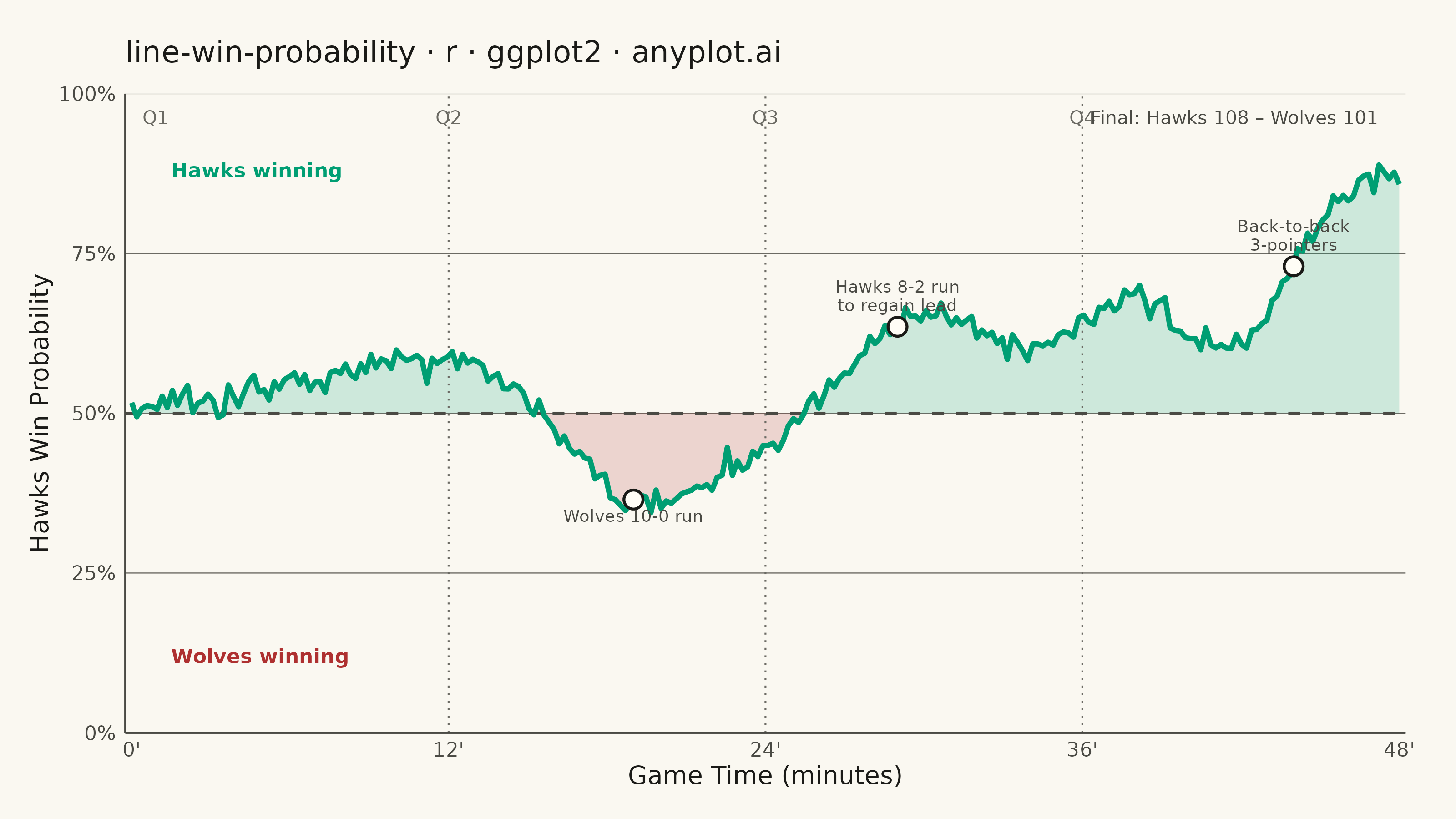
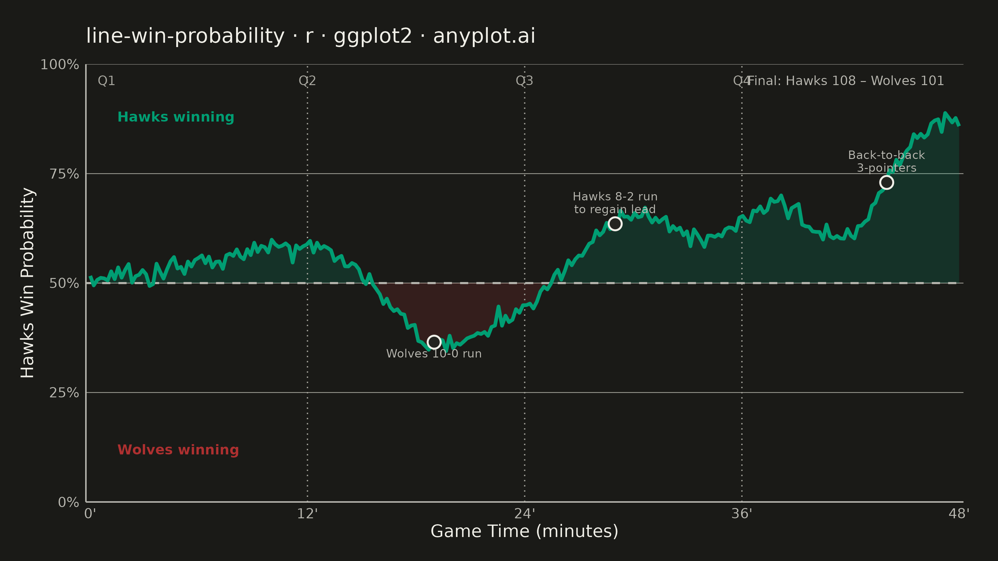
A win probability chart shows how each team's likelihood of winning evolves over the course of a game. The line starts near 50% and fluctuates based on scoring events, ultimately reaching 100% or 0% at game end. The area above and below the 50% baseline is filled with team colors to convey momentum at a glance. This visualization is widely used across major sports for post-game analysis and live broadcasting.
#' anyplot.ai
#' line-win-probability: Win Probability Chart
#' Library: ggplot2 3.5.1 | R 4.4.1
#' Quality: 90/100 | Created: 2026-06-21

library(ggplot2)
library(scales)
library(ragg)

set.seed(42)

# Theme tokens
THEME       <- Sys.getenv("ANYPLOT_THEME", "light")
PAGE_BG     <- if (THEME == "light") "#FAF8F1" else "#1A1A17"
ELEVATED_BG <- if (THEME == "light") "#FFFDF6" else "#242420"
INK         <- if (THEME == "light") "#1A1A17" else "#F0EFE8"
INK_SOFT    <- if (THEME == "light") "#4A4A44" else "#B8B7B0"
INK_MUTED   <- if (THEME == "light") "#6B6A63" else "#A8A79F"

# Imprint categorical palette — first series always #009E73
IMPRINT_PALETTE <- c(
  "#009E73",  # 1 — brand green (Hawks / home team winning zone)
  "#C475FD",  # 2
  "#4467A3",  # 3
  "#BD8233",  # 4
  "#AE3030",  # 5 — matte red (Wolves / away team winning zone)
  "#2ABCCD",  # 6
  "#954477",  # 7
  "#99B314"   # 8
)

HOME_COLOR <- IMPRINT_PALETTE[1]  # #009E73: Hawks (home)
AWAY_COLOR <- IMPRINT_PALETTE[5]  # #AE3030: Wolves (away) — semantic red for loss zone

# Win probability via spline control points encoding the game narrative:
# Hawks start slightly ahead, Wolves mount a 10-0 run in Q2 to take the lead,
# Hawks storm back in Q3, then seal it with back-to-back 3-pointers in Q4.
ctrl <- data.frame(
  t = c(0,    5,    10,   15,   19,   22,   26,   30,   34,   38,   42,   45,   48),
  p = c(0.50, 0.54, 0.58, 0.52, 0.36, 0.40, 0.52, 0.66, 0.60, 0.68, 0.61, 0.80, 0.87)
)

n        <- 250
minute   <- seq(0, 48, length.out = n)
wp_fn    <- splinefun(ctrl$t, ctrl$p, method = "natural")
win_prob <- pmin(pmax(wp_fn(minute) + rnorm(n, 0, 0.012), 0.03), 0.97)
df       <- data.frame(minute = minute, win_prob = win_prob)

# Key annotated events
event_times <- c(19, 29, 44)
events <- data.frame(
  minute    = event_times,
  win_prob  = approx(df$minute, df$win_prob, xout = event_times)$y,
  label     = c("Wolves 10-0 run", "Hawks 8-2 run\nto regain lead", "Back-to-back\n3-pointers"),
  vjust_lbl = c(1.8, -0.5, -0.5)
)

# Quarter dividers
qt <- data.frame(minute = c(12, 24, 36), label = c("Q2", "Q3", "Q4"))

plot_title <- "line-win-probability · r · ggplot2 · anyplot.ai"

p <- ggplot(df, aes(x = minute, y = win_prob)) +
  # Home winning zone: fill between 50% and line when Hawks are ahead
  geom_ribbon(
    aes(ymin = 0.5, ymax = pmax(win_prob, 0.5)),
    fill = HOME_COLOR, alpha = 0.18
  ) +
  # Away winning zone: fill between line and 50% when Wolves are ahead
  geom_ribbon(
    aes(ymin = pmin(win_prob, 0.5), ymax = 0.5),
    fill = AWAY_COLOR, alpha = 0.18
  ) +
  # Quarter dividers
  geom_vline(
    data = qt, aes(xintercept = minute),
    color = INK_MUTED, linewidth = 0.35, linetype = "dotted"
  ) +
  # 50% reference line
  geom_hline(
    yintercept = 0.5,
    color = INK_SOFT, linewidth = 0.55, linetype = "dashed"
  ) +
  # Win probability line
  geom_line(color = HOME_COLOR, linewidth = 1.0) +
  # Key event markers
  geom_point(
    data = events, aes(x = minute, y = win_prob),
    shape = 21, size = 3.0,
    fill = ELEVATED_BG, color = INK, stroke = 0.8
  ) +
  # Key event labels
  geom_text(
    data = events,
    aes(x = minute, y = win_prob, label = label, vjust = vjust_lbl),
    color = INK_SOFT, size = 2.4, lineheight = 0.9
  ) +
  # Quarter labels at top of panel
  annotate(
    "text",
    x = c(0.4, qt$minute), y = 0.963,
    label = c("Q1", qt$label),
    color = INK_MUTED, size = 2.6, hjust = c(0, 0.5, 0.5, 0.5)
  ) +
  # Zone labels
  annotate("text", x = 1.5, y = 0.88,
    label = "Hawks winning", color = HOME_COLOR,
    size = 2.8, hjust = 0, fontface = "bold"
  ) +
  annotate("text", x = 1.5, y = 0.12,
    label = "Wolves winning", color = AWAY_COLOR,
    size = 2.8, hjust = 0, fontface = "bold"
  ) +
  # Final score
  annotate("text", x = 47.2, y = 0.963,
    label = "Final: Hawks 108 – Wolves 101",
    color = INK_SOFT, size = 2.6, hjust = 1
  ) +
  scale_y_continuous(
    labels = scales::percent_format(accuracy = 1),
    limits = c(0, 1),
    breaks = c(0, 0.25, 0.5, 0.75, 1.0),
    expand = c(0, 0)
  ) +
  scale_x_continuous(
    limits = c(0, 48),
    breaks = c(0, 12, 24, 36, 48),
    labels = c("0'", "12'", "24'", "36'", "48'"),
    expand = c(0.005, 0)
  ) +
  labs(
    title = plot_title,
    x = "Game Time (minutes)",
    y = "Hawks Win Probability"
  ) +
  theme_minimal(base_size = 8) +
  theme(
    plot.background    = element_rect(fill = PAGE_BG, color = PAGE_BG),
    panel.background   = element_rect(fill = PAGE_BG, color = NA),
    panel.grid.major.y = element_line(color = INK_MUTED, linewidth = 0.2),
    panel.grid.major.x = element_blank(),
    panel.grid.minor   = element_blank(),
    panel.border       = element_blank(),
    axis.line.x        = element_line(color = INK_SOFT, linewidth = 0.4),
    axis.line.y        = element_line(color = INK_SOFT, linewidth = 0.4),
    axis.title         = element_text(color = INK, size = 10),
    axis.text          = element_text(color = INK_SOFT, size = 8),
    plot.title         = element_text(color = INK, size = 12, margin = margin(b = 10)),
    plot.margin        = margin(t = 16, r = 20, b = 12, l = 12)
  )

ggsave(
  filename = sprintf("plot-%s.png", THEME),
  plot     = p,
  device   = ragg::agg_png,
  width    = 8,
  height   = 4.5,
  units    = "in",
  dpi      = 400
)
Runnable source as JSON, for any HTTP client: https://api.anyplot.ai/specs/line-win-probability/ggplot2/code. Any spec id and library id listed in llms-full.txt fit the same URL shape; every URL below is complete and callable.
{
  "spec_id": "line-win-probability",
  "language": "r",
  "library": "ggplot2",
  "page": "https://anyplot.ai/line-win-probability/r/ggplot2",
  "hub": "https://anyplot.ai/line-win-probability",
  "code_json": "https://api.anyplot.ai/specs/line-win-probability/ggplot2/code",
  "spec_json": "https://api.anyplot.ai/specs/line-win-probability",
  "render_light_png": "https://storage.googleapis.com/anyplot-images/plots/line-win-probability/r/ggplot2/plot-light.png",
  "render_dark_png": "https://storage.googleapis.com/anyplot-images/plots/line-win-probability/r/ggplot2/plot-dark.png",
  "quality_score": 90.0,
  "license": "MIT",
  "guide": "https://anyplot.ai/llms.txt"
}
Part of Win Probability Chart on anyplot.ai.