The same plot in 14 other libraries — Python: Altair, Bokeh, lets-plot, Matplotlib, Plotly, Pygal, Seaborn; R: ggplot2; Julia: Makie.jl; JavaScript: Chart.js, D3.js, Apache ECharts, Highcharts, MUI X Charts. Compare all 15 side by side: Directed Network Graph in Python, R, Julia and JavaScript.
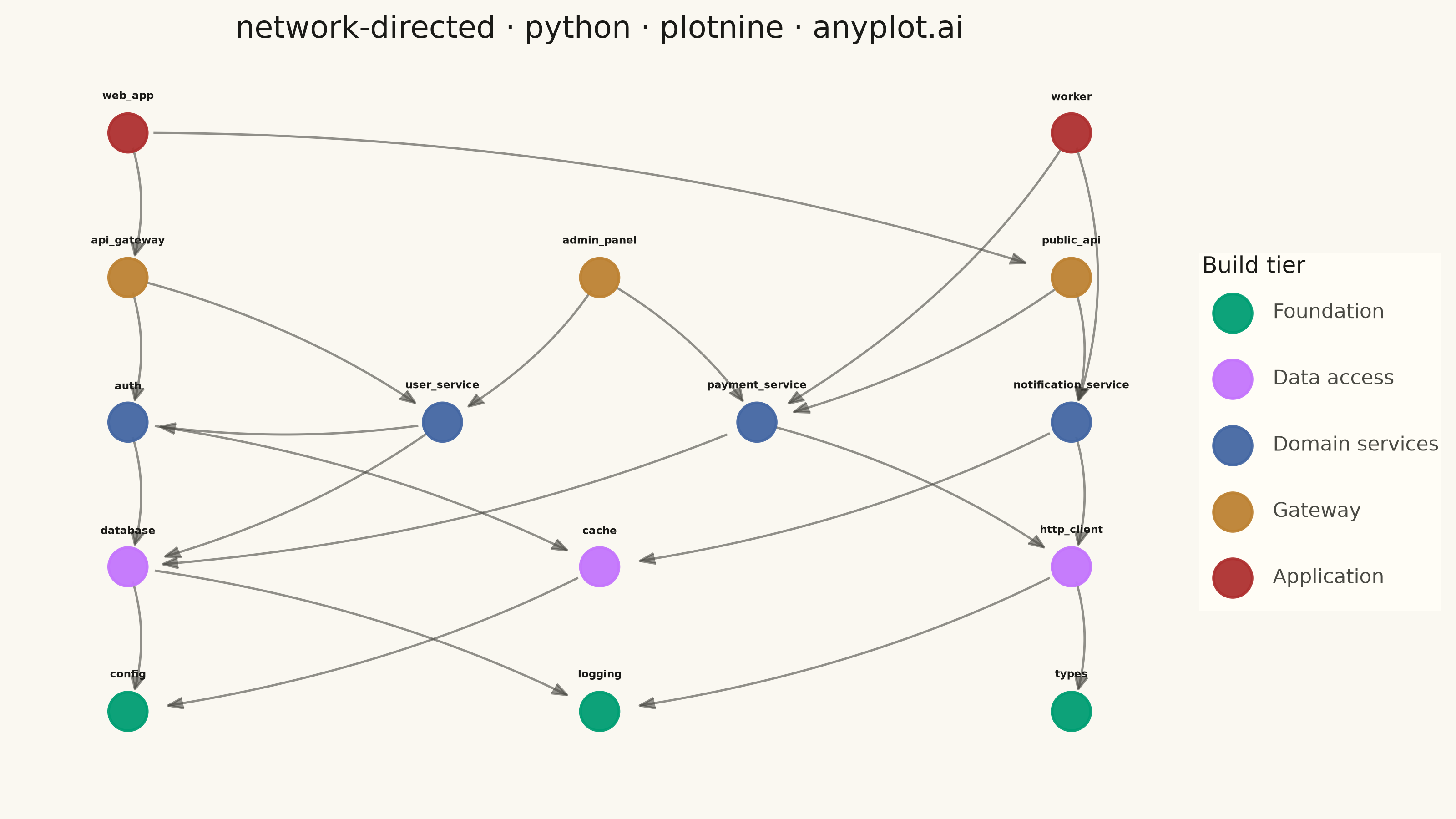
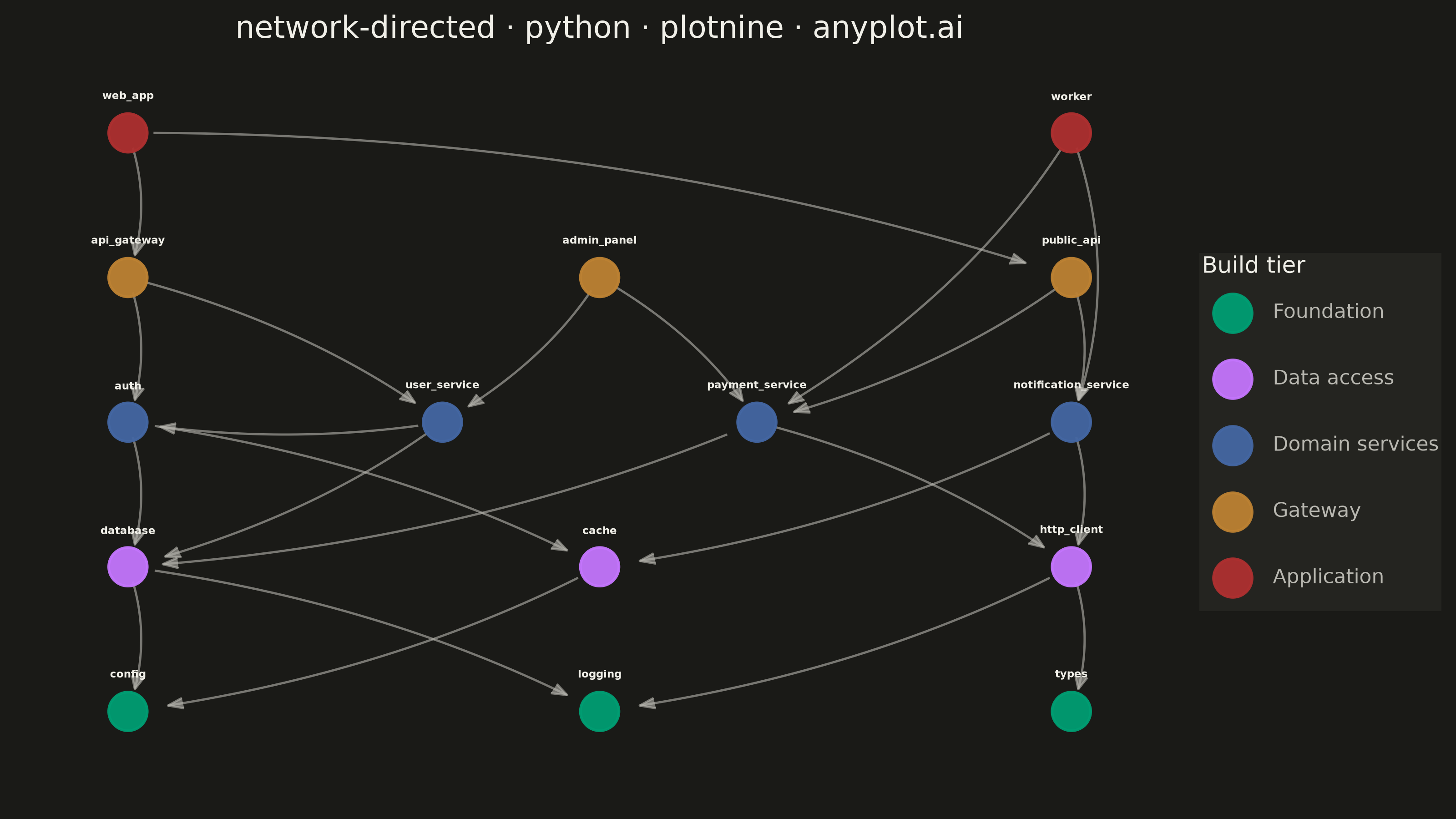
A directed network graph visualizes relationships between entities using nodes connected by edges with arrows, indicating the direction of relationships or flow. Unlike undirected graphs, directed graphs reveal asymmetric relationships such as dependencies, hierarchies, or information flow. The arrows clearly communicate which entity points to which, making cause-and-effect relationships and directional dependencies immediately visible.
""" anyplot.ai
network-directed: Directed Network Graph
Library: plotnine 0.15.8 | Python 3.13.15
Quality: 88/100 | Created: 2026-08-24
"""

import os

import numpy as np
import pandas as pd
from plotnine import (
    aes,
    arrow,
    coord_cartesian,
    element_blank,
    element_rect,
    element_text,
    geom_path,
    geom_point,
    geom_text,
    ggplot,
    labs,
    scale_color_manual,
    theme,
)


# Theme tokens
THEME = os.getenv("ANYPLOT_THEME", "light")
PAGE_BG = "#FAF8F1" if THEME == "light" else "#1A1A17"
ELEVATED_BG = "#FFFDF6" if THEME == "light" else "#242420"
INK = "#1A1A17" if THEME == "light" else "#F0EFE8"
INK_SOFT = "#4A4A44" if THEME == "light" else "#B8B7B0"

IMPRINT_PALETTE = ["#009E73", "#C475FD", "#4467A3", "#BD8233", "#AE3030"]

# Data: Python package import graph for a web service — arrows point from an
# importing module to the module it depends on, showing build order bottom-up.
modules = [
    {"id": "config", "tier": "Foundation"},
    {"id": "logging", "tier": "Foundation"},
    {"id": "types", "tier": "Foundation"},
    {"id": "database", "tier": "Data access"},
    {"id": "cache", "tier": "Data access"},
    {"id": "http_client", "tier": "Data access"},
    {"id": "auth", "tier": "Domain services"},
    {"id": "user_service", "tier": "Domain services"},
    {"id": "payment_service", "tier": "Domain services"},
    {"id": "notification_service", "tier": "Domain services"},
    {"id": "api_gateway", "tier": "Gateway"},
    {"id": "admin_panel", "tier": "Gateway"},
    {"id": "public_api", "tier": "Gateway"},
    {"id": "web_app", "tier": "Application"},
    {"id": "worker", "tier": "Application"},
]

imports = [
    ("database", "config"),
    ("database", "logging"),
    ("cache", "config"),
    ("http_client", "logging"),
    ("http_client", "types"),
    ("auth", "database"),
    ("auth", "cache"),
    ("user_service", "database"),
    ("user_service", "auth"),
    ("payment_service", "database"),
    ("payment_service", "http_client"),
    ("notification_service", "http_client"),
    ("notification_service", "cache"),
    ("api_gateway", "auth"),
    ("api_gateway", "user_service"),
    ("admin_panel", "user_service"),
    ("admin_panel", "payment_service"),
    ("public_api", "payment_service"),
    ("public_api", "notification_service"),
    ("web_app", "api_gateway"),
    ("web_app", "public_api"),
    ("worker", "notification_service"),
    ("worker", "payment_service"),
]

# Layered layout: one row per tier, modules spread evenly across the row.
tier_order = ["Foundation", "Data access", "Domain services", "Gateway", "Application"]
tier_rows = {tier: [] for tier in tier_order}
for module in modules:
    tier_rows[module["tier"]].append(module["id"])

positions = {}
for row, tier in enumerate(tier_order):
    members = tier_rows[tier]
    count = len(members)
    xs = np.linspace(0.03, 0.97, count) if count > 1 else np.array([0.5])
    y = 0.06 + row * (0.88 / (len(tier_order) - 1))
    for module_id, x in zip(members, xs, strict=True):
        positions[module_id] = (float(x), float(y))

node_df = pd.DataFrame(
    {
        "x": [positions[m["id"]][0] for m in modules],
        "y": [positions[m["id"]][1] for m in modules],
        "label": [m["id"] for m in modules],
        "tier": pd.Categorical([m["tier"] for m in modules], categories=tier_order, ordered=True),
    }
)

# Every edge bows along a quadratic Bezier with the same curvature ratio, so
# parallel/overlapping straight lines fan out into distinguishable arcs while
# the arrow style stays consistent across the whole graph (per spec notes).
# Endpoints are trimmed by arc length so the line starts clear of the source
# marker and the arrowhead lands just outside the target marker.
CURVATURE = 0.12
START_MARGIN = 0.018
END_MARGIN = 0.032

edge_rows = []
for edge_id, (src, tgt) in enumerate(imports):
    p0 = np.array(positions[src])
    p2 = np.array(positions[tgt])
    direction = p2 - p0
    dist = max(float(np.hypot(*direction)), 1e-6)
    unit = direction / dist
    normal = np.array([-unit[1], unit[0]])
    control = (p0 + p2) / 2 + normal * CURVATURE * dist

    t = np.linspace(0, 1, 40)
    curve_x = (1 - t) ** 2 * p0[0] + 2 * (1 - t) * t * control[0] + t**2 * p2[0]
    curve_y = (1 - t) ** 2 * p0[1] + 2 * (1 - t) * t * control[1] + t**2 * p2[1]

    seg_len = np.hypot(np.diff(curve_x), np.diff(curve_y))
    dist_from_start = np.concatenate([[0], np.cumsum(seg_len)])
    dist_from_end = dist_from_start[-1] - dist_from_start
    keep = (dist_from_start >= START_MARGIN) & (dist_from_end >= END_MARGIN)
    if keep.sum() < 2:
        keep = np.array([True] * len(t))

    for x, y in zip(curve_x[keep], curve_y[keep], strict=True):
        edge_rows.append({"edge_id": edge_id, "x": x, "y": y})
edge_df = pd.DataFrame(edge_rows)

tier_colors = dict(zip(tier_order, IMPRINT_PALETTE, strict=True))

# Plot
plot = (
    ggplot()
    + geom_path(
        data=edge_df,
        mapping=aes(x="x", y="y", group="edge_id"),
        color=INK_SOFT,
        size=0.5,
        alpha=0.6,
        arrow=arrow(angle=22, length=0.09, ends="last", type="closed"),
    )
    + geom_point(data=node_df, mapping=aes(x="x", y="y", color="tier"), size=8, alpha=0.95, stroke=0.6)
    + geom_text(
        data=node_df,
        mapping=aes(x="x", y="y", label="label"),
        color=INK,
        size=4.2,
        fontweight="bold",
        nudge_y=0.046,
        va="bottom",
    )
    + scale_color_manual(values=tier_colors, name="Build tier")
    + coord_cartesian(xlim=(-0.03, 1.03), ylim=(-0.03, 1.0))
    + labs(title="network-directed · python · plotnine · anyplot.ai")
    + theme(
        figure_size=(8, 4.5),
        text=element_text(size=7),
        plot_background=element_rect(fill=PAGE_BG, color=PAGE_BG),
        panel_background=element_rect(fill=PAGE_BG),
        panel_grid_major=element_blank(),
        panel_grid_minor=element_blank(),
        panel_border=element_blank(),
        axis_title=element_blank(),
        axis_text=element_blank(),
        axis_ticks=element_blank(),
        axis_line=element_blank(),
        plot_title=element_text(color=INK, size=12, ha="center"),
        legend_background=element_rect(fill=ELEVATED_BG, color=None),
        legend_text=element_text(color=INK_SOFT, size=8),
        legend_title=element_text(color=INK, size=9),
        legend_key=element_rect(fill=ELEVATED_BG),
        legend_box_spacing=0.01,
        plot_margin=0.01,
    )
)

plot.save(f"plot-{THEME}.png", dpi=400, width=8, height=4.5, units="in")
Runnable source as JSON, for any HTTP client: https://api.anyplot.ai/specs/network-directed/plotnine/code. Any spec id and library id listed in llms-full.txt fit the same URL shape; every URL below is complete and callable.
{
  "spec_id": "network-directed",
  "language": "python",
  "library": "plotnine",
  "page": "https://anyplot.ai/network-directed/python/plotnine",
  "hub": "https://anyplot.ai/network-directed",
  "code_json": "https://api.anyplot.ai/specs/network-directed/plotnine/code",
  "spec_json": "https://api.anyplot.ai/specs/network-directed",
  "render_light_png": "https://storage.googleapis.com/anyplot-images/plots/network-directed/python/plotnine/plot-light.png",
  "render_dark_png": "https://storage.googleapis.com/anyplot-images/plots/network-directed/python/plotnine/plot-dark.png",
  "quality_score": 88.0,
  "license": "MIT",
  "guide": "https://anyplot.ai/llms.txt"
}
Part of Directed Network Graph on anyplot.ai.