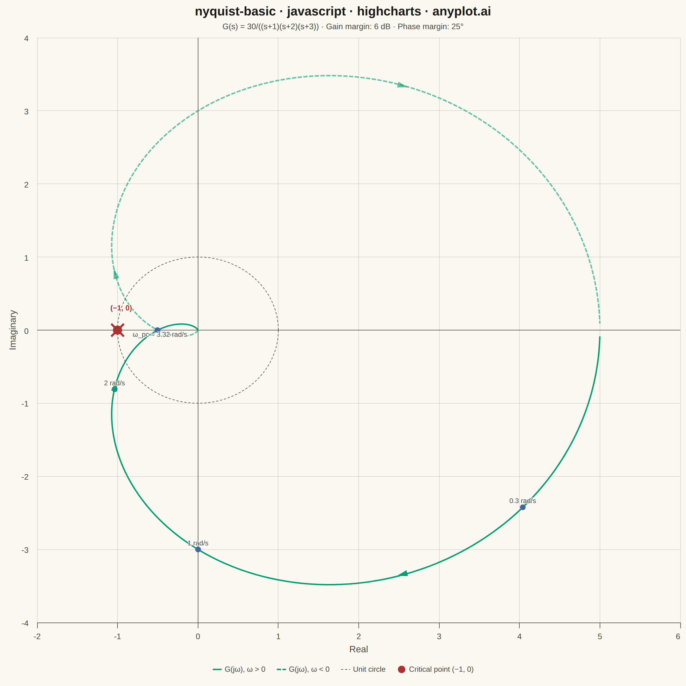
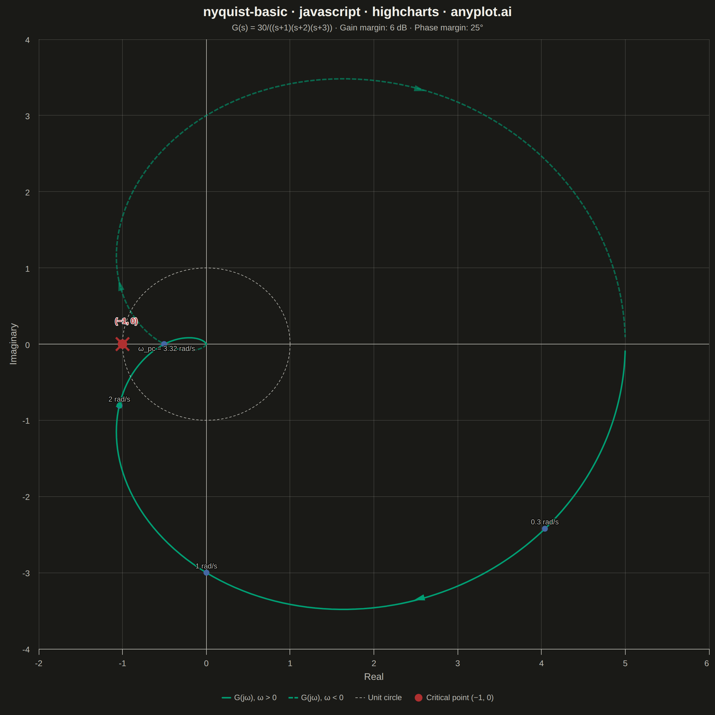
A Nyquist plot maps a system's open-loop frequency response onto the complex plane by plotting the imaginary part against the real part of the transfer function as frequency varies from zero to infinity. It is the primary tool for applying the Nyquist stability criterion to determine whether a closed-loop control system is stable. The plot visually reveals gain and phase margins and is widely used in classical control theory and electronic circuit design.
// anyplot.ai
// nyquist-basic: Nyquist Plot for Control Systems
// Library: highcharts 12.6.0 | JavaScript 22.22.3
// Quality: 87/100 | Created: 2026-06-17
//# anyplot-orientation: square

const t = window.ANYPLOT_TOKENS;

// --- Data: G(s) = 30 / ((s+1)(s+2)(s+3)) ---
// G(jw) = 30 / ((6 - 6w²) + j(11w - w³))
// Phase crossover at w = √11 ≈ 3.317 rad/s: G(j√11) = -0.5 (gain margin = 2 = 6 dB)
function g(w) {
  const dr = 6 - 6 * w * w;
  const di = 11 * w - w * w * w;
  const d2 = dr * dr + di * di;
  return { re: 30 * dr / d2, im: -30 * di / d2 };
}

// Gain crossover frequency: binary search for |G(jω)| = 1
// At ω=1: |G|≈3 > 1;  at ω=4: |G|≈0.33 < 1  →  root lies in [1, 4]
let wgcLow = 1.0, wgcHigh = 4.0;
for (let i = 0; i < 50; i++) {
  const wm = (wgcLow + wgcHigh) / 2;
  const pm = g(wm);
  const mag2 = pm.re * pm.re + pm.im * pm.im;
  if (mag2 > 1) wgcLow = wm; else wgcHigh = wm;
}
const wgc = (wgcLow + wgcHigh) / 2;
const pgc = g(wgc);
// Phase margin = 180° + ∠G(jω_gc)  [∠G is negative for this system]
const phaseGc = Math.atan2(pgc.im, pgc.re) * 180 / Math.PI;
const pmDeg = Math.round(180 + phaseGc);

// Logarithmically spaced frequencies: ω ∈ [0.01, 100] rad/s
const N = 400;
const posData = [];
for (let i = 0; i <= N; i++) {
  const w = Math.exp(Math.log(0.01) + (Math.log(100) - Math.log(0.01)) * i / N);
  const p = g(w);
  posData.push([p.re, p.im]);
}
// Negative frequencies: conjugate of positive, traversed in reverse
const negData = posData.slice().reverse().map(([r, im]) => [r, -im]);

// Unit circle centered at origin (reference)
const unitCircle = [];
for (let i = 0; i <= 200; i++) {
  const th = 2 * Math.PI * i / 200;
  unitCircle.push([Math.cos(th), Math.sin(th)]);
}

// Frequency annotation points — ω_pc handled separately with below-axis label
// to avoid crowding with the (−1, 0) label above the real axis
const annotPoints = [
  { w: 0.3, label: "0.3 rad/s" },
  { w: 1.0, label: "1 rad/s" },
  { w: 2.0, label: "2 rad/s" }
].map(f => {
  const p = g(f.w);
  return { x: p.re, y: p.im, name: f.label };
});

// ω_pc sits on the real axis at (−0.5, 0) — place label below to clear the
// (−1, 0) label above the axis
const wpc = Math.sqrt(11);
const ppc = g(wpc);
const wpcPoint = {
  x: ppc.re, y: ppc.im, name: "ω_pc ≈ 3.32 rad/s",
  dataLabels: { y: 18, x: 4 }
};

// Frequencies at which to place direction arrows (ω > 0 curve and its mirror)
const arrowFreqs = [0.5, 2.0];

// Title and subtitle conveying the transfer function and stability margins
const title = "nyquist-basic · javascript · highcharts · anyplot.ai";
const subtitle = `G(s) = 30/((s+1)(s+2)(s+3))  ·  Gain margin: 6 dB  ·  Phase margin: ${pmDeg}°`;

// --- Chart ---
Highcharts.chart("container", {
  chart: {
    type: "line",
    backgroundColor: "transparent",
    animation: false,
    style: { fontFamily: "inherit" },
    events: {
      render() {
        // Remove previously added SVG elements (prevents stacking on re-render)
        if (this._svgExtra) {
          this._svgExtra.forEach(el => el.destroy());
        }
        this._svgExtra = [];

        const ax = this.xAxis[0];
        const ay = this.yAxis[0];

        // Draw "×" at critical point (-1, 0) using SVG renderer
        const cpx = ax.toPixels(-1);
        const cpy = ay.toPixels(0);
        const xs = 11;
        this._svgExtra.push(
          this.renderer.path([
            "M", cpx - xs, cpy - xs, "L", cpx + xs, cpy + xs,
            "M", cpx + xs, cpy - xs, "L", cpx - xs, cpy + xs
          ]).attr({
            stroke: t.palette[4],
            "stroke-width": 3.5,
            zIndex: 6
          }).add()
        );

        // Direction arrows on positive-frequency curve (solid) and its mirror (dashed)
        arrowFreqs.forEach(w => {
          const dw = 0.06;
          const pa = g(w), pb = g(w + dw);

          // Positive curve: arrow pointing from pa → pb
          const x1 = ax.toPixels(pa.re), y1 = ay.toPixels(pa.im);
          const x2 = ax.toPixels(pb.re), y2 = ay.toPixels(pb.im);
          const ang = Math.atan2(y2 - y1, x2 - x1);
          const cx = (x1 + x2) / 2, cy = (y1 + y2) / 2;
          const hs = 10;

          this._svgExtra.push(
            this.renderer.path([
              "M", cx + hs * Math.cos(ang), cy + hs * Math.sin(ang),
              "L", cx - hs * Math.cos(ang - 0.55), cy - hs * Math.sin(ang - 0.55),
              "L", cx - hs * Math.cos(ang + 0.55), cy - hs * Math.sin(ang + 0.55),
              "Z"
            ]).attr({ fill: t.palette[0], zIndex: 5 }).add()
          );

          // Negative-frequency mirror: reversed direction, conjugate position
          const x1n = ax.toPixels(pb.re), y1n = ay.toPixels(-pb.im);
          const x2n = ax.toPixels(pa.re), y2n = ay.toPixels(-pa.im);
          const angn = Math.atan2(y2n - y1n, x2n - x1n);
          const cxn = (x1n + x2n) / 2, cyn = (y1n + y2n) / 2;

          this._svgExtra.push(
            this.renderer.path([
              "M", cxn + hs * Math.cos(angn), cyn + hs * Math.sin(angn),
              "L", cxn - hs * Math.cos(angn - 0.55), cyn - hs * Math.sin(angn - 0.55),
              "L", cxn - hs * Math.cos(angn + 0.55), cyn - hs * Math.sin(angn + 0.55),
              "Z"
            ]).attr({ fill: t.palette[0], zIndex: 5, opacity: 0.6 }).add()
          );
        });
      }
    }
  },
  credits: { enabled: false },
  colors: t.palette,
  title: {
    text: title,
    style: { color: t.ink, fontSize: "22px", fontWeight: "600" }
  },
  subtitle: {
    text: subtitle,
    style: { color: t.inkSoft, fontSize: "14px" }
  },
  xAxis: {
    type: "linear",
    title: { text: "Real", style: { color: t.inkSoft, fontSize: "16px" } },
    min: -2, max: 6,
    tickInterval: 1,
    gridLineColor: t.grid,
    gridLineWidth: 1,
    lineColor: t.inkSoft,
    tickColor: t.inkSoft,
    labels: { style: { color: t.inkSoft, fontSize: "14px" } },
    plotLines: [{ value: 0, color: t.inkSoft, width: 1, zIndex: 2 }]
  },
  yAxis: {
    title: { text: "Imaginary", style: { color: t.inkSoft, fontSize: "16px" } },
    min: -4, max: 4,
    tickInterval: 1,
    gridLineColor: t.grid,
    gridLineWidth: 1,
    lineColor: t.inkSoft,
    tickColor: t.inkSoft,
    labels: { style: { color: t.inkSoft, fontSize: "14px" } },
    plotLines: [{ value: 0, color: t.inkSoft, width: 1, zIndex: 2 }]
  },
  legend: {
    itemStyle: { color: t.inkSoft, fontSize: "13px" },
    itemHoverStyle: { color: t.ink }
  },
  plotOptions: {
    series: { animation: false },
    line: {
      marker: { enabled: false },
      states: { hover: { lineWidthPlus: 0 } }
    },
    scatter: {
      states: { hover: { enabled: false } }
    }
  },
  series: [
    {
      name: "G(jω), ω > 0",
      type: "line",
      data: posData,
      color: t.palette[0],
      lineWidth: 2.5
    },
    {
      name: "G(jω), ω < 0",
      type: "line",
      data: negData,
      color: t.palette[0],
      lineWidth: 2.5,
      dashStyle: "ShortDash",
      opacity: 0.6
    },
    {
      name: "Unit circle",
      type: "line",
      data: unitCircle,
      color: t.inkSoft,
      lineWidth: 1,
      dashStyle: "Dash",
      enableMouseTracking: false
    },
    {
      name: "Critical point (−1, 0)",
      type: "scatter",
      data: [{ x: -1, y: 0 }],
      color: t.palette[4],
      marker: { symbol: "circle", radius: 8 },
      dataLabels: {
        enabled: true,
        format: "(−1, 0)",
        style: { color: t.palette[4], fontSize: "13px", fontWeight: "600" },
        x: 6, y: -28
      }
    },
    {
      name: "Frequency markers",
      type: "scatter",
      data: [...annotPoints, wpcPoint],
      color: t.palette[2],
      marker: { symbol: "circle", radius: 5 },
      dataLabels: {
        enabled: true,
        format: "{point.name}",
        style: { color: t.inkSoft, fontSize: "12px", fontWeight: "normal" },
        allowOverlap: false
      },
      showInLegend: false
    }
  ]
});
Runnable source as JSON, for any HTTP client: https://api.anyplot.ai/specs/nyquist-basic/highcharts/code. Any spec id and library id listed in llms-full.txt fit the same URL shape; every URL below is complete and callable.
{
  "spec_id": "nyquist-basic",
  "language": "javascript",
  "library": "highcharts",
  "page": "https://anyplot.ai/nyquist-basic/javascript/highcharts",
  "hub": "https://anyplot.ai/nyquist-basic",
  "code_json": "https://api.anyplot.ai/specs/nyquist-basic/highcharts/code",
  "spec_json": "https://api.anyplot.ai/specs/nyquist-basic",
  "render_light_png": "https://storage.googleapis.com/anyplot-images/plots/nyquist-basic/javascript/highcharts/plot-light.png",
  "render_dark_png": "https://storage.googleapis.com/anyplot-images/plots/nyquist-basic/javascript/highcharts/plot-dark.png",
  "interactive_light_html": "https://storage.googleapis.com/anyplot-images/plots/nyquist-basic/javascript/highcharts/plot-light.html",
  "interactive_dark_html": "https://storage.googleapis.com/anyplot-images/plots/nyquist-basic/javascript/highcharts/plot-dark.html",
  "quality_score": 87.0,
  "license": "MIT",
  "guide": "https://anyplot.ai/llms.txt"
}
Part of Nyquist Plot for Control Systems on anyplot.ai.