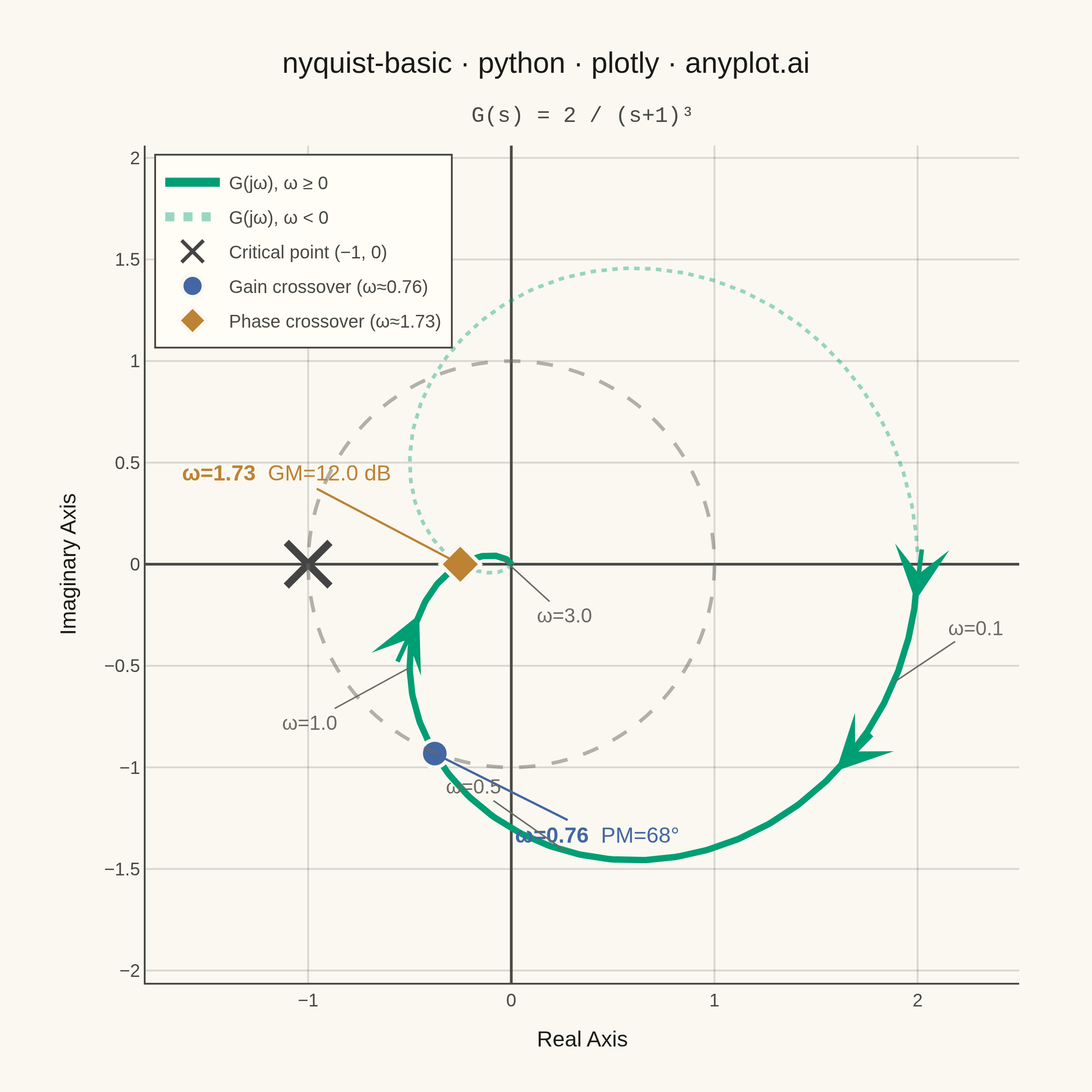
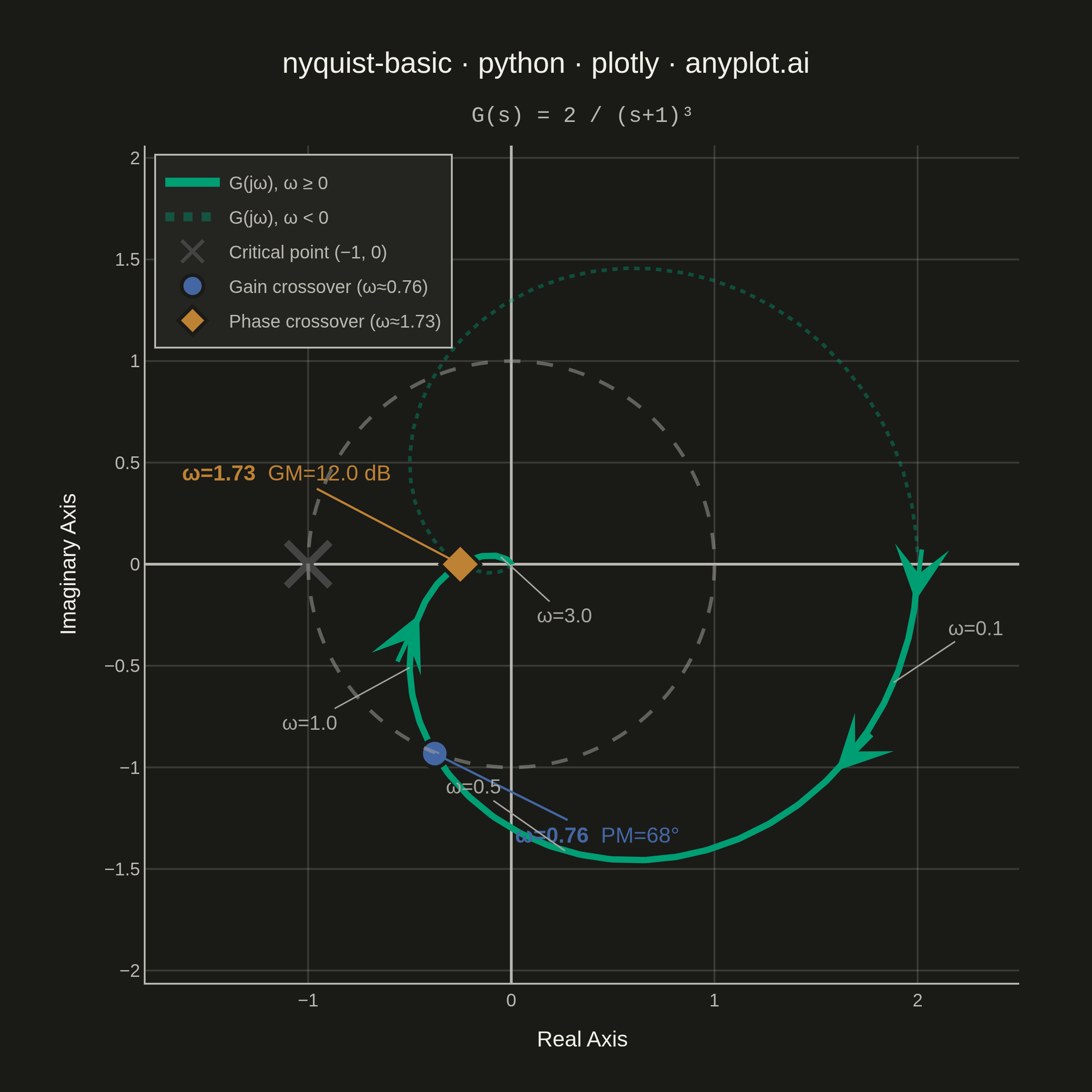
A Nyquist plot maps a system's open-loop frequency response onto the complex plane by plotting the imaginary part against the real part of the transfer function as frequency varies from zero to infinity. It is the primary tool for applying the Nyquist stability criterion to determine whether a closed-loop control system is stable. The plot visually reveals gain and phase margins and is widely used in classical control theory and electronic circuit design.
""" anyplot.ai
nyquist-basic: Nyquist Plot for Control Systems
Library: plotly 6.8.0 | Python 3.13.14
Quality: 90/100 | Updated: 2026-06-17
"""

import os

import numpy as np
import plotly.graph_objects as go


# Theme tokens
THEME = os.getenv("ANYPLOT_THEME", "light")
PAGE_BG = "#FAF8F1" if THEME == "light" else "#1A1A17"
ELEVATED_BG = "#FFFDF6" if THEME == "light" else "#242420"
INK = "#1A1A17" if THEME == "light" else "#F0EFE8"
INK_SOFT = "#4A4A44" if THEME == "light" else "#B8B7B0"
INK_MUTED = "#6B6A63" if THEME == "light" else "#A8A79F"
GRID = "rgba(26,26,23,0.15)" if THEME == "light" else "rgba(240,239,232,0.15)"

# Imprint categorical palette — positions used
BRAND = "#009E73"  # position 1 — ALWAYS first series / main curve
IMPRINT_BLUE = "#4467A3"  # position 3 — gain crossover marker
IMPRINT_OCHRE = "#BD8233"  # position 4 — phase crossover marker
CRITICAL_RED = "#AE3030"  # position 5 — semantic red for critical point

# Data: Transfer function G(s) = 2 / (s+1)^3
# Three identical poles at s = -1, no zeros
# DC gain = 2, phase crossover at ω = √3 ≈ 1.73 rad/s
# Gain margin ≈ 12 dB, phase margin ≈ 67.5°
omega = np.logspace(-2, 2, 800)
s = 1j * omega
G = 2.0 / (s + 1) ** 3

real_part = G.real
imag_part = G.imag
magnitude = np.abs(G)
phase_deg = np.degrees(np.angle(G))

# Phase crossover: where imag(G) crosses zero and real(G) < 0
sign_changes = np.where(np.diff(np.sign(imag_part)) != 0)[0]
phase_crossover_idx = None
for idx in sign_changes:
    if real_part[idx] < 0:
        phase_crossover_idx = idx
        break

# Gain crossover: where |G| = 1
gain_crossover_idx = np.argmin(np.abs(magnitude - 1.0))

# Plot
fig = go.Figure()

# Unit circle — idiomatic Plotly built-in shape (no coordinate trace needed)
fig.add_shape(
    type="circle",
    x0=-1,
    y0=-1,
    x1=1,
    y1=1,
    line={"color": INK_MUTED, "dash": "dash", "width": 2},
    fillcolor="rgba(0,0,0,0)",
    opacity=0.5,
)

# Nyquist curve (positive frequencies ω ≥ 0)
fig.add_trace(
    go.Scatter(
        x=real_part,
        y=imag_part,
        mode="lines",
        line={"width": 3.5, "color": BRAND},
        name="G(jω), ω ≥ 0",
        customdata=np.column_stack([omega, magnitude, phase_deg]),
        hovertemplate=(
            "<b>Nyquist Curve</b><br>"
            "Re = %{x:.3f}<br>"
            "Im = %{y:.3f}<br>"
            "ω = %{customdata[0]:.3f} rad/s<br>"
            "|G| = %{customdata[1]:.3f}<br>"
            "∠G = %{customdata[2]:.1f}°"
            "<extra></extra>"
        ),
    )
)

# Mirror curve (negative frequencies)
fig.add_trace(
    go.Scatter(
        x=real_part,
        y=-imag_part,
        mode="lines",
        line={"width": 2.0, "color": BRAND, "dash": "dot"},
        name="G(jω), ω < 0",
        opacity=0.4,
        hoverinfo="skip",
    )
)

# Direction arrows along the curve showing increasing frequency
n = len(real_part)
for frac in [0.12, 0.32, 0.52]:
    idx = int(n * frac)
    if idx < n - 5:
        dx = real_part[idx + 5] - real_part[idx]
        dy = imag_part[idx + 5] - imag_part[idx]
        norm = np.sqrt(dx**2 + dy**2)
        if norm > 1e-8:
            fig.add_annotation(
                x=real_part[idx],
                y=imag_part[idx],
                ax=-dx / norm * 30,
                ay=dy / norm * 30,
                xref="x",
                yref="y",
                axref="pixel",
                ayref="pixel",
                showarrow=True,
                arrowhead=3,
                arrowsize=2.0,
                arrowwidth=2.5,
                arrowcolor=BRAND,
                text="",
            )

# Critical point (-1, 0)
fig.add_trace(
    go.Scatter(
        x=[-1],
        y=[0],
        mode="markers",
        marker={"symbol": "x-thin", "size": 24, "color": CRITICAL_RED, "line": {"width": 4}},
        name="Critical point (−1, 0)",
        hovertemplate="Critical point<br>(−1, 0)<extra></extra>",
    )
)

# Gain crossover frequency marker
gc_re = real_part[gain_crossover_idx]
gc_im = imag_part[gain_crossover_idx]
gc_omega = omega[gain_crossover_idx]
gc_phase = phase_deg[gain_crossover_idx]
phase_margin = 180.0 + gc_phase
fig.add_trace(
    go.Scatter(
        x=[gc_re],
        y=[gc_im],
        mode="markers",
        marker={"symbol": "circle", "size": 15, "color": IMPRINT_BLUE, "line": {"width": 2, "color": PAGE_BG}},
        name=f"Gain crossover (ω≈{gc_omega:.2f})",
        hovertemplate=(
            f"Gain crossover<br>ω = {gc_omega:.2f} rad/s<br>|G| = 1<br>PM = {phase_margin:.1f}°<extra></extra>"
        ),
    )
)
fig.add_annotation(
    x=gc_re,
    y=gc_im,
    text=f"<b>ω={gc_omega:.2f}</b>  PM={phase_margin:.0f}°",
    showarrow=True,
    arrowhead=0,
    arrowwidth=1.2,
    arrowcolor=IMPRINT_BLUE,
    ax=90,
    ay=45,
    font={"size": 12, "color": IMPRINT_BLUE, "family": "Arial, sans-serif"},
)

# Phase crossover frequency marker
if phase_crossover_idx is not None:
    pc_re = real_part[phase_crossover_idx]
    pc_im = imag_part[phase_crossover_idx]
    pc_omega = omega[phase_crossover_idx]
    gain_margin_db = -20 * np.log10(abs(pc_re))
    fig.add_trace(
        go.Scatter(
            x=[pc_re],
            y=[pc_im],
            mode="markers",
            marker={"symbol": "diamond", "size": 17, "color": IMPRINT_OCHRE, "line": {"width": 2, "color": PAGE_BG}},
            name=f"Phase crossover (ω≈{pc_omega:.2f})",
            hovertemplate=(
                f"Phase crossover<br>ω = {pc_omega:.2f} rad/s<br>GM = {gain_margin_db:.1f} dB<extra></extra>"
            ),
        )
    )
    fig.add_annotation(
        x=pc_re,
        y=pc_im,
        text=f"<b>ω={pc_omega:.2f}</b>  GM={gain_margin_db:.1f} dB",
        showarrow=True,
        arrowhead=0,
        arrowwidth=1.2,
        arrowcolor=IMPRINT_OCHRE,
        ax=-95,
        ay=-50,
        font={"size": 12, "color": IMPRINT_OCHRE, "family": "Arial, sans-serif"},
    )

# Frequency annotations at selected points — spread away from the crowded origin region
freq_label_config = [(0.1, 45, -30), (0.5, -50, -35), (1.0, -55, 30), (3.0, 35, 32)]
for f_label, ax_off, ay_off in freq_label_config:
    idx = np.argmin(np.abs(omega - f_label))
    fig.add_annotation(
        x=real_part[idx],
        y=imag_part[idx],
        text=f"ω={f_label}",
        showarrow=True,
        arrowhead=0,
        arrowwidth=0.8,
        arrowcolor=INK_MUTED,
        ax=ax_off,
        ay=ay_off,
        font={"size": 11, "color": INK_MUTED, "family": "Arial, sans-serif"},
    )

# Layout — square canvas (2400×2400) suits the symmetric Nyquist geometry
title_text = "nyquist-basic · python · plotly · anyplot.ai"
fig.update_layout(
    autosize=False,
    title={
        "text": title_text,
        "font": {"size": 16, "color": INK, "family": "Arial, sans-serif"},
        "x": 0.5,
        "xanchor": "center",
    },
    xaxis={
        "title": {
            "text": "Real Axis",
            "font": {"size": 12, "color": INK, "family": "Arial, sans-serif"},
            "standoff": 12,
        },
        "tickfont": {"size": 10, "color": INK_SOFT},
        "zeroline": True,
        "zerolinewidth": 1.5,
        "zerolinecolor": INK_SOFT,
        "showgrid": True,
        "gridwidth": 1,
        "gridcolor": GRID,
        "linecolor": INK_SOFT,
        "constrain": "domain",
        "range": [-1.8, 2.5],
    },
    yaxis={
        "title": {
            "text": "Imaginary Axis",
            "font": {"size": 12, "color": INK, "family": "Arial, sans-serif"},
            "standoff": 12,
        },
        "tickfont": {"size": 10, "color": INK_SOFT},
        "zeroline": True,
        "zerolinewidth": 1.5,
        "zerolinecolor": INK_SOFT,
        "showgrid": True,
        "gridwidth": 1,
        "gridcolor": GRID,
        "linecolor": INK_SOFT,
        "scaleanchor": "x",
        "scaleratio": 1,
    },
    paper_bgcolor=PAGE_BG,
    plot_bgcolor=PAGE_BG,
    font={"color": INK},
    legend={
        "font": {"size": 10, "color": INK_SOFT, "family": "Arial, sans-serif"},
        "bgcolor": ELEVATED_BG,
        "bordercolor": INK_SOFT,
        "borderwidth": 1,
        "x": 0.01,
        "y": 0.99,
        "itemsizing": "constant",
    },
    margin={"l": 80, "r": 40, "t": 80, "b": 60},
    hoverlabel={"bgcolor": ELEVATED_BG, "font_size": 12, "bordercolor": INK_SOFT},
)

# Subtitle with transfer function
fig.add_annotation(
    text="G(s) = 2 / (s+1)³",
    xref="paper",
    yref="paper",
    x=0.5,
    y=1.055,
    showarrow=False,
    font={"size": 12, "color": INK_SOFT, "family": "Courier New, monospace"},
)

# Save — square 2400×2400 (suitable for symmetric Nyquist geometry)
fig.write_image(f"plot-{THEME}.png", width=600, height=600, scale=4)
fig.write_html(f"plot-{THEME}.html", include_plotlyjs="cdn")
Runnable source as JSON, for any HTTP client: https://api.anyplot.ai/specs/nyquist-basic/plotly/code. Any spec id and library id listed in llms-full.txt fit the same URL shape; every URL below is complete and callable.
{
  "spec_id": "nyquist-basic",
  "language": "python",
  "library": "plotly",
  "page": "https://anyplot.ai/nyquist-basic/python/plotly",
  "hub": "https://anyplot.ai/nyquist-basic",
  "code_json": "https://api.anyplot.ai/specs/nyquist-basic/plotly/code",
  "spec_json": "https://api.anyplot.ai/specs/nyquist-basic",
  "render_light_png": "https://storage.googleapis.com/anyplot-images/plots/nyquist-basic/python/plotly/plot-light.png",
  "render_dark_png": "https://storage.googleapis.com/anyplot-images/plots/nyquist-basic/python/plotly/plot-dark.png",
  "interactive_light_html": "https://storage.googleapis.com/anyplot-images/plots/nyquist-basic/python/plotly/plot-light.html",
  "interactive_dark_html": "https://storage.googleapis.com/anyplot-images/plots/nyquist-basic/python/plotly/plot-dark.html",
  "quality_score": 90.0,
  "license": "MIT",
  "guide": "https://anyplot.ai/llms.txt"
}
Part of Nyquist Plot for Control Systems on anyplot.ai.