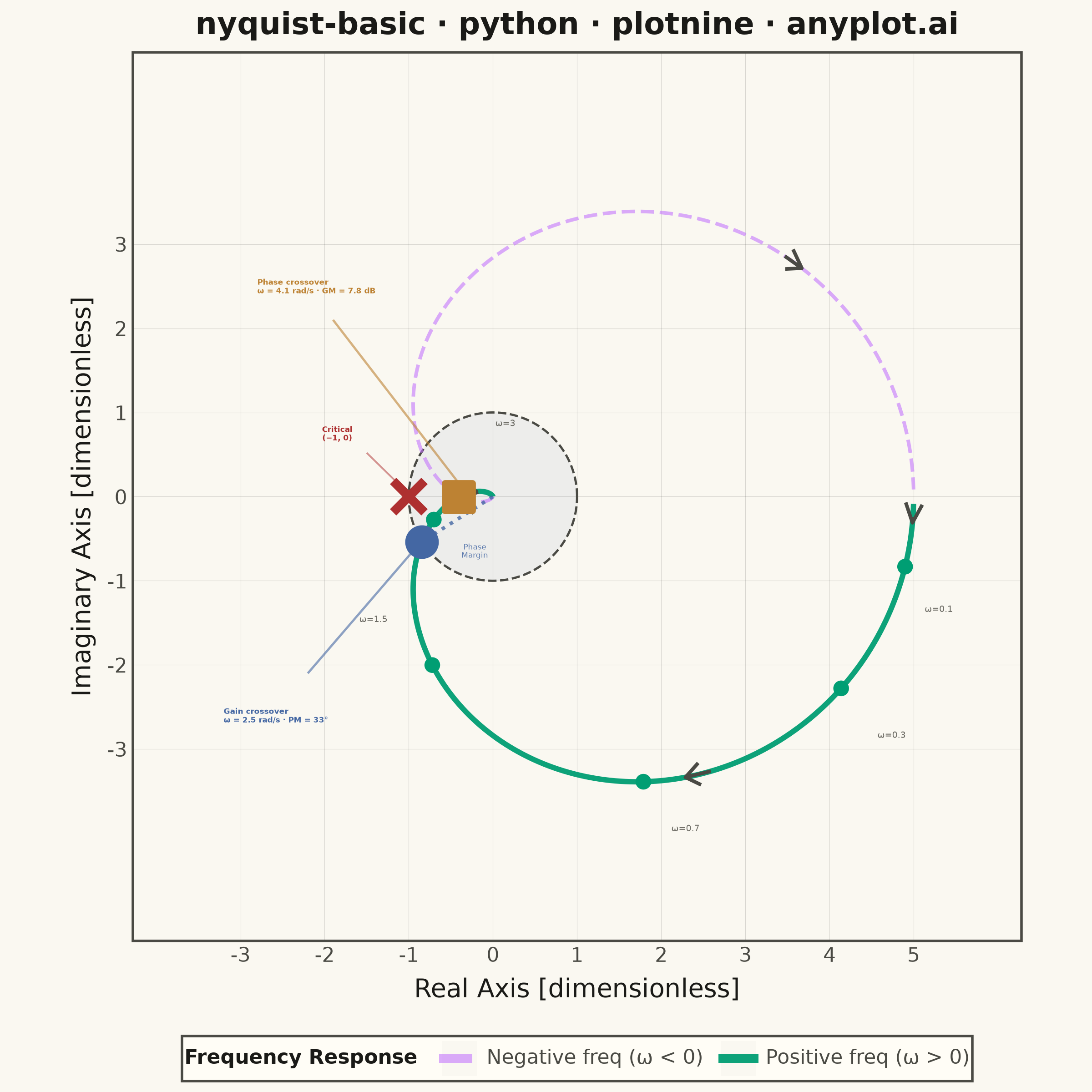
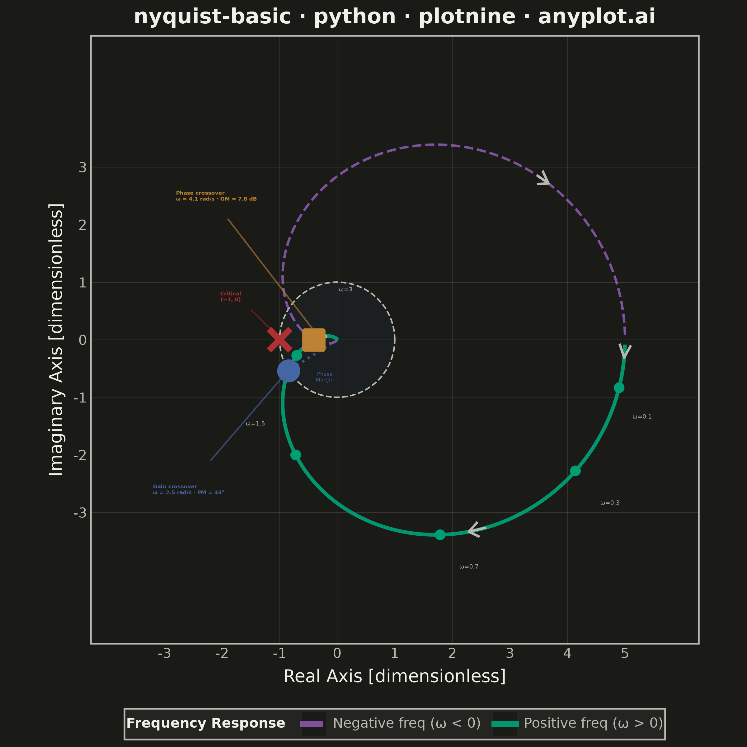
A Nyquist plot maps a system's open-loop frequency response onto the complex plane by plotting the imaginary part against the real part of the transfer function as frequency varies from zero to infinity. It is the primary tool for applying the Nyquist stability criterion to determine whether a closed-loop control system is stable. The plot visually reveals gain and phase margins and is widely used in classical control theory and electronic circuit design.
""" anyplot.ai
nyquist-basic: Nyquist Plot for Control Systems
Library: plotnine 0.15.7 | Python 3.13.13
Quality: 85/100 | Updated: 2026-06-17
"""

import os
import sys


# This file is named 'plotnine.py' — remove its own directory from sys.path
# so that 'import plotnine' resolves to the installed library, not this file.
_here = os.path.realpath(os.path.dirname(os.path.abspath(__file__)))
sys.path = [p for p in sys.path if os.path.realpath(p or ".") != _here]
del _here

import numpy as np
import pandas as pd
from plotnine import (
    aes,
    annotate,
    arrow,
    coord_fixed,
    element_blank,
    element_line,
    element_rect,
    element_text,
    geom_path,
    geom_point,
    geom_ribbon,
    geom_segment,
    ggplot,
    guide_legend,
    guides,
    labs,
    scale_alpha_manual,
    scale_color_manual,
    scale_linetype_manual,
    scale_size_manual,
    scale_x_continuous,
    scale_y_continuous,
    theme,
    theme_minimal,
)


# Theme-adaptive chrome tokens (Imprint palette)
THEME = os.getenv("ANYPLOT_THEME", "light")
PAGE_BG = "#FAF8F1" if THEME == "light" else "#1A1A17"
ELEVATED_BG = "#FFFDF6" if THEME == "light" else "#242420"
INK = "#1A1A17" if THEME == "light" else "#F0EFE8"
INK_SOFT = "#4A4A44" if THEME == "light" else "#B8B7B0"
INK_MUTED = "#6B6A63" if THEME == "light" else "#A8A79F"

# Imprint categorical palette — hybrid-v3 sort order, theme-independent
IMPRINT = ["#009E73", "#C475FD", "#4467A3", "#BD8233", "#AE3030", "#2ABCCD", "#954477", "#99B314"]

# Transfer function G(s) = 5 / [(s+1)(0.5s+1)(0.2s+1)]
# Poles at s = -1, -2, -5 (stable minimum-phase system)
omega = np.concatenate(
    [np.logspace(-2, -0.5, 150), np.logspace(-0.5, 0.5, 300), np.logspace(0.5, 1.5, 200), np.logspace(1.5, 3, 100)]
)
K = 5.0
jw = 1j * omega
G = K / ((jw + 1) * (0.5 * jw + 1) * (0.2 * jw + 1))
real_part = G.real
imag_part = G.imag

# Positive and negative frequency curves (conjugate pair)
df_pos = pd.DataFrame({"real": real_part, "imaginary": imag_part, "curve": "Positive freq (ω > 0)"})
df_neg = pd.DataFrame({"real": real_part[::-1], "imaginary": -imag_part[::-1], "curve": "Negative freq (ω < 0)"})
df_curves = pd.concat([df_pos, df_neg], ignore_index=True)

# Unit circle reference
theta = np.linspace(0, 2 * np.pi, 200)
unit_circle_df = pd.DataFrame({"real": np.cos(theta), "imaginary": np.sin(theta)})

# Stability region shading (interior of unit circle)
theta_fill = np.linspace(0, 2 * np.pi, 100)
cos_vals = np.cos(theta_fill)
sin_vals = np.sin(np.arccos(np.clip(cos_vals, -1, 1)))
stability_df = pd.DataFrame({"x": cos_vals, "ymin": -sin_vals, "ymax": sin_vals})

# Stability margin calculations
mag = np.abs(G)
phase = np.degrees(np.angle(G))
gc_idx = np.argmin(np.abs(mag - 1.0))
gc_omega = omega[gc_idx]
phase_margin = 180 + phase[gc_idx]
pc_idx = np.argmin(np.abs(phase + 180))
pc_omega = omega[pc_idx]
gain_margin_db = -20 * np.log10(mag[pc_idx])

# Phase margin indicator: origin → gain crossover point
gc_seg_df = pd.DataFrame({"x": [0.0], "y": [0.0], "xend": [G[gc_idx].real], "yend": [G[gc_idx].imag]})
pm_label_x = float(G[gc_idx].real) * 0.55 + 0.25
pm_label_y = float(G[gc_idx].imag) * 0.55 - 0.35

# Frequency annotations with offsets — ω=3 pushed higher to avoid phase crossover crowding
freq_annotations = [(0.1, 0.4, -0.5), (0.3, 0.6, -0.55), (0.7, 0.5, -0.55), (1.5, -0.7, 0.55), (3.0, 0.85, 1.15)]
annot_rows = []
for wf, ox, oy in freq_annotations:
    idx = np.argmin(np.abs(omega - wf))
    rx, ry = real_part[idx], imag_part[idx]
    annot_rows.append({"real": rx, "imaginary": ry, "label": f"ω={wf:g}", "lx": rx + ox, "ly": ry + oy})
annot_df = pd.DataFrame(annot_rows)

# Direction arrows along both curves
arrow_data = []
for frac in [0.06, 0.3, 0.65]:
    idx = int(frac * len(df_pos))
    step = max(2, int(0.015 * len(df_pos)))
    if 0 < idx < len(df_pos) - step:
        arrow_data.append(
            {
                "x": df_pos.iloc[idx]["real"],
                "y": df_pos.iloc[idx]["imaginary"],
                "xend": df_pos.iloc[idx + step]["real"],
                "yend": df_pos.iloc[idx + step]["imaginary"],
            }
        )
for frac in [0.35, 0.75]:
    idx = int(frac * len(df_neg))
    step = max(2, int(0.015 * len(df_neg)))
    if 0 < idx < len(df_neg) - step:
        arrow_data.append(
            {
                "x": df_neg.iloc[idx]["real"],
                "y": df_neg.iloc[idx]["imaginary"],
                "xend": df_neg.iloc[idx + step]["real"],
                "yend": df_neg.iloc[idx + step]["imaginary"],
            }
        )
arrow_df = pd.DataFrame(arrow_data)

plot = (
    ggplot()
    # Stability region (subtle blue fill inside unit circle)
    + geom_ribbon(stability_df, aes(x="x", ymin="ymin", ymax="ymax"), fill=IMPRINT[2], alpha=0.07)
    # Unit circle (theme-adaptive dashed reference)
    + geom_path(unit_circle_df, aes(x="real", y="imaginary"), color=INK_SOFT, size=0.5, linetype="dashed")
    # Nyquist curves: Imprint pos 0 (green) for positive, pos 1 (lavender) for negative
    + geom_path(df_curves, aes(x="real", y="imaginary", color="curve", linetype="curve", size="curve", alpha="curve"))
    + scale_color_manual(
        values={"Positive freq (ω > 0)": IMPRINT[0], "Negative freq (ω < 0)": IMPRINT[1]}, name="Frequency Response"
    )
    + scale_linetype_manual(
        values={"Positive freq (ω > 0)": "solid", "Negative freq (ω < 0)": "dashed"}, name="Frequency Response"
    )
    + scale_size_manual(values={"Positive freq (ω > 0)": 1.2, "Negative freq (ω < 0)": 0.8}, name="Frequency Response")
    + scale_alpha_manual(
        values={"Positive freq (ω > 0)": 0.95, "Negative freq (ω < 0)": 0.6}, name="Frequency Response"
    )
    # Direction arrows (theme-adaptive)
    + geom_segment(
        arrow_df, aes(x="x", y="y", xend="xend", yend="yend"), color=INK_SOFT, size=0.8, arrow=arrow(length=0.12)
    )
    # Phase margin indicator: dotted line origin → gain crossover
    + geom_segment(
        gc_seg_df, aes(x="x", y="y", xend="xend", yend="yend"), color=IMPRINT[2], size=0.8, linetype="dotted", alpha=0.8
    )
    + annotate(
        "text", x=pm_label_x, y=pm_label_y, label="Phase\nMargin", color=IMPRINT[2], size=3.0, ha="center", alpha=0.85
    )
    # Critical point: Imprint matte red — semantic anchor for critical/danger
    + geom_point(
        pd.DataFrame({"real": [-1.0], "imaginary": [0.0]}),
        aes(x="real", y="imaginary"),
        color=IMPRINT[4],
        size=5,
        shape="x",
        stroke=2.0,
    )
    + annotate(
        "text", x=-1.85, y=0.75, label="Critical\n(−1, 0)", color=IMPRINT[4], size=3.0, fontweight="bold", ha="center"
    )
    + annotate("segment", x=-1.5, y=0.52, xend=-1.05, yend=0.08, color=IMPRINT[4], size=0.4, alpha=0.5)
    # Gain crossover marker: Imprint blue
    + geom_point(
        pd.DataFrame({"real": [G[gc_idx].real], "imaginary": [G[gc_idx].imag]}),
        aes(x="real", y="imaginary"),
        color=IMPRINT[2],
        size=4.5,
        shape="o",
        stroke=1.5,
    )
    # Phase crossover marker: Imprint ochre
    + geom_point(
        pd.DataFrame({"real": [G[pc_idx].real], "imaginary": [G[pc_idx].imag]}),
        aes(x="real", y="imaginary"),
        color=IMPRINT[3],
        size=4.5,
        shape="s",
        stroke=1.5,
        fill=IMPRINT[3],
    )
    # Gain crossover annotation
    + annotate(
        "text",
        x=-3.2,
        y=-2.6,
        label=f"Gain crossover\nω = {gc_omega:.1f} rad/s · PM = {phase_margin:.0f}°",
        color=IMPRINT[2],
        size=3.0,
        ha="left",
        fontweight="bold",
    )
    + annotate(
        "segment",
        x=-2.2,
        y=-2.1,
        xend=G[gc_idx].real - 0.08,
        yend=G[gc_idx].imag - 0.08,
        color=IMPRINT[2],
        size=0.5,
        alpha=0.6,
    )
    # Phase crossover annotation
    + annotate(
        "text",
        x=-2.8,
        y=2.5,
        label=f"Phase crossover\nω = {pc_omega:.1f} rad/s · GM = {gain_margin_db:.1f} dB",
        color=IMPRINT[3],
        size=3.0,
        ha="left",
        fontweight="bold",
    )
    + annotate(
        "segment",
        x=-1.9,
        y=2.1,
        xend=G[pc_idx].real + 0.05,
        yend=G[pc_idx].imag + 0.1,
        color=IMPRINT[3],
        size=0.5,
        alpha=0.6,
    )
    # Frequency annotation dots
    + geom_point(annot_df, aes(x="real", y="imaginary"), color=IMPRINT[0], size=2.5, shape="o", fill=IMPRINT[0])
)

# Frequency labels (theme-adaptive muted ink, size in mm per plotnine convention)
for _, row in annot_df.iterrows():
    plot = plot + annotate("text", x=row["lx"], y=row["ly"], label=row["label"], color=INK_MUTED, size=3.5)

# Axes, scales, and theme — square canvas 2400×2400 (6in × 400dpi)
# ylim matches x-range (9.6 units each) so coord_fixed fills the panel with no wasted space
plot = (
    plot
    + scale_x_continuous(breaks=[-3, -2, -1, 0, 1, 2, 3, 4, 5])
    + scale_y_continuous(breaks=[-3, -2, -1, 0, 1, 2, 3])
    + coord_fixed(ratio=1, xlim=(-3.8, 5.8), ylim=(-4.8, 4.8))
    + labs(
        title="nyquist-basic · python · plotnine · anyplot.ai",
        x="Real Axis [dimensionless]",
        y="Imaginary Axis [dimensionless]",
    )
    + guides(color=guide_legend(title="Frequency Response", override_aes={"size": 2}))
    + theme_minimal()
    + theme(
        figure_size=(6, 6),
        plot_title=element_text(size=12, weight="bold", ha="center", color=INK),
        axis_title=element_text(size=10, color=INK),
        axis_text=element_text(size=8, color=INK_SOFT),
        panel_grid_major=element_line(color=INK, size=0.2, alpha=0.15),
        panel_grid_minor=element_blank(),
        plot_background=element_rect(fill=PAGE_BG, color=PAGE_BG),
        panel_background=element_rect(fill=PAGE_BG),
        panel_border=element_rect(color=INK_SOFT, fill=None),
        legend_position="bottom",
        legend_title=element_text(size=8, weight="bold", color=INK),
        legend_text=element_text(size=8, color=INK_SOFT),
        legend_background=element_rect(fill=ELEVATED_BG, color=INK_SOFT),
    )
)

plot.save(f"plot-{THEME}.png", dpi=400, width=6, height=6, units="in", verbose=False)
Runnable source as JSON, for any HTTP client: https://api.anyplot.ai/specs/nyquist-basic/plotnine/code. Any spec id and library id listed in llms-full.txt fit the same URL shape; every URL below is complete and callable.
{
  "spec_id": "nyquist-basic",
  "language": "python",
  "library": "plotnine",
  "page": "https://anyplot.ai/nyquist-basic/python/plotnine",
  "hub": "https://anyplot.ai/nyquist-basic",
  "code_json": "https://api.anyplot.ai/specs/nyquist-basic/plotnine/code",
  "spec_json": "https://api.anyplot.ai/specs/nyquist-basic",
  "render_light_png": "https://storage.googleapis.com/anyplot-images/plots/nyquist-basic/python/plotnine/plot-light.png",
  "render_dark_png": "https://storage.googleapis.com/anyplot-images/plots/nyquist-basic/python/plotnine/plot-dark.png",
  "quality_score": 85.0,
  "license": "MIT",
  "guide": "https://anyplot.ai/llms.txt"
}
Part of Nyquist Plot for Control Systems on anyplot.ai.