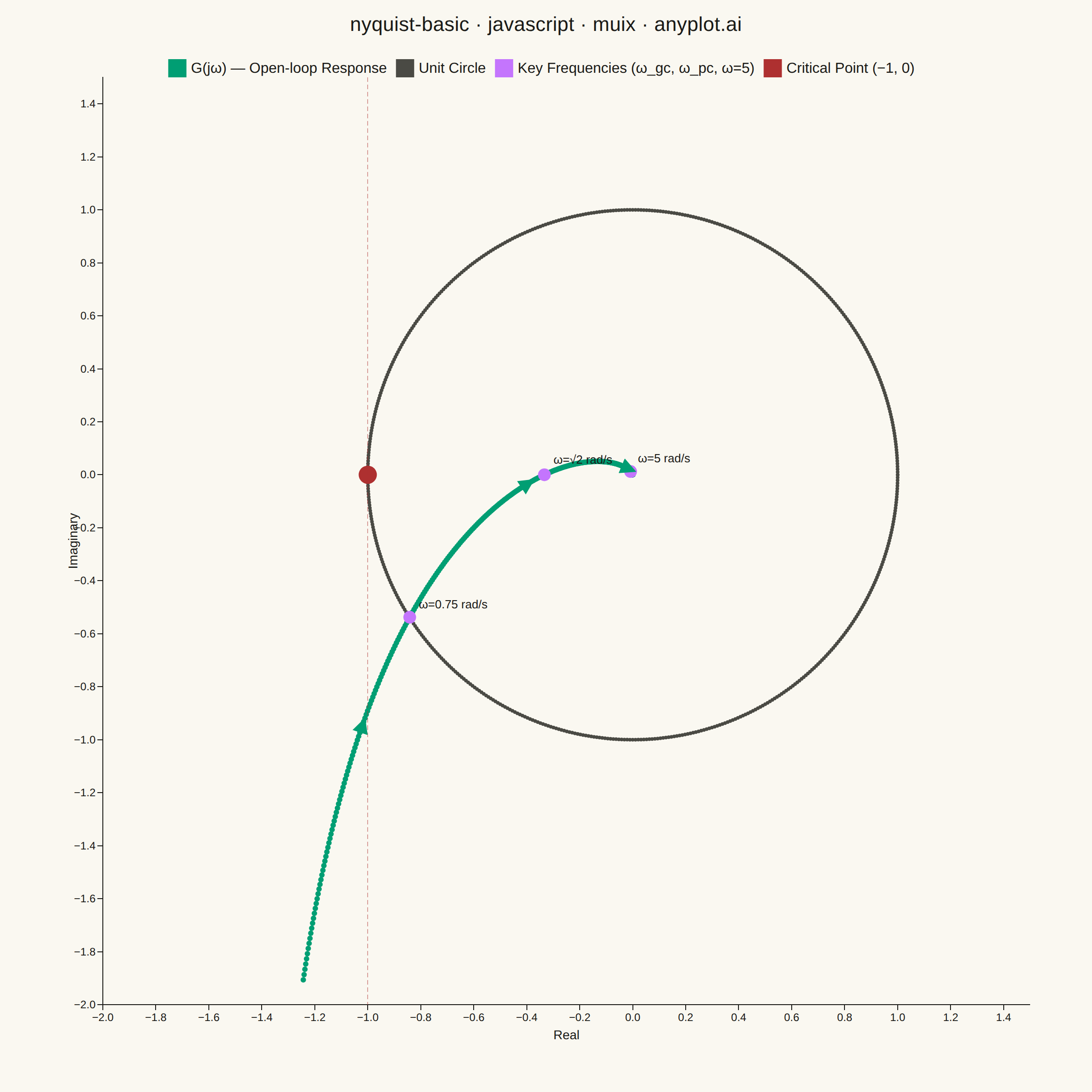
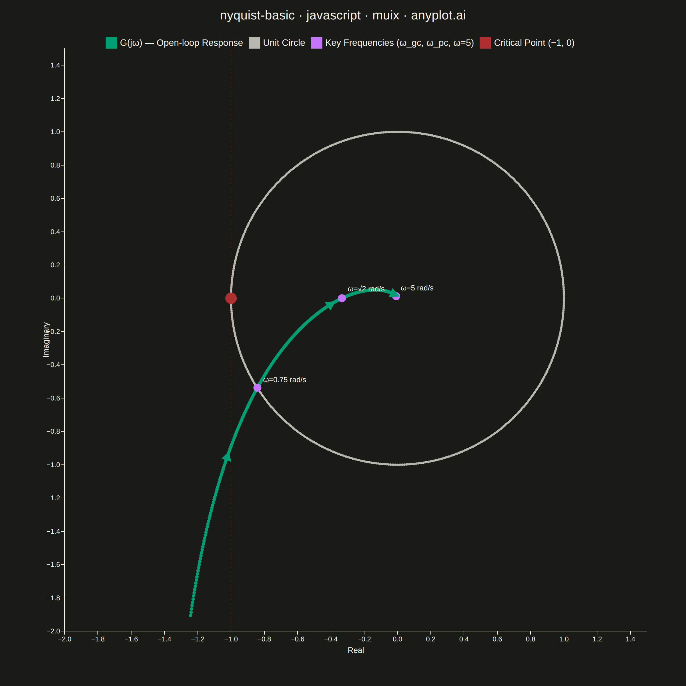
A Nyquist plot maps a system's open-loop frequency response onto the complex plane by plotting the imaginary part against the real part of the transfer function as frequency varies from zero to infinity. It is the primary tool for applying the Nyquist stability criterion to determine whether a closed-loop control system is stable. The plot visually reveals gain and phase margins and is widely used in classical control theory and electronic circuit design.
// anyplot.ai
// nyquist-basic: Nyquist Plot for Control Systems
// Library: muix 7.29.1 | JavaScript 22.22.3
// Quality: 86/100 | Created: 2026-06-17
//# anyplot-orientation: square
// anyplot.ai
// nyquist-basic: Nyquist Plot for Control Systems
// Library: MUI X Charts | React | Node 22
// License: @mui/x-charts — MIT (community). Pro/Premium are out of scope.
// Quality: pending | Created: 2026-06-17

import { ScatterChart } from "@mui/x-charts/ScatterChart";
import { ChartsReferenceLine } from "@mui/x-charts/ChartsReferenceLine";

const t = window.ANYPLOT_TOKENS;

// G(jω) = 1/(jω(1+jω)(1+0.5jω)); denominator = -1.5ω² + jω(1-0.5ω²)
// Re(G) = -1.5ω²/|d|²,  Im(G) = -ω(1-0.5ω²)/|d|²
const nyquistXY = (omega) => {
  const dre = -1.5 * omega * omega;
  const dim = omega * (1 - 0.5 * omega * omega);
  const m2 = dre * dre + dim * dim;
  return [dre / m2, -dim / m2];
};

// Nyquist curve: 600 log-spaced points ω ∈ [0.4, 25] rad/s
const nyquistData = Array.from({ length: 600 }, (_, k) => {
  const omega = 0.4 * Math.pow(62.5, k / 599);
  const [x, y] = nyquistXY(omega);
  return { x, y, id: k };
});

// Unit circle reference
const circleData = Array.from({ length: 601 }, (_, k) => {
  const theta = (2 * Math.PI * k) / 600;
  return { x: Math.cos(theta), y: Math.sin(theta), id: 1000 + k };
});

// Key frequency markers: gain crossover, phase crossover, high-freq
const KEY_FREQS = [
  { omega: 0.75, label: "ω=0.75 rad/s" },
  { omega: Math.SQRT2, label: "ω=√2 rad/s" },
  { omega: 5, label: "ω=5 rad/s" },
];
const keyFreqData = KEY_FREQS.map(({ omega }, i) => {
  const [x, y] = nyquistXY(omega);
  return { x, y, id: 2000 + i };
});

// Indices along Nyquist curve where direction arrows are drawn
const ARROW_INDICES = [50, 160, 290];

export default function Chart() {
  const { width, height } = window.ANYPLOT_SIZE;
  const margin = { left: 80, right: 35, top: 35, bottom: 80 };
  const titleH = 52;
  const chartSize = Math.min(width - 8, height - titleH - 14);

  // Data-to-SVG-pixel coordinate transform for the plot area
  const plotW = chartSize - margin.left - margin.right;
  const plotH = chartSize - margin.top - margin.bottom;
  const [xMin, xMax, yMin, yMax] = [-2.0, 1.5, -2.0, 1.5];
  const toPixX = (xv) => margin.left + ((xv - xMin) / (xMax - xMin)) * plotW;
  const toPixY = (yv) => margin.top + ((yMax - yv) / (yMax - yMin)) * plotH;

  // Direction arrows: tangent computed in pixel space
  const arrows = ARROW_INDICES.map((idx) => {
    const p0 = nyquistData[idx];
    const p1 = nyquistData[idx + 10];
    const px0 = toPixX(p0.x), py0 = toPixY(p0.y);
    const px1 = toPixX(p1.x), py1 = toPixY(p1.y);
    const dpx = px1 - px0, dpy = py1 - py0;
    const len = Math.sqrt(dpx * dpx + dpy * dpy);
    const nx = dpx / len, ny = dpy / len;
    const cx = (px0 + px1) / 2, cy = (py0 + py1) / 2;
    const AL = 26;
    return {
      x1: cx - (nx * AL) / 2,
      y1: cy - (ny * AL) / 2,
      x2: cx + (nx * AL) / 2,
      y2: cy + (ny * AL) / 2,
    };
  });

  // Text label anchor offsets relative to each key frequency marker
  const labelOffsets = [
    { dx: 10, dy: -10 }, // ω=0.75: lower-left quadrant → label right+up
    { dx: 10, dy: -12 }, // ω=√2: on real axis → label right+up
    { dx: 8, dy: -10 },  // ω=5: near origin → label right+up
  ];

  return (
    <div
      style={{
        width,
        height,
        backgroundColor: t.pageBg,
        display: "flex",
        flexDirection: "column",
        alignItems: "center",
        padding: "14px 4px 4px",
        boxSizing: "border-box",
        fontFamily: "sans-serif",
      }}
    >
      <div
        style={{
          fontSize: "22px",
          fontWeight: 500,
          color: t.ink,
          marginBottom: "10px",
          textAlign: "center",
          letterSpacing: "0.01em",
        }}
      >
        nyquist-basic · javascript · muix · anyplot.ai
      </div>
      <div style={{ position: "relative", width: chartSize, height: chartSize }}>
        <ScatterChart
          width={chartSize}
          height={chartSize}
          skipAnimation
          series={[
            {
              data: nyquistData,
              label: "G(jω) — Open-loop Response",
              color: t.palette[0],
              markerSize: 3,
            },
            {
              data: circleData,
              label: "Unit Circle",
              color: t.inkSoft,
              markerSize: 2,
            },
            {
              data: keyFreqData,
              label: "Key Frequencies (ω_gc, ω_pc, ω=5)",
              color: t.palette[1],
              markerSize: 7,
            },
            {
              data: [{ x: -1, y: 0, id: 9999 }],
              label: "Critical Point (−1, 0)",
              color: "#AE3030",
              markerSize: 10,
            },
          ]}
          xAxis={[{ label: "Real", min: xMin, max: xMax, showGrid: true }]}
          yAxis={[{ label: "Imaginary", min: yMin, max: yMax, showGrid: true }]}
          margin={margin}
          sx={{
            "& .MuiChartsAxis-tickLabel": { fontSize: "14px" },
            "& .MuiChartsAxis-label": { fontSize: "16px" },
            "& .MuiChartsLegend-label": { fontSize: "14px" },
            "& .MuiChartsGrid-line": {
              stroke: t.inkSoft,
              strokeOpacity: 0.2,
            },
          }}
        >
          {/* Vertical reference line through the critical point x=-1 */}
          <ChartsReferenceLine
            x={-1}
            lineStyle={{
              stroke: "#AE3030",
              strokeDasharray: "5 3",
              strokeOpacity: 0.45,
              strokeWidth: 1,
            }}
          />
        </ScatterChart>
        {/* SVG overlay: direction-of-increasing-ω arrows + frequency labels */}
        <svg
          style={{
            position: "absolute",
            top: 0,
            left: 0,
            width: chartSize,
            height: chartSize,
            pointerEvents: "none",
            overflow: "visible",
          }}
        >
          <defs>
            <marker
              id="arr"
              markerWidth="7"
              markerHeight="7"
              refX="5"
              refY="3.5"
              orient="auto"
            >
              <path d="M0,0 L7,3.5 L0,7 Z" fill={t.palette[0]} />
            </marker>
          </defs>
          {arrows.map((a, i) => (
            <line
              key={i}
              x1={a.x1}
              y1={a.y1}
              x2={a.x2}
              y2={a.y2}
              stroke={t.palette[0]}
              strokeWidth={2.5}
              markerEnd="url(#arr)"
            />
          ))}
          {KEY_FREQS.map(({ omega, label }, i) => {
            const [xv, yv] = nyquistXY(omega);
            const px = toPixX(xv);
            const py = toPixY(yv);
            const { dx, dy } = labelOffsets[i];
            return (
              <text
                key={i}
                x={px + dx}
                y={py + dy}
                fill={t.ink}
                fontSize="13"
                fontFamily="sans-serif"
                fontWeight="500"
              >
                {label}
              </text>
            );
          })}
        </svg>
      </div>
    </div>
  );
}
Runnable source as JSON, for any HTTP client: https://api.anyplot.ai/specs/nyquist-basic/muix/code. Any spec id and library id listed in llms-full.txt fit the same URL shape; every URL below is complete and callable.
{
  "spec_id": "nyquist-basic",
  "language": "javascript",
  "library": "muix",
  "page": "https://anyplot.ai/nyquist-basic/javascript/muix",
  "hub": "https://anyplot.ai/nyquist-basic",
  "code_json": "https://api.anyplot.ai/specs/nyquist-basic/muix/code",
  "spec_json": "https://api.anyplot.ai/specs/nyquist-basic",
  "render_light_png": "https://storage.googleapis.com/anyplot-images/plots/nyquist-basic/javascript/muix/plot-light.png",
  "render_dark_png": "https://storage.googleapis.com/anyplot-images/plots/nyquist-basic/javascript/muix/plot-dark.png",
  "interactive_light_html": "https://storage.googleapis.com/anyplot-images/plots/nyquist-basic/javascript/muix/plot-light.html",
  "interactive_dark_html": "https://storage.googleapis.com/anyplot-images/plots/nyquist-basic/javascript/muix/plot-dark.html",
  "quality_score": 86.0,
  "license": "MIT",
  "guide": "https://anyplot.ai/llms.txt"
}
Part of Nyquist Plot for Control Systems on anyplot.ai.