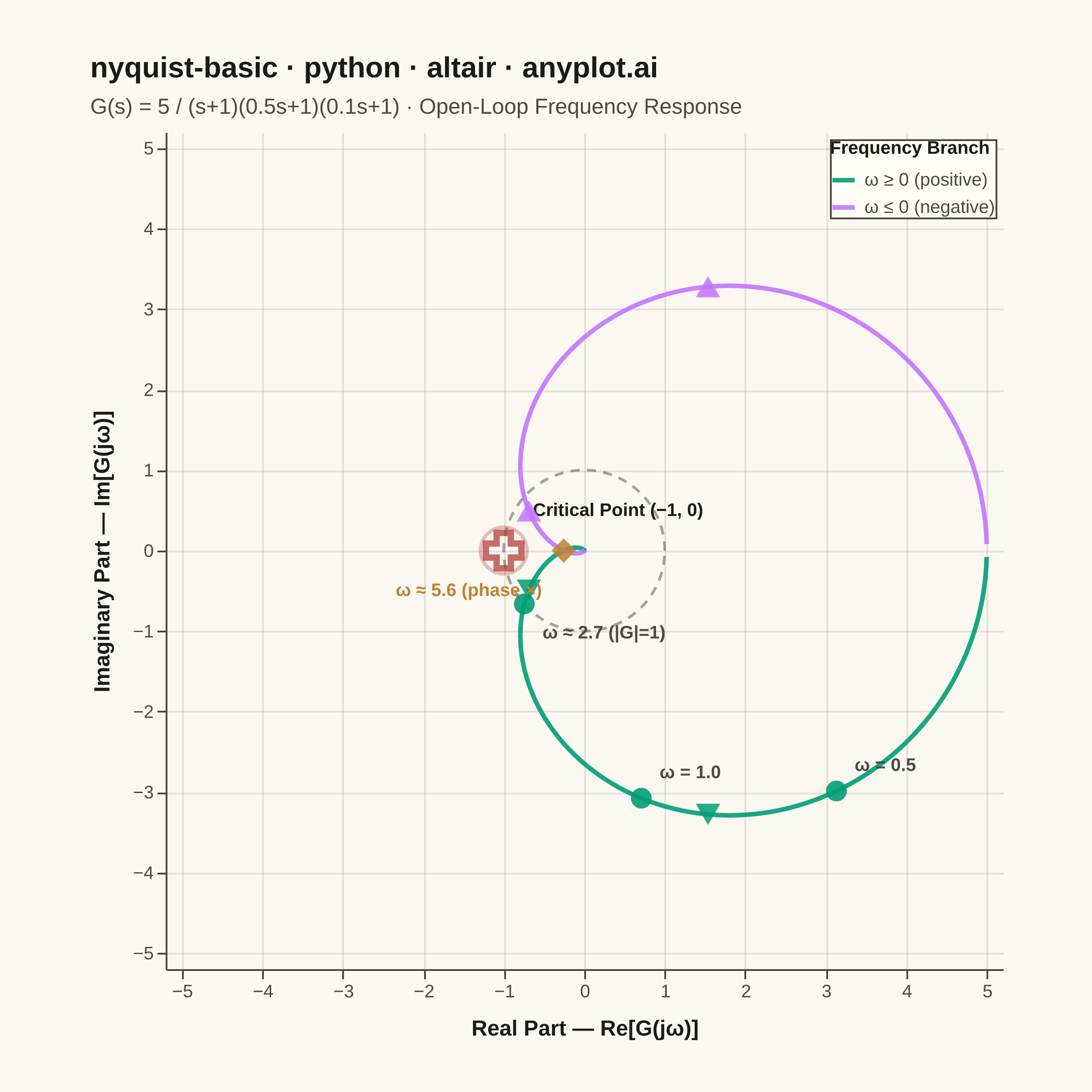
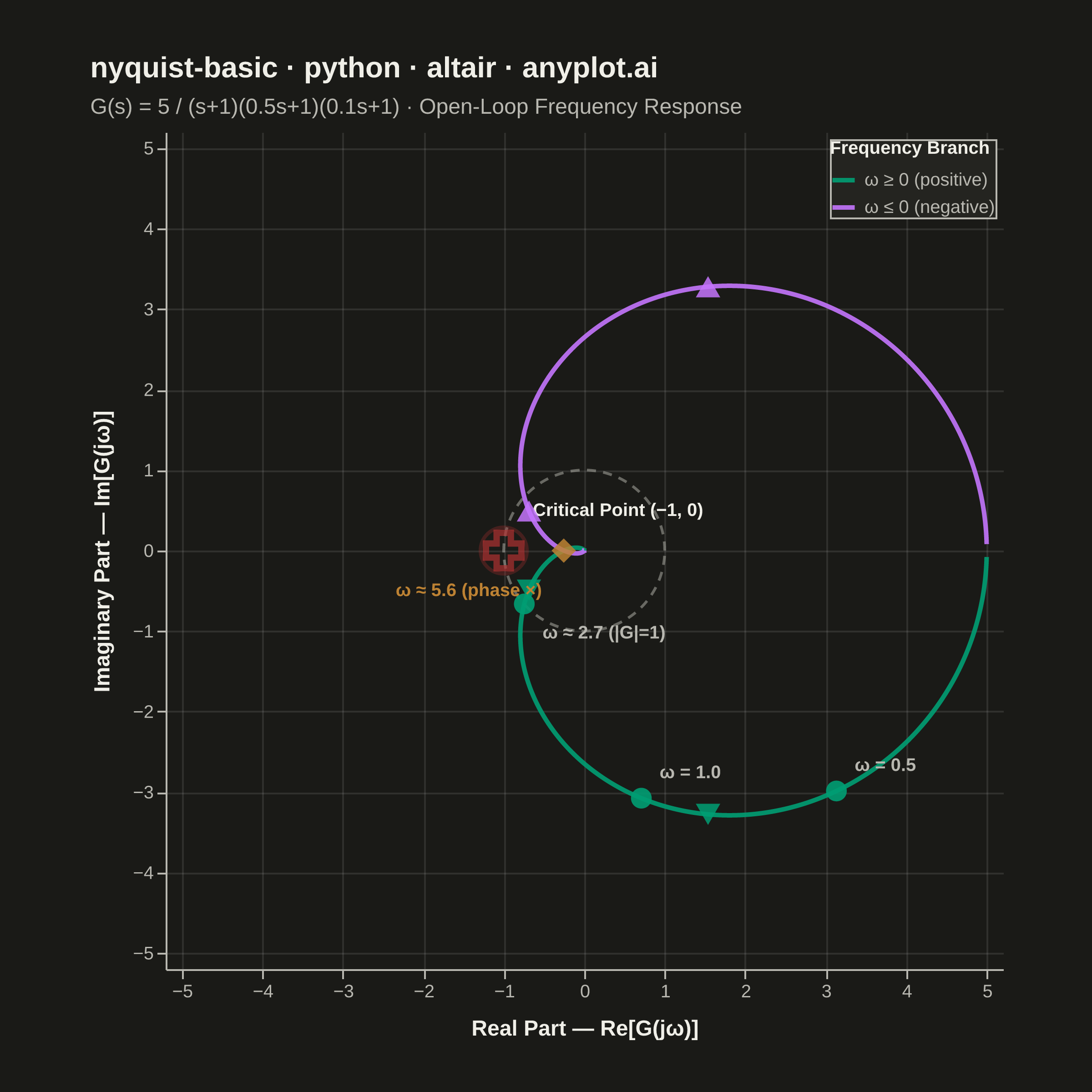
A Nyquist plot maps a system's open-loop frequency response onto the complex plane by plotting the imaginary part against the real part of the transfer function as frequency varies from zero to infinity. It is the primary tool for applying the Nyquist stability criterion to determine whether a closed-loop control system is stable. The plot visually reveals gain and phase margins and is widely used in classical control theory and electronic circuit design.
""" anyplot.ai
nyquist-basic: Nyquist Plot for Control Systems
Library: altair 6.2.1 | Python 3.13.14
Quality: 88/100 | Updated: 2026-06-17
"""

import os

import altair as alt
import numpy as np
import pandas as pd
from PIL import Image


# Theme tokens
THEME = os.getenv("ANYPLOT_THEME", "light")
PAGE_BG = "#FAF8F1" if THEME == "light" else "#1A1A17"
ELEVATED_BG = "#FFFDF6" if THEME == "light" else "#242420"
INK = "#1A1A17" if THEME == "light" else "#F0EFE8"
INK_SOFT = "#4A4A44" if THEME == "light" else "#B8B7B0"

# Imprint palette — first series always #009E73
BRANCH_POS = "#009E73"  # positive frequency branch
BRANCH_NEG = "#C475FD"  # negative frequency branch
CRITICAL_COLOR = "#AE3030"  # semantic red for critical point
CROSS_COLOR = "#BD8233"  # ochre for phase crossover marker

# Data — G(s) = 5 / ((s+1)(0.5s+1)(0.1s+1)), a stable third-order system
omega = np.concatenate(
    [np.logspace(-2, -0.5, 100), np.logspace(-0.5, 0.5, 250), np.logspace(0.5, 1.5, 200), np.logspace(1.5, 3, 100)]
)

K = 5.0
s = 1j * omega
G = K / ((s + 1.0) * (0.5 * s + 1.0) * (0.1 * s + 1.0))

real_part = G.real
imag_part = G.imag

# Positive frequency branch
pos_df = pd.DataFrame(
    {
        "real": real_part,
        "imaginary": imag_part,
        "frequency": omega,
        "branch": "ω ≥ 0 (positive)",
        "idx": np.arange(len(omega)),
    }
)

# Negative frequency branch — mirror about the real axis
neg_df = pd.DataFrame(
    {
        "real": real_part,
        "imaginary": -imag_part,
        "frequency": -omega[::-1],
        "branch": "ω ≤ 0 (negative)",
        "idx": np.arange(len(omega)),
    }
)

nyquist_df = pd.concat([pos_df, neg_df], ignore_index=True)

# Unit circle for reference
theta = np.linspace(0, 2 * np.pi, 200)
unit_circle_df = pd.DataFrame({"ux": np.cos(theta), "uy": np.sin(theta), "idx": np.arange(len(theta))})

# Critical point (-1, 0)
critical_df = pd.DataFrame({"real": [-1.0], "imaginary": [0.0], "label": ["Critical Point (−1, 0)"]})

# Gain crossover: |G(jω)| = 1
magnitude = np.abs(G)
gain_cross_idx = np.argmin(np.abs(magnitude - 1.0))
gain_cross_omega = omega[gain_cross_idx]

# Phase crossover: imaginary part crosses zero (skip near-DC region)
sign_changes = np.where(np.diff(np.sign(imag_part[30:])))[0] + 30
phase_cross_idx = sign_changes[0] if len(sign_changes) > 0 else None
phase_cross_omega = omega[phase_cross_idx] if phase_cross_idx is not None else None

# Frequency markers — ω=2.0 omitted to avoid overlap with gain crossover at ≈2.0
freq_annotations = []
for w_mark, dy_sign in [(0.5, -1), (1.0, -1)]:
    idx = np.argmin(np.abs(omega - w_mark))
    freq_annotations.append(
        {"real": real_part[idx], "imaginary": imag_part[idx], "label": f"ω = {w_mark}", "above": dy_sign < 0}
    )
# Gain crossover — placed below the curve point, clear of other labels
freq_annotations.append(
    {
        "real": real_part[gain_cross_idx],
        "imaginary": imag_part[gain_cross_idx],
        "label": f"ω ≈ {gain_cross_omega:.1f} (|G|=1)",
        "above": False,
    }
)
freq_df = pd.DataFrame(freq_annotations)

# Phase crossover annotation — separate layer for independent positioning
phase_cross_layers = []
if phase_cross_idx is not None:
    pc_df = pd.DataFrame(
        {
            "real": [real_part[phase_cross_idx]],
            "imaginary": [imag_part[phase_cross_idx]],
            "label": [f"ω ≈ {phase_cross_omega:.1f} (phase ×)"],
        }
    )
    pc_point = (
        alt.Chart(pc_df)
        .mark_point(shape="diamond", size=180, color=CROSS_COLOR, filled=True, opacity=0.85)
        .encode(x=alt.X("real:Q"), y=alt.Y("imaginary:Q"), tooltip=[alt.Tooltip("label:N", title="Phase Crossover")])
    )
    # Label goes below-left of the diamond, away from the critical point label above
    pc_text = (
        alt.Chart(pc_df)
        .mark_text(fontSize=10, color=CROSS_COLOR, fontWeight="bold", align="right", dx=-12, dy=22)
        .encode(x=alt.X("real:Q"), y=alt.Y("imaginary:Q"), text="label:N")
    )
    phase_cross_layers = [pc_point, pc_text]

# Direction arrows showing increasing frequency
arrow_rows = []
for target_w in [0.8, 3.0]:
    idx = np.argmin(np.abs(omega - target_w))
    im_val = imag_part[idx]
    if abs(im_val) > 0.05:
        shape = "down" if im_val < 0 else "up"
        arrow_rows.append({"ax": real_part[idx], "ay": imag_part[idx], "branch": "ω ≥ 0 (positive)", "shape": shape})
        arrow_rows.append(
            {
                "ax": real_part[idx],
                "ay": -imag_part[idx],
                "branch": "ω ≤ 0 (negative)",
                "shape": "up" if shape == "down" else "down",
            }
        )
arrow_df = pd.DataFrame(arrow_rows)

# Axis — 1:1 aspect ratio: equal domain extent, square view
# Data range: real ∈ [~-1.3, 5.0], imaginary ∈ [~-4.5, 4.5]
# Use [-5.2, 5.2] on both axes; width=height so unit circle is circular
PLOT_RANGE = 5.2
x_scale = alt.Scale(domain=[-PLOT_RANGE, PLOT_RANGE], nice=False)
y_scale = alt.Scale(domain=[-PLOT_RANGE, PLOT_RANGE], nice=False)

branch_domain = ["ω ≥ 0 (positive)", "ω ≤ 0 (negative)"]
branch_range = [BRANCH_POS, BRANCH_NEG]

highlight = alt.selection_point(fields=["branch"], bind="legend")

# Nyquist curve — two branches, interactive legend selection
nyquist_layer = (
    alt.Chart(nyquist_df)
    .mark_line(strokeWidth=2.5)
    .encode(
        x=alt.X("real:Q", scale=x_scale, title="Real Part — Re[G(jω)]"),
        y=alt.Y("imaginary:Q", scale=y_scale, title="Imaginary Part — Im[G(jω)]"),
        color=alt.Color(
            "branch:N",
            scale=alt.Scale(domain=branch_domain, range=branch_range),
            legend=alt.Legend(
                title="Frequency Branch",
                titleFontSize=10,
                labelFontSize=10,
                symbolSize=150,
                symbolStrokeWidth=2.5,
                orient="top-right",
                offset=4,
            ),
        ),
        opacity=alt.condition(highlight, alt.value(0.9), alt.value(0.2)),
        order="idx:Q",
        tooltip=[
            alt.Tooltip("branch:N", title="Branch"),
            alt.Tooltip("real:Q", title="Re(G)", format=".3f"),
            alt.Tooltip("imaginary:Q", title="Im(G)", format=".3f"),
            alt.Tooltip("frequency:Q", title="ω (rad/s)", format=".3f"),
        ],
    )
    .add_params(highlight)
)

# Unit circle reference
unit_circle_layer = (
    alt.Chart(unit_circle_df)
    .mark_line(strokeWidth=1.5, strokeDash=[5, 4], color=INK_SOFT, opacity=0.5)
    .encode(x=alt.X("ux:Q", scale=x_scale), y=alt.Y("uy:Q", scale=y_scale), order="idx:Q")
)

# Critical point ring (emphasis) + cross marker
critical_ring = (
    alt.Chart(critical_df)
    .mark_point(shape="circle", size=650, strokeWidth=2, color=CRITICAL_COLOR, filled=False, opacity=0.3)
    .encode(x=alt.X("real:Q", scale=x_scale), y=alt.Y("imaginary:Q", scale=y_scale))
)
critical_cross = (
    alt.Chart(critical_df)
    .mark_point(shape="cross", size=380, strokeWidth=3.5, color=CRITICAL_COLOR, filled=False)
    .encode(
        x=alt.X("real:Q", scale=x_scale),
        y=alt.Y("imaginary:Q", scale=y_scale),
        tooltip=[alt.Tooltip("label:N", title="Critical Point")],
    )
)
# Label to the upper-right; use INK for contrast on both light/dark themes
critical_text = (
    alt.Chart(critical_df)
    .mark_text(fontSize=10, fontWeight="bold", color=INK, align="left", dx=16, dy=-22)
    .encode(x=alt.X("real:Q", scale=x_scale), y=alt.Y("imaginary:Q", scale=y_scale), text="label:N")
)

# Frequency annotation points
freq_points = (
    alt.Chart(freq_df)
    .mark_point(shape="circle", size=130, color=BRANCH_POS, filled=True, opacity=0.9)
    .encode(
        x=alt.X("real:Q", scale=x_scale),
        y=alt.Y("imaginary:Q", scale=y_scale),
        tooltip=[alt.Tooltip("label:N", title="Frequency")],
    )
)
freq_above_df = freq_df[freq_df["above"]].copy()
freq_below_df = freq_df[~freq_df["above"]].copy()
freq_labels_above = (
    alt.Chart(freq_above_df)
    .mark_text(fontSize=10, color=INK_SOFT, fontWeight="bold", align="left", dx=10, dy=-14)
    .encode(x=alt.X("real:Q", scale=x_scale), y=alt.Y("imaginary:Q", scale=y_scale), text="label:N")
)
freq_labels_below = (
    alt.Chart(freq_below_df)
    .mark_text(fontSize=10, color=INK_SOFT, fontWeight="bold", align="left", dx=10, dy=16)
    .encode(x=alt.X("real:Q", scale=x_scale), y=alt.Y("imaginary:Q", scale=y_scale), text="label:N")
)

# Direction arrows
arrow_up_df = arrow_df[arrow_df["shape"] == "up"].copy()
arrow_down_df = arrow_df[arrow_df["shape"] == "down"].copy()
arrow_up_layer = (
    alt.Chart(arrow_up_df)
    .mark_point(shape="triangle-up", size=180, filled=True, opacity=0.85)
    .encode(
        x=alt.X("ax:Q", scale=x_scale),
        y=alt.Y("ay:Q", scale=y_scale),
        color=alt.Color("branch:N", scale=alt.Scale(domain=branch_domain, range=branch_range), legend=None),
    )
)
arrow_down_layer = (
    alt.Chart(arrow_down_df)
    .mark_point(shape="triangle-down", size=180, filled=True, opacity=0.85)
    .encode(
        x=alt.X("ax:Q", scale=x_scale),
        y=alt.Y("ay:Q", scale=y_scale),
        color=alt.Color("branch:N", scale=alt.Scale(domain=branch_domain, range=branch_range), legend=None),
    )
)

# Compose all layers
combined = (
    unit_circle_layer
    + nyquist_layer
    + critical_ring
    + critical_cross
    + critical_text
    + freq_points
    + freq_labels_above
    + freq_labels_below
    + arrow_up_layer
    + arrow_down_layer
)
for layer in phase_cross_layers:
    combined = combined + layer

# Square view (width=height) enforces 1:1 aspect ratio so the unit circle is circular
chart = (
    combined.properties(
        width=460,
        height=460,
        background=PAGE_BG,
        title=alt.Title(
            "nyquist-basic · python · altair · anyplot.ai",
            fontSize=16,
            fontWeight="bold",
            color=INK,
            subtitle="G(s) = 5 / (s+1)(0.5s+1)(0.1s+1)  ·  Open-Loop Frequency Response",
            subtitleFontSize=12,
            subtitleColor=INK_SOFT,
            subtitlePadding=8,
            anchor="start",
            offset=8,
        ),
    )
    .configure_view(fill=PAGE_BG, stroke="transparent")
    .configure_axis(
        domainColor=INK_SOFT,
        tickColor=INK_SOFT,
        gridColor=INK,
        gridOpacity=0.10,
        labelColor=INK_SOFT,
        labelFontSize=10,
        titleColor=INK,
        titleFontSize=12,
        titleFontWeight="bold",
        titlePadding=10,
    )
    .configure_legend(
        fillColor=ELEVATED_BG,
        strokeColor=INK_SOFT,
        labelColor=INK_SOFT,
        titleColor=INK,
        titleFontSize=10,
        labelFontSize=10,
    )
    .interactive()
)

TW, TH = 2400, 2400

chart.save(f"plot-{THEME}.png", scale_factor=4.0)
chart.save(f"plot-{THEME}.html")

_img = Image.open(f"plot-{THEME}.png").convert("RGB")
_w, _h = _img.size
if _w > TW or _h > TH:
    raise SystemExit(
        f"altair vl-convert produced {_w}×{_h}, exceeds target {TW}×{TH}. "
        f"Shrink chart .properties(width=, height=) values and re-render."
    )
if _w < TW or _h < TH:
    _canvas = Image.new("RGB", (TW, TH), PAGE_BG)
    _canvas.paste(_img, ((TW - _w) // 2, (TH - _h) // 2))
    _canvas.save(f"plot-{THEME}.png")
Runnable source as JSON, for any HTTP client: https://api.anyplot.ai/specs/nyquist-basic/altair/code. Any spec id and library id listed in llms-full.txt fit the same URL shape; every URL below is complete and callable.
{
  "spec_id": "nyquist-basic",
  "language": "python",
  "library": "altair",
  "page": "https://anyplot.ai/nyquist-basic/python/altair",
  "hub": "https://anyplot.ai/nyquist-basic",
  "code_json": "https://api.anyplot.ai/specs/nyquist-basic/altair/code",
  "spec_json": "https://api.anyplot.ai/specs/nyquist-basic",
  "render_light_png": "https://storage.googleapis.com/anyplot-images/plots/nyquist-basic/python/altair/plot-light.png",
  "render_dark_png": "https://storage.googleapis.com/anyplot-images/plots/nyquist-basic/python/altair/plot-dark.png",
  "interactive_light_html": "https://storage.googleapis.com/anyplot-images/plots/nyquist-basic/python/altair/plot-light.html",
  "interactive_dark_html": "https://storage.googleapis.com/anyplot-images/plots/nyquist-basic/python/altair/plot-dark.html",
  "quality_score": 88.0,
  "license": "MIT",
  "guide": "https://anyplot.ai/llms.txt"
}
Part of Nyquist Plot for Control Systems on anyplot.ai.