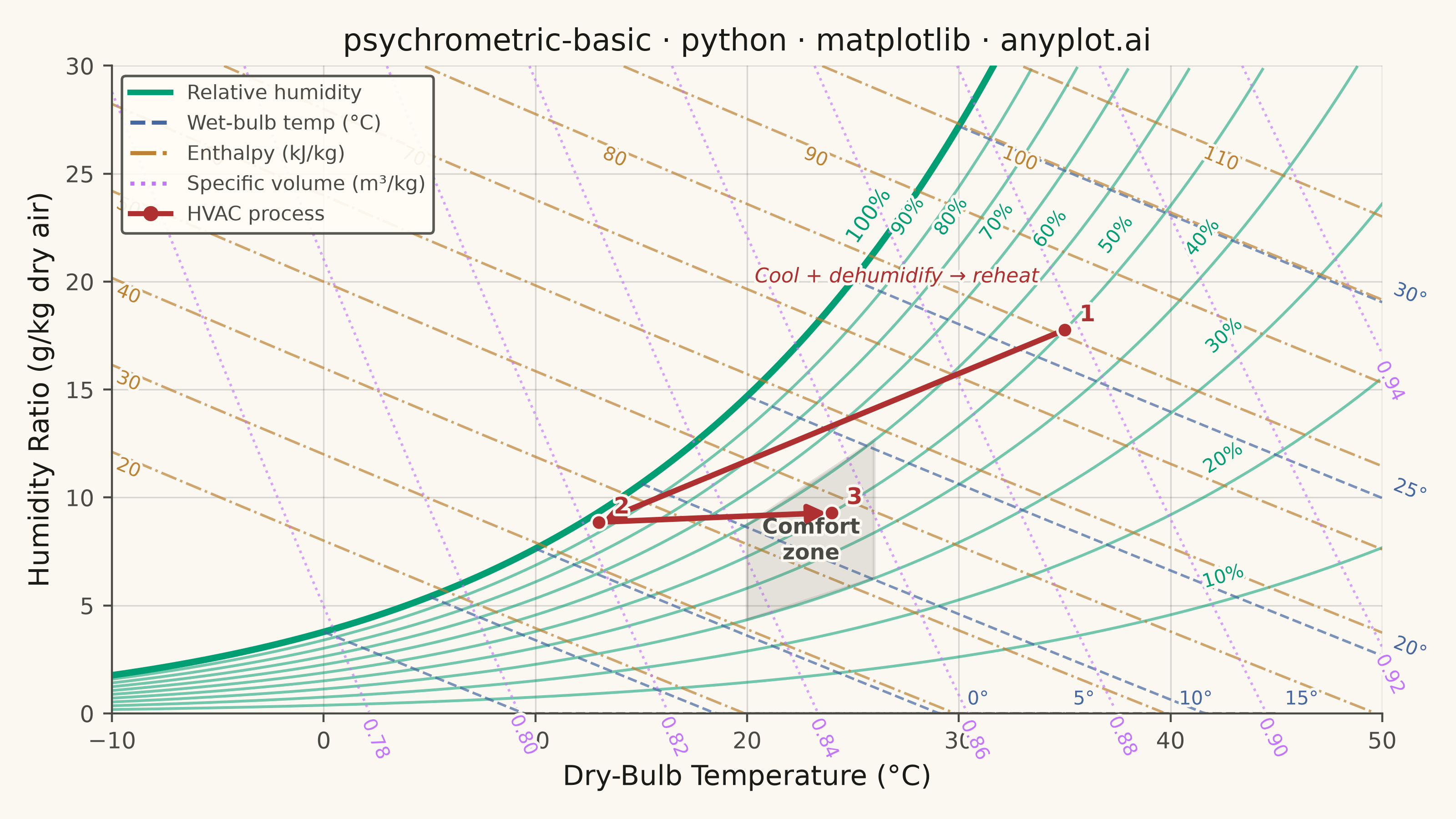
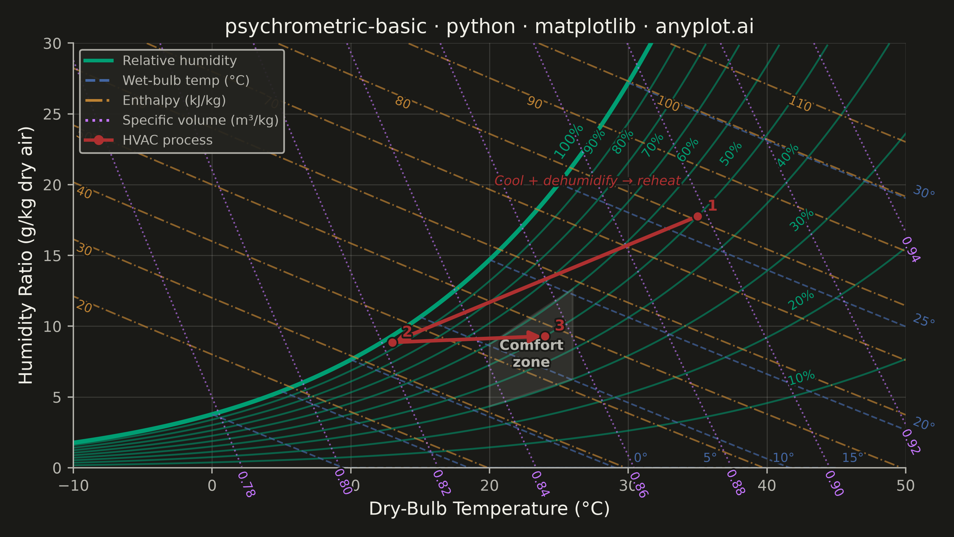
A psychrometric chart plots dry-bulb temperature against humidity ratio, overlaid with curves for relative humidity, wet-bulb temperature, enthalpy, and specific volume. It is the fundamental tool for HVAC system design and air conditioning process analysis. The chart reveals the thermodynamic properties of moist air at a glance, enabling engineers to trace heating, cooling, humidification, and dehumidification processes as paths on the diagram.
""" anyplot.ai
psychrometric-basic: Psychrometric Chart for HVAC
Library: matplotlib 3.11.0 | Python 3.13.13
Quality: 92/100 | Updated: 2026-06-16
"""

import os

import matplotlib.patheffects as pe
import matplotlib.pyplot as plt
import numpy as np
from matplotlib.lines import Line2D
from matplotlib.patches import FancyArrowPatch, Polygon


# Theme tokens (see prompts/default-style-guide.md "Theme-adaptive Chrome")
THEME = os.getenv("ANYPLOT_THEME", "light")
PAGE_BG = "#FAF8F1" if THEME == "light" else "#1A1A17"
ELEVATED_BG = "#FFFDF6" if THEME == "light" else "#242420"
INK = "#1A1A17" if THEME == "light" else "#F0EFE8"
INK_SOFT = "#4A4A44" if THEME == "light" else "#B8B7B0"
INK_MUTED = "#6B6A63" if THEME == "light" else "#A8A79F"

# Imprint palette — first family is brand green; line styles add redundant encoding
RH_COLOR = "#009E73"  # brand green — relative-humidity family (primary structure)
WB_COLOR = "#4467A3"  # blue — wet-bulb (evaporative cooling)
ENTH_COLOR = "#BD8233"  # ochre — enthalpy (energy)
VOL_COLOR = "#C475FD"  # lavender — specific volume
PROC_COLOR = "#AE3030"  # matte red — highlighted HVAC process path

# Constants
P_ATM = 101325.0  # Pa, standard sea-level pressure
W_MAX = 30.0  # g/kg, top of plotted humidity-ratio range

# Data — psychrometric properties from ASHRAE/Buck formulas (deterministic)
t_db = np.linspace(-10, 50, 500)
ps_db = 611.21 * np.exp((18.678 - t_db / 234.5) * (t_db / (257.14 + t_db)))

# Plot
fig, ax = plt.subplots(figsize=(8, 4.5), dpi=400, facecolor=PAGE_BG)
ax.set_facecolor(PAGE_BG)
ax.set_xlim(-10, 50)
ax.set_ylim(0, 30)

# Theme-adaptive halo so inline labels stay legible over crossing lines
halo = [pe.withStroke(linewidth=2.2, foreground=PAGE_BG)]
LABEL_FS = 7.5

# Relative-humidity curves (10%–100%); saturation curve (100%) is prominent
for rh in np.arange(0.1, 1.001, 0.1):
    w = 0.621945 * rh * ps_db / (P_ATM - rh * ps_db) * 1000
    mask = (w >= 0) & (w <= W_MAX)
    t_p, w_p = t_db[mask], w[mask]
    if len(t_p) < 3:
        continue
    is_sat = abs(rh - 1.0) < 0.01
    ax.plot(t_p, w_p, color=RH_COLOR, linewidth=2.6 if is_sat else 1.1, alpha=1.0 if is_sat else 0.55)
    # Label near the upper end of each curve (where the family fans out), but
    # clamp below 27 g/kg so labels never crowd the title at the top edge
    i = min(int(len(t_p) * 0.9), len(t_p) - 2)
    if w_p[i] > 27:
        below = np.nonzero(w_p <= 27)[0]
        if len(below):
            i = min(max(below[-1], 1), len(t_p) - 2)
    ang = np.degrees(np.arctan2(w_p[i + 1] - w_p[i - 1], t_p[i + 1] - t_p[i - 1]))
    ax.text(
        t_p[i] - 0.5,
        w_p[i] + 0.5,
        f"{int(round(rh * 100))}%",
        fontsize=LABEL_FS + (1 if is_sat else 0),
        color=RH_COLOR,
        fontweight="medium" if is_sat else "normal",
        rotation=ang,
        rotation_mode="anchor",
        transform_rotates_text=True,
        ha="right",
        va="bottom",
        path_effects=halo,
    )

# Wet-bulb temperature lines — labelled at their lower-right ends (clear of RH band)
for t_wb in np.arange(0, 35, 5):
    t_r = np.linspace(t_wb, min(t_wb + 30, 50), 200)
    ps_wb = 611.21 * np.exp((18.678 - t_wb / 234.5) * (t_wb / (257.14 + t_wb)))
    ws_wb = 0.621945 * ps_wb / (P_ATM - ps_wb)
    w = np.maximum(ws_wb - 1.006e3 * (t_r - t_wb) / (2501e3 + 1.86e3 * t_r - 4.186e3 * t_wb), 0) * 1000
    mask = (w >= 0) & (w <= W_MAX) & (t_r >= -10) & (t_r <= 50)
    t_p, w_p = t_r[mask], w[mask]
    if len(t_p) < 3:
        continue
    ax.plot(t_p, w_p, color=WB_COLOR, linewidth=1.0, alpha=0.7, linestyle="--")
    i = len(t_p) - 1
    ang = np.degrees(np.arctan2(w_p[i] - w_p[i - 1], t_p[i] - t_p[i - 1]))
    ax.text(
        t_p[i] + 0.4,
        w_p[i] + 0.2,
        f"{int(t_wb)}°",
        fontsize=LABEL_FS,
        color=WB_COLOR,
        rotation=ang,
        rotation_mode="anchor",
        transform_rotates_text=True,
        ha="left",
        va="bottom",
        path_effects=halo,
    )

# Enthalpy lines (kJ/kg) — labelled at their upper-left ends
for h in np.arange(20, 120, 10):
    w = (h - 1.006 * t_db) / (2501 + 1.86 * t_db) * 1000
    mask = (w >= 0) & (w <= W_MAX) & (t_db >= -10) & (t_db <= 50)
    t_p, w_p = t_db[mask], w[mask]
    if len(t_p) < 3:
        continue
    ax.plot(t_p, w_p, color=ENTH_COLOR, linewidth=1.0, alpha=0.7, linestyle="-.")
    # Enthalpy lines descend left→right; high-h lines enter at the top edge, so
    # anchor the label at the first point at/below 26.5 g/kg to clear the title
    below = np.nonzero(w_p <= 26.5)[0]
    li = below[0] if len(below) else len(t_p) // 2
    li = min(max(li, 1), len(t_p) - 2)
    ang = np.degrees(np.arctan2(w_p[li + 1] - w_p[li - 1], t_p[li + 1] - t_p[li - 1]))
    ax.text(
        t_p[li] + 0.3,
        w_p[li] - 0.1,
        f"{int(h)}",
        fontsize=LABEL_FS,
        color=ENTH_COLOR,
        rotation=ang,
        rotation_mode="anchor",
        transform_rotates_text=True,
        ha="left",
        va="top",
        path_effects=halo,
    )

# Specific-volume lines (m3/kg) — steep; labelled at their lower ends
for v in np.arange(0.78, 0.96, 0.02):
    w = (v * P_ATM / (287.055 * (t_db + 273.15)) - 1) / 1.6078 * 1000
    mask = (w >= 0) & (w <= W_MAX) & (t_db >= -10) & (t_db <= 50)
    t_p, w_p = t_db[mask], w[mask]
    if len(t_p) < 3:
        continue
    ax.plot(t_p, w_p, color=VOL_COLOR, linewidth=1.0, alpha=0.65, linestyle=":")
    i = len(t_p) - 1
    ang = np.degrees(np.arctan2(w_p[i] - w_p[i - 1], t_p[i] - t_p[i - 1]))
    ax.text(
        t_p[i] + 0.3,
        w_p[i] - 0.2,
        f"{v:.2f}",
        fontsize=LABEL_FS,
        color=VOL_COLOR,
        rotation=ang,
        rotation_mode="anchor",
        transform_rotates_text=True,
        ha="left",
        va="top",
        path_effects=halo,
    )

# Comfort zone (~20–26 C, 30–60% RH) — muted fill so it sits behind the data
ct = np.array([20.0, 26.0])
cps = 611.21 * np.exp((18.678 - ct / 234.5) * (ct / (257.14 + ct)))
cw_lo = 0.621945 * 0.30 * cps / (P_ATM - 0.30 * cps) * 1000
cw_hi = 0.621945 * 0.60 * cps / (P_ATM - 0.60 * cps) * 1000
comfort = np.array([[20, cw_lo[0]], [26, cw_lo[1]], [26, cw_hi[1]], [20, cw_hi[0]]])
ax.add_patch(
    Polygon(comfort, closed=True, facecolor=INK_MUTED, alpha=0.16, edgecolor=INK_MUTED, linewidth=1.2, zorder=3)
)
ax.text(
    23,
    comfort[:, 1].mean(),
    "Comfort\nzone",
    fontsize=8.5,
    color=INK_SOFT,
    ha="center",
    va="center",
    fontweight="bold",
    zorder=4,
    path_effects=halo,
)

# HVAC process: hot humid air -> cool & dehumidify -> reheat to comfort
proc_t = np.array([35.0, 13.0, 24.0])
proc_rh = np.array([0.50, 0.95, 0.50])
proc_ps = 611.21 * np.exp((18.678 - proc_t / 234.5) * (proc_t / (257.14 + proc_t)))
proc_w = 0.621945 * proc_rh * proc_ps / (P_ATM - proc_rh * proc_ps) * 1000

arrow_kw = {"arrowstyle": "-|>", "color": PROC_COLOR, "linewidth": 2.2, "mutation_scale": 14, "zorder": 5}
ax.add_patch(FancyArrowPatch((proc_t[0], proc_w[0]), (proc_t[1], proc_w[1]), **arrow_kw))
ax.add_patch(FancyArrowPatch((proc_t[1], proc_w[1]), (proc_t[2], proc_w[2]), **arrow_kw))
for t, w, lab in zip(proc_t, proc_w, ("1", "2", "3"), strict=True):
    ax.plot(t, w, "o", color=PROC_COLOR, markersize=6, zorder=6, markeredgecolor=PAGE_BG, markeredgewidth=1.0)
    ax.text(t + 0.7, w + 0.4, lab, fontsize=9, color=PROC_COLOR, fontweight="bold", zorder=6, path_effects=halo)
ax.text(
    27,
    proc_w[0] + 2.2,
    "Cool + dehumidify → reheat",
    fontsize=8,
    color=PROC_COLOR,
    fontstyle="italic",
    ha="center",
    zorder=6,
    path_effects=halo,
)

# Style
ax.set_xlabel("Dry-Bulb Temperature (°C)", fontsize=11, color=INK)
ax.set_ylabel("Humidity Ratio (g/kg dry air)", fontsize=11, color=INK)
ax.set_title("psychrometric-basic · python · matplotlib · anyplot.ai", fontsize=12, fontweight="medium", color=INK)
ax.tick_params(axis="both", labelsize=9, colors=INK_SOFT)
ax.spines["top"].set_visible(False)
ax.spines["right"].set_visible(False)
for s in ("left", "bottom"):
    ax.spines[s].set_color(INK_SOFT)
ax.grid(True, alpha=0.15, linewidth=0.6, color=INK)

legend_elements = [
    Line2D([0], [0], color=RH_COLOR, linewidth=2.2, label="Relative humidity"),
    Line2D([0], [0], color=WB_COLOR, linewidth=1.6, linestyle="--", label="Wet-bulb temp (°C)"),
    Line2D([0], [0], color=ENTH_COLOR, linewidth=1.6, linestyle="-.", label="Enthalpy (kJ/kg)"),
    Line2D([0], [0], color=VOL_COLOR, linewidth=1.6, linestyle=":", label="Specific volume (m³/kg)"),
    Line2D([0], [0], color=PROC_COLOR, linewidth=2.0, marker="o", markersize=5, label="HVAC process"),
]
leg = ax.legend(handles=legend_elements, fontsize=8, loc="upper left", framealpha=0.92)
leg.get_frame().set_facecolor(ELEVATED_BG)
leg.get_frame().set_edgecolor(INK_SOFT)
for txt in leg.get_texts():
    txt.set_color(INK_SOFT)

# Save
plt.tight_layout()
plt.savefig(f"plot-{THEME}.png", dpi=400, facecolor=PAGE_BG)
Runnable source as JSON, for any HTTP client: https://api.anyplot.ai/specs/psychrometric-basic/matplotlib/code. Any spec id and library id listed in llms-full.txt fit the same URL shape; every URL below is complete and callable.
{
  "spec_id": "psychrometric-basic",
  "language": "python",
  "library": "matplotlib",
  "page": "https://anyplot.ai/psychrometric-basic/python/matplotlib",
  "hub": "https://anyplot.ai/psychrometric-basic",
  "code_json": "https://api.anyplot.ai/specs/psychrometric-basic/matplotlib/code",
  "spec_json": "https://api.anyplot.ai/specs/psychrometric-basic",
  "render_light_png": "https://storage.googleapis.com/anyplot-images/plots/psychrometric-basic/python/matplotlib/plot-light.png",
  "render_dark_png": "https://storage.googleapis.com/anyplot-images/plots/psychrometric-basic/python/matplotlib/plot-dark.png",
  "quality_score": 92.0,
  "license": "MIT",
  "guide": "https://anyplot.ai/llms.txt"
}
Part of Psychrometric Chart for HVAC on anyplot.ai.