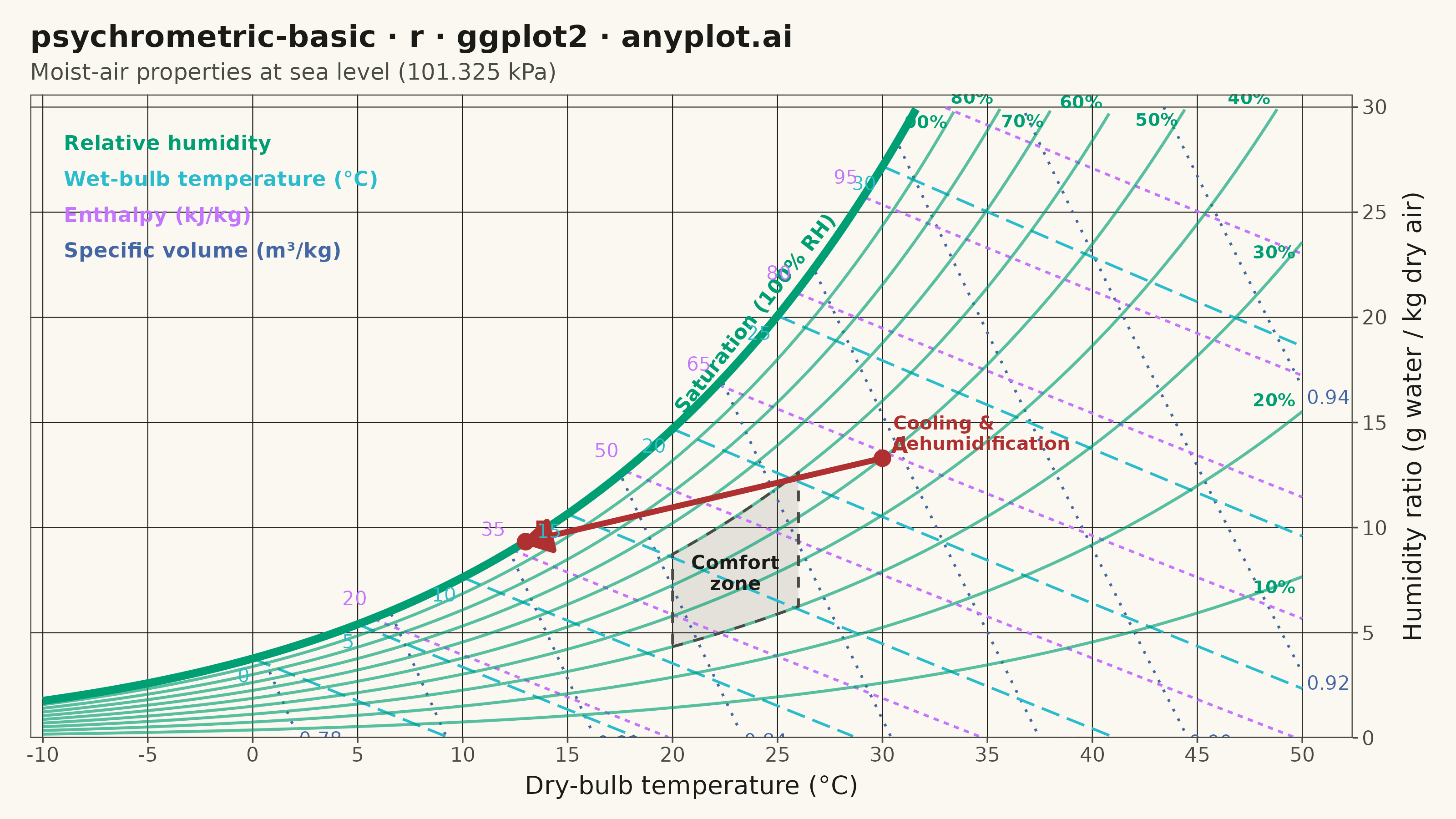
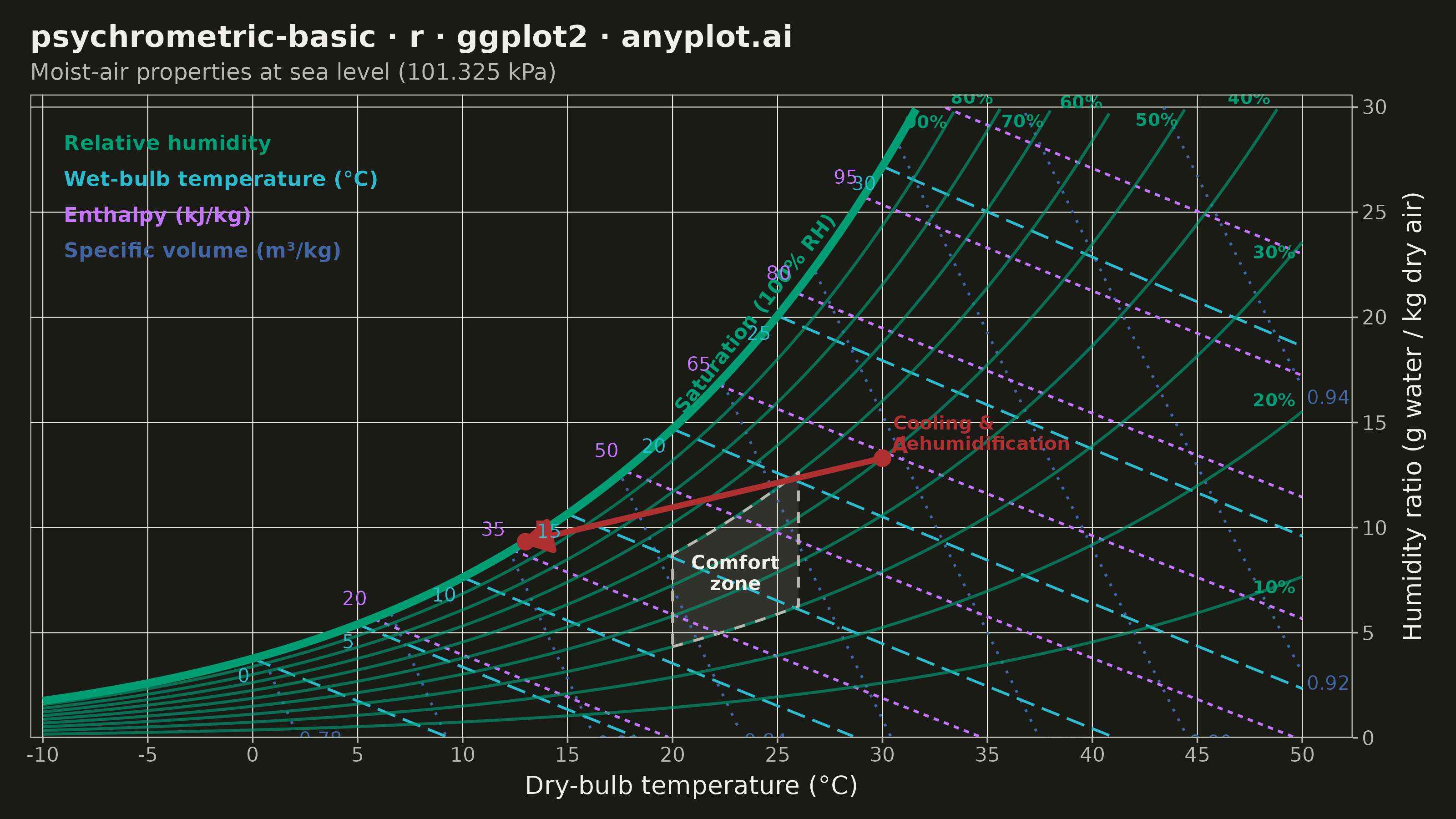
A psychrometric chart plots dry-bulb temperature against humidity ratio, overlaid with curves for relative humidity, wet-bulb temperature, enthalpy, and specific volume. It is the fundamental tool for HVAC system design and air conditioning process analysis. The chart reveals the thermodynamic properties of moist air at a glance, enabling engineers to trace heating, cooling, humidification, and dehumidification processes as paths on the diagram.
#' anyplot.ai
#' psychrometric-basic: Psychrometric Chart for HVAC
#' Library: ggplot2 3.5.1 | R 4.4.1
#' Quality: 90/100 | Created: 2026-06-16

library(ggplot2)
library(dplyr)
library(ragg)

# --- Theme tokens -----------------------------------------------------------
THEME       <- Sys.getenv("ANYPLOT_THEME", "light")
PAGE_BG     <- if (THEME == "light") "#FAF8F1" else "#1A1A17"
ELEVATED_BG <- if (THEME == "light") "#FFFDF6" else "#242420"
INK         <- if (THEME == "light") "#1A1A17" else "#F0EFE8"
INK_SOFT    <- if (THEME == "light") "#4A4A44" else "#B8B7B0"
INK_MUTED   <- if (THEME == "light") "#6B6A63" else "#A8A79F"

# Imprint palette — one hue per property family, semantically chosen
GREEN <- "#009E73"  # 1 — relative-humidity curves (saturation = hero series)
CYAN  <- "#2ABCCD"  # 6 — wet-bulb temperature (cool / wet association)
LAV   <- "#C475FD"  # 2 — constant-enthalpy lines
BLUE  <- "#4467A3"  # 3 — constant specific-volume lines
RED   <- "#AE3030"  # 5 — example HVAC process path (emphasis)

# --- Psychrometric model (ASHRAE, sea-level 101.325 kPa) --------------------
P_ATM <- 101.325                                          # kPa
p_ws  <- function(t) 0.61078 * exp(17.27 * t / (t + 237.3))   # sat. vapour pressure, kPa
W_of  <- function(t, rh) {                                # humidity ratio, g/kg dry air
  pw <- rh * p_ws(t)
  1000 * 0.62198 * pw / (P_ATM - pw)
}
W_sat <- function(t) W_of(t, 1.0)                         # saturation curve, g/kg

T_MIN <- -10; T_MAX <- 50
W_MIN <- 0;   W_MAX <- 30
temps <- seq(T_MIN, T_MAX, by = 0.2)

# keep only the physical region (at or below the saturation curve, inside the box)
clip_region <- function(df) {
  df |>
    filter(w >= W_MIN, w <= W_MAX, t >= T_MIN, t <= T_MAX,
           w <= W_sat(t) + 1e-6)
}

# --- Relative-humidity curves (10 % .. 100 %) -------------------------------
rh_levels <- seq(10, 100, by = 10)
rh_df <- bind_rows(lapply(rh_levels, function(rh) {
  data.frame(rh = rh, t = temps, w = W_of(temps, rh / 100))
})) |> clip_region()

sat_df <- filter(rh_df, rh == 100)            # 100 % RH — saturation boundary
rh_minor <- filter(rh_df, rh < 100)
# stagger label offsets so converging high-RH curves near the top don't crowd
rh_lab <- rh_minor |> group_by(rh) |> slice_max(t, n = 1) |> ungroup() |>
  mutate(vj = ifelse(rh %% 20 == 0, -0.4, 1.3))

# --- Constant wet-bulb temperature lines ------------------------------------
wb_levels <- seq(0, 30, by = 5)
wb_df <- bind_rows(lapply(wb_levels, function(twb) {
  ws_wb <- W_of(twb, 1.0) / 1000                          # kg/kg at wet-bulb temp
  tt <- seq(twb, T_MAX, by = 0.2)
  w  <- ((2501 - 2.326 * twb) * ws_wb - 1.006 * (tt - twb)) /
        (2501 + 1.86 * tt - 4.186 * twb)
  data.frame(twb = twb, t = tt, w = w * 1000)
})) |> clip_region()
wb_lab <- wb_df |> group_by(twb) |> slice_min(t, n = 1) |> ungroup()

# --- Constant-enthalpy lines (kJ/kg dry air) --------------------------------
h_levels <- seq(20, 110, by = 15)
h_df <- bind_rows(lapply(h_levels, function(h) {
  w <- (h - 1.006 * temps) / (2501 + 1.86 * temps)        # kg/kg
  data.frame(h = h, t = temps, w = w * 1000)
})) |> clip_region()
h_lab <- h_df |> group_by(h) |> slice_min(t, n = 1) |> ungroup()

# --- Constant specific-volume lines (m3/kg dry air) -------------------------
v_levels <- seq(0.78, 0.94, by = 0.02)
v_df <- bind_rows(lapply(v_levels, function(v) {
  w <- (v * P_ATM / (0.287042 * (temps + 273.15)) - 1) / 1.6078  # kg/kg
  data.frame(v = v, t = temps, w = w * 1000)
})) |> clip_region()
v_lab <- v_df |> group_by(v) |> slice_max(t, n = 1) |> ungroup()

# --- Thermal comfort zone (~20-26 C, 30-60 % RH) ----------------------------
comfort <- bind_rows(
  data.frame(t = seq(20, 26, 0.25), rh = 30),
  data.frame(t = 26, rh = seq(30, 60, 2)),
  data.frame(t = seq(26, 20, -0.25), rh = 60),
  data.frame(t = 20, rh = seq(60, 30, -2))
) |> mutate(w = W_of(t, rh / 100))

# --- Example HVAC process: cooling & dehumidification -----------------------
state_a <- data.frame(t = 30, w = W_of(30, 0.50))         # warm humid return air
state_b <- data.frame(t = 13, w = W_sat(13))              # cooled, near-saturated supply
process <- bind_rows(cbind(state_a, lab = "A"), cbind(state_b, lab = "B"))

# --- Plot -------------------------------------------------------------------
p <- ggplot() +
  # comfort zone
  geom_polygon(data = comfort, aes(t, w),
               fill = INK_MUTED, alpha = 0.16, color = NA) +
  # specific-volume lines (steep, dotted)
  geom_line(data = v_df, aes(t, w, group = v),
            color = BLUE, linewidth = 0.5, linetype = "dotted") +
  # enthalpy lines (oblique, dashed)
  geom_line(data = h_df, aes(t, w, group = h),
            color = LAV, linewidth = 0.5, linetype = "22") +
  # wet-bulb lines (diagonal, dashed)
  geom_line(data = wb_df, aes(t, w, group = twb),
            color = CYAN, linewidth = 0.5, linetype = "longdash") +
  # relative-humidity curves
  geom_line(data = rh_minor, aes(t, w, group = rh),
            color = GREEN, linewidth = 0.55, alpha = 0.65) +
  # saturation curve (100 % RH) — the hero boundary
  geom_line(data = sat_df, aes(t, w),
            color = GREEN, linewidth = 1.5) +
  # comfort outline + label
  geom_path(data = comfort, aes(t, w),
            color = INK_SOFT, linewidth = 0.5, linetype = "dashed") +
  annotate("text", x = 23, y = W_of(23, 0.45), label = "Comfort\nzone",
           color = INK, size = 2.7, lineheight = 0.9, fontface = "bold") +
  # process path A -> B
  geom_segment(data = data.frame(x = state_a$t, y = state_a$w,
                                 xe = state_b$t, ye = state_b$w),
               aes(x = x, y = y, xend = xe, yend = ye),
               color = RED, linewidth = 1.1,
               arrow = arrow(length = unit(0.16, "in"), type = "closed")) +
  geom_point(data = process, aes(t, w), color = RED, size = 2.6) +
  geom_text(data = process, aes(t, w, label = lab),
            color = RED, size = 3.1, fontface = "bold",
            hjust = -0.5, vjust = -0.3) +
  annotate("text", x = 30.5, y = W_of(30, 0.50) + 1.2,
           label = "Cooling &\ndehumidification", color = RED,
           size = 2.6, hjust = 0, lineheight = 0.9, fontface = "bold")

# --- Direct line labels -----------------------------------------------------
p <- p +
  geom_text(data = rh_lab, aes(t, w, label = paste0(rh, "%")),
            color = GREEN, size = 2.5, hjust = 1.15, vjust = rh_lab$vj,
            fontface = "bold") +
  annotate("text", x = 28.5, y = W_sat(28.5), label = "Saturation (100% RH)",
           color = GREEN, size = 2.8, hjust = 1.05, vjust = -0.6,
           fontface = "bold", angle = 52) +
  geom_text(data = wb_lab, aes(t, w, label = twb),
            color = CYAN, size = 2.7, hjust = 1.25, vjust = 1.7) +
  geom_text(data = h_lab, aes(t, w, label = h),
            color = LAV, size = 2.7, hjust = 1.3, vjust = -1.0) +
  geom_text(data = v_lab, aes(t, w, label = sprintf("%.2f", v)),
            color = BLUE, size = 2.7, hjust = -0.1, vjust = 1.2) +
  # family descriptors (direct, colour-keyed)
  annotate("text", x = -9, y = 28.3, label = "Relative humidity",
           color = GREEN, size = 2.9, hjust = 0, fontface = "bold") +
  annotate("text", x = -9, y = 26.6, label = "Wet-bulb temperature (°C)",
           color = CYAN, size = 2.9, hjust = 0, fontface = "bold") +
  annotate("text", x = -9, y = 24.9, label = "Enthalpy (kJ/kg)",
           color = LAV, size = 2.9, hjust = 0, fontface = "bold") +
  annotate("text", x = -9, y = 23.2, label = "Specific volume (m³/kg)",
           color = BLUE, size = 2.9, hjust = 0, fontface = "bold")

# --- Scales, labels, theme --------------------------------------------------
p <- p +
  scale_x_continuous(breaks = seq(-10, 50, 5),
                     expand = expansion(mult = c(0.01, 0.04))) +
  scale_y_continuous(position = "right", breaks = seq(0, 30, 5),
                     expand = expansion(mult = c(0.0, 0.02))) +
  coord_cartesian(xlim = c(T_MIN, T_MAX), ylim = c(W_MIN, W_MAX)) +
  labs(
    title = "psychrometric-basic · r · ggplot2 · anyplot.ai",
    subtitle = "Moist-air properties at sea level (101.325 kPa)",
    x = "Dry-bulb temperature (°C)",
    y = "Humidity ratio (g water / kg dry air)"
  ) +
  theme_minimal(base_size = 8) +
  theme(
    plot.background  = element_rect(fill = PAGE_BG, color = PAGE_BG),
    panel.background = element_rect(fill = PAGE_BG, color = NA),
    panel.grid.major = element_line(color = INK, linewidth = 0.18),
    panel.grid.minor = element_blank(),
    panel.border     = element_rect(color = INK_SOFT, fill = NA, linewidth = 0.4),
    axis.title       = element_text(color = INK, size = 10),
    axis.title.x     = element_text(margin = margin(t = 4)),
    axis.title.y.right = element_text(margin = margin(l = 6), angle = 90),
    axis.text        = element_text(color = INK_SOFT, size = 8),
    axis.ticks       = element_line(color = INK_SOFT, linewidth = 0.3),
    plot.title       = element_text(color = INK, size = 12, face = "bold"),
    plot.subtitle    = element_text(color = INK_SOFT, size = 9),
    plot.margin      = margin(10, 12, 8, 12)
  )

# --- Save -------------------------------------------------------------------
ggsave(
  filename = sprintf("plot-%s.png", THEME),
  plot     = p,
  device   = ragg::agg_png,
  width    = 8,
  height   = 4.5,
  units    = "in",
  dpi      = 400
)
Runnable source as JSON, for any HTTP client: https://api.anyplot.ai/specs/psychrometric-basic/ggplot2/code. Any spec id and library id listed in llms-full.txt fit the same URL shape; every URL below is complete and callable.
{
  "spec_id": "psychrometric-basic",
  "language": "r",
  "library": "ggplot2",
  "page": "https://anyplot.ai/psychrometric-basic/r/ggplot2",
  "hub": "https://anyplot.ai/psychrometric-basic",
  "code_json": "https://api.anyplot.ai/specs/psychrometric-basic/ggplot2/code",
  "spec_json": "https://api.anyplot.ai/specs/psychrometric-basic",
  "render_light_png": "https://storage.googleapis.com/anyplot-images/plots/psychrometric-basic/r/ggplot2/plot-light.png",
  "render_dark_png": "https://storage.googleapis.com/anyplot-images/plots/psychrometric-basic/r/ggplot2/plot-dark.png",
  "quality_score": 90.0,
  "license": "MIT",
  "guide": "https://anyplot.ai/llms.txt"
}
Part of Psychrometric Chart for HVAC on anyplot.ai.