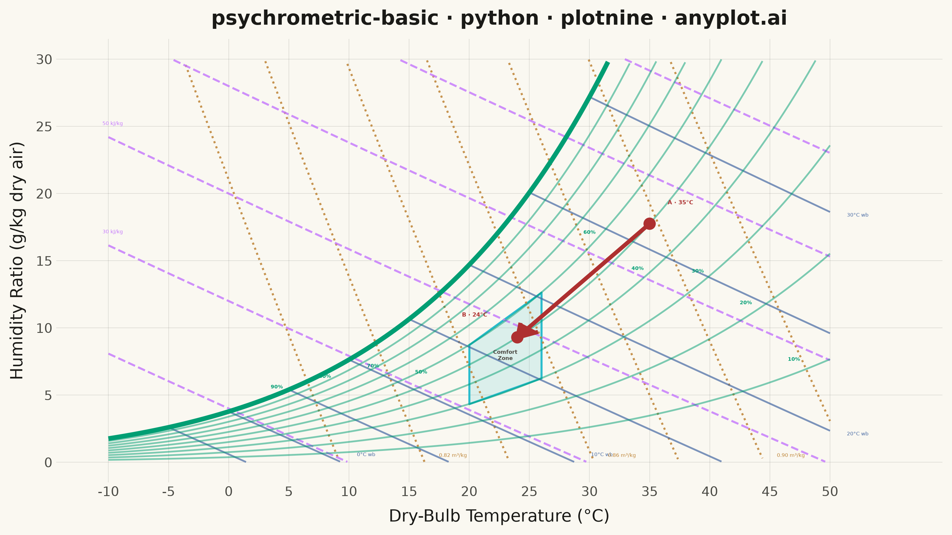
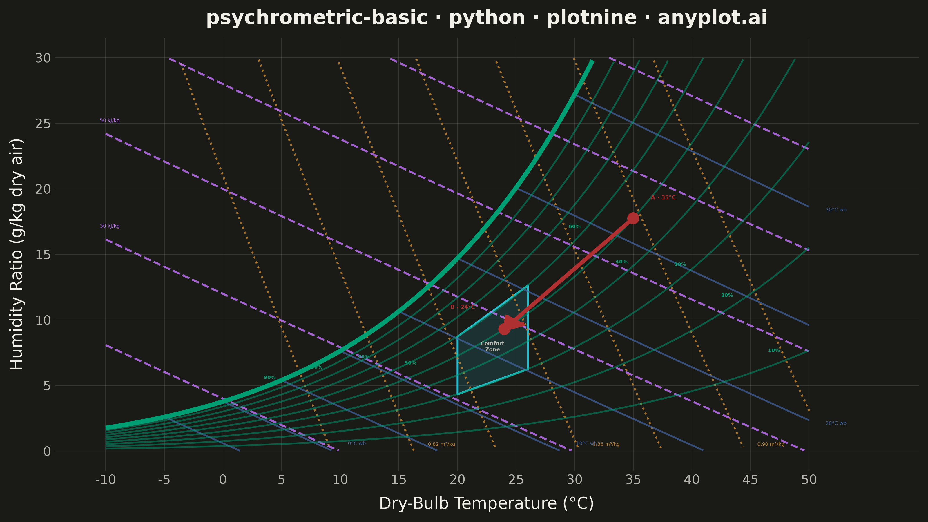
A psychrometric chart plots dry-bulb temperature against humidity ratio, overlaid with curves for relative humidity, wet-bulb temperature, enthalpy, and specific volume. It is the fundamental tool for HVAC system design and air conditioning process analysis. The chart reveals the thermodynamic properties of moist air at a glance, enabling engineers to trace heating, cooling, humidification, and dehumidification processes as paths on the diagram.
""" anyplot.ai
psychrometric-basic: Psychrometric Chart for HVAC
Library: plotnine 0.15.7 | Python 3.13.13
Quality: 93/100 | Updated: 2026-06-16
"""

import os

import numpy as np
import pandas as pd
from plotnine import (
    aes,
    annotate,
    arrow,
    coord_cartesian,
    element_blank,
    element_line,
    element_rect,
    element_text,
    geom_line,
    geom_point,
    geom_polygon,
    geom_ribbon,
    geom_segment,
    geom_text,
    ggplot,
    labs,
    scale_x_continuous,
    scale_y_continuous,
    theme,
    theme_minimal,
)


# Theme-adaptive chrome (see prompts/default-style-guide.md "Theme-adaptive Chrome")
THEME = os.getenv("ANYPLOT_THEME", "light")
PAGE_BG = "#FAF8F1" if THEME == "light" else "#1A1A17"
INK = "#1A1A17" if THEME == "light" else "#F0EFE8"
INK_SOFT = "#4A4A44" if THEME == "light" else "#B8B7B0"

# Imprint palette — one hue family per psychrometric property type.
BRAND = "#009E73"  # ★ first series: relative-humidity / saturation curves
BLUE = "#4467A3"  # wet-bulb temperature (moisture cue)
LAVENDER = "#C475FD"  # enthalpy
OCHRE = "#BD8233"  # specific volume
RED = "#AE3030"  # HVAC process path (semantic emphasis)
CYAN = "#2ABCCD"  # comfort zone

# Constants — standard sea-level atmosphere
PATM = 101.325  # kPa
T_MIN, T_MAX = -10, 50
W_MAX = 30

t_range = np.linspace(T_MIN, T_MAX, 300)

# Magnus saturation vapor pressure: psat(t) = 0.61078 * exp(17.27 t / (t + 237.3))
# Humidity ratio (inlined throughout): w = 622 * pw / (PATM - pw), pw = rh_frac * psat

# Relative-humidity curves 10%-90%
rh_frames = []
for rh in range(10, 100, 10):
    pw = np.minimum(rh / 100.0 * 0.61078 * np.exp(17.27 * t_range / (t_range + 237.3)), PATM - 0.01)
    w = 622.0 * pw / (PATM - pw)
    mask = (w >= 0) & (w <= W_MAX)
    rh_frames.append(pd.DataFrame({"t": t_range[mask], "w": w[mask], "group": f"RH {rh}"}))
df_rh = pd.concat(rh_frames, ignore_index=True)

# Saturation curve (100% RH) — the visually prominent upper boundary
pw_sat = np.minimum(0.61078 * np.exp(17.27 * t_range / (t_range + 237.3)), PATM - 0.01)
w_sat = 622.0 * pw_sat / (PATM - pw_sat)
mask_sat = (w_sat >= 0) & (w_sat <= W_MAX)
df_sat = pd.DataFrame({"t": t_range[mask_sat], "w": w_sat[mask_sat]})

# RH labels positioned along their curves, spaced to avoid the comfort zone and state points
rh_label_pos = {10: 47, 20: 43, 30: 39, 40: 34, 50: 16, 60: 30, 70: 12, 80: 8, 90: 4}
rh_labels = []
for rh, t_l in rh_label_pos.items():
    pw_l = min(rh / 100.0 * 0.61078 * np.exp(17.27 * t_l / (t_l + 237.3)), PATM - 0.01)
    w_l = 622.0 * pw_l / (PATM - pw_l)
    if 0 < w_l < W_MAX:
        rh_labels.append({"t": t_l, "w": w_l + 1.1, "label": f"{rh}%"})
df_rh_labels = pd.DataFrame(rh_labels)

# Wet-bulb temperature lines
wb_frames = []
for twb in range(-5, 35, 5):
    pws_wb = 0.61078 * np.exp(17.27 * twb / (twb + 237.3))
    ws_wb = 622.0 * pws_wb / (PATM - pws_wb)
    t_line = np.linspace(twb, min(twb + 30, T_MAX), 150)
    w_line = ((2501.0 - 2.326 * twb) * ws_wb - 1006.0 * (t_line - twb)) / (2501.0 + 1.86 * t_line - 4.186 * twb)
    mask = (w_line >= 0) & (w_line <= W_MAX) & (t_line >= T_MIN)
    if np.sum(mask) > 2:
        wb_frames.append(pd.DataFrame({"t": t_line[mask], "w": w_line[mask], "group": f"WB {twb}"}))
df_wb = pd.concat(wb_frames, ignore_index=True)

# Wet-bulb labels at the lower-right end of every other line
wb_labels = []
for twb in range(0, 35, 10):
    sub = df_wb[df_wb["group"] == f"WB {twb}"]
    if len(sub) > 0:
        row = sub.loc[sub["t"].idxmax()]
        wb_labels.append({"t": row["t"] + 1.4, "w": max(row["w"] - 0.2, 0.6), "label": f"{twb}°C wb"})
df_wb_labels = pd.DataFrame(wb_labels)

# Enthalpy lines (kJ/kg dry air)
enth_frames = []
for h in range(10, 130, 20):
    w_line = (h - 1.006 * t_range) / (2.501 + 0.00186 * t_range)
    mask = (w_line >= 0) & (w_line <= W_MAX) & (t_range >= T_MIN) & (t_range <= T_MAX)
    if np.sum(mask) > 2:
        enth_frames.append(pd.DataFrame({"t": t_range[mask], "w": w_line[mask], "group": f"h={h}"}))
df_enth = pd.concat(enth_frames, ignore_index=True)

# Enthalpy labels at the UPPER-LEFT (high-w) end of each line — keeps them clear of the
# wet-bulb / specific-volume labels that cluster in the lower-right corner
enth_labels = []
for h in range(30, 130, 20):
    sub = df_enth[df_enth["group"] == f"h={h}"]
    if len(sub) > 0:
        row = sub.loc[sub["w"].idxmax()]
        if row["w"] < W_MAX - 1.5:
            enth_labels.append({"t": row["t"] - 0.5, "w": min(row["w"] + 1.0, W_MAX - 0.5), "label": f"{h} kJ/kg"})
df_enth_labels = pd.DataFrame(enth_labels)

# Specific volume lines (m³/kg dry air)
sv_frames = []
for v_100 in range(80, 94, 2):
    v = v_100 / 100.0
    w_line = (v * PATM / (0.287055 * (t_range + 273.15)) - 1.0) / 1.6078 * 1000.0
    mask = (w_line >= 0) & (w_line <= W_MAX) & (t_range >= T_MIN) & (t_range <= T_MAX)
    if np.sum(mask) > 2:
        sv_frames.append(pd.DataFrame({"t": t_range[mask], "w": w_line[mask], "group": f"v={v:.2f}"}))
df_sv = pd.concat(sv_frames, ignore_index=True)

# Specific-volume labels along the bottom edge, well below the wet-bulb labels
sv_labels = []
for v_100 in range(82, 94, 4):
    v = v_100 / 100.0
    sub = df_sv[df_sv["group"] == f"v={v:.2f}"]
    if len(sub) > 0:
        row = sub.loc[sub["t"].idxmax()]
        sv_labels.append({"t": min(row["t"] + 1.2, T_MAX), "w": max(row["w"] - 0.9, 0.5), "label": f"{v:.2f} m³/kg"})
df_sv_labels = pd.DataFrame(sv_labels)

# Comfort zone (20-26°C, 30-60% RH)
t_comfort = np.linspace(20, 26, 50)
pw_clo = 0.30 * 0.61078 * np.exp(17.27 * t_comfort / (t_comfort + 237.3))
pw_chi = 0.60 * 0.61078 * np.exp(17.27 * t_comfort / (t_comfort + 237.3))
df_comfort_ribbon = pd.DataFrame(
    {"t": t_comfort, "w_lo": 622.0 * pw_clo / (PATM - pw_clo), "w_hi": 622.0 * pw_chi / (PATM - pw_chi)}
)
t_corner = np.array([20.0, 26.0])
pw_lo = 0.30 * 0.61078 * np.exp(17.27 * t_corner / (t_corner + 237.3))
pw_hi = 0.60 * 0.61078 * np.exp(17.27 * t_corner / (t_corner + 237.3))
c_lo = 622.0 * pw_lo / (PATM - pw_lo)
c_hi = 622.0 * pw_hi / (PATM - pw_hi)
df_comfort = pd.DataFrame({"t": [20, 26, 26, 20, 20], "w": [c_lo[0], c_lo[1], c_hi[1], c_hi[0], c_lo[0]]})

# HVAC process: cooling and dehumidification from A (35°C, 50% RH) to B (24°C, 50% RH)
pw_a = min(0.50 * 0.61078 * np.exp(17.27 * 35 / (35 + 237.3)), PATM - 0.01)
w_a = 622.0 * pw_a / (PATM - pw_a)
pw_b = min(0.50 * 0.61078 * np.exp(17.27 * 24 / (24 + 237.3)), PATM - 0.01)
w_b = 622.0 * pw_b / (PATM - pw_b)
df_states = pd.DataFrame({"t": [35, 24], "w": [w_a, w_b]})
df_arrow = pd.DataFrame({"x": [35], "y": [w_a], "xend": [24], "yend": [w_b]})

# Build plot with layered grammar of graphics
plot = (
    ggplot()
    # Comfort zone (plotnine-distinctive: geom_ribbon with ymin/ymax mapping)
    + geom_ribbon(aes(x="t", ymin="w_lo", ymax="w_hi"), data=df_comfort_ribbon, fill=CYAN, alpha=0.15)
    + geom_polygon(aes(x="t", y="w"), data=df_comfort, fill="none", color=CYAN, size=0.7, alpha=0.85)
    # Specific volume — ochre dotted
    + geom_line(aes(x="t", y="w", group="group"), data=df_sv, color=OCHRE, size=0.7, alpha=0.85, linetype="dotted")
    # Enthalpy — lavender dashed
    + geom_line(aes(x="t", y="w", group="group"), data=df_enth, color=LAVENDER, size=0.7, alpha=0.8, linetype="dashed")
    # Wet-bulb — blue solid, thin
    + geom_line(aes(x="t", y="w", group="group"), data=df_wb, color=BLUE, size=0.6, alpha=0.7)
    # Relative-humidity curves — brand green, light
    + geom_line(aes(x="t", y="w", group="group"), data=df_rh, color=BRAND, size=0.6, alpha=0.5)
    # Saturation curve (100% RH) — prominent brand-green boundary
    + geom_line(aes(x="t", y="w"), data=df_sat, color=BRAND, size=1.6)
    # HVAC process arrow
    + geom_segment(
        aes(x="x", y="y", xend="xend", yend="yend"),
        data=df_arrow,
        color=RED,
        size=1.4,
        arrow=arrow(length=0.16, type="closed"),
    )
    + geom_point(aes(x="t", y="w"), data=df_states, color=RED, fill=RED, size=3.2)
    # Direct property labels (geom_text size is in mm, not pt)
    + geom_text(aes(x="t", y="w", label="label"), data=df_rh_labels, size=3.0, color=BRAND, fontweight="bold")
    + geom_text(aes(x="t", y="w", label="label"), data=df_wb_labels, size=3.0, color=BLUE, ha="left")
    + geom_text(aes(x="t", y="w", label="label"), data=df_enth_labels, size=3.0, color=LAVENDER, ha="left")
    + geom_text(aes(x="t", y="w", label="label"), data=df_sv_labels, size=3.0, color=OCHRE, ha="left")
    # State-point and comfort annotations
    + annotate("text", x=36.5, y=w_a + 1.6, label="A · 35°C", size=3.4, color=RED, ha="left", fontweight="bold")
    + annotate("text", x=21.5, y=w_b + 1.7, label="B · 24°C", size=3.4, color=RED, ha="right", fontweight="bold")
    + annotate(
        "text",
        x=23,
        y=(c_lo.mean() + c_hi.mean()) / 2,
        label="Comfort\nZone",
        size=3.2,
        color=INK_SOFT,
        fontweight="bold",
        ha="center",
        va="center",
    )
    + labs(
        x="Dry-Bulb Temperature (°C)",
        y="Humidity Ratio (g/kg dry air)",
        title="psychrometric-basic · python · plotnine · anyplot.ai",
    )
    + scale_x_continuous(breaks=range(T_MIN, T_MAX + 1, 5))
    + scale_y_continuous(breaks=range(0, W_MAX + 1, 5))
    + coord_cartesian(xlim=(T_MIN - 1, T_MAX + 6), ylim=(0, W_MAX))
    + theme_minimal()
    + theme(
        figure_size=(8, 4.5),
        plot_title=element_text(size=12, weight="bold", color=INK),
        axis_title=element_text(size=10, color=INK),
        axis_text=element_text(size=8, color=INK_SOFT),
        panel_grid_major=element_line(color=INK, size=0.3, alpha=0.15),
        panel_grid_minor=element_blank(),
        legend_position="none",
        plot_background=element_rect(fill=PAGE_BG, color=PAGE_BG),
        panel_background=element_rect(fill=PAGE_BG, color="none"),
    )
)

plot.save(f"plot-{THEME}.png", dpi=400, width=8, height=4.5, units="in")
Runnable source as JSON, for any HTTP client: https://api.anyplot.ai/specs/psychrometric-basic/plotnine/code. Any spec id and library id listed in llms-full.txt fit the same URL shape; every URL below is complete and callable.
{
  "spec_id": "psychrometric-basic",
  "language": "python",
  "library": "plotnine",
  "page": "https://anyplot.ai/psychrometric-basic/python/plotnine",
  "hub": "https://anyplot.ai/psychrometric-basic",
  "code_json": "https://api.anyplot.ai/specs/psychrometric-basic/plotnine/code",
  "spec_json": "https://api.anyplot.ai/specs/psychrometric-basic",
  "render_light_png": "https://storage.googleapis.com/anyplot-images/plots/psychrometric-basic/python/plotnine/plot-light.png",
  "render_dark_png": "https://storage.googleapis.com/anyplot-images/plots/psychrometric-basic/python/plotnine/plot-dark.png",
  "quality_score": 93.0,
  "license": "MIT",
  "guide": "https://anyplot.ai/llms.txt"
}
Part of Psychrometric Chart for HVAC on anyplot.ai.