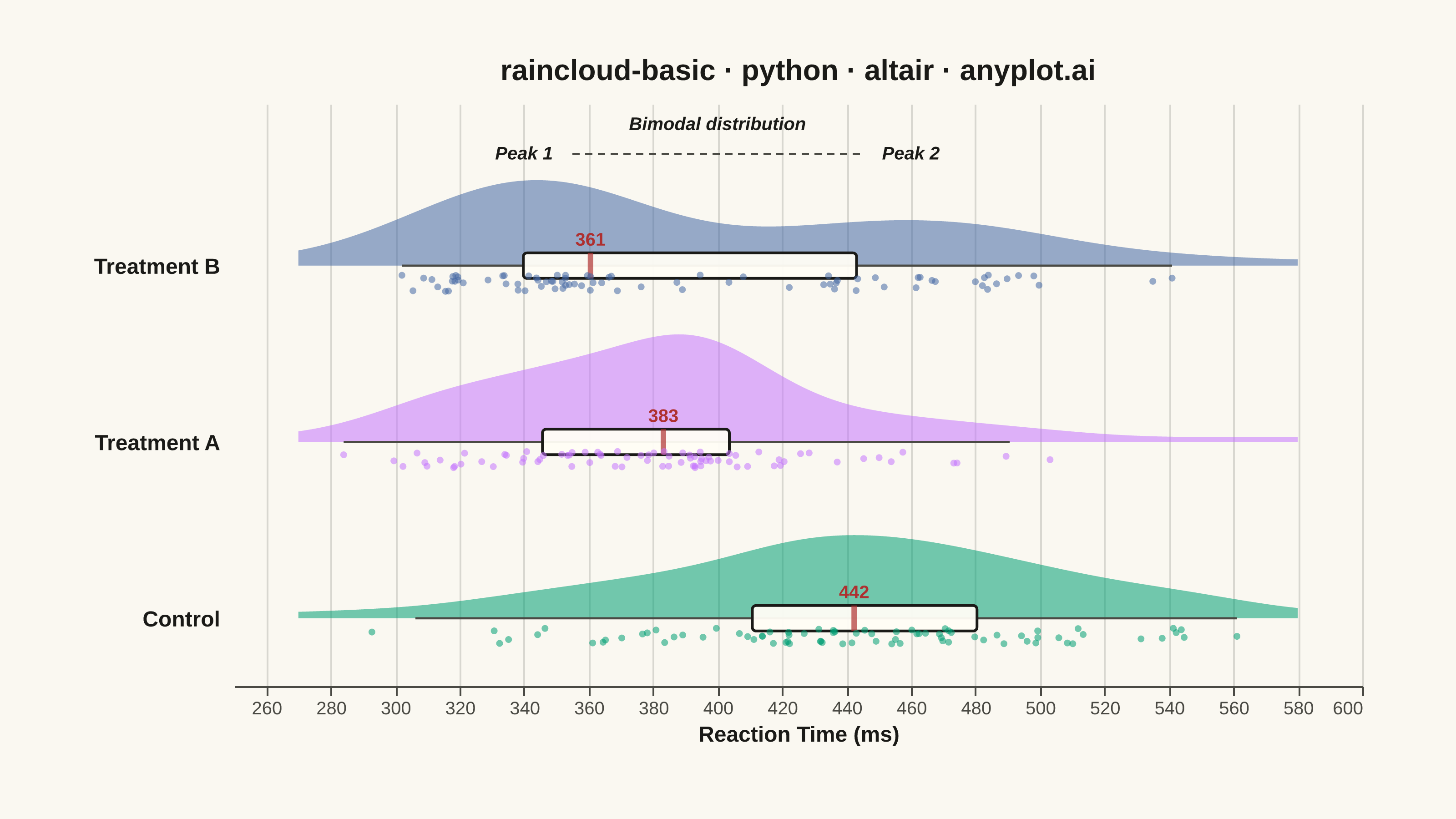
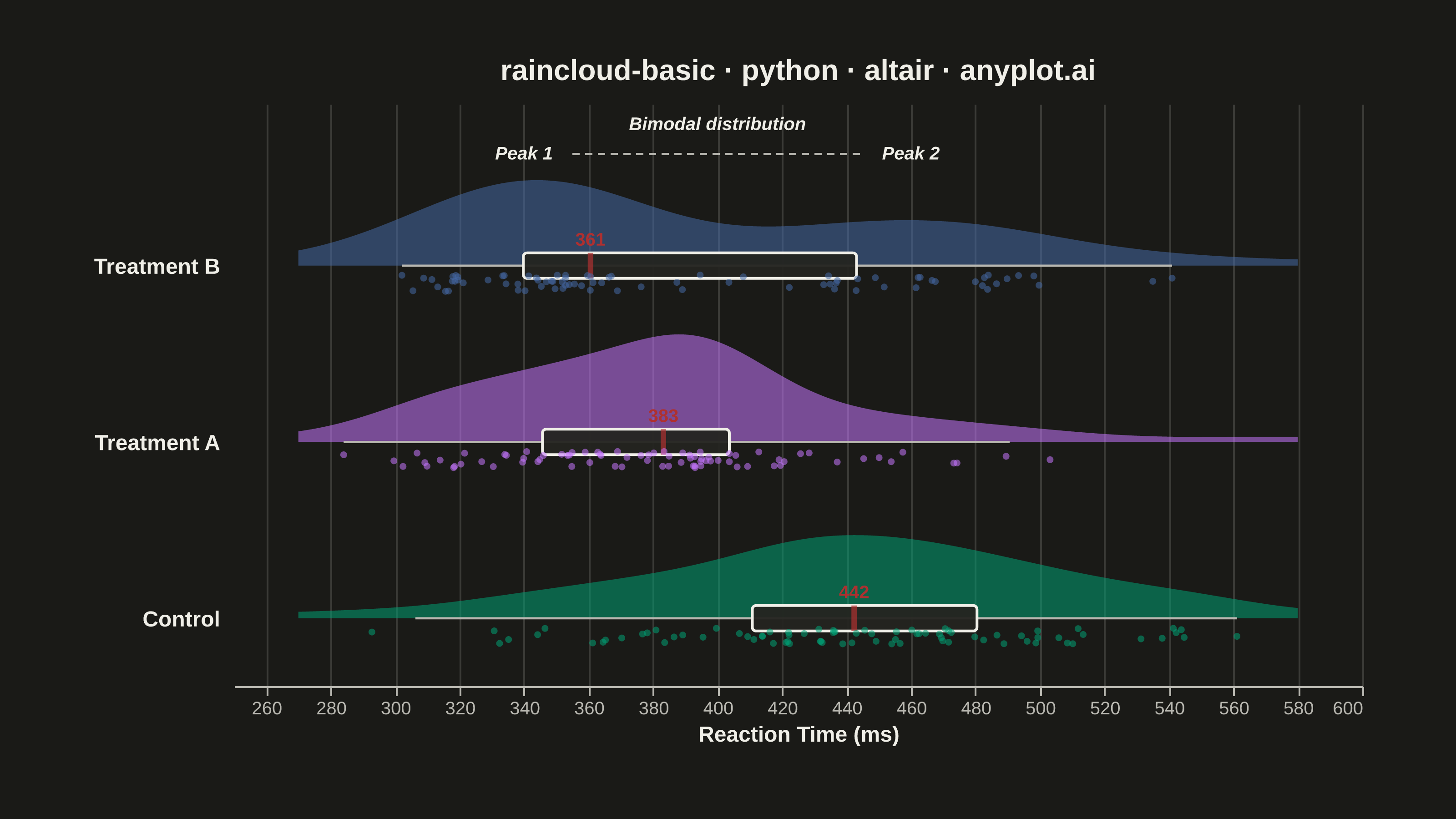
A raincloud plot combines three visualization elements—a half-violin (the "cloud"), jittered strip points (the "rain"), and a box plot—to provide a comprehensive view of data distribution. This hybrid approach shows distribution shape, summary statistics, and individual observations simultaneously, addressing the limitation of box plots that can hide multimodal distributions. Often called the "gold standard" for transparent statistical visualization in scientific publications.
""" anyplot.ai
raincloud-basic: Basic Raincloud Plot
Library: altair 6.1.0 | Python 3.13.13
Quality: 91/100 | Updated: 2026-05-26
"""

import os
import sys


# Avoid shadowing the installed altair package with this file's directory
sys.path[:] = [p for p in sys.path if os.path.realpath(p or ".") != os.path.dirname(os.path.realpath(__file__))]

import altair as alt
import numpy as np
import pandas as pd
from PIL import Image


# Theme tokens
THEME = os.getenv("ANYPLOT_THEME", "light")
PAGE_BG = "#FAF8F1" if THEME == "light" else "#1A1A17"
ELEVATED_BG = "#FFFDF6" if THEME == "light" else "#242420"
INK = "#1A1A17" if THEME == "light" else "#F0EFE8"
INK_SOFT = "#4A4A44" if THEME == "light" else "#B8B7B0"

# Imprint palette — first three positions for three abstract categories
COLORS = ["#009E73", "#C475FD", "#4467A3"]
SEMANTIC_RED = "#AE3030"  # palette position 5 — median highlight

# Data: Reaction times (ms) across three experimental conditions
np.random.seed(42)
control = np.random.normal(450, 60, 80)
treatment_a = np.random.normal(380, 50, 80)
treatment_b = np.concatenate([np.random.normal(340, 25, 50), np.random.normal(460, 35, 30)])

condition_order = ["Control", "Treatment A", "Treatment B"]
data = pd.DataFrame(
    {
        "condition": ["Control"] * 80 + ["Treatment A"] * 80 + ["Treatment B"] * 80,
        "reaction_time": np.concatenate([control, treatment_a, treatment_b]),
    }
)

# Map conditions to numeric y baselines (1.5 spacing between rows)
condition_map = {c: i * 1.5 for i, c in enumerate(condition_order)}
data["condition_num"] = data["condition"].map(condition_map)

# Rain positions — jittered BELOW each baseline
data["jitter_pos"] = data["condition_num"] + np.random.uniform(-0.22, -0.08, len(data))

# Box plot statistics per condition
box_rows = []
for cond in condition_order:
    vals = data.loc[data["condition"] == cond, "reaction_time"]
    q1, med, q3 = vals.quantile([0.25, 0.5, 0.75])
    iqr = q3 - q1
    box_rows.append(
        {
            "condition": cond,
            "condition_num": condition_map[cond],
            "q1": q1,
            "median": med,
            "q3": q3,
            "lower_w": max(q1 - 1.5 * iqr, vals.min()),
            "upper_w": min(q3 + 1.5 * iqr, vals.max()),
        }
    )
box_df = pd.DataFrame(box_rows)

# Scales
x_min, x_max = data["reaction_time"].min(), data["reaction_time"].max()
x_pad = (x_max - x_min) * 0.06
x_domain = [round(x_min - x_pad, -1), round(x_max + x_pad, -1)]
x_scale = alt.Scale(domain=x_domain)
y_domain = [-0.5, 4.3]
y_scale = alt.Scale(domain=y_domain)
color_scale = alt.Scale(domain=condition_order, range=COLORS)

# Native y-axis labels for the three condition baselines
y_axis = alt.Axis(
    values=[0, 1.5, 3.0],
    labelExpr=(
        "datum.value === 0 ? 'Control' : datum.value === 1.5 ? 'Treatment A' : datum.value === 3 ? 'Treatment B' : ''"
    ),
    title=None,
    labelFontSize=12,
    labelFontWeight="bold",
    labelColor=INK,
    labelPadding=8,
    domain=False,
    ticks=False,
    grid=False,
)

# Half-violin "cloud" — extends ABOVE the baseline
violin = (
    alt.Chart(data)
    .transform_density(
        "reaction_time", as_=["reaction_time", "density"], groupby=["condition", "condition_num"], extent=x_domain
    )
    .transform_calculate(violin_pos="datum.condition_num + 0.04 + datum.density * 100")
    .mark_area(orient="vertical", opacity=0.55, interpolate="monotone")
    .encode(
        x=alt.X("reaction_time:Q", title="Reaction Time (ms)", scale=x_scale),
        y=alt.Y("condition_num:Q", axis=y_axis, scale=y_scale),
        y2="violin_pos:Q",
        color=alt.Color("condition:N", scale=color_scale, legend=None),
        tooltip=[
            alt.Tooltip("condition:N", title="Condition"),
            alt.Tooltip("reaction_time:Q", title="Reaction Time (ms)", format=".0f"),
        ],
    )
)

# IQR box — elevated fill with INK outline distinguishes from cloud
box_iqr = (
    alt.Chart(box_df)
    .mark_bar(height=14, stroke=INK, strokeWidth=1.5, cornerRadius=2, fill=ELEVATED_BG, fillOpacity=0.95)
    .encode(x=alt.X("q1:Q", scale=x_scale), x2="q3:Q", y=alt.Y("condition_num:Q", scale=y_scale))
)

# Median tick — semantic red
box_median = (
    alt.Chart(box_df)
    .mark_tick(thickness=3, color=SEMANTIC_RED, orient="vertical", size=14)
    .encode(x=alt.X("median:Q", scale=x_scale), y=alt.Y("condition_num:Q", scale=y_scale))
)

# Whisker rules
box_whiskers = (
    alt.Chart(box_df)
    .mark_rule(strokeWidth=1.2, color=INK_SOFT)
    .encode(x=alt.X("lower_w:Q", scale=x_scale), x2="upper_w:Q", y=alt.Y("condition_num:Q", scale=y_scale))
)

# Rain — jittered strip BELOW the baseline
strip = (
    alt.Chart(data)
    .mark_circle(size=14, opacity=0.55)
    .encode(
        x=alt.X("reaction_time:Q", scale=x_scale),
        y=alt.Y("jitter_pos:Q", scale=y_scale),
        color=alt.Color("condition:N", scale=color_scale, legend=None),
        tooltip=[
            alt.Tooltip("condition:N", title="Condition"),
            alt.Tooltip("reaction_time:Q", title="Reaction Time (ms)", format=".1f"),
        ],
    )
)

# Bimodality annotation for Treatment B (data storytelling)
annotation_df = pd.DataFrame([{"x": 340, "y": 3.95, "text": "Peak 1"}, {"x": 460, "y": 3.95, "text": "Peak 2"}])
bimodal_labels = (
    alt.Chart(annotation_df)
    .mark_text(fontSize=10, fontStyle="italic", color=INK, fontWeight="bold")
    .encode(x="x:Q", y=alt.Y("y:Q", scale=y_scale), text="text:N")
)

arrow_df = pd.DataFrame([{"x": 355, "y": 3.95, "x2": 445, "y2": 3.95}])
bimodal_arrow = (
    alt.Chart(arrow_df)
    .mark_rule(strokeDash=[4, 3], color=INK_SOFT, strokeWidth=1.2)
    .encode(x="x:Q", y=alt.Y("y:Q", scale=y_scale), x2="x2:Q", y2="y2:Q")
)

note_df = pd.DataFrame([{"x": 400, "y": 4.20, "text": "Bimodal distribution"}])
bimodal_note = (
    alt.Chart(note_df)
    .mark_text(fontSize=10, color=INK, fontStyle="italic", fontWeight="bold")
    .encode(x="x:Q", y=alt.Y("y:Q", scale=y_scale), text="text:N")
)

# Median value labels above each box
median_labels = (
    alt.Chart(box_df)
    .mark_text(fontSize=10, color=SEMANTIC_RED, fontWeight="bold", dy=-14)
    .encode(
        x=alt.X("median:Q", scale=x_scale),
        y=alt.Y("condition_num:Q", scale=y_scale),
        text=alt.Text("median:Q", format=".0f"),
    )
)

chart = (
    alt.layer(
        violin, box_whiskers, box_iqr, box_median, median_labels, strip, bimodal_labels, bimodal_arrow, bimodal_note
    )
    .properties(
        width=620,
        height=320,
        background=PAGE_BG,
        title=alt.Title(
            "raincloud-basic · python · altair · anyplot.ai",
            fontSize=16,
            fontWeight="bold",
            anchor="middle",
            offset=10,
            color=INK,
        ),
    )
    .configure(padding={"left": 15, "right": 15, "top": 5, "bottom": 15})
    .configure_view(fill=PAGE_BG, stroke=None)
    .configure_axis(
        labelFontSize=10,
        titleFontSize=12,
        titleFontWeight="bold",
        domainColor=INK_SOFT,
        tickColor=INK_SOFT,
        gridColor=INK,
        gridOpacity=0.15,
        labelColor=INK_SOFT,
        titleColor=INK,
    )
    .configure_title(color=INK)
    .interactive()
)

# Save PNG, then pad to canonical 3200×1800 with PAGE_BG
chart.save(f"plot-{THEME}.png", scale_factor=4.0)

TW, TH = 3200, 1800
_img = Image.open(f"plot-{THEME}.png").convert("RGB")
_w, _h = _img.size
if _w > TW or _h > TH:
    raise SystemExit(
        f"altair vl-convert produced {_w}×{_h}, exceeds target {TW}×{TH}. "
        f"Shrink chart .properties(width=, height=) values and re-render."
    )
if _w < TW or _h < TH:
    _canvas = Image.new("RGB", (TW, TH), PAGE_BG)
    _canvas.paste(_img, ((TW - _w) // 2, (TH - _h) // 2))
    _canvas.save(f"plot-{THEME}.png")

# Save HTML (interactive)
chart.save(f"plot-{THEME}.html")
Runnable source as JSON, for any HTTP client: https://api.anyplot.ai/specs/raincloud-basic/altair/code. Any spec id and library id listed in llms-full.txt fit the same URL shape; every URL below is complete and callable.
{
  "spec_id": "raincloud-basic",
  "language": "python",
  "library": "altair",
  "page": "https://anyplot.ai/raincloud-basic/python/altair",
  "hub": "https://anyplot.ai/raincloud-basic",
  "code_json": "https://api.anyplot.ai/specs/raincloud-basic/altair/code",
  "spec_json": "https://api.anyplot.ai/specs/raincloud-basic",
  "render_light_png": "https://storage.googleapis.com/anyplot-images/plots/raincloud-basic/python/altair/plot-light.png",
  "render_dark_png": "https://storage.googleapis.com/anyplot-images/plots/raincloud-basic/python/altair/plot-dark.png",
  "interactive_light_html": "https://storage.googleapis.com/anyplot-images/plots/raincloud-basic/python/altair/plot-light.html",
  "interactive_dark_html": "https://storage.googleapis.com/anyplot-images/plots/raincloud-basic/python/altair/plot-dark.html",
  "quality_score": 91.0,
  "license": "MIT",
  "guide": "https://anyplot.ai/llms.txt"
}
Part of Basic Raincloud Plot on anyplot.ai.