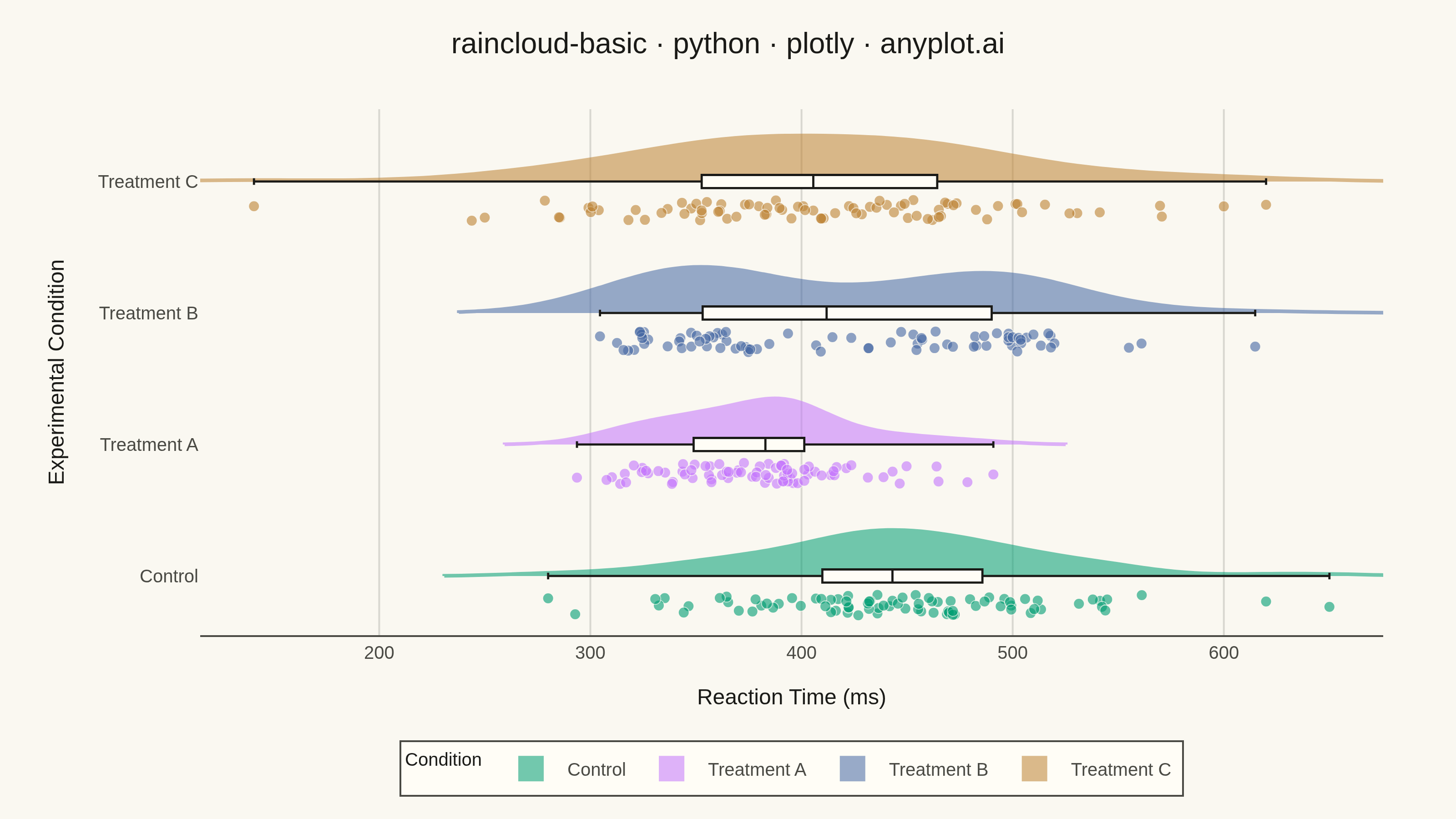
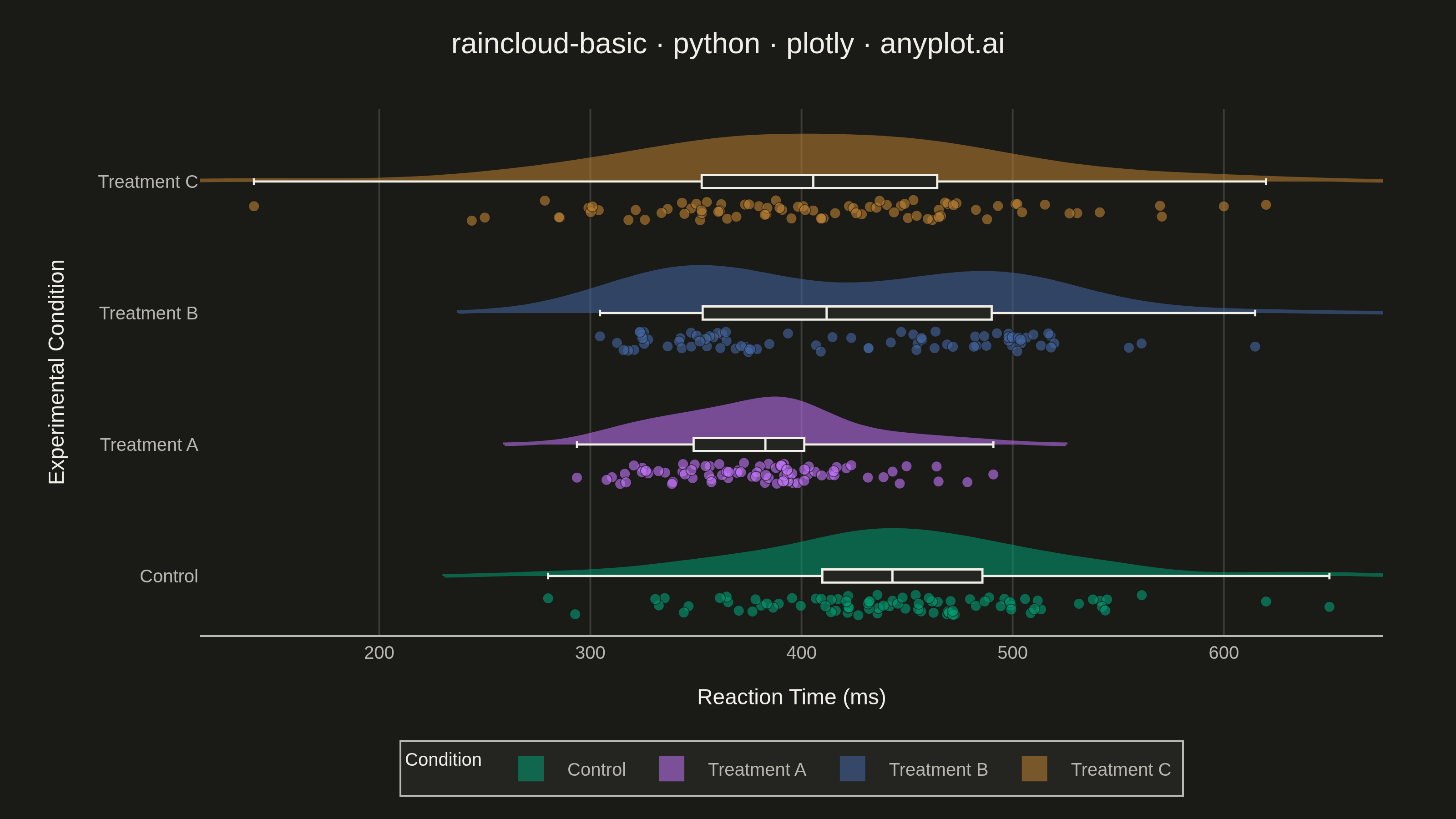
A raincloud plot combines three visualization elements—a half-violin (the "cloud"), jittered strip points (the "rain"), and a box plot—to provide a comprehensive view of data distribution. This hybrid approach shows distribution shape, summary statistics, and individual observations simultaneously, addressing the limitation of box plots that can hide multimodal distributions. Often called the "gold standard" for transparent statistical visualization in scientific publications.
""" anyplot.ai
raincloud-basic: Basic Raincloud Plot
Library: plotly 6.7.0 | Python 3.13.13
Quality: 89/100 | Updated: 2026-05-26
"""

import os

import numpy as np
import plotly.graph_objects as go


# Theme tokens
THEME = os.getenv("ANYPLOT_THEME", "light")
PAGE_BG = "#FAF8F1" if THEME == "light" else "#1A1A17"
ELEVATED_BG = "#FFFDF6" if THEME == "light" else "#242420"
INK = "#1A1A17" if THEME == "light" else "#F0EFE8"
INK_SOFT = "#4A4A44" if THEME == "light" else "#B8B7B0"
GRID = "rgba(26,26,23,0.15)" if THEME == "light" else "rgba(240,239,232,0.15)"

# anyplot categorical palette — first series is always brand green
IMPRINT_PALETTE = ["#009E73", "#C475FD", "#4467A3", "#BD8233"]

# Data — reaction times (ms) across experimental conditions
np.random.seed(42)
conditions = ["Control", "Treatment A", "Treatment B", "Treatment C"]
n_per_group = 80

data = {
    "Control": np.random.normal(450, 60, n_per_group),
    "Treatment A": np.random.normal(380, 45, n_per_group),
    "Treatment B": np.concatenate(
        [np.random.normal(350, 30, n_per_group // 2), np.random.normal(480, 35, n_per_group // 2)]
    ),
    "Treatment C": np.random.normal(400, 80, n_per_group),
}
data["Control"] = np.append(data["Control"], [620, 650, 280])
data["Treatment C"] = np.append(data["Treatment C"], [600, 620, 250])

# X-axis range from data with padding
all_values = np.concatenate(list(data.values()))
x_min, x_max = all_values.min(), all_values.max()
x_padding = (x_max - x_min) * 0.05
x_range = [x_min - x_padding, x_max + x_padding]

# Plot
fig = go.Figure()

cloud_width = 0.7
box_width = 0.10
rain_offset = -0.22
rain_jitter_amp = 0.08

for i, (condition, values) in enumerate(data.items()):
    color = IMPRINT_PALETTE[i]
    y_base = np.full(len(values), i)

    # Cloud — half-violin extending upward above the category baseline
    fig.add_trace(
        go.Violin(
            x=values,
            y=y_base,
            side="positive",
            width=cloud_width,
            line_color=color,
            fillcolor=color,
            opacity=0.55,
            meanline_visible=False,
            box_visible=False,
            points=False,
            name=condition,
            legendgroup=condition,
            showlegend=False,
            hoveron="violins",
            hoverinfo="x+name",
            orientation="h",
            scalemode="width",
        )
    )

    # Box plot — centered on the category baseline, outline tinted with category color
    fig.add_trace(
        go.Box(
            x=values,
            y=y_base,
            width=box_width,
            marker_color=color,
            line={"color": color, "width": 1.6},
            fillcolor=ELEVATED_BG,
            boxpoints=False,
            name=condition,
            legendgroup=condition,
            showlegend=False,
            orientation="h",
            hoverinfo="skip",
        )
    )

    # Rain — idiomatic scatter falling downward below the baseline
    rng = np.random.default_rng(42 + i)
    y_jitter = rng.uniform(-rain_jitter_amp, rain_jitter_amp, size=len(values))
    fig.add_trace(
        go.Scatter(
            x=values,
            y=i + rain_offset + y_jitter,
            mode="markers",
            marker={"size": 6, "color": color, "opacity": 0.6, "line": {"width": 0.5, "color": PAGE_BG}},
            name=condition,
            legendgroup=condition,
            showlegend=False,
            hovertemplate=f"<b>{condition}</b><br>%{{x:.0f}} ms<extra></extra>",
        )
    )

# Title — length-scaled fontsize (baseline 16px @ 67 chars)
title = "raincloud-basic · python · plotly · anyplot.ai"
title_fontsize = max(11, round(16 * 67 / len(title))) if len(title) > 67 else 16

# Layout
fig.update_layout(
    autosize=False,
    width=800,
    height=450,
    margin={"l": 110, "r": 40, "t": 60, "b": 60},
    paper_bgcolor=PAGE_BG,
    plot_bgcolor=PAGE_BG,
    title={
        "text": title,
        "font": {"size": title_fontsize, "color": INK},
        "x": 0.5,
        "xanchor": "center",
        "y": 0.96,
        "yanchor": "top",
    },
    font={"color": INK},
    yaxis={
        "title": {"text": "Experimental Condition", "font": {"size": 12, "color": INK}},
        "tickfont": {"size": 11, "color": INK_SOFT},
        "tickmode": "array",
        "tickvals": list(range(len(conditions))),
        "ticktext": conditions,
        "range": [-0.45, len(conditions) - 0.45],
        "showgrid": False,
        "zeroline": False,
        "showline": False,
        "ticks": "",
    },
    xaxis={
        "title": {"text": "Reaction Time (ms)", "font": {"size": 12, "color": INK}},
        "tickfont": {"size": 11, "color": INK_SOFT},
        "gridcolor": GRID,
        "gridwidth": 1,
        "range": x_range,
        "zeroline": False,
        "showline": True,
        "linecolor": INK_SOFT,
        "linewidth": 1,
    },
    violingap=0,
    violinmode="overlay",
    showlegend=False,
    hoverlabel={"bgcolor": ELEVATED_BG, "bordercolor": INK, "font": {"size": 11, "color": INK}},
)

# Save PNG (static) at the canonical landscape canvas: 3200×1800
fig.write_image(f"plot-{THEME}.png", width=800, height=450, scale=4)

# Save HTML with range slider for interactive exploration
fig.update_xaxes(rangeslider={"visible": True, "thickness": 0.05})
fig.write_html(f"plot-{THEME}.html", include_plotlyjs="cdn")
Runnable source as JSON, for any HTTP client: https://api.anyplot.ai/specs/raincloud-basic/plotly/code. Any spec id and library id listed in llms-full.txt fit the same URL shape; every URL below is complete and callable.
{
  "spec_id": "raincloud-basic",
  "language": "python",
  "library": "plotly",
  "page": "https://anyplot.ai/raincloud-basic/python/plotly",
  "hub": "https://anyplot.ai/raincloud-basic",
  "code_json": "https://api.anyplot.ai/specs/raincloud-basic/plotly/code",
  "spec_json": "https://api.anyplot.ai/specs/raincloud-basic",
  "render_light_png": "https://storage.googleapis.com/anyplot-images/plots/raincloud-basic/python/plotly/plot-light.png",
  "render_dark_png": "https://storage.googleapis.com/anyplot-images/plots/raincloud-basic/python/plotly/plot-dark.png",
  "interactive_light_html": "https://storage.googleapis.com/anyplot-images/plots/raincloud-basic/python/plotly/plot-light.html",
  "interactive_dark_html": "https://storage.googleapis.com/anyplot-images/plots/raincloud-basic/python/plotly/plot-dark.html",
  "quality_score": 89.0,
  "license": "MIT",
  "guide": "https://anyplot.ai/llms.txt"
}
Part of Basic Raincloud Plot on anyplot.ai.