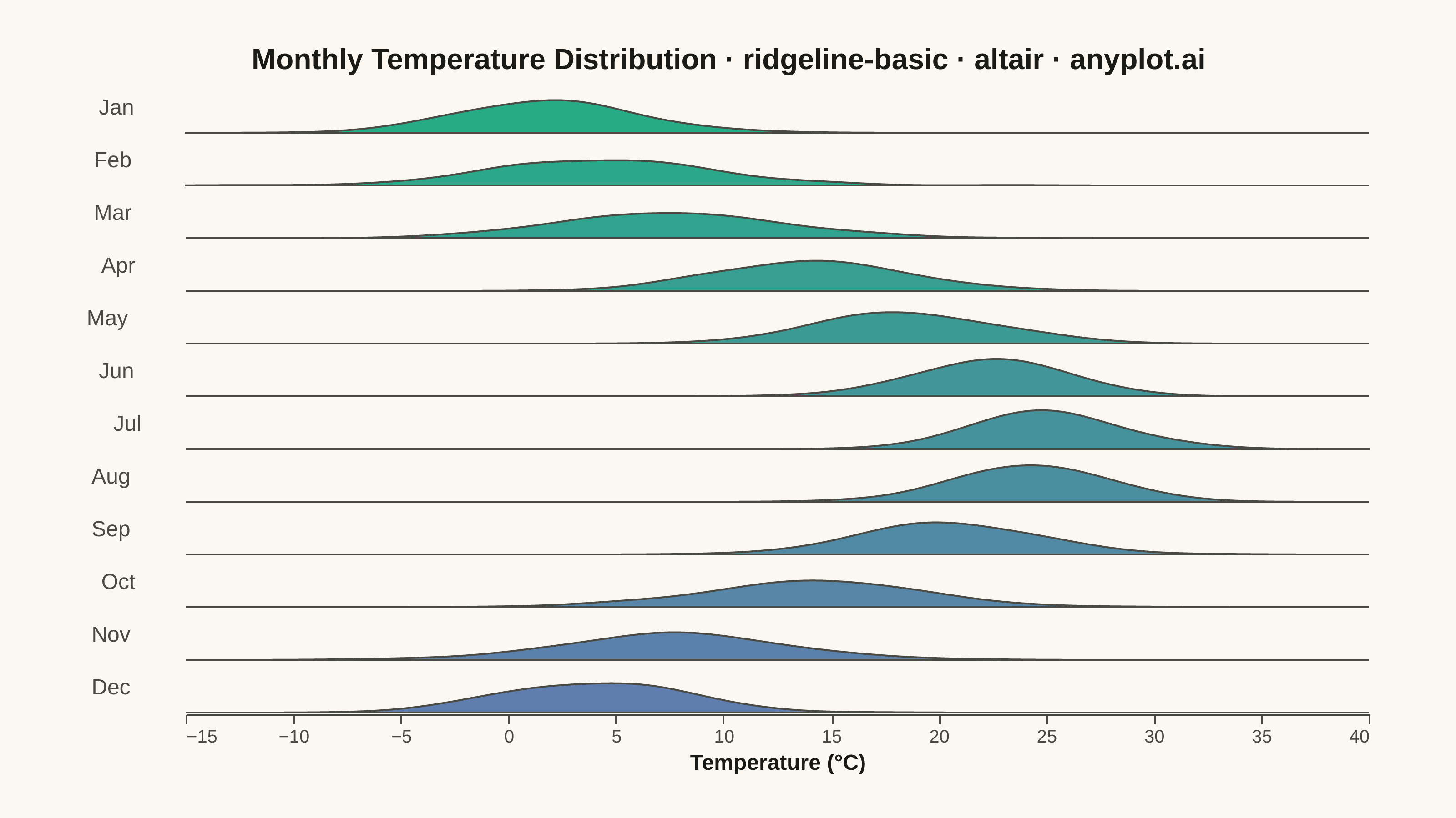
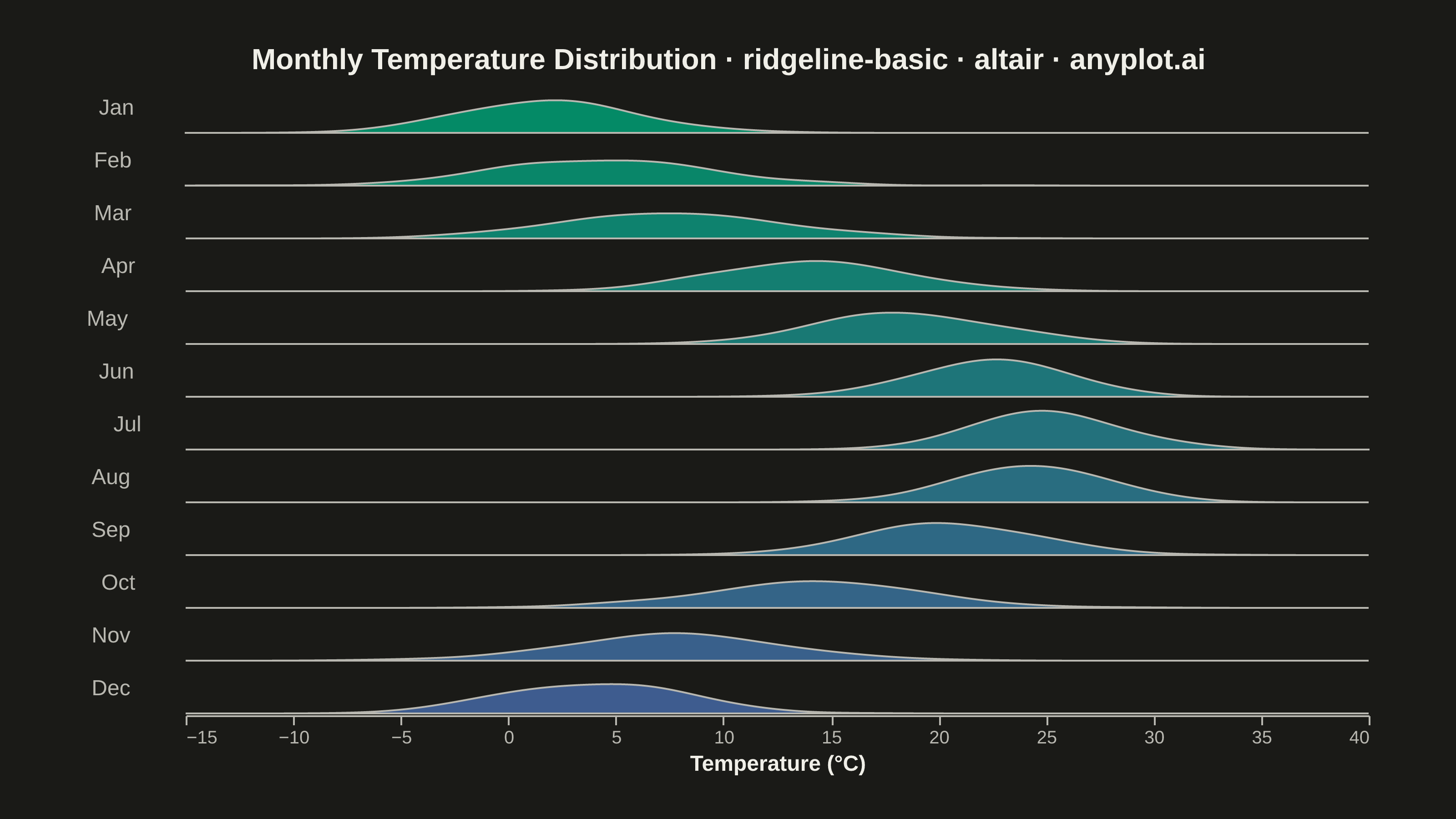
A ridgeline plot (also known as Joy Plot, named after the Joy Division album cover) displays the distribution of multiple groups by stacking partially overlapping density curves vertically. This creates a mountain ridge appearance that allows efficient comparison of many distributions simultaneously while maintaining a compact and visually striking presentation.
""" anyplot.ai
ridgeline-basic: Basic Ridgeline Plot
Library: altair 6.2.2 | Python 3.13.14
Quality: 93/100 | Updated: 2026-07-25
"""

import os

import altair as alt
import numpy as np
import pandas as pd
from PIL import Image


# Theme tokens
THEME = os.getenv("ANYPLOT_THEME", "light")
PAGE_BG = "#FAF8F1" if THEME == "light" else "#1A1A17"
ELEVATED_BG = "#FFFDF6" if THEME == "light" else "#242420"
INK = "#1A1A17" if THEME == "light" else "#F0EFE8"
INK_SOFT = "#4A4A44" if THEME == "light" else "#B8B7B0"

# Imprint sequential colormap (brand green -> blue) for the 12 ordered ridges
IMPRINT_SEQ = ["#009E73", "#4467A3"]
_c0 = tuple(int(IMPRINT_SEQ[0][i : i + 2], 16) for i in (1, 3, 5))
_c1 = tuple(int(IMPRINT_SEQ[1][i : i + 2], 16) for i in (1, 3, 5))
month_colors = [
    "#{:02x}{:02x}{:02x}".format(*(round(_c0[j] + (_c1[j] - _c0[j]) * i / 11) for j in range(3))) for i in range(12)
]

# Data
np.random.seed(42)
months = ["Jan", "Feb", "Mar", "Apr", "May", "Jun", "Jul", "Aug", "Sep", "Oct", "Nov", "Dec"]

data = []
base_temps = [2, 4, 8, 14, 18, 22, 25, 24, 20, 14, 8, 4]
temp_stds = [4, 5, 5, 4, 4, 3, 3, 3, 4, 5, 5, 4]

for i, month in enumerate(months):
    temps = np.random.normal(base_temps[i], temp_stds[i], 200)
    for t in temps:
        data.append({"month": month, "temperature": t, "month_order": i})

df = pd.DataFrame(data)

# Plot - ridgeline via row faceting with negative spacing for overlap
chart = (
    alt.Chart(df)
    .transform_density(
        density="temperature",
        as_=["temperature", "density"],
        groupby=["month", "month_order"],
        extent=[-15, 40],
        bandwidth=2,
    )
    .mark_area(fillOpacity=0.85, stroke=INK_SOFT, strokeWidth=1, interpolate="monotone")
    .encode(
        x=alt.X(
            "temperature:Q",
            title="Temperature (°C)",
            axis=alt.Axis(labelFontSize=10, titleFontSize=12, grid=False),
            scale=alt.Scale(domain=[-15, 40]),
        ),
        y=alt.Y("density:Q", title=None, axis=None, scale=alt.Scale(domain=[0, 0.15])),
        fill=alt.Fill("month_order:O", scale=alt.Scale(domain=list(range(12)), range=month_colors), legend=None),
        row=alt.Row(
            "month:N",
            sort=months,
            header=alt.Header(
                labelFontSize=12, labelAngle=0, labelAlign="right", labelPadding=8, title=None, labelColor=INK_SOFT
            ),
        ),
    )
    .properties(
        width=650,
        height=28,
        background=PAGE_BG,
        title=alt.Title(
            text="Monthly Temperature Distribution · ridgeline-basic · altair · anyplot.ai",
            fontSize=16,
            anchor="middle",
        ),
    )
    .configure_facet(spacing=-13)
    .configure_view(fill=PAGE_BG, stroke=None)
    .configure_axis(
        labelFontSize=10,
        titleFontSize=12,
        labelColor=INK_SOFT,
        titleColor=INK,
        domainColor=INK_SOFT,
        tickColor=INK_SOFT,
    )
    .configure_title(color=INK)
    .configure_header(labelColor=INK_SOFT)
)

# Save
chart.save(f"plot-{THEME}.png", scale_factor=4.0)

# PAD-only to exact target canvas — see prompts/library/altair.md "Canvas"
TW, TH = 3200, 1800
_img = Image.open(f"plot-{THEME}.png").convert("RGB")
_w, _h = _img.size
if _w > TW or _h > TH:
    raise SystemExit(
        f"altair vl-convert produced {_w}×{_h}, exceeds target {TW}×{TH}. "
        f"Shrink chart .properties(width=, height=) values and re-render."
    )
if _w < TW or _h < TH:
    _canvas = Image.new("RGB", (TW, TH), PAGE_BG)
    _canvas.paste(_img, ((TW - _w) // 2, (TH - _h) // 2))
    _canvas.save(f"plot-{THEME}.png")

chart.save(f"plot-{THEME}.html")
Runnable source as JSON, for any HTTP client: https://api.anyplot.ai/specs/ridgeline-basic/altair/code. Any spec id and library id listed in llms-full.txt fit the same URL shape; every URL below is complete and callable.
{
  "spec_id": "ridgeline-basic",
  "language": "python",
  "library": "altair",
  "page": "https://anyplot.ai/ridgeline-basic/python/altair",
  "hub": "https://anyplot.ai/ridgeline-basic",
  "code_json": "https://api.anyplot.ai/specs/ridgeline-basic/altair/code",
  "spec_json": "https://api.anyplot.ai/specs/ridgeline-basic",
  "render_light_png": "https://storage.googleapis.com/anyplot-images/plots/ridgeline-basic/python/altair/plot-light.png",
  "render_dark_png": "https://storage.googleapis.com/anyplot-images/plots/ridgeline-basic/python/altair/plot-dark.png",
  "interactive_light_html": "https://storage.googleapis.com/anyplot-images/plots/ridgeline-basic/python/altair/plot-light.html",
  "interactive_dark_html": "https://storage.googleapis.com/anyplot-images/plots/ridgeline-basic/python/altair/plot-dark.html",
  "quality_score": 93.0,
  "license": "MIT",
  "guide": "https://anyplot.ai/llms.txt"
}
Part of Basic Ridgeline Plot on anyplot.ai.