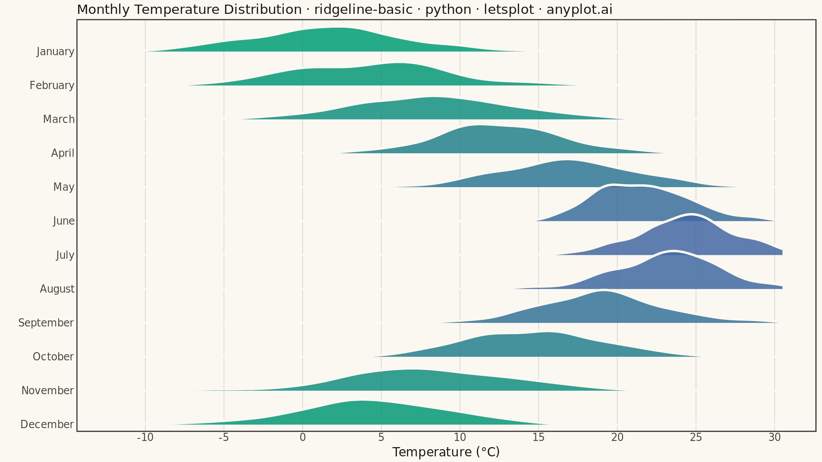
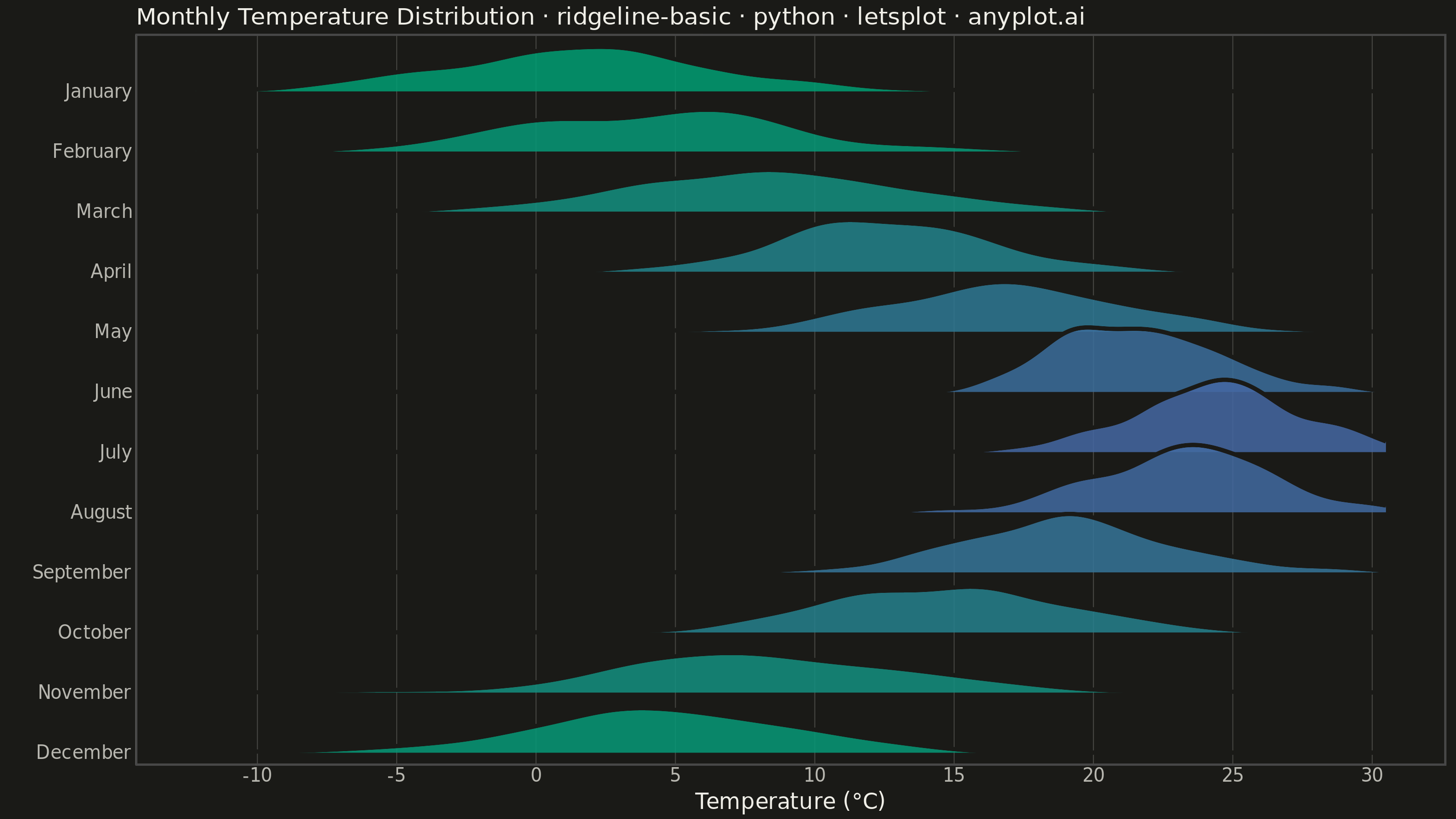
A ridgeline plot (also known as Joy Plot, named after the Joy Division album cover) displays the distribution of multiple groups by stacking partially overlapping density curves vertically. This creates a mountain ridge appearance that allows efficient comparison of many distributions simultaneously while maintaining a compact and visually striking presentation.
""" anyplot.ai
ridgeline-basic: Basic Ridgeline Plot
Library: letsplot 4.11.0 | Python 3.13.14
Quality: 92/100 | Updated: 2026-07-25
"""

import os

import numpy as np
import pandas as pd
from lets_plot import *
from lets_plot.export import ggsave as export_ggsave


LetsPlot.setup_html()

THEME = os.getenv("ANYPLOT_THEME", "light")
PAGE_BG = "#FAF8F1" if THEME == "light" else "#1A1A17"
INK = "#1A1A17" if THEME == "light" else "#F0EFE8"
INK_SOFT = "#4A4A44" if THEME == "light" else "#B8B7B0"
RULE = "rgba(26,26,23,0.2)" if THEME == "light" else "rgba(240,239,232,0.2)"

# Data - Monthly temperature distributions (realistic weather data)
np.random.seed(42)

months = [
    "January",
    "February",
    "March",
    "April",
    "May",
    "June",
    "July",
    "August",
    "September",
    "October",
    "November",
    "December",
]

# Temperature parameters (mean, std) for each month - Northern hemisphere pattern
temp_params = {
    "January": (2, 5),
    "February": (4, 5),
    "March": (8, 5),
    "April": (13, 4),
    "May": (17, 4),
    "June": (21, 3),
    "July": (24, 3),
    "August": (23, 3),
    "September": (19, 4),
    "October": (14, 4),
    "November": (8, 5),
    "December": (4, 5),
}

# Generate temperature observations for each month
data = []
for month in months:
    mean, std = temp_params[month]
    temps = np.random.normal(mean, std, 150)
    for t in temps:
        data.append({"Month": month, "Temperature": t})

df = pd.DataFrame(data)

# Convert month to categorical with correct order (reversed for ridgeline bottom-to-top)
df["Month"] = pd.Categorical(df["Month"], categories=months[::-1], ordered=True)

# Imprint imprint_seq gradient (brand green -> blue), keyed by each month's mean
# temperature rather than calendar order: single-polarity intensity encoding, per
# the style guide's "Continuous Data" rule, so hue reads as a temperature story
# (coldest months green, warmest months blue) instead of an arbitrary sequence.
# Intentional exception to the 8-slot categorical palette: this chart type needs
# all 12 groups visible at once, so small multiples (the 9+ series guidance) would
# defeat the point of a ridgeline; every group still stays within the Imprint family.
means = [temp_params[month][0] for month in months]
mean_lo, mean_hi = min(means), max(means)
month_colors = {
    month: "#{:02X}{:02X}{:02X}".format(
        *(
            round(a + (b - a) * (temp_params[month][0] - mean_lo) / (mean_hi - mean_lo))
            for a, b in zip((0x00, 0x9E, 0x73), (0x44, 0x67, 0xA3), strict=True)
        )
    )
    for month in months
}

plot = (
    ggplot(df, aes(x="Temperature", y="Month", fill="Month"))
    + geom_area_ridges(
        scale=1.2,  # Overlap amount (>1 means overlap)
        alpha=0.85,
        size=1.0,  # Border thickness
        color=PAGE_BG,  # Border matches page background for clean ridge separation
    )
    + scale_fill_manual(values=month_colors)
    + labs(
        x="Temperature (°C)",
        y="",
        title="Monthly Temperature Distribution · ridgeline-basic · python · letsplot · anyplot.ai",
    )
    + theme_minimal()
    + theme(
        plot_background=element_rect(fill=PAGE_BG, color=PAGE_BG),
        panel_background=element_rect(fill=PAGE_BG),
        axis_title=element_text(size=12, color=INK),
        axis_text_x=element_text(size=10, color=INK_SOFT),
        axis_text_y=element_text(size=10, color=INK_SOFT),
        axis_line=element_line(color=INK_SOFT),
        plot_title=element_text(size=13, color=INK),
        legend_position="none",  # Y-axis labels are sufficient; fill encodes temperature intensity
        panel_border=element_blank(),
        panel_grid_major_y=element_blank(),
        panel_grid_major_x=element_line(color=RULE, size=0.5),
        panel_grid_minor=element_blank(),
    )
    + ggsize(800, 450)
)

# Save PNG (scale 4x for 3200x1800) and HTML
export_ggsave(plot, f"plot-{THEME}.png", path=".", scale=4)
export_ggsave(plot, f"plot-{THEME}.html", path=".")
Runnable source as JSON, for any HTTP client: https://api.anyplot.ai/specs/ridgeline-basic/letsplot/code. Any spec id and library id listed in llms-full.txt fit the same URL shape; every URL below is complete and callable.
{
  "spec_id": "ridgeline-basic",
  "language": "python",
  "library": "letsplot",
  "page": "https://anyplot.ai/ridgeline-basic/python/letsplot",
  "hub": "https://anyplot.ai/ridgeline-basic",
  "code_json": "https://api.anyplot.ai/specs/ridgeline-basic/letsplot/code",
  "spec_json": "https://api.anyplot.ai/specs/ridgeline-basic",
  "render_light_png": "https://storage.googleapis.com/anyplot-images/plots/ridgeline-basic/python/letsplot/plot-light.png",
  "render_dark_png": "https://storage.googleapis.com/anyplot-images/plots/ridgeline-basic/python/letsplot/plot-dark.png",
  "interactive_light_html": "https://storage.googleapis.com/anyplot-images/plots/ridgeline-basic/python/letsplot/plot-light.html",
  "interactive_dark_html": "https://storage.googleapis.com/anyplot-images/plots/ridgeline-basic/python/letsplot/plot-dark.html",
  "quality_score": 92.0,
  "license": "MIT",
  "guide": "https://anyplot.ai/llms.txt"
}
Part of Basic Ridgeline Plot on anyplot.ai.