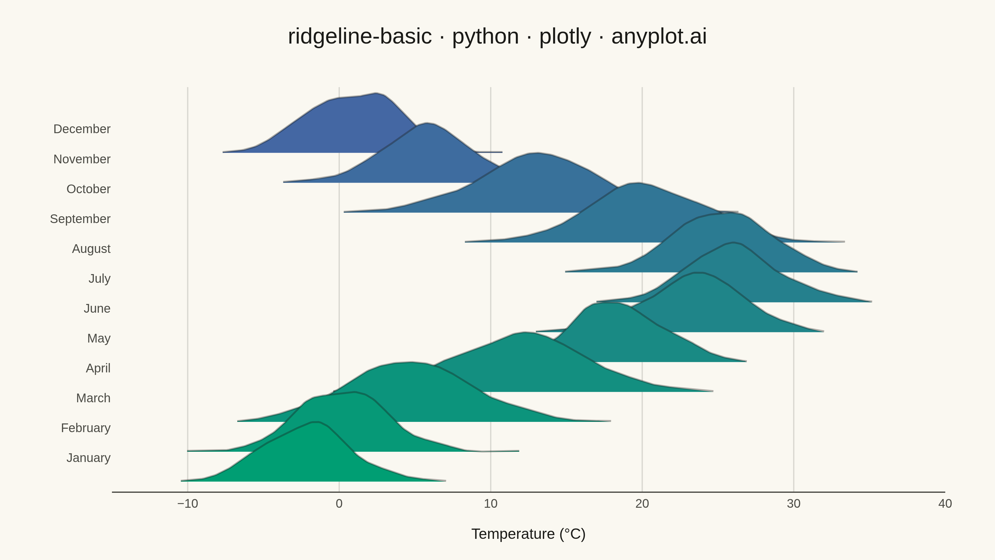
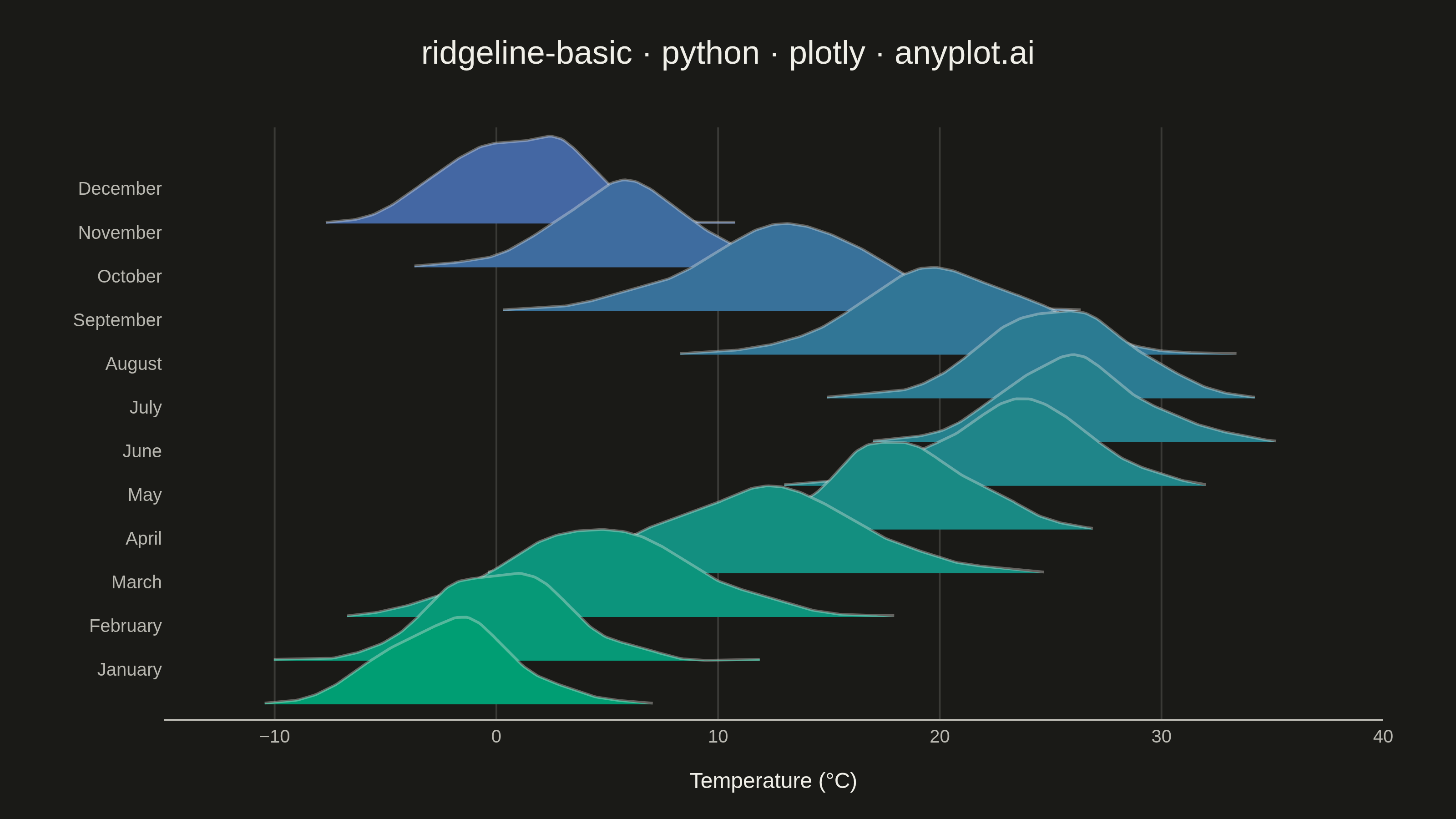
A ridgeline plot (also known as Joy Plot, named after the Joy Division album cover) displays the distribution of multiple groups by stacking partially overlapping density curves vertically. This creates a mountain ridge appearance that allows efficient comparison of many distributions simultaneously while maintaining a compact and visually striking presentation.
""" anyplot.ai
ridgeline-basic: Basic Ridgeline Plot
Library: plotly 6.9.0 | Python 3.13.14
Quality: 87/100 | Updated: 2026-07-25
"""

import os

import numpy as np
import plotly.colors
import plotly.graph_objects as go
from scipy.stats import gaussian_kde


# Theme tokens
THEME = os.getenv("ANYPLOT_THEME", "light")
PAGE_BG = "#FAF8F1" if THEME == "light" else "#1A1A17"
INK = "#1A1A17" if THEME == "light" else "#F0EFE8"
INK_SOFT = "#4A4A44" if THEME == "light" else "#B8B7B0"
GRID = "rgba(26,26,23,0.15)" if THEME == "light" else "rgba(240,239,232,0.15)"
LINE_EDGE = "rgba(26,26,23,0.35)" if THEME == "light" else "rgba(240,239,232,0.35)"

# Data - Monthly temperature distributions (Northern hemisphere)
np.random.seed(42)

months = [
    "January",
    "February",
    "March",
    "April",
    "May",
    "June",
    "July",
    "August",
    "September",
    "October",
    "November",
    "December",
]

base_temps = [-2, 0, 5, 12, 18, 23, 26, 25, 20, 13, 6, 1]
data = {}
for i, month in enumerate(months):
    std = 4 if i in [2, 3, 8, 9] else 3
    data[month] = np.random.normal(base_temps[i], std, 200)

# X range for density evaluation
x_range = np.linspace(-15, 40, 400)

# Imprint sequential colormap (brand green -> blue) sampled across the chronological ridges
imprint_seq = [[0.0, "#009E73"], [1.0, "#4467A3"]]
colors = plotly.colors.sample_colorscale(imprint_seq, [i / 11 for i in range(12)])

# Plot
fig = go.Figure()

# Scaling for ridge height and ~50% overlap per spec
ridge_scale = 0.12
overlap = 0.5

# Add ridges December-to-January (back-to-front) so January sits at the bottom,
# each foreground ridge partially occluding the one behind it
for idx in reversed(range(len(months))):
    month = months[idx]
    temps = data[month]

    kde = gaussian_kde(temps)
    density = kde(x_range)
    density = density / density.max() * ridge_scale
    y_offset = idx * (1 - overlap) * ridge_scale

    # Crop each ridge to where its own density is non-negligible (>1.5% of
    # its peak) instead of plotting across the full shared x_range. The KDE
    # tails are asymptotically flat near zero, so evaluating every ridge
    # over the same wide range produced long near-baseline lines that cut
    # straight through neighboring ridges' fills.
    support = np.flatnonzero(density > 0.015 * ridge_scale)
    lo = max(support[0] - 1, 0)
    hi = min(support[-1] + 1, len(x_range) - 1)
    x_curve = x_range[lo : hi + 1]
    y_fill = density[lo : hi + 1] + y_offset

    # Fill trace: closed polygon (curve + flat baseline return path) with an
    # invisible line so only the shaded area shows, not the baseline itself.
    fig.add_trace(
        go.Scatter(
            x=np.concatenate([[x_curve[0]], x_curve, [x_curve[-1]]]),
            y=np.concatenate([[y_offset], y_fill, [y_offset]]),
            fill="toself",
            fillcolor=colors[idx],
            line={"width": 0},
            mode="lines",
            name=month,
            showlegend=False,
            hoverinfo="skip",
        )
    )

    # Outline trace: only the density curve itself, cropped to its own
    # support, so neighboring ridges aren't crossed by a baseline line.
    fig.add_trace(
        go.Scatter(
            x=x_curve,
            y=y_fill,
            mode="lines",
            line={"color": LINE_EDGE, "width": 1.5},
            showlegend=False,
            hovertemplate=f"{month}<br>Temperature: %{{x:.1f}}°C<extra></extra>",
        )
    )

# Y-tick positions aligned to ridge peaks (same idx-based offset as the traces above)
y_ticks = [idx * (1 - overlap) * ridge_scale + ridge_scale * 0.4 for idx in range(len(months))]

# Style
fig.update_layout(
    autosize=False,
    title={
        "text": "ridgeline-basic · python · plotly · anyplot.ai",
        "font": {"size": 18, "color": INK},
        "x": 0.5,
        "xanchor": "center",
    },
    xaxis={
        "title": {"text": "Temperature (°C)", "font": {"size": 12, "color": INK}},
        "tickfont": {"size": 10, "color": INK_SOFT},
        "range": [-15, 40],
        "gridcolor": GRID,
        "showgrid": True,
        "zeroline": False,
        "linecolor": INK_SOFT,
    },
    yaxis={
        "title": {"text": "", "font": {"size": 12}},
        "tickfont": {"size": 10, "color": INK_SOFT},
        "tickvals": y_ticks,
        "ticktext": months,
        "showgrid": False,
        "zeroline": False,
        "range": [-0.02, max(y_ticks) + ridge_scale * 0.7],
    },
    paper_bgcolor=PAGE_BG,
    plot_bgcolor=PAGE_BG,
    font={"color": INK},
    margin={"l": 90, "r": 40, "t": 70, "b": 55},
)

# Save
fig.write_image(f"plot-{THEME}.png", width=800, height=450, scale=4)
fig.write_html(f"plot-{THEME}.html", include_plotlyjs="cdn")
Runnable source as JSON, for any HTTP client: https://api.anyplot.ai/specs/ridgeline-basic/plotly/code. Any spec id and library id listed in llms-full.txt fit the same URL shape; every URL below is complete and callable.
{
  "spec_id": "ridgeline-basic",
  "language": "python",
  "library": "plotly",
  "page": "https://anyplot.ai/ridgeline-basic/python/plotly",
  "hub": "https://anyplot.ai/ridgeline-basic",
  "code_json": "https://api.anyplot.ai/specs/ridgeline-basic/plotly/code",
  "spec_json": "https://api.anyplot.ai/specs/ridgeline-basic",
  "render_light_png": "https://storage.googleapis.com/anyplot-images/plots/ridgeline-basic/python/plotly/plot-light.png",
  "render_dark_png": "https://storage.googleapis.com/anyplot-images/plots/ridgeline-basic/python/plotly/plot-dark.png",
  "interactive_light_html": "https://storage.googleapis.com/anyplot-images/plots/ridgeline-basic/python/plotly/plot-light.html",
  "interactive_dark_html": "https://storage.googleapis.com/anyplot-images/plots/ridgeline-basic/python/plotly/plot-dark.html",
  "quality_score": 87.0,
  "license": "MIT",
  "guide": "https://anyplot.ai/llms.txt"
}
Part of Basic Ridgeline Plot on anyplot.ai.