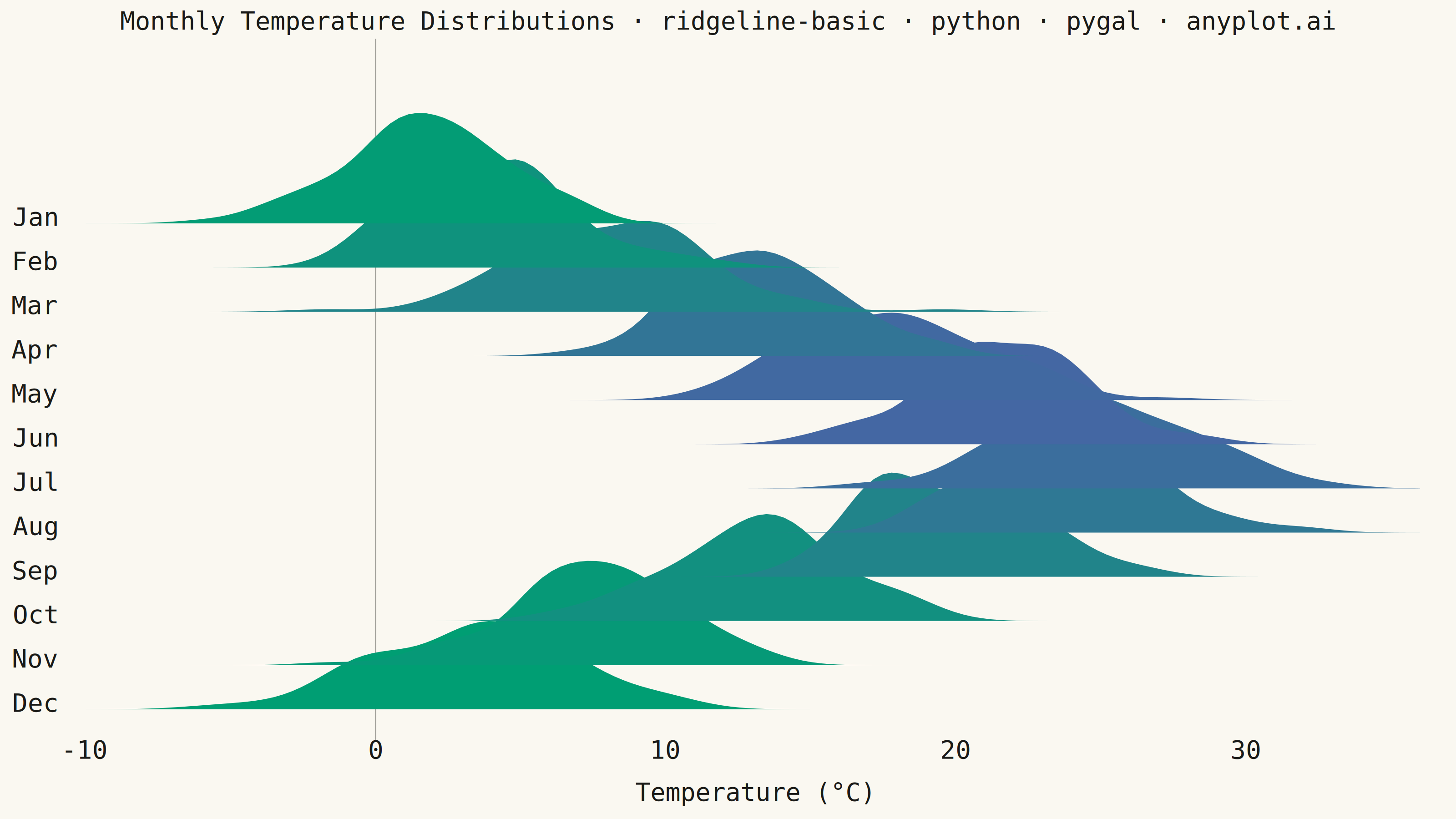
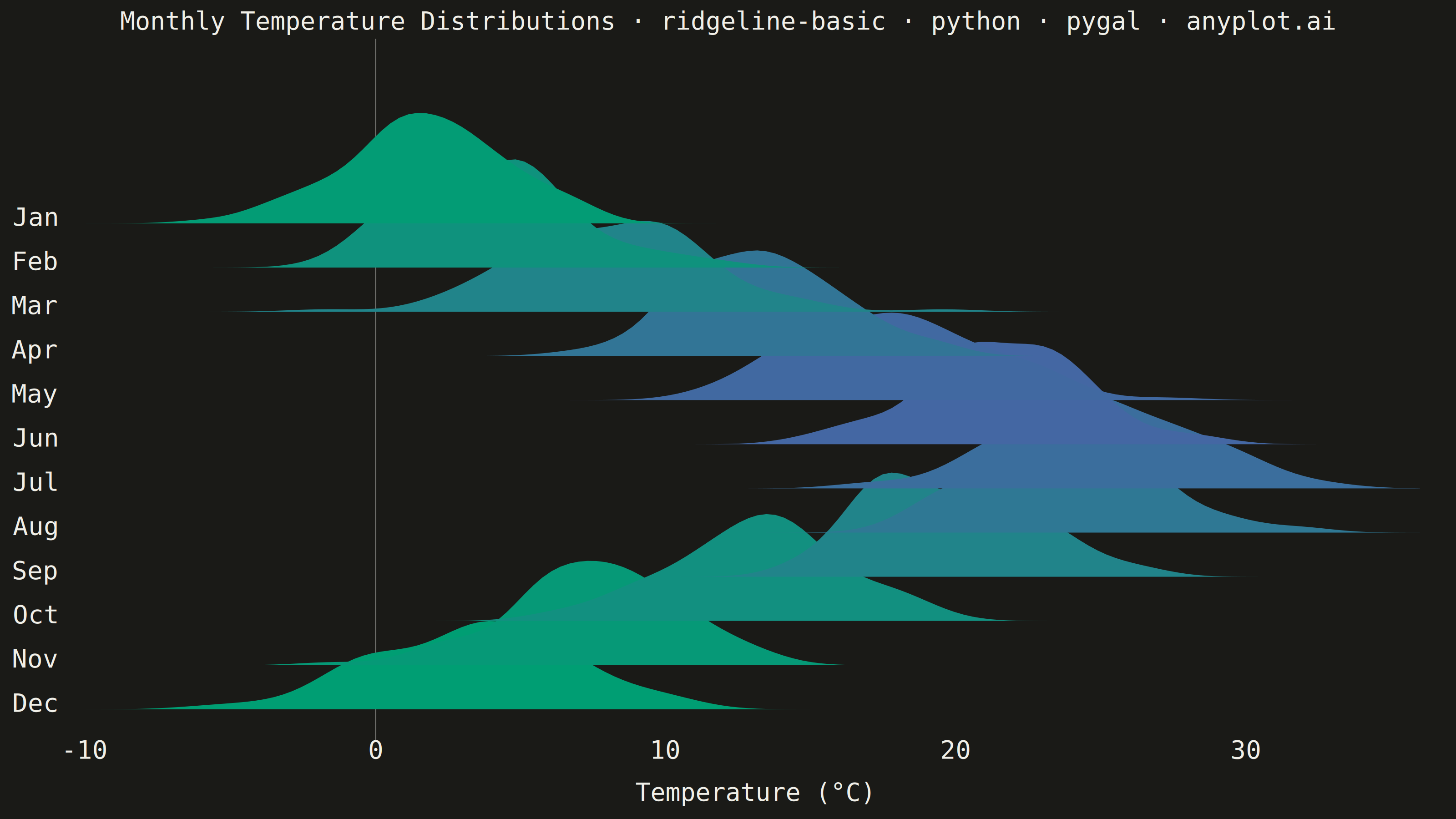
A ridgeline plot (also known as Joy Plot, named after the Joy Division album cover) displays the distribution of multiple groups by stacking partially overlapping density curves vertically. This creates a mountain ridge appearance that allows efficient comparison of many distributions simultaneously while maintaining a compact and visually striking presentation.
""" anyplot.ai
ridgeline-basic: Basic Ridgeline Plot
Library: pygal 3.1.3 | Python 3.13.14
Quality: 90/100 | Updated: 2026-07-25
"""

import os
import sys

import numpy as np


# Pop script directory so local pygal.py doesn't shadow the installed package
_script_dir = sys.path.pop(0)
import pygal
from pygal.style import Style


sys.path.insert(0, _script_dir)

# Theme tokens
THEME = os.getenv("ANYPLOT_THEME", "light")
PAGE_BG = "#FAF8F1" if THEME == "light" else "#1A1A17"
INK = "#1A1A17" if THEME == "light" else "#F0EFE8"
INK_MUTED = "#6B6A63" if THEME == "light" else "#A8A79F"

# Data - Monthly temperature distributions for a temperate city
np.random.seed(42)

months = ["Jan", "Feb", "Mar", "Apr", "May", "Jun", "Jul", "Aug", "Sep", "Oct", "Nov", "Dec"]

# Seasonal temperature baselines (°C)
base_temps = [2, 4, 8, 13, 18, 22, 25, 24, 19, 13, 7, 3]
month_data = []
for base in base_temps:
    temps = np.random.normal(base, 3, 100)
    month_data.append(temps)

# Common x range for all distributions
x_range = np.linspace(-10, 36, 150)

# Compute KDE for each month (inline, no functions)
kde_data = []
for temps in month_data:
    n = len(temps)
    bandwidth = n ** (-1 / 5) * np.std(temps)
    density = np.zeros_like(x_range)
    for xi in temps:
        density += np.exp(-0.5 * ((x_range - xi) / bandwidth) ** 2)
    density /= n * bandwidth * np.sqrt(2 * np.pi)
    kde_data.append(density)

# Normalize all densities
max_density = max(d.max() for d in kde_data)
kde_data = [d / max_density for d in kde_data]


# Imprint sequential colormap (single-polarity continuous data): brand green
# -> blue. Each ridge's mean temperature drives its position on the
# gradient, so color encodes the underlying continuous variable directly.
def _lerp_hex(c0, c1, t):
    r0, g0, b0 = (int(c0[i : i + 2], 16) for i in (1, 3, 5))
    r1, g1, b1 = (int(c1[i : i + 2], 16) for i in (1, 3, 5))
    r, g, b = (int(round(a + (b - a) * t)) for a, b in ((r0, r1), (g0, g1), (b0, b1)))
    return f"#{r:02X}{g:02X}{b:02X}"


temp_min, temp_max = min(base_temps), max(base_temps)
colors = tuple(_lerp_hex("#009E73", "#4467A3", (t - temp_min) / (temp_max - temp_min)) for t in base_temps)

# Title fontsize scales linearly off the 67-char baseline (see plot-generator.md)
title = "Monthly Temperature Distributions · ridgeline-basic · python · pygal · anyplot.ai"
title_font_size = max(44, round(66 * min(1.0, 67 / len(title))))

custom_style = Style(
    background=PAGE_BG,
    plot_background=PAGE_BG,
    foreground=INK,
    foreground_strong=INK,
    foreground_subtle=INK_MUTED,
    colors=colors,
    title_font_size=title_font_size,
    label_font_size=56,
    major_label_font_size=44,
    legend_font_size=44,
    value_font_size=36,
    # Fully opaque fills (painter's algorithm, back-to-front) instead of a
    # translucent stack — semi-transparent overlaps compound at each ridge's
    # flat baseline where they cross a neighbor's fill, producing a visible
    # seam line; opaque fills simply occlude what's behind with no blending.
    opacity=1,
    opacity_hover=1,
    # A pure `stroke-width: 0` CSS override is dropped by pygal's
    # get_strokes() (falsy check), and even a near-zero width still
    # rasterizes as a visible hairline in cairosvg — stroke_opacity=0 kills
    # the outline unambiguously so each ridge's flat polygon-bottom edge
    # doesn't read as a stray horizontal line.
    stroke_opacity=0,
)

# Ridge parameters — height/spacing ratio tuned for ~60% vertical overlap
ridge_height = 3.0
ridge_spacing = 1.2

# Y-axis labels positioned just above each ridge's own baseline (offset is a
# small fraction of ridge_spacing, not ridge_height, so the label hugs its
# own baseline instead of drifting toward the ridge above)
y_label_values = []
for i, month in enumerate(reversed(months)):
    y_label_values.append((i * ridge_spacing + ridge_spacing * 0.15, month))

chart = pygal.XY(
    width=3200,
    height=1800,
    style=custom_style,
    title=title,
    x_title="Temperature (°C)",
    y_title="",
    show_legend=False,
    stroke=True,
    fill=True,
    dots_size=0,
    show_x_guides=False,
    show_y_guides=False,
    range=(-0.5, len(months) * ridge_spacing + ridge_height * 1.15),
    xrange=(-10, 36),
    margin_bottom=40,
)

chart.y_labels = [{"value": v, "label": lbl} for v, lbl in y_label_values]

# Add ridges from back (Dec) to front (Jan) for correct visual layering;
# month names as series labels appear in HTML hover tooltips
for i, (month, density) in enumerate(reversed(list(zip(months, kde_data, strict=True)))):
    baseline = i * ridge_spacing
    scaled_density = density * ridge_height

    bottom_edge = [(float(x), float(baseline)) for x in x_range]
    top_edge = [(float(x), float(baseline + d)) for x, d in zip(x_range[::-1], scaled_density[::-1], strict=True)]
    polygon = bottom_edge + top_edge + [bottom_edge[0]]

    chart.add(month, polygon)

# Save outputs
chart.render_to_file(f"plot-{THEME}.html")
chart.render_to_png(f"plot-{THEME}.png")
Runnable source as JSON, for any HTTP client: https://api.anyplot.ai/specs/ridgeline-basic/pygal/code. Any spec id and library id listed in llms-full.txt fit the same URL shape; every URL below is complete and callable.
{
  "spec_id": "ridgeline-basic",
  "language": "python",
  "library": "pygal",
  "page": "https://anyplot.ai/ridgeline-basic/python/pygal",
  "hub": "https://anyplot.ai/ridgeline-basic",
  "code_json": "https://api.anyplot.ai/specs/ridgeline-basic/pygal/code",
  "spec_json": "https://api.anyplot.ai/specs/ridgeline-basic",
  "render_light_png": "https://storage.googleapis.com/anyplot-images/plots/ridgeline-basic/python/pygal/plot-light.png",
  "render_dark_png": "https://storage.googleapis.com/anyplot-images/plots/ridgeline-basic/python/pygal/plot-dark.png",
  "interactive_light_html": "https://storage.googleapis.com/anyplot-images/plots/ridgeline-basic/python/pygal/plot-light.html",
  "interactive_dark_html": "https://storage.googleapis.com/anyplot-images/plots/ridgeline-basic/python/pygal/plot-dark.html",
  "quality_score": 90.0,
  "license": "MIT",
  "guide": "https://anyplot.ai/llms.txt"
}
Part of Basic Ridgeline Plot on anyplot.ai.