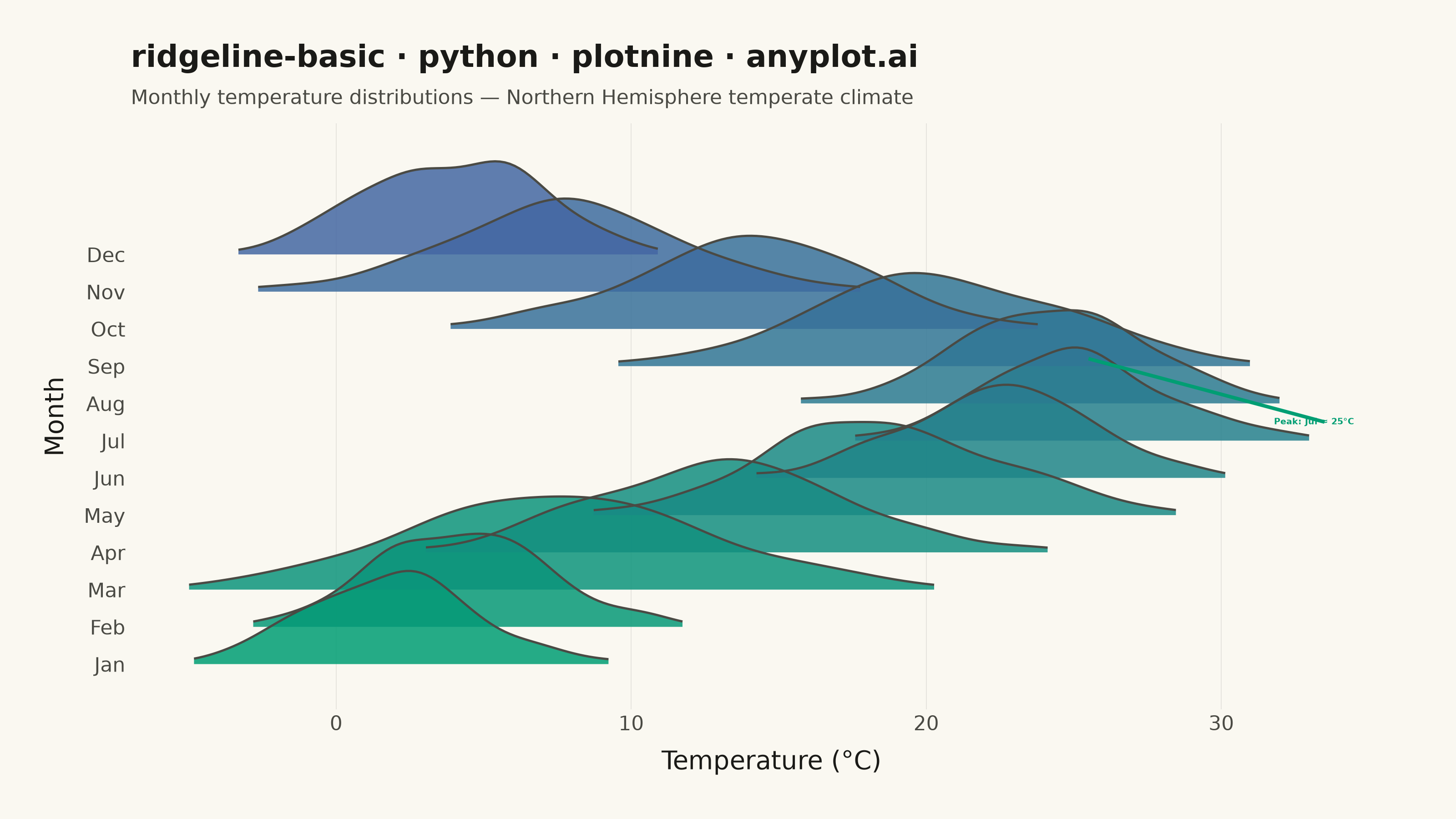
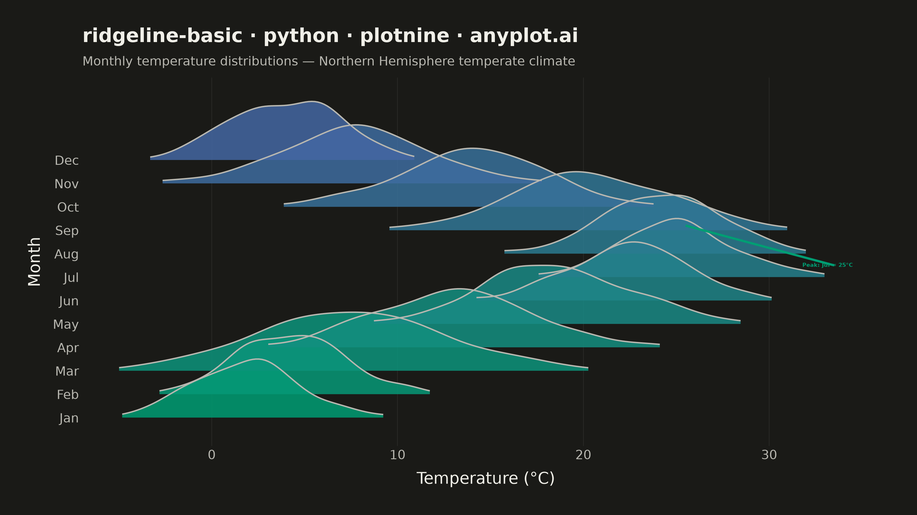
A ridgeline plot (also known as Joy Plot, named after the Joy Division album cover) displays the distribution of multiple groups by stacking partially overlapping density curves vertically. This creates a mountain ridge appearance that allows efficient comparison of many distributions simultaneously while maintaining a compact and visually striking presentation.
""" anyplot.ai
ridgeline-basic: Basic Ridgeline Plot
Library: plotnine 0.15.7 | Python 3.13.14
Quality: 89/100 | Updated: 2026-07-25
"""

import os

import numpy as np
import pandas as pd
from plotnine import (
    aes,
    annotate,
    element_blank,
    element_line,
    element_rect,
    element_text,
    geom_line,
    geom_ribbon,
    geom_text,
    ggplot,
    labs,
    scale_fill_gradient,
    scale_y_continuous,
    theme,
    theme_minimal,
)
from scipy import stats


# Theme tokens
THEME = os.getenv("ANYPLOT_THEME", "light")
PAGE_BG = "#FAF8F1" if THEME == "light" else "#1A1A17"
INK = "#1A1A17" if THEME == "light" else "#F0EFE8"
INK_SOFT = "#4A4A44" if THEME == "light" else "#B8B7B0"
ACCENT = "#009E73"  # Imprint palette position 1 — focal annotation accent

# Data - Monthly temperature distributions for a temperate climate
np.random.seed(42)

months = ["Jan", "Feb", "Mar", "Apr", "May", "Jun", "Jul", "Aug", "Sep", "Oct", "Nov", "Dec"]

temp_params = {
    "Jan": (2, 3),
    "Feb": (4, 3),
    "Mar": (8, 5),
    "Apr": (13, 4),
    "May": (18, 4),
    "Jun": (22, 3),
    "Jul": (25, 3),
    "Aug": (24, 3),
    "Sep": (20, 4.5),
    "Oct": (14, 4),
    "Nov": (8, 4),
    "Dec": (4, 3),
}

# Generate raw samples for KDE
data = []
for month in months:
    mean, std = temp_params[month]
    values = np.random.normal(mean, std, 200)
    for v in values:
        data.append({"month": month, "temp": v})

df = pd.DataFrame(data)

# Compute KDE density curves for ridgeline layout
x_range = np.linspace(-10, 40, 300)
ridge_scale = 2.5

# Trim each month's near-zero-density tails before building ridge_df so the
# ribbon fill (and the top-edge line drawn separately below) only cover the
# visible bump, instead of a sliver extending across the full x_range. The
# threshold mask alone isn't guaranteed contiguous -- gaussian_kde's tail
# estimate can ripple back above a lenient threshold far from the mode -- so
# walk outward from the density peak and stop at the first drop below
# threshold, keeping only that single contiguous run for geom_line to trace.
density_data = []
for i, month in enumerate(months):
    month_data = df[df["month"] == month]["temp"]
    kde = stats.gaussian_kde(month_data)
    density = kde(x_range)
    density_scaled = density / density.max() * ridge_scale

    threshold = 0.05 * ridge_scale
    peak_idx = int(np.argmax(density_scaled))
    left = peak_idx
    while left > 0 and density_scaled[left - 1] > threshold:
        left -= 1
    right = peak_idx
    while right < len(density_scaled) - 1 and density_scaled[right + 1] > threshold:
        right += 1

    x_visible = x_range[left : right + 1]
    density_visible = density_scaled[left : right + 1]

    for x, d in zip(x_visible, density_visible, strict=True):
        density_data.append(
            {"x": x, "ymin": float(i), "ymax": float(i) + d, "group": month, "month_idx": float(i) / 11.0}
        )

ridge_df = pd.DataFrame(density_data)
ridge_df["group"] = pd.Categorical(ridge_df["group"], categories=months, ordered=True)

# Peak label data: placed at July's baseline level (y=jul_idx) to the right
# of where the Jul ridge tapers off — clearly within July's y-band on the axis
jul_idx = months.index("Jul")
peak_df = pd.DataFrame([{"x": 34.5, "y": float(jul_idx) + 0.5, "label": "Peak: Jul ≈ 25°C"}])

# Plot — month order is a continuous temporal axis, so the ridges use the
# Imprint sequential gradient (imprint_seq: brand green -> blue) rather than
# a categorical palette; this keeps January anchored at #009E73.
plot = (
    ggplot(ridge_df, aes(x="x", ymin="ymin", ymax="ymax", fill="month_idx", group="group"))
    # No ribbon outline: the ymin edge would stroke a flat line across each
    # ridge's full visible x-span, cutting through neighboring ridges. Instead
    # only the top density curve (ymax) is stroked, drawn as a separate line.
    + geom_ribbon(alpha=0.85, color=None)
    + geom_line(aes(y="ymax"), color=INK_SOFT, size=0.5)
    + scale_fill_gradient(low="#009E73", high="#4467A3")
    # geom_text from a separate dataframe anchored to July's y-band (showcases multi-layer grammar)
    + geom_text(
        data=peak_df,
        mapping=aes(x="x", y="y", label="label"),
        inherit_aes=False,
        color=ACCENT,
        size=3.5,
        fontweight="bold",
        ha="right",
        va="center",
    )
    # Diagonal leader segment from label anchor to July's density peak at (25, jul_idx+ridge_scale)
    + annotate(
        "segment", x=25.5, xend=33.5, y=jul_idx + ridge_scale - 0.3, yend=float(jul_idx) + 0.5, color=ACCENT, size=0.8
    )
    + scale_y_continuous(breaks=list(range(12)), labels=months, limits=(-0.5, 13.8))
    + labs(
        x="Temperature (°C)",
        y="Month",
        title="ridgeline-basic · python · plotnine · anyplot.ai",
        subtitle="Monthly temperature distributions — Northern Hemisphere temperate climate",
    )
    + theme_minimal()
    + theme(
        figure_size=(8, 4.5),
        plot_background=element_rect(fill=PAGE_BG, color=PAGE_BG),
        panel_background=element_rect(fill=PAGE_BG),
        panel_border=element_blank(),
        text=element_text(size=7, color=INK_SOFT),
        axis_title=element_text(size=10, color=INK),
        axis_text=element_text(size=8, color=INK_SOFT),
        plot_title=element_text(size=12, color=INK, fontweight="bold"),
        plot_subtitle=element_text(size=8, color=INK_SOFT),
        plot_margin=0.03,
        panel_grid_major_y=element_blank(),
        panel_grid_minor=element_blank(),
        panel_grid_major_x=element_line(color=INK, size=0.3, alpha=0.10),
        legend_position="none",
    )
)

# Save
plot.save(f"plot-{THEME}.png", dpi=400, width=8, height=4.5, units="in", verbose=False)
Runnable source as JSON, for any HTTP client: https://api.anyplot.ai/specs/ridgeline-basic/plotnine/code. Any spec id and library id listed in llms-full.txt fit the same URL shape; every URL below is complete and callable.
{
  "spec_id": "ridgeline-basic",
  "language": "python",
  "library": "plotnine",
  "page": "https://anyplot.ai/ridgeline-basic/python/plotnine",
  "hub": "https://anyplot.ai/ridgeline-basic",
  "code_json": "https://api.anyplot.ai/specs/ridgeline-basic/plotnine/code",
  "spec_json": "https://api.anyplot.ai/specs/ridgeline-basic",
  "render_light_png": "https://storage.googleapis.com/anyplot-images/plots/ridgeline-basic/python/plotnine/plot-light.png",
  "render_dark_png": "https://storage.googleapis.com/anyplot-images/plots/ridgeline-basic/python/plotnine/plot-dark.png",
  "quality_score": 89.0,
  "license": "MIT",
  "guide": "https://anyplot.ai/llms.txt"
}
Part of Basic Ridgeline Plot on anyplot.ai.