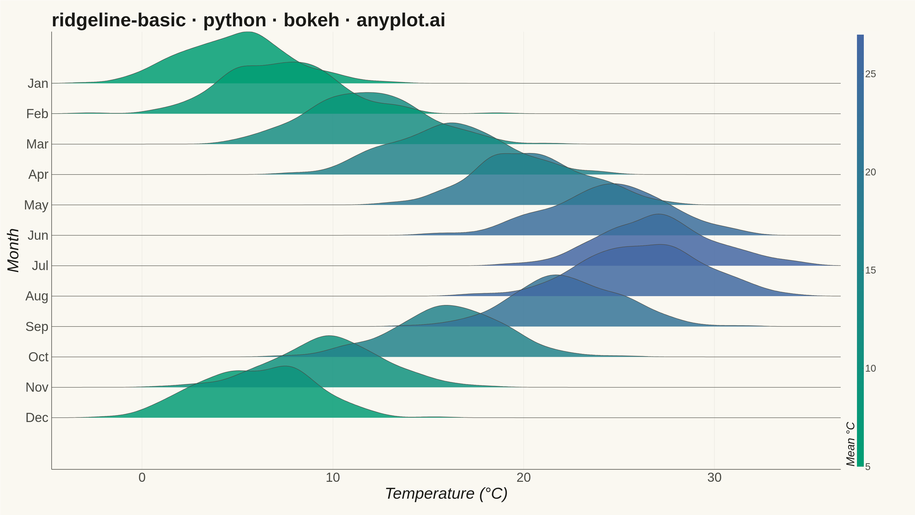
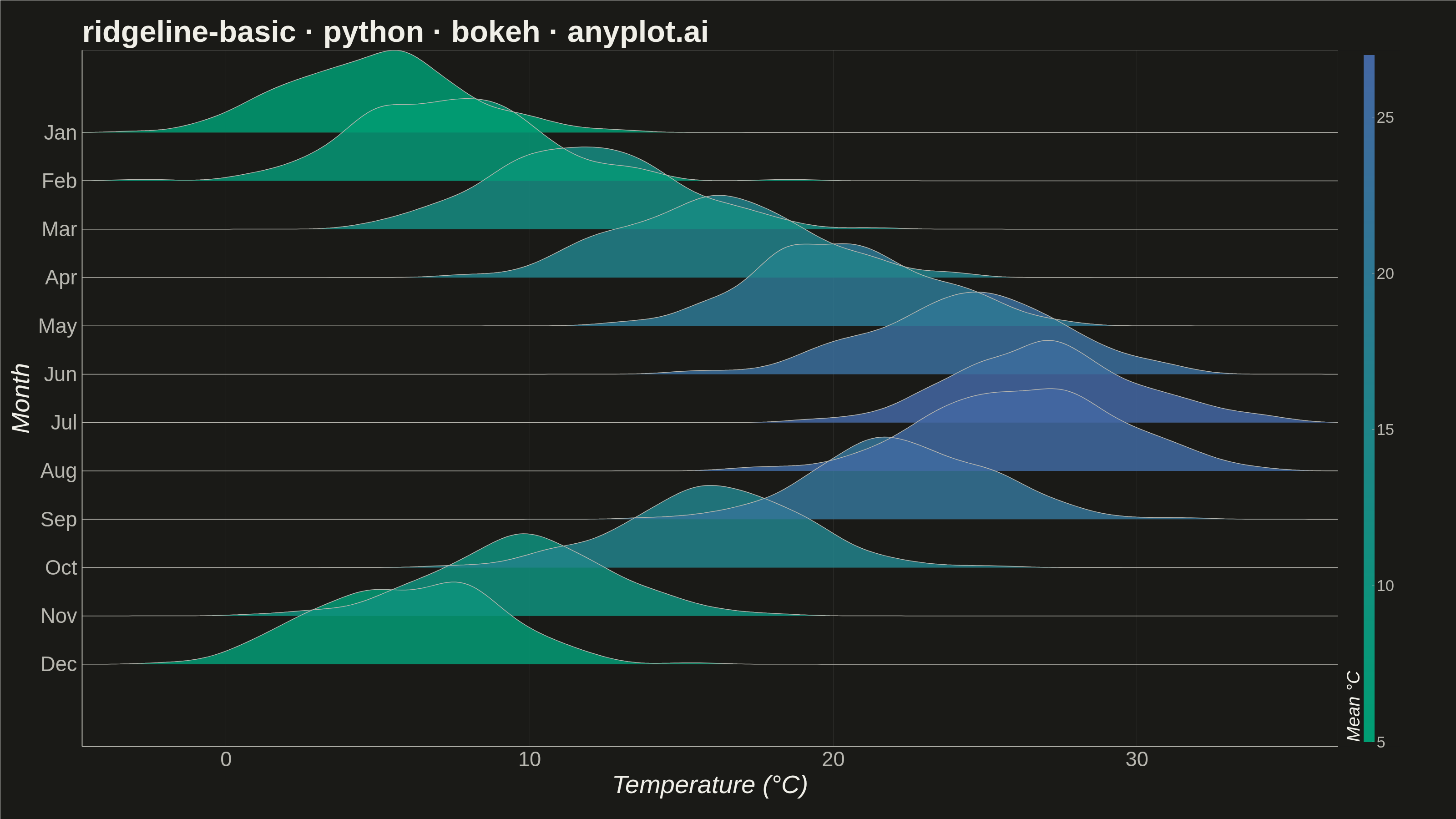
A ridgeline plot (also known as Joy Plot, named after the Joy Division album cover) displays the distribution of multiple groups by stacking partially overlapping density curves vertically. This creates a mountain ridge appearance that allows efficient comparison of many distributions simultaneously while maintaining a compact and visually striking presentation.
""" anyplot.ai
ridgeline-basic: Basic Ridgeline Plot
Library: bokeh 3.9.1 | Python 3.13.14
Quality: 93/100 | Updated: 2026-07-25
"""

import os
import time
from pathlib import Path

import numpy as np
from bokeh.io import output_file, save
from bokeh.models import ColorBar, ColumnDataSource, FactorRange, HoverTool, LinearColorMapper
from bokeh.plotting import figure
from selenium import webdriver
from selenium.webdriver.chrome.options import Options


# Theme tokens
THEME = os.getenv("ANYPLOT_THEME", "light")
PAGE_BG = "#FAF8F1" if THEME == "light" else "#1A1A17"
ELEVATED_BG = "#FFFDF6" if THEME == "light" else "#242420"
INK = "#1A1A17" if THEME == "light" else "#F0EFE8"
INK_SOFT = "#4A4A44" if THEME == "light" else "#B8B7B0"

# Data - Monthly temperature distributions
np.random.seed(42)

months = ["Jan", "Feb", "Mar", "Apr", "May", "Jun", "Jul", "Aug", "Sep", "Oct", "Nov", "Dec"]

# Generate realistic monthly temperature data (Celsius) with seasonal variation
base_temps = [5, 7, 12, 16, 20, 24, 27, 26, 22, 16, 10, 6]
temp_data = {}
for i, month in enumerate(months):
    temp_data[month] = np.random.normal(base_temps[i], 3, 200)


# Imprint sequential colormap (brand green -> blue) — mapped to mean temperature
# (cool months get green, warm months get blue). Viridis is forbidden for
# continuous data; only imprint_seq / imprint_div are allowed.
def _lerp_hex(c0, c1, t):
    r0, g0, b0 = (int(c0[i : i + 2], 16) for i in (1, 3, 5))
    r1, g1, b1 = (int(c1[i : i + 2], 16) for i in (1, 3, 5))
    r, g, b = (int(round(a + (b - a) * t)) for a, b in ((r0, r1), (g0, g1), (b0, b1)))
    return f"#{r:02X}{g:02X}{b:02X}"


ANYPLOT_SEQ256 = [_lerp_hex("#009E73", "#4467A3", t / 255.0) for t in range(256)]

min_t, max_t = min(base_temps), max(base_temps)
colors_by_month = {
    month: ANYPLOT_SEQ256[int((base_temps[i] - min_t) / (max_t - min_t) * 255)] for i, month in enumerate(months)
}

# Ridge parameters — height 1.7 -> ~70% overlap between adjacent bands (spec: 50-70%)
ridge_height = 1.7

# Tie the x-range to the actual generated data support (with a small margin)
# instead of an arbitrary wide range, so the canvas isn't left with blank
# corners where no density ever reaches.
all_temps = np.concatenate(list(temp_data.values()))
temp_min, temp_max = all_temps.min(), all_temps.max()
pad = (temp_max - temp_min) * 0.05
x_grid = np.linspace(temp_min - pad, temp_max + pad, 300)

# Pre-compute all patch coordinates for ColumnDataSource
all_xs = []
all_ys = []
all_xs_line = []
all_ys_line = []
all_colors = []
all_months_labels = []
all_mean_temps = []

for _i, month in enumerate(reversed(months)):
    temps = temp_data[month]

    # Gaussian KDE — Silverman's bandwidth rule
    n = len(temps)
    std = np.std(temps)
    iqr = np.percentile(temps, 75) - np.percentile(temps, 25)
    bandwidth = 0.9 * min(std, iqr / 1.34) * n ** (-0.2)
    bandwidth = max(bandwidth, 0.1)

    density = np.zeros_like(x_grid, dtype=float)
    for xi in temps:
        density += np.exp(-0.5 * ((x_grid - xi) / bandwidth) ** 2)
    density /= n * bandwidth * np.sqrt(2 * np.pi)

    density_normalized = density / density.max() * ridge_height

    x_patch = np.concatenate([[x_grid[0]], x_grid, [x_grid[-1]]])
    y_patch_numeric = np.concatenate([[0], density_normalized, [0]])
    # Categorical offset tuples: (month_label, float_offset)
    y_patches = [(month, float(v)) for v in y_patch_numeric]
    # Curve-only outline (excludes the zero-baseline) so the stroke traces just
    # the ridge silhouette instead of a full-width line under empty regions.
    y_line = [(month, float(v)) for v in density_normalized]

    all_xs.append(list(x_patch))
    all_ys.append(y_patches)
    all_xs_line.append(list(x_grid))
    all_ys_line.append(y_line)
    all_colors.append(colors_by_month[month])
    all_months_labels.append(month)
    all_mean_temps.append(round(float(np.mean(temps)), 1))

source = ColumnDataSource(
    data={
        "xs": all_xs,
        "ys": all_ys,
        "xs_line": all_xs_line,
        "ys_line": all_ys_line,
        "color": all_colors,
        "month": all_months_labels,
        "mean_temp": all_mean_temps,
    }
)

# Plot (3200 x 1800 px — canonical anyplot landscape canvas)
# min_border_right reserves room for the temperature ColorBar on the right edge.
p = figure(
    width=3200,
    height=1800,
    title="ridgeline-basic · python · bokeh · anyplot.ai",
    x_axis_label="Temperature (°C)",
    y_axis_label="Month",
    y_range=FactorRange(factors=months[::-1], range_padding=0.2),
    toolbar_location=None,  # bokeh's default toolbar shrinks the saved PNG below `height=`
    min_border_bottom=160,
    min_border_left=180,
    min_border_top=110,
    min_border_right=260,
)

# Fill has no outline of its own — the outline is drawn separately below,
# following only the ridge curve, so the flat zero-baseline under empty
# regions stays clutter-free instead of drawing a full-width stroke.
patches_renderer = p.patches("xs", "ys", fill_color="color", fill_alpha=0.85, line_color=None, source=source)
p.multi_line("xs_line", "ys_line", line_color=INK_SOFT, line_width=1.5, source=source)

# HoverTool — distinctive Bokeh interactivity
hover = HoverTool(renderers=[patches_renderer], tooltips=[("Month", "@month"), ("Mean temp", "@mean_temp °C")])
p.add_tools(hover)

# ColorBar — makes the temperature-to-color encoding explicit (previous review's weakness)
color_mapper = LinearColorMapper(palette=ANYPLOT_SEQ256, low=min_t, high=max_t)
color_bar = ColorBar(
    color_mapper=color_mapper,
    width=24,
    location=(0, 0),
    title="Mean °C",
    title_text_font_size="30pt",
    title_text_color=INK,
    major_label_text_font_size="26pt",
    major_label_text_color=INK_SOFT,
    background_fill_color=PAGE_BG,
    border_line_color=None,
    major_tick_line_color=INK_SOFT,
)
p.add_layout(color_bar, "right")

# Style
p.title.text_font_size = "50pt"
p.title.text_color = INK
p.xaxis.axis_label_text_font_size = "42pt"
p.yaxis.axis_label_text_font_size = "42pt"
p.xaxis.axis_label_text_color = INK
p.yaxis.axis_label_text_color = INK
p.xaxis.major_label_text_font_size = "34pt"
p.yaxis.major_label_text_font_size = "34pt"
p.xaxis.major_label_text_color = INK_SOFT
p.yaxis.major_label_text_color = INK_SOFT
p.xaxis.axis_line_color = INK_SOFT
p.yaxis.axis_line_color = INK_SOFT
p.xaxis.axis_line_width = 2
p.yaxis.axis_line_width = 2

# Grid
p.xgrid.grid_line_color = INK
p.xgrid.grid_line_alpha = 0.10
p.xgrid.grid_line_dash = "solid"
p.ygrid.grid_line_color = INK
p.ygrid.grid_line_alpha = 0.05

# Remove tick marks on both axes (keep tick labels) for consistent minimalism
p.xaxis.major_tick_line_color = None
p.xaxis.minor_tick_line_color = None
p.yaxis.major_tick_line_color = None
p.yaxis.minor_tick_line_color = None

# Set x-axis range to the padded data support (see x_grid above)
p.x_range.start = float(x_grid[0])
p.x_range.end = float(x_grid[-1])

# Background — remove four-sided outline box for cleaner L-frame look
p.background_fill_color = PAGE_BG
p.border_fill_color = PAGE_BG
p.outline_line_color = None

# Save — write the interactive HTML, then screenshot it with headless Chrome.
# `bokeh.io.export_png` is avoided: it probes a chromedriver binary that isn't
# reliably available in the render environment.
output_file(f"plot-{THEME}.html")
save(p)

W, H = 3200, 1800
opts = Options()
for arg in (
    "--headless=new",
    "--no-sandbox",
    "--disable-dev-shm-usage",
    "--disable-gpu",
    f"--window-size={W},{H}",
    "--hide-scrollbars",
):
    opts.add_argument(arg)
driver = webdriver.Chrome(options=opts)
driver.set_window_size(W, H)
driver.get(f"file://{Path(f'plot-{THEME}.html').resolve()}")
# Pin the viewport exactly via CDP — headless Chrome's --window-size sets the
# OUTER window, which still reserves a phantom title-bar height even headless.
driver.execute_cdp_cmd(
    "Emulation.setDeviceMetricsOverride", {"width": W, "height": H, "deviceScaleFactor": 1, "mobile": False}
)
time.sleep(3)  # let bokeh's JS render the canvas
driver.save_screenshot(f"plot-{THEME}.png")
driver.quit()
Runnable source as JSON, for any HTTP client: https://api.anyplot.ai/specs/ridgeline-basic/bokeh/code. Any spec id and library id listed in llms-full.txt fit the same URL shape; every URL below is complete and callable.
{
  "spec_id": "ridgeline-basic",
  "language": "python",
  "library": "bokeh",
  "page": "https://anyplot.ai/ridgeline-basic/python/bokeh",
  "hub": "https://anyplot.ai/ridgeline-basic",
  "code_json": "https://api.anyplot.ai/specs/ridgeline-basic/bokeh/code",
  "spec_json": "https://api.anyplot.ai/specs/ridgeline-basic",
  "render_light_png": "https://storage.googleapis.com/anyplot-images/plots/ridgeline-basic/python/bokeh/plot-light.png",
  "render_dark_png": "https://storage.googleapis.com/anyplot-images/plots/ridgeline-basic/python/bokeh/plot-dark.png",
  "interactive_light_html": "https://storage.googleapis.com/anyplot-images/plots/ridgeline-basic/python/bokeh/plot-light.html",
  "interactive_dark_html": "https://storage.googleapis.com/anyplot-images/plots/ridgeline-basic/python/bokeh/plot-dark.html",
  "quality_score": 93.0,
  "license": "MIT",
  "guide": "https://anyplot.ai/llms.txt"
}
Part of Basic Ridgeline Plot on anyplot.ai.