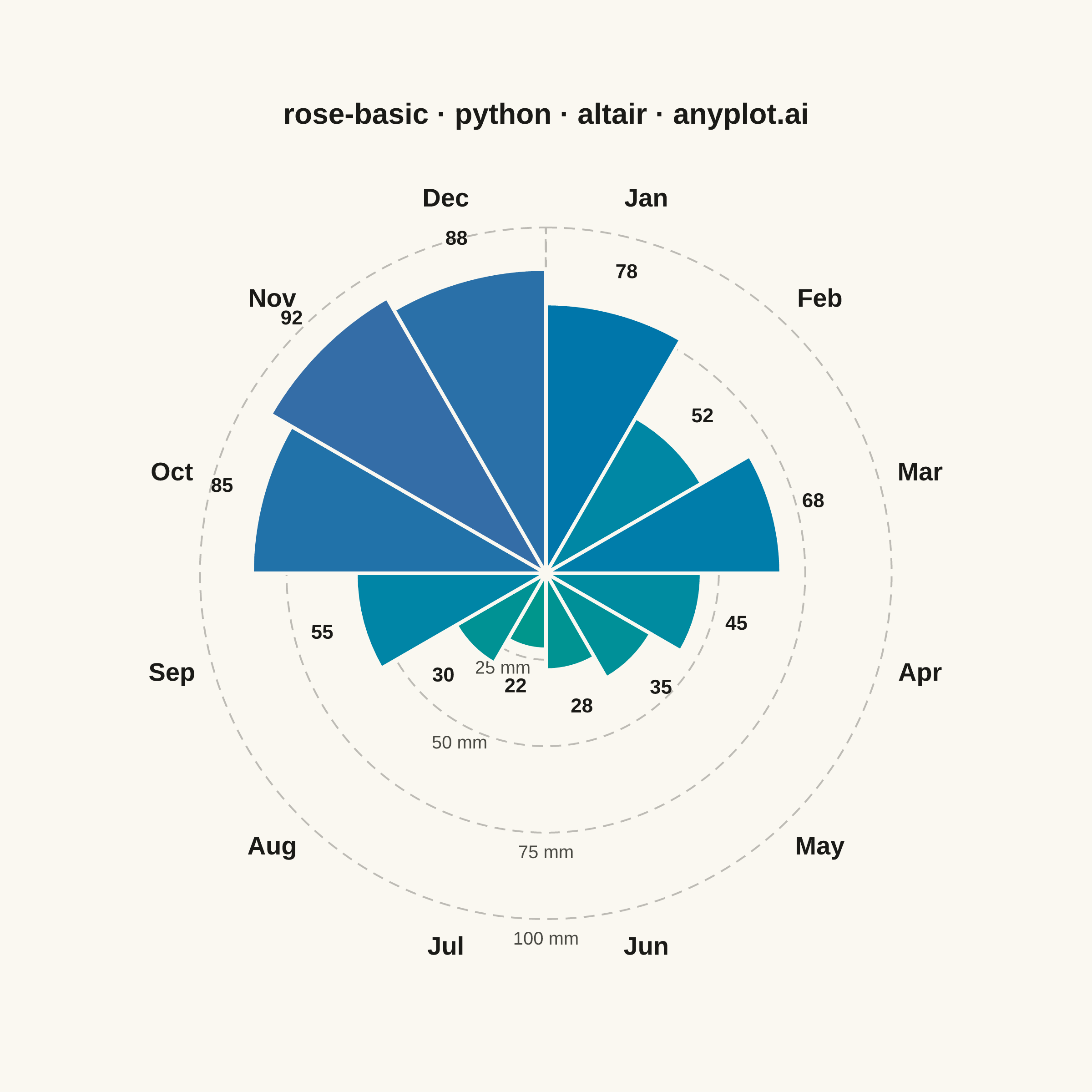
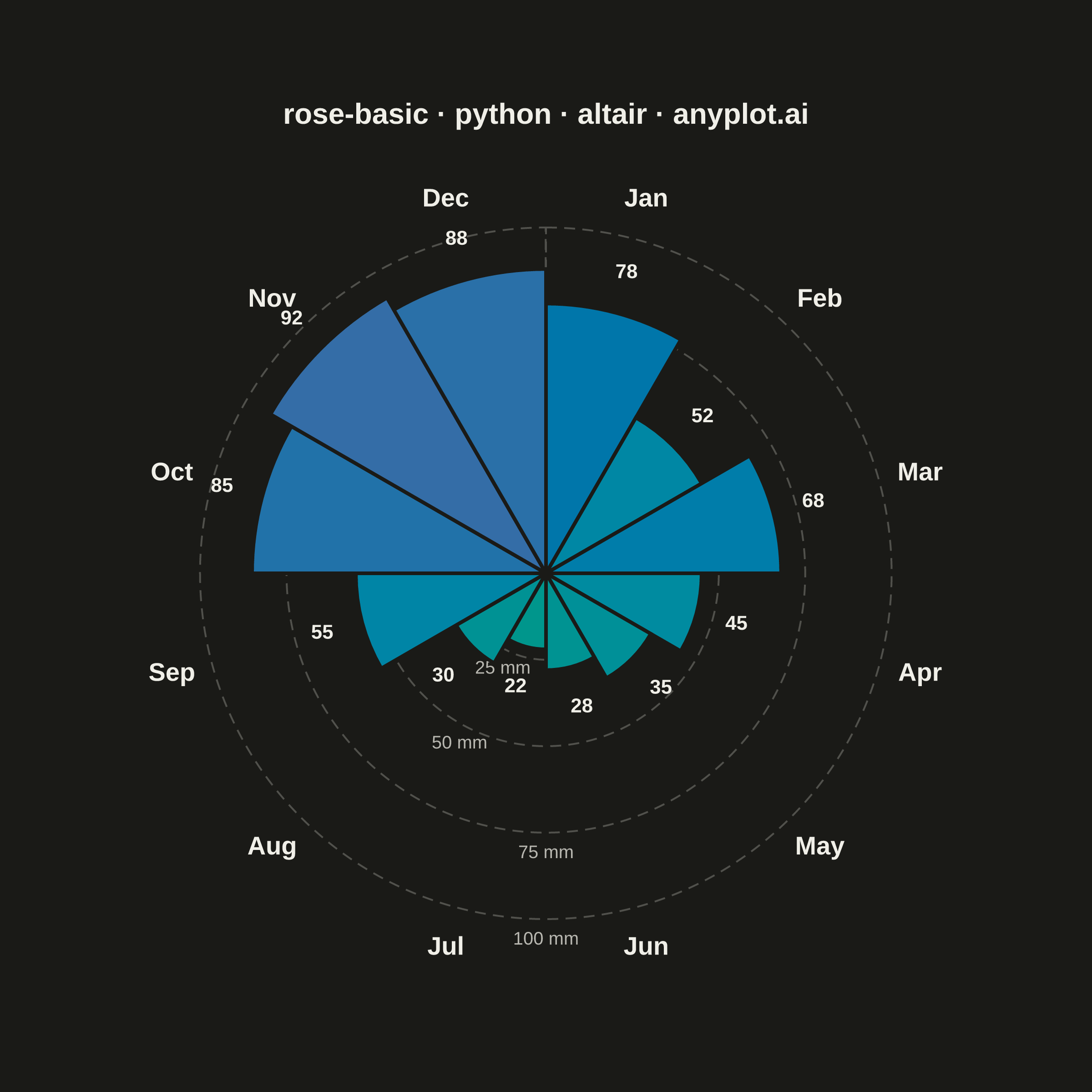
A rose chart (also called Nightingale or coxcomb diagram) displays categorical data in a circular format where segments are arranged around the center like pie slices, but with radius proportional to the value rather than angle. This visualization excels at showing cyclical or directional patterns where the circular arrangement has natural meaning. The equal-angle wedges make comparison of values across categories intuitive while emphasizing the periodic nature of the data.
""" anyplot.ai
rose-basic: Basic Rose Chart
Library: altair 6.2.2 | Python 3.13.14
Quality: 90/100 | Updated: 2026-07-25
"""

import os

import altair as alt
import numpy as np
import pandas as pd
from PIL import Image


# Theme
THEME = os.getenv("ANYPLOT_THEME", "light")
PAGE_BG = "#FAF8F1" if THEME == "light" else "#1A1A17"
INK = "#1A1A17" if THEME == "light" else "#F0EFE8"
INK_SOFT = "#4A4A44" if THEME == "light" else "#B8B7B0"

# Data - Monthly rainfall in mm (12-month cyclical pattern)
months = ["Jan", "Feb", "Mar", "Apr", "May", "Jun", "Jul", "Aug", "Sep", "Oct", "Nov", "Dec"]
rainfall = [78, 52, 68, 45, 35, 28, 22, 30, 55, 85, 92, 88]

n = len(months)
angle_step = 360 / n
start_angles = [i * angle_step for i in range(n)]
end_angles = [(i + 1) * angle_step for i in range(n)]

df = pd.DataFrame(
    {"month": months, "value": rainfall, "startAngle": np.radians(start_angles), "endAngle": np.radians(end_angles)}
)

max_val = 100
chart_radius = 190

# theta channel identity scale — without it, Altair auto-fits each layer's theta
# domain independently to a 0..2*pi range, which rotates/stretches every layer by a
# different amount and desyncs the month/value labels from their wedges. An explicit
# domain=range=[0, 2*pi] scale disables that auto-fit so raw radians (0 = 12 o'clock,
# increasing clockwise — the mark_arc convention) pass through unchanged everywhere.
THETA_SCALE = alt.Scale(domain=[0, 2 * np.pi], range=[0, 2 * np.pi])

# Radial gridlines at 25, 50, 75, 100 mm.
# (mark_point / mark_line silently collapse the "radius" channel to 0 in this
# vl-convert version — only arc-family marks honor it correctly. A literal full
# sweep via alt.value(2*pi) also triggers a vl-convert autosize bug that balloons
# the exported canvas, so each ring is a near-full unfilled arc (0 -> 2*pi minus a
# hair) driven by data columns instead, which renders as a clean circle.)
grid_values = [25, 50, 75, 100]
grid_data = pd.DataFrame({"value": grid_values, "start": [0.0] * 4, "end": [2 * np.pi - 0.001] * 4})

gridlines = (
    alt.Chart(grid_data)
    .mark_arc(filled=False, stroke=INK_SOFT, strokeWidth=1.0, strokeOpacity=0.35, strokeDash=[6, 4])
    .encode(
        theta=alt.Theta("start:Q", scale=THETA_SCALE),
        theta2=alt.Theta2("end:Q"),
        radius=alt.Radius("value:Q", scale=alt.Scale(type="linear", domain=[0, max_val], range=[0, chart_radius])),
    )
)

# Grid labels — the rose layer draws *after* gridlines/labels, so a ring label
# sitting over a taller petal gets silently painted over; each label is anchored at
# the wedge *boundary* (never a midpoint, which is where month/value labels sit)
# nearest the shortest petals (Jun 28 mm / Jul 22 mm / Aug 30 mm), found by
# checking every boundary's neighboring petal height. 25/50 mm use the Jul/Aug
# boundary, 75/100 mm the Jun/Jul boundary — both comfortably below every ring radius.
grid_label_inner = pd.DataFrame({"value": [25, 50], "label": ["25 mm", "50 mm"], "theta": [np.radians(210)] * 2})
grid_label_outer = pd.DataFrame({"value": [75, 100], "label": ["75 mm", "100 mm"], "theta": [np.pi] * 2})
_grid_radius_scale = alt.Scale(type="linear", domain=[0, max_val], range=[0, chart_radius])

grid_labels = alt.Chart(grid_label_inner).mark_text(fontSize=10, dy=6, align="center", baseline="top").encode(
    theta=alt.Theta("theta:Q", scale=THETA_SCALE),
    radius=alt.Radius("value:Q", scale=_grid_radius_scale),
    text="label:N",
    color=alt.value(INK_SOFT),
) + alt.Chart(grid_label_outer).mark_text(fontSize=10, dy=6, align="center", baseline="top").encode(
    theta=alt.Theta("theta:Q", scale=THETA_SCALE),
    radius=alt.Radius("value:Q", scale=_grid_radius_scale),
    text="label:N",
    color=alt.value(INK_SOFT),
)

# Rose chart segments — imprint_seq (sequential Imprint gradient) for value-based color encoding
rose = (
    alt.Chart(df)
    .mark_arc(stroke=PAGE_BG, strokeWidth=2, innerRadius=0)
    .encode(
        theta=alt.Theta("startAngle:Q", stack=None, scale=THETA_SCALE),
        theta2=alt.Theta2("endAngle:Q"),
        radius=alt.Radius("value:Q", scale=alt.Scale(type="linear", domain=[0, max_val], range=[0, chart_radius])),
        color=alt.Color("value:Q", scale=alt.Scale(domain=[0, max_val], range=["#009E73", "#4467A3"]), legend=None),
        tooltip=[alt.Tooltip("month:N", title="Month"), alt.Tooltip("value:Q", title="Rainfall (mm)")],
    )
)

# Value labels near segment tips — fixed additive offset keeps spacing consistent for small segments
mid_angles = [(i + 0.5) * angle_step for i in range(n)]
mid_angles_rad = np.radians(mid_angles)

label_radii = [v + 12 for v in rainfall]

label_data = pd.DataFrame({"month": months, "value": rainfall, "theta": mid_angles_rad, "labelRadius": label_radii})

value_labels = (
    alt.Chart(label_data)
    .mark_text(fontSize=11, fontWeight="bold")
    .encode(
        theta=alt.Theta("theta:Q", scale=THETA_SCALE),
        radius=alt.Radius(
            "labelRadius:Q", scale=alt.Scale(type="linear", domain=[0, max_val], range=[0, chart_radius])
        ),
        text=alt.Text("value:Q"),
        color=alt.value(INK),
    )
)

# Month labels at outer edge — just beyond the 100 mm gridline
month_label_data = pd.DataFrame({"month": months, "theta": mid_angles_rad, "labelRadius": [112.0] * n})

month_labels = (
    alt.Chart(month_label_data)
    .mark_text(fontSize=14, fontWeight="bold")
    .encode(
        theta=alt.Theta("theta:Q", scale=THETA_SCALE),
        radius=alt.Radius(
            "labelRadius:Q", scale=alt.Scale(type="linear", domain=[0, max_val], range=[0, chart_radius])
        ),
        text=alt.Text("month:N"),
        color=alt.value(INK),
    )
)

# Combine all layers
chart = (
    alt.layer(gridlines, grid_labels, rose, value_labels, month_labels)
    .properties(
        width=500,
        height=460,
        background=PAGE_BG,
        title=alt.Title(
            text="rose-basic · python · altair · anyplot.ai", fontSize=16, anchor="middle", offset=14, color=INK
        ),
    )
    .configure_view(strokeWidth=0, fill=PAGE_BG)
    .configure_axis(grid=False, domain=False, ticks=False, labels=False, title=None)
)

# Save
chart.save(f"plot-{THEME}.png", scale_factor=4.0)

# Canvas hard rule: pad (never crop) up to the exact 2400x2400 target.
TW, TH = 2400, 2400
_img = Image.open(f"plot-{THEME}.png").convert("RGB")
_w, _h = _img.size
if _w > TW or _h > TH:
    raise SystemExit(
        f"altair vl-convert produced {_w}x{_h}, exceeds target {TW}x{TH}. "
        f"Shrink chart .properties(width=, height=) values and re-render."
    )
if _w < TW or _h < TH:
    _canvas = Image.new("RGB", (TW, TH), PAGE_BG)
    _canvas.paste(_img, ((TW - _w) // 2, (TH - _h) // 2))
    _canvas.save(f"plot-{THEME}.png")

chart.save(f"plot-{THEME}.html")
Runnable source as JSON, for any HTTP client: https://api.anyplot.ai/specs/rose-basic/altair/code. Any spec id and library id listed in llms-full.txt fit the same URL shape; every URL below is complete and callable.
{
  "spec_id": "rose-basic",
  "language": "python",
  "library": "altair",
  "page": "https://anyplot.ai/rose-basic/python/altair",
  "hub": "https://anyplot.ai/rose-basic",
  "code_json": "https://api.anyplot.ai/specs/rose-basic/altair/code",
  "spec_json": "https://api.anyplot.ai/specs/rose-basic",
  "render_light_png": "https://storage.googleapis.com/anyplot-images/plots/rose-basic/python/altair/plot-light.png",
  "render_dark_png": "https://storage.googleapis.com/anyplot-images/plots/rose-basic/python/altair/plot-dark.png",
  "interactive_light_html": "https://storage.googleapis.com/anyplot-images/plots/rose-basic/python/altair/plot-light.html",
  "interactive_dark_html": "https://storage.googleapis.com/anyplot-images/plots/rose-basic/python/altair/plot-dark.html",
  "quality_score": 90.0,
  "license": "MIT",
  "guide": "https://anyplot.ai/llms.txt"
}
Part of Basic Rose Chart on anyplot.ai.