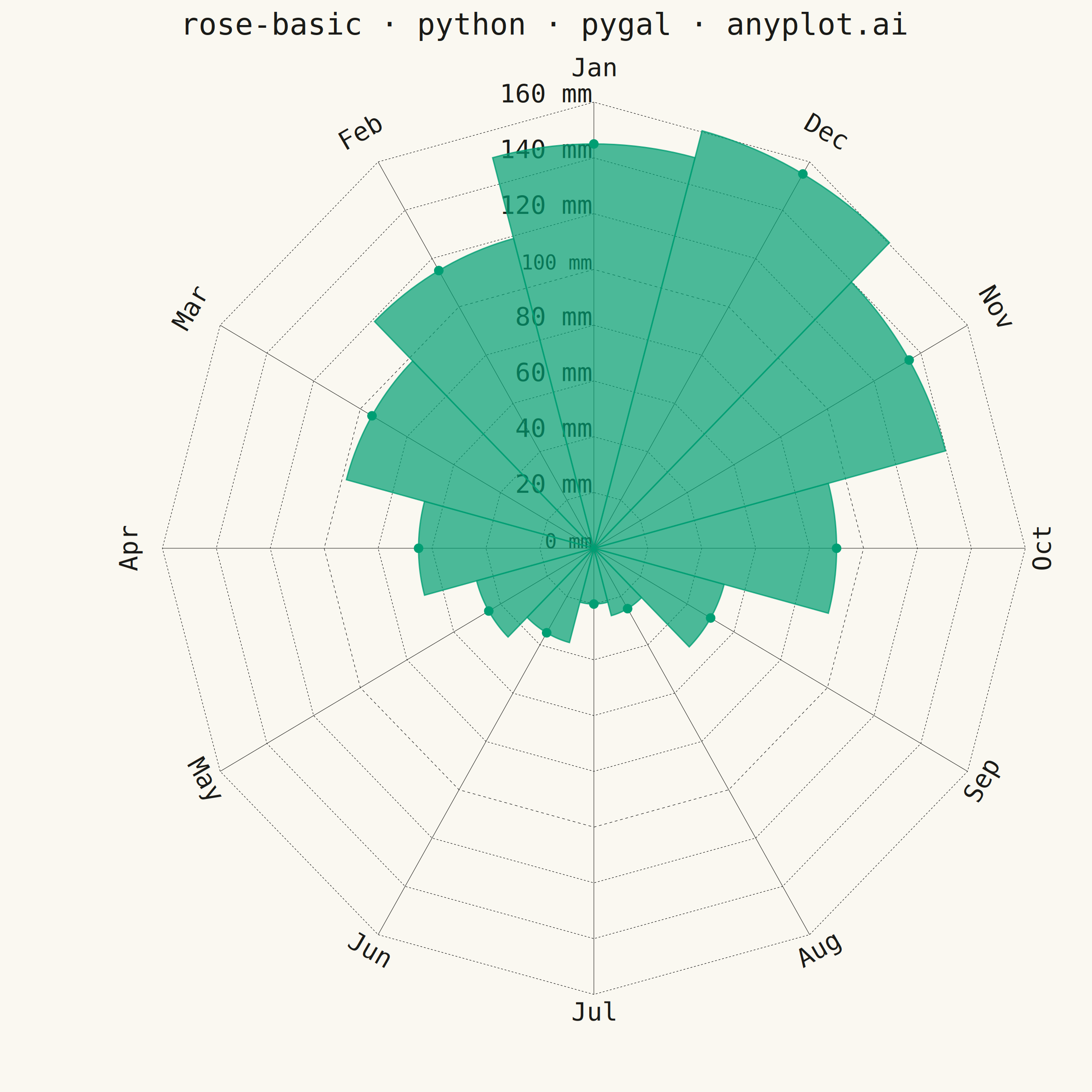
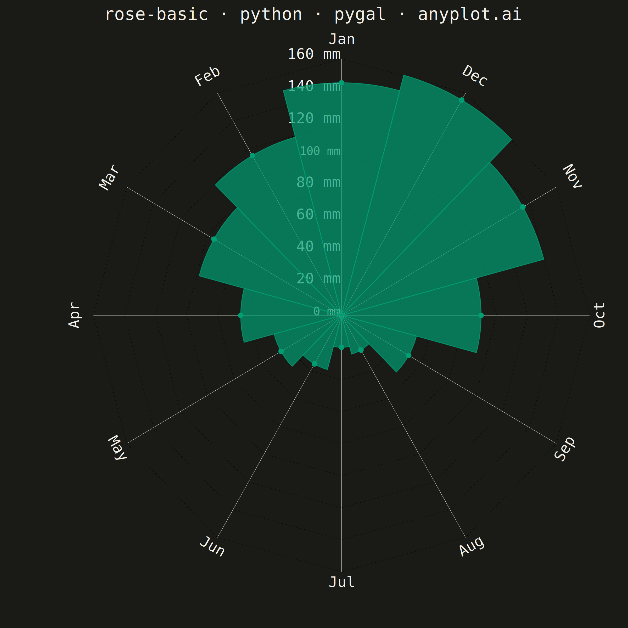
A rose chart (also called Nightingale or coxcomb diagram) displays categorical data in a circular format where segments are arranged around the center like pie slices, but with radius proportional to the value rather than angle. This visualization excels at showing cyclical or directional patterns where the circular arrangement has natural meaning. The equal-angle wedges make comparison of values across categories intuitive while emphasizing the periodic nature of the data.
""" anyplot.ai
rose-basic: Basic Rose Chart
Library: pygal 3.1.3 | Python 3.13.14
Quality: 87/100 | Updated: 2026-07-25
"""

import os
import sys
from math import pi


# Pop script directory so local pygal.py doesn't shadow the installed package
_script_dir = sys.path.pop(0)
from pygal.graph.radar import Radar
from pygal.style import Style


sys.path.insert(0, _script_dir)

THEME = os.getenv("ANYPLOT_THEME", "light")
PAGE_BG = "#FAF8F1" if THEME == "light" else "#1A1A17"
INK = "#1A1A17" if THEME == "light" else "#F0EFE8"
INK_MUTED = "#6B6A63" if THEME == "light" else "#A8A79F"

BRAND = "#009E73"  # Imprint palette position 1 — single series, always brand green

# Data: Monthly rainfall (mm) — Pacific Northwest seasonal pattern
months = ["Jan", "Feb", "Mar", "Apr", "May", "Jun", "Jul", "Aug", "Sep", "Oct", "Nov", "Dec"]
rainfall = [145, 115, 95, 65, 45, 35, 20, 25, 50, 90, 135, 155]

ARC_STEPS = 20  # points sampled along each wedge's outer arc for a smooth curve


class RoseChart(Radar):
    """Radar subclass that draws true pie-slice wedge sectors instead of a
    connected star polygon: each category becomes its own closed shape
    (center -> radial edge -> curved outer arc -> radial edge -> center),
    which is the defining visual signature of a rose/coxcomb chart. Reuses
    Radar's polar grid, angular month labels, and 12-o'clock start position
    unchanged (those already render correctly)."""

    def _plot(self):
        delta = 2 * pi / self._len if self._len else 0
        half = delta / 2
        for serie in self.series:
            serie_node = self.svg.serie(serie)
            for i, value in enumerate(serie.values):
                theta_center = self._x_pos[i]
                theta_start = theta_center - half
                theta_end = theta_center + half
                wedge = [self.view((0, theta_start))] + [
                    self.view((value, theta_start + (theta_end - theta_start) * k / ARC_STEPS))
                    for k in range(ARC_STEPS + 1)
                ]
                self.svg.line(serie_node["plot"], wedge, close=True, class_="line reactive")
                if serie.show_dots:
                    x, y = self.view((value, theta_center))
                    dots = self.svg.node(serie_node["overlay"], class_="dots")
                    self.svg.node(dots, "circle", cx=x, cy=y, r=serie.dots_size, class_="dot reactive tooltip-trigger")


custom_style = Style(
    background=PAGE_BG,
    plot_background=PAGE_BG,
    foreground=INK,
    foreground_strong=INK,
    foreground_subtle=INK_MUTED,
    colors=(BRAND,),
    title_font_size=66,
    label_font_size=56,
    major_label_font_size=44,
    stroke_width=3,
    opacity=0.7,
    opacity_hover=0.88,
)

chart = RoseChart(
    width=2400,
    height=2400,
    style=custom_style,
    title="rose-basic · python · pygal · anyplot.ai",
    fill=True,
    stroke=True,
    show_dots=True,
    dots_size=10,
    show_legend=False,
    show_x_guides=True,
    show_y_guides=True,
    range=(0, 160),
    margin=70,
    value_formatter=lambda v: f"{v:.0f} mm",
)

chart.x_labels = months
chart.add("Monthly Rainfall", rainfall)

# Save
chart.render_to_png(f"plot-{THEME}.png")
with open(f"plot-{THEME}.html", "wb") as f:
    f.write(chart.render())
Runnable source as JSON, for any HTTP client: https://api.anyplot.ai/specs/rose-basic/pygal/code. Any spec id and library id listed in llms-full.txt fit the same URL shape; every URL below is complete and callable.
{
  "spec_id": "rose-basic",
  "language": "python",
  "library": "pygal",
  "page": "https://anyplot.ai/rose-basic/python/pygal",
  "hub": "https://anyplot.ai/rose-basic",
  "code_json": "https://api.anyplot.ai/specs/rose-basic/pygal/code",
  "spec_json": "https://api.anyplot.ai/specs/rose-basic",
  "render_light_png": "https://storage.googleapis.com/anyplot-images/plots/rose-basic/python/pygal/plot-light.png",
  "render_dark_png": "https://storage.googleapis.com/anyplot-images/plots/rose-basic/python/pygal/plot-dark.png",
  "interactive_light_html": "https://storage.googleapis.com/anyplot-images/plots/rose-basic/python/pygal/plot-light.html",
  "interactive_dark_html": "https://storage.googleapis.com/anyplot-images/plots/rose-basic/python/pygal/plot-dark.html",
  "quality_score": 87.0,
  "license": "MIT",
  "guide": "https://anyplot.ai/llms.txt"
}
Part of Basic Rose Chart on anyplot.ai.