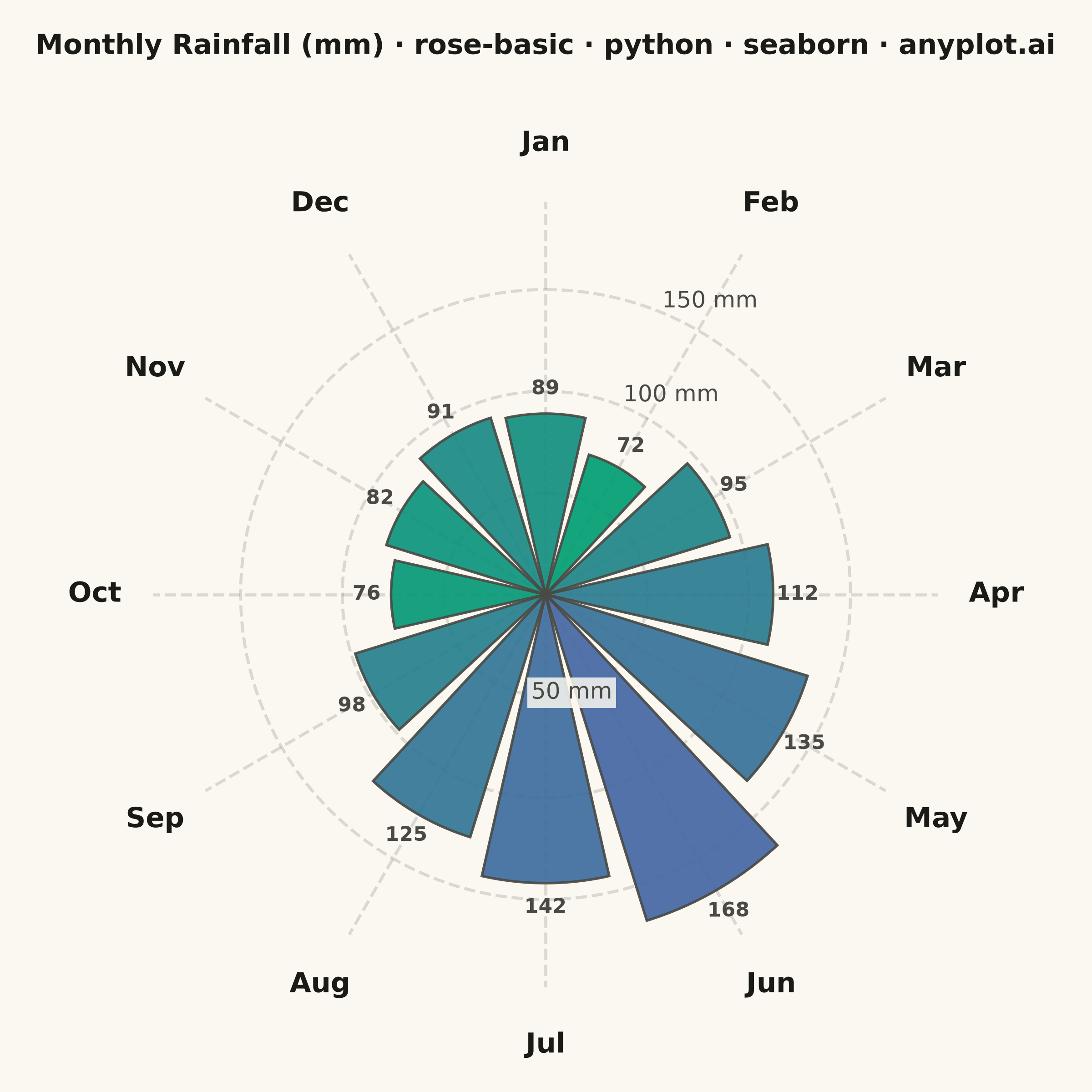
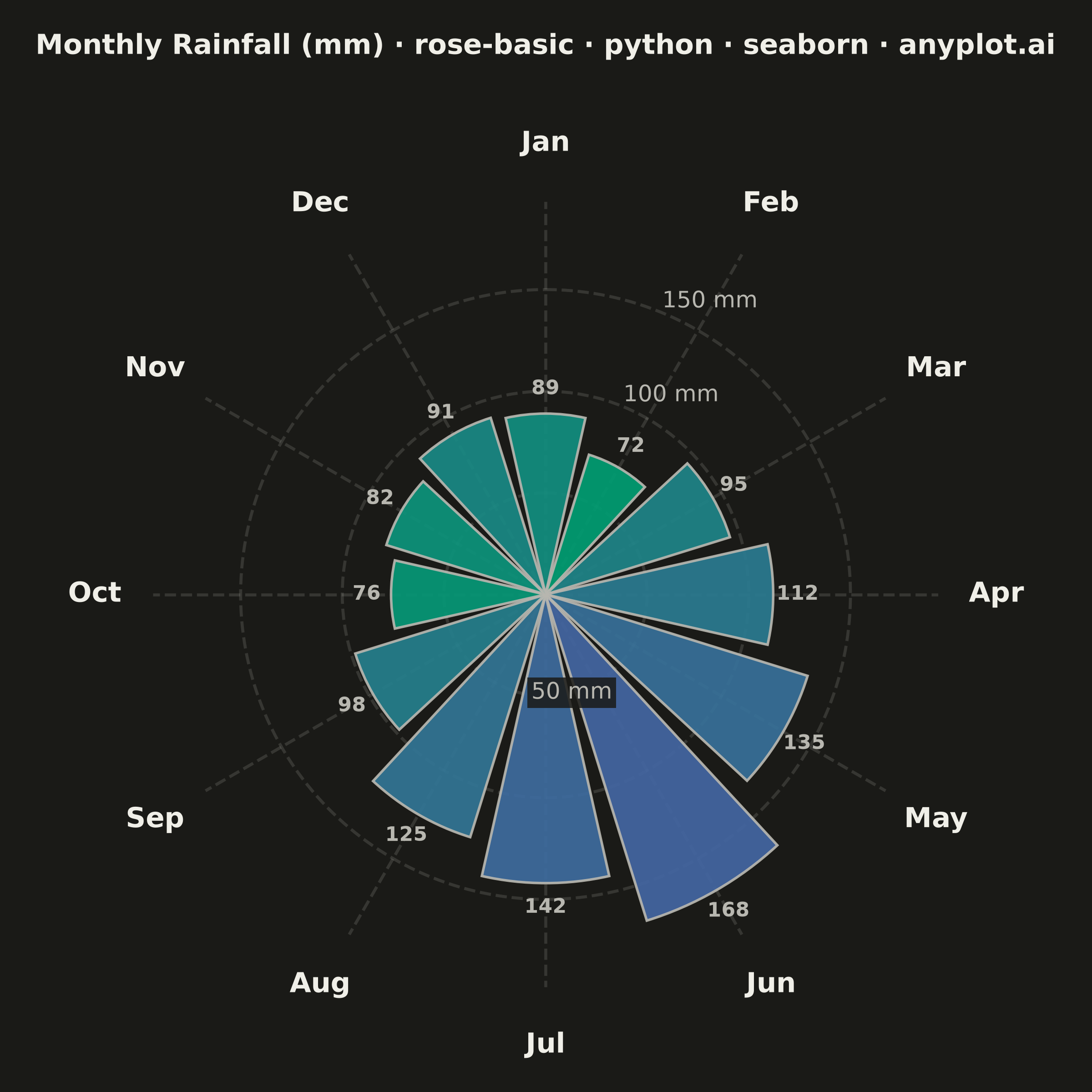
A rose chart (also called Nightingale or coxcomb diagram) displays categorical data in a circular format where segments are arranged around the center like pie slices, but with radius proportional to the value rather than angle. This visualization excels at showing cyclical or directional patterns where the circular arrangement has natural meaning. The equal-angle wedges make comparison of values across categories intuitive while emphasizing the periodic nature of the data.
""" anyplot.ai
rose-basic: Basic Rose Chart
Library: seaborn 0.13.2 | Python 3.13.14
Quality: 87/100 | Updated: 2026-07-25
"""

import os

import matplotlib.pyplot as plt
import numpy as np
import seaborn as sns


# Theme tokens
THEME = os.getenv("ANYPLOT_THEME", "light")
PAGE_BG = "#FAF8F1" if THEME == "light" else "#1A1A17"
ELEVATED_BG = "#FFFDF6" if THEME == "light" else "#242420"
INK = "#1A1A17" if THEME == "light" else "#F0EFE8"
INK_SOFT = "#4A4A44" if THEME == "light" else "#B8B7B0"

# Apply seaborn theme with full adaptive chrome
sns.set_theme(
    style="ticks",
    rc={
        "figure.facecolor": PAGE_BG,
        "axes.facecolor": PAGE_BG,
        "axes.edgecolor": INK_SOFT,
        "axes.labelcolor": INK,
        "text.color": INK,
        "xtick.color": INK_SOFT,
        "ytick.color": INK_SOFT,
        "grid.color": INK,
        "grid.alpha": 0.15,
        "legend.facecolor": ELEVATED_BG,
        "legend.edgecolor": INK_SOFT,
    },
)

# Data: Monthly rainfall (mm) showing seasonal patterns
months = ["Jan", "Feb", "Mar", "Apr", "May", "Jun", "Jul", "Aug", "Sep", "Oct", "Nov", "Dec"]
rainfall = [89, 72, 95, 112, 135, 168, 142, 125, 98, 76, 82, 91]

# Calculate angles - start at top (12 o'clock position)
n_categories = len(months)
angles = np.linspace(0, 2 * np.pi, n_categories, endpoint=False)
width = 2 * np.pi / n_categories * 0.85

# Create figure with polar projection — canonical square canvas (2400x2400 @ dpi=400)
fig, ax = plt.subplots(figsize=(6, 6), dpi=400, subplot_kw={"projection": "polar"})
fig.patch.set_facecolor(PAGE_BG)
ax.set_facecolor(PAGE_BG)

# Imprint sequential ramp (brand green -> blue) built via seaborn's blend_palette,
# assigned by rainfall rank so color depth reflects magnitude regardless of month order
value_ranks = np.argsort(np.argsort(rainfall))
imprint_seq = sns.blend_palette(["#009E73", "#4467A3"], n_colors=n_categories)
bar_colors = [imprint_seq[rank] for rank in value_ranks]

# Plot bars - radius proportional to value
ax.bar(angles, rainfall, width=width, bottom=0, color=bar_colors, edgecolor=INK_SOFT, linewidth=1, alpha=0.92, zorder=2)

# Configure polar axis - start at top (12 o'clock), clockwise
ax.set_theta_offset(np.pi / 2)
ax.set_theta_direction(-1)

# Category labels
ax.set_xticks(angles)
ax.set_xticklabels(months, fontsize=11, fontweight="bold", color=INK)
ax.tick_params(axis="x", pad=10)

# Radial gridlines and labels. Every month exceeds the innermost gridline, so the "50 mm"
# tick always lands inside a bar. seaborn's "axisbelow" theme forces native tick-label
# z-order below patches at draw time (any per-label zorder override is silently reset), so
# that one label is drawn manually as a standalone Text with a halo box instead.
max_val = max(rainfall)
ax.set_ylim(0, max_val * 1.15)
ax.set_yticks([50, 100, 150])
ax.set_yticklabels(["", "100 mm", "150 mm"], fontsize=9, color=INK_SOFT)
# Placed in the angular gap between the Jun/Jul bars (bottom of the chart, away from
# the title and the Dec/Jan boundary) so the halo box no longer sits on top of bar fill.
gap_angle = angles[5] + (2 * np.pi / n_categories) / 2
ax.text(
    gap_angle,
    50,
    "50 mm",
    ha="center",
    va="center",
    fontsize=9,
    color=INK_SOFT,
    zorder=5,
    bbox={"facecolor": PAGE_BG, "edgecolor": "none", "alpha": 0.85, "pad": 1.5},
)

# Grid and spine styling
ax.grid(True, alpha=0.18, linestyle="--", linewidth=1.2, color=INK_SOFT)
ax.spines["polar"].set_visible(False)

# Title (extra pad keeps it clear of the 12 o'clock "Jan" tick label)
ax.set_title(
    "Monthly Rainfall (mm) · rose-basic · python · seaborn · anyplot.ai",
    fontsize=11,
    fontweight="bold",
    pad=30,
    color=INK,
)

# Value labels on each bar
for angle, value in zip(angles, rainfall, strict=True):
    ax.text(angle, value + 12, f"{value}", ha="center", va="center", fontsize=8, fontweight="bold", color=INK_SOFT)

plt.tight_layout()
plt.savefig(f"plot-{THEME}.png", dpi=400, facecolor=PAGE_BG)
Runnable source as JSON, for any HTTP client: https://api.anyplot.ai/specs/rose-basic/seaborn/code. Any spec id and library id listed in llms-full.txt fit the same URL shape; every URL below is complete and callable.
{
  "spec_id": "rose-basic",
  "language": "python",
  "library": "seaborn",
  "page": "https://anyplot.ai/rose-basic/python/seaborn",
  "hub": "https://anyplot.ai/rose-basic",
  "code_json": "https://api.anyplot.ai/specs/rose-basic/seaborn/code",
  "spec_json": "https://api.anyplot.ai/specs/rose-basic",
  "render_light_png": "https://storage.googleapis.com/anyplot-images/plots/rose-basic/python/seaborn/plot-light.png",
  "render_dark_png": "https://storage.googleapis.com/anyplot-images/plots/rose-basic/python/seaborn/plot-dark.png",
  "quality_score": 87.0,
  "license": "MIT",
  "guide": "https://anyplot.ai/llms.txt"
}
Part of Basic Rose Chart on anyplot.ai.