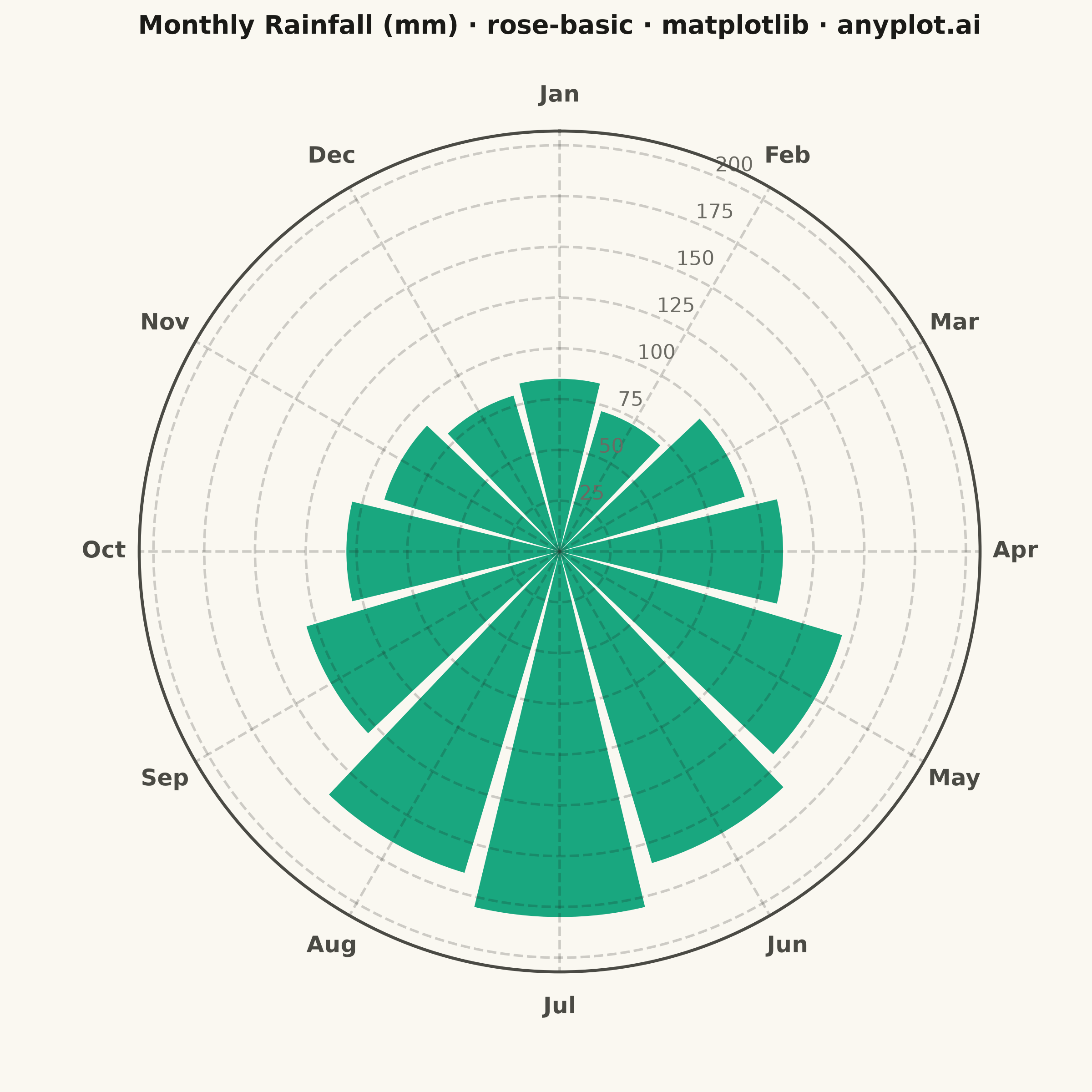
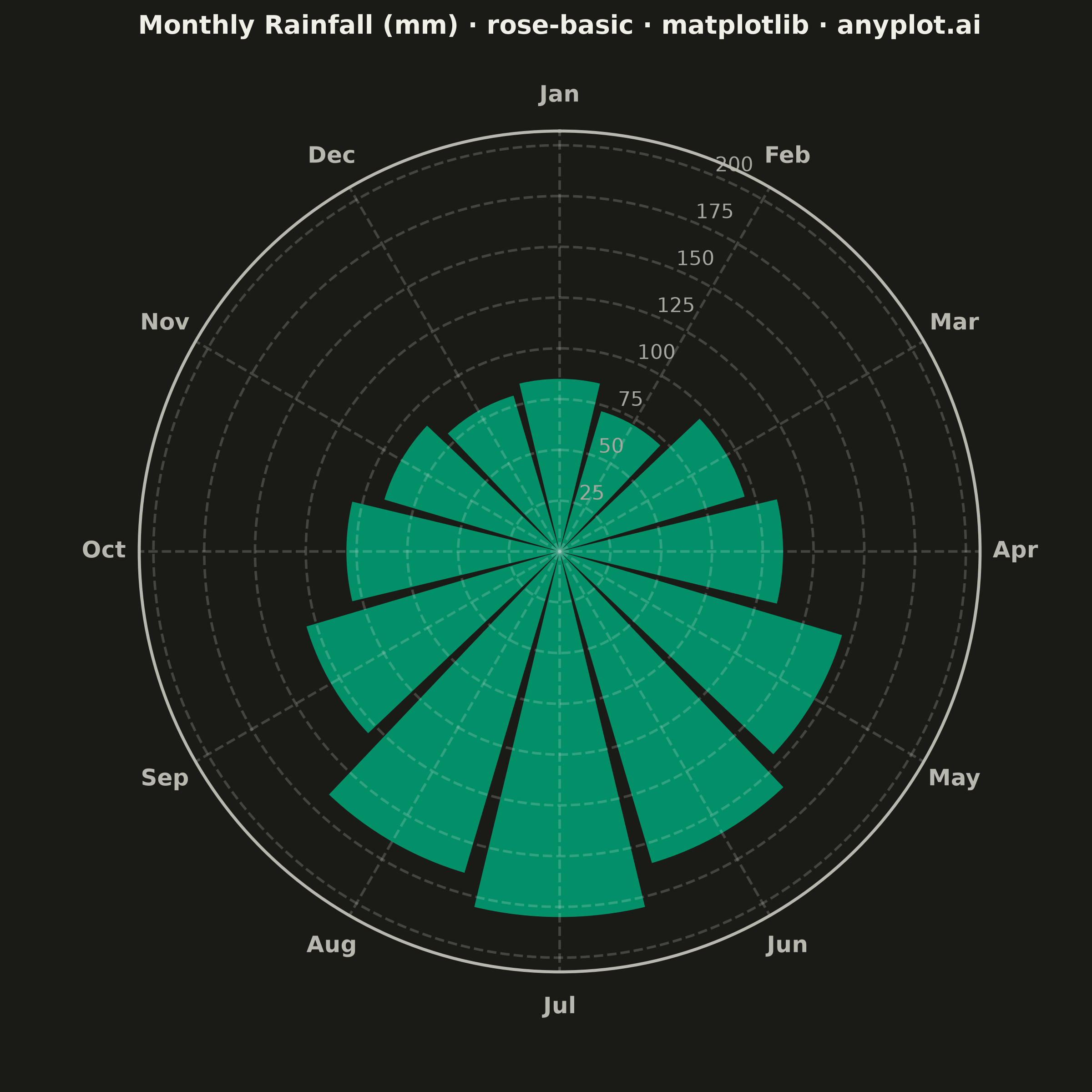
A rose chart (also called Nightingale or coxcomb diagram) displays categorical data in a circular format where segments are arranged around the center like pie slices, but with radius proportional to the value rather than angle. This visualization excels at showing cyclical or directional patterns where the circular arrangement has natural meaning. The equal-angle wedges make comparison of values across categories intuitive while emphasizing the periodic nature of the data.
""" anyplot.ai
rose-basic: Basic Rose Chart
Library: matplotlib 3.11.1 | Python 3.13.14
Quality: 90/100 | Updated: 2026-07-25
"""

import os

import matplotlib.pyplot as plt
import numpy as np


THEME = os.getenv("ANYPLOT_THEME", "light")

# Theme-adaptive chrome tokens (Imprint)
PAGE_BG = "#FAF8F1" if THEME == "light" else "#1A1A17"
INK = "#1A1A17" if THEME == "light" else "#F0EFE8"
INK_SOFT = "#4A4A44" if THEME == "light" else "#B8B7B0"
INK_MUTED = "#6B6A63" if THEME == "light" else "#A8A79F"

# Imprint categorical palette — position 1 is always brand green
IMPRINT_PALETTE = ["#009E73", "#C475FD", "#4467A3", "#BD8233", "#AE3030", "#2ABCCD", "#954477", "#99B314"]
BRAND = IMPRINT_PALETTE[0]

# Data - Monthly rainfall (mm) showing seasonal patterns
months = ["Jan", "Feb", "Mar", "Apr", "May", "Jun", "Jul", "Aug", "Sep", "Oct", "Nov", "Dec"]
values = np.array([85, 72, 95, 110, 145, 160, 180, 165, 130, 105, 90, 80])

# Equal-angle segments, one per month
n_categories = len(months)
angles = np.linspace(0, 2 * np.pi, n_categories, endpoint=False)

# Square canvas (2400x2400 px at 400 dpi) — a circular chart fills a square frame
# far better than 16:9, which leaves dead space on both sides.
fig, ax = plt.subplots(figsize=(6, 6), dpi=400, subplot_kw={"projection": "polar"}, facecolor=PAGE_BG)
ax.set_facecolor(PAGE_BG)

# Orientation - set BEFORE plotting
ax.set_theta_zero_location("N")  # 12 o'clock start
ax.set_theta_direction(-1)  # Clockwise

# Bar width to fill the circle, leaving a small angular gap between wedges for
# separation — no edge stroke needed on top of that gap
width = 2 * np.pi / n_categories * 0.9

# Per-wedge alpha scaled by value adds a subtle saturation gradient (the spec
# calls out "single color with varying saturation") and gives the peak month
# extra visual weight without leaving the brand-green hue.
alpha_min, alpha_max = 0.55, 0.95
alphas = alpha_min + (values - values.min()) / (values.max() - values.min()) * (alpha_max - alpha_min)
bars = ax.bar(angles, values, width=width, bottom=0, color=BRAND)
for bar, a in zip(bars, alphas, strict=True):
    bar.set_alpha(a)

# Month labels around the circumference
ax.set_xticks(angles)
ax.set_xticklabels(months, fontsize=9, fontweight="bold", color=INK_SOFT)

# Radial gridlines and tick labels — position them in the angular gap between
# Jan and Feb (15°) instead of the default 0° so they never sit on top of a wedge.
ax.set_ylim(0, max(values) * 1.32)
ax.set_rlabel_position(15)
ax.tick_params(axis="y", labelsize=8, colors=INK_MUTED)
ax.grid(True, alpha=0.2, linestyle="--", linewidth=1, color=INK)
ax.spines["polar"].set_color(INK_SOFT)
ax.spines["polar"].set_linewidth(1.2)

# Callout on the peak month for a clearer visual story — placed with enough
# headroom (1.32 ylim padding above) to clear the outer boundary spine.
peak_idx = int(np.argmax(values))
ax.annotate(
    f"Peak: {months[peak_idx]} {values[peak_idx]}mm",
    xy=(angles[peak_idx], values[peak_idx]),
    xytext=(angles[peak_idx], values[peak_idx] * 1.15),
    ha="center",
    va="center",
    fontsize=8,
    fontweight="bold",
    color=INK,
    arrowprops={"arrowstyle": "-", "color": INK_SOFT, "lw": 1},
)

# Title — scale fontsize down from the 12pt/67-char landscape baseline for this
# narrower (2400px) square canvas so a mandated title this length doesn't overflow.
title = "Monthly Rainfall (mm) · rose-basic · python · matplotlib · anyplot.ai"
square_char_budget = round(67 * 2400 / 3200)
title_fontsize = 12 if len(title) <= square_char_budget else max(8, round(12 * square_char_budget / len(title)))
ax.set_title(title, fontsize=title_fontsize, fontweight="bold", color=INK, pad=20)

plt.savefig(f"plot-{THEME}.png", dpi=400, facecolor=PAGE_BG)
Runnable source as JSON, for any HTTP client: https://api.anyplot.ai/specs/rose-basic/matplotlib/code. Any spec id and library id listed in llms-full.txt fit the same URL shape; every URL below is complete and callable.
{
  "spec_id": "rose-basic",
  "language": "python",
  "library": "matplotlib",
  "page": "https://anyplot.ai/rose-basic/python/matplotlib",
  "hub": "https://anyplot.ai/rose-basic",
  "code_json": "https://api.anyplot.ai/specs/rose-basic/matplotlib/code",
  "spec_json": "https://api.anyplot.ai/specs/rose-basic",
  "render_light_png": "https://storage.googleapis.com/anyplot-images/plots/rose-basic/python/matplotlib/plot-light.png",
  "render_dark_png": "https://storage.googleapis.com/anyplot-images/plots/rose-basic/python/matplotlib/plot-dark.png",
  "quality_score": 90.0,
  "license": "MIT",
  "guide": "https://anyplot.ai/llms.txt"
}
Part of Basic Rose Chart on anyplot.ai.