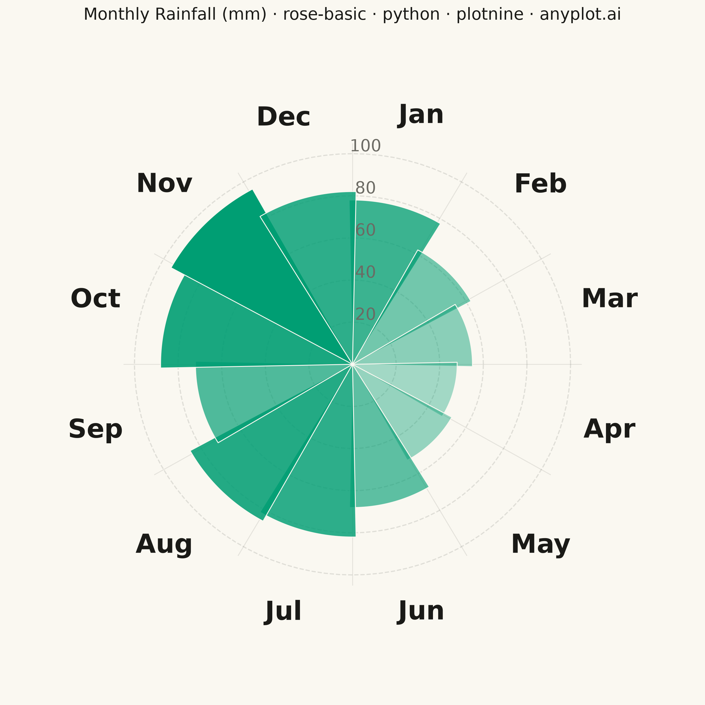
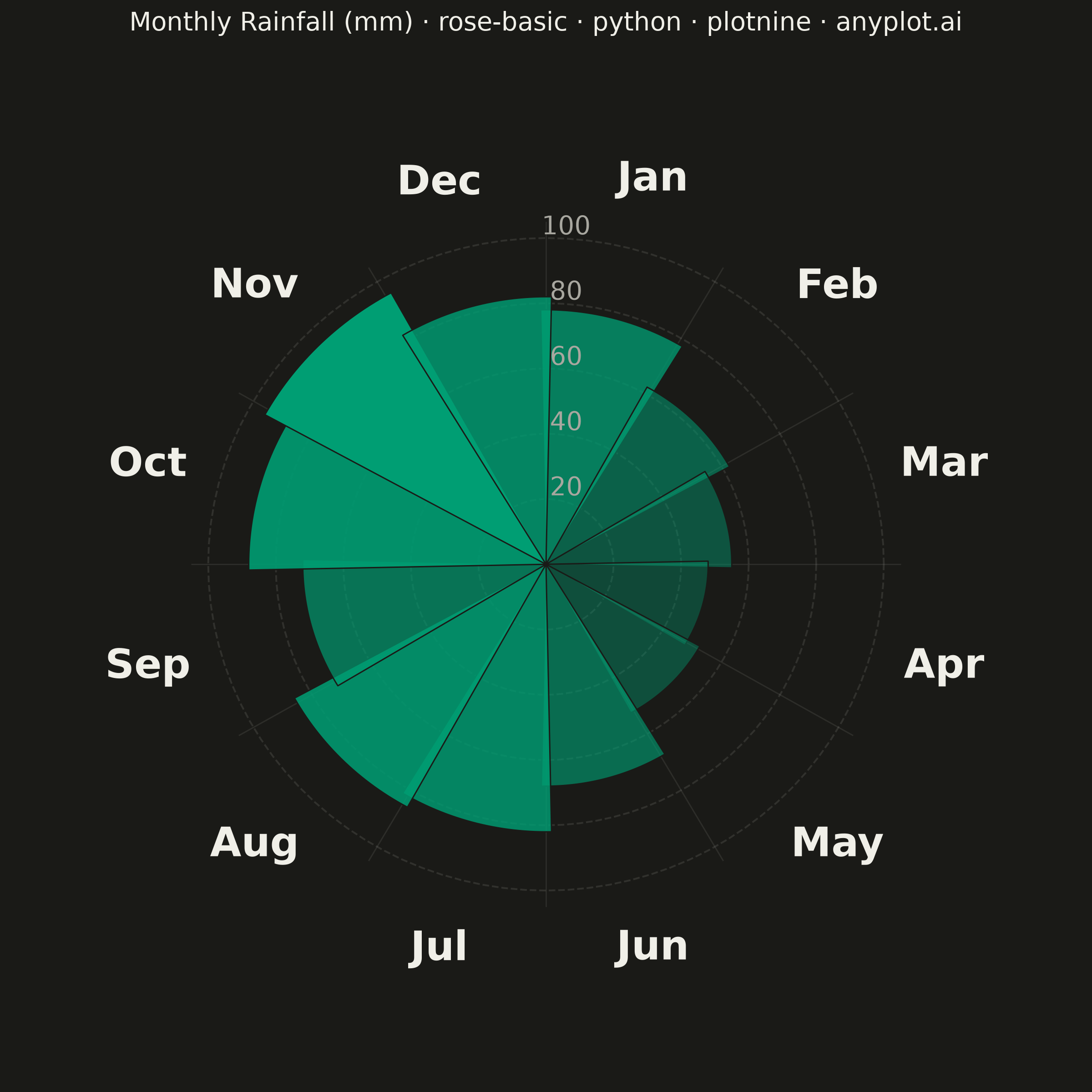
A rose chart (also called Nightingale or coxcomb diagram) displays categorical data in a circular format where segments are arranged around the center like pie slices, but with radius proportional to the value rather than angle. This visualization excels at showing cyclical or directional patterns where the circular arrangement has natural meaning. The equal-angle wedges make comparison of values across categories intuitive while emphasizing the periodic nature of the data.
""" anyplot.ai
rose-basic: Basic Rose Chart
Library: plotnine 0.15.7 | Python 3.13.14
Quality: 90/100 | Updated: 2026-07-25
"""

import math
import os
import sys


# Remove this file's own directory from sys.path so that "plotnine" resolves
# to the installed library rather than this file (Python 3.13 naming-collision fix).
_script_dir = os.path.dirname(os.path.abspath(__file__))
sys.path = [p for p in sys.path if os.path.realpath(p) != os.path.realpath(_script_dir)]

import numpy as np
import pandas as pd
from plotnine import (
    aes,
    element_blank,
    element_rect,
    element_text,
    geom_path,
    geom_polygon,
    geom_text,
    ggplot,
    labs,
    scale_alpha_continuous,
    scale_x_continuous,
    scale_y_continuous,
    theme,
)


# Theme tokens (Imprint palette)
THEME = os.getenv("ANYPLOT_THEME", "light")
PAGE_BG = "#FAF8F1" if THEME == "light" else "#1A1A17"
INK = "#1A1A17" if THEME == "light" else "#F0EFE8"
INK_SOFT = "#4A4A44" if THEME == "light" else "#B8B7B0"
INK_MUTED = "#6B6A63" if THEME == "light" else "#A8A79F"
BRAND = "#009E73"  # Imprint palette position 1 — always first series

# Data - Monthly rainfall (mm) for a temperate climate
months = ["Jan", "Feb", "Mar", "Apr", "May", "Jun", "Jul", "Aug", "Sep", "Oct", "Nov", "Dec"]
rainfall = [78, 62, 55, 48, 52, 68, 82, 85, 72, 88, 95, 82]

n = len(months)

# Create wedge polygons for each month. Radius is proportional to rainfall
# (not area), and fill alpha also scales with rainfall so a single Imprint
# hue (rainfall -> water -> brand green) carries the value redundantly
# without a second, competing colormap.
n_arc_points = 30
wedge_rows = []
for i, (month, value) in enumerate(zip(months, rainfall, strict=True)):
    start_angle = math.pi / 2 - (i * 2 * math.pi / n)
    end_angle = math.pi / 2 - ((i + 1) * 2 * math.pi / n)
    gap = 0.02
    start_angle += gap
    end_angle -= gap
    wedge_rows.append({"x": 0, "y": 0, "month": month, "rainfall": value, "order": 0})
    for j, angle in enumerate(np.linspace(start_angle, end_angle, n_arc_points)):
        wedge_rows.append(
            {
                "x": value * math.cos(angle),
                "y": value * math.sin(angle),
                "month": month,
                "rainfall": value,
                "order": j + 1,
            }
        )
    wedge_rows.append({"x": 0, "y": 0, "month": month, "rainfall": value, "order": n_arc_points + 1})

df = pd.DataFrame(wedge_rows)
df["month"] = pd.Categorical(df["month"], categories=months, ordered=True)

# Radial gridlines (circles)
grid_rows = []
grid_angles = np.linspace(0, 2 * math.pi, 101)
for radius in [20, 40, 60, 80, 100]:
    for angle in grid_angles:
        grid_rows.append({"x": radius * math.cos(angle), "y": radius * math.sin(angle), "radius": radius})
grid_df = pd.DataFrame(grid_rows)

# Spoke lines from center to edge
spoke_rows = []
for i in range(n):
    angle = math.pi / 2 - (i * 2 * math.pi / n)
    spoke_rows.append({"x": 0, "y": 0, "spoke_id": i})
    spoke_rows.append({"x": 105 * math.cos(angle), "y": 105 * math.sin(angle), "spoke_id": i})
spoke_df = pd.DataFrame(spoke_rows)

# Month labels positioned outside the chart
label_rows = []
for i, month in enumerate(months):
    center_angle = math.pi / 2 - ((i + 0.5) * 2 * math.pi / n)
    label_rows.append({"label": month, "x": 122 * math.cos(center_angle), "y": 122 * math.sin(center_angle)})
label_df = pd.DataFrame(label_rows)

# Value labels positioned along the top-right spoke
value_label_rows = [{"label": str(r), "x": 6, "y": r + 4} for r in [20, 40, 60, 80, 100]]
value_label_df = pd.DataFrame(value_label_rows)

# Plot
plot = (
    ggplot()
    + geom_path(
        aes(x="x", y="y", group="radius"), data=grid_df, color=INK_SOFT, size=0.4, alpha=0.15, linetype="dashed"
    )
    + geom_path(aes(x="x", y="y", group="spoke_id"), data=spoke_df, color=INK_SOFT, size=0.3, alpha=0.12)
    + geom_polygon(aes(x="x", y="y", alpha="rainfall", group="month"), data=df, fill=BRAND, color=PAGE_BG, size=0.3)
    + geom_text(aes(x="x", y="y", label="label"), data=label_df, size=16, fontweight="bold", color=INK)
    + geom_text(aes(x="x", y="y", label="label"), data=value_label_df, size=10, color=INK_MUTED)
    + scale_alpha_continuous(range=(0.35, 1.0), guide=None)
    + scale_x_continuous(limits=(-144, 144))
    + scale_y_continuous(limits=(-144, 144))
    + labs(title="Monthly Rainfall (mm) · rose-basic · python · plotnine · anyplot.ai")
    + theme(
        figure_size=(6, 6),
        plot_background=element_rect(fill=PAGE_BG, color=PAGE_BG),
        panel_background=element_rect(fill=PAGE_BG),
        plot_title=element_text(size=10, ha="center", color=INK),
        axis_title=element_blank(),
        axis_text=element_blank(),
        axis_ticks=element_blank(),
        axis_line=element_blank(),
        panel_grid_major=element_blank(),
        panel_grid_minor=element_blank(),
        panel_border=element_blank(),
        legend_position="none",
    )
)

# Save
plot.save(f"plot-{THEME}.png", dpi=400, width=6, height=6, units="in")
Runnable source as JSON, for any HTTP client: https://api.anyplot.ai/specs/rose-basic/plotnine/code. Any spec id and library id listed in llms-full.txt fit the same URL shape; every URL below is complete and callable.
{
  "spec_id": "rose-basic",
  "language": "python",
  "library": "plotnine",
  "page": "https://anyplot.ai/rose-basic/python/plotnine",
  "hub": "https://anyplot.ai/rose-basic",
  "code_json": "https://api.anyplot.ai/specs/rose-basic/plotnine/code",
  "spec_json": "https://api.anyplot.ai/specs/rose-basic",
  "render_light_png": "https://storage.googleapis.com/anyplot-images/plots/rose-basic/python/plotnine/plot-light.png",
  "render_dark_png": "https://storage.googleapis.com/anyplot-images/plots/rose-basic/python/plotnine/plot-dark.png",
  "quality_score": 90.0,
  "license": "MIT",
  "guide": "https://anyplot.ai/llms.txt"
}
Part of Basic Rose Chart on anyplot.ai.