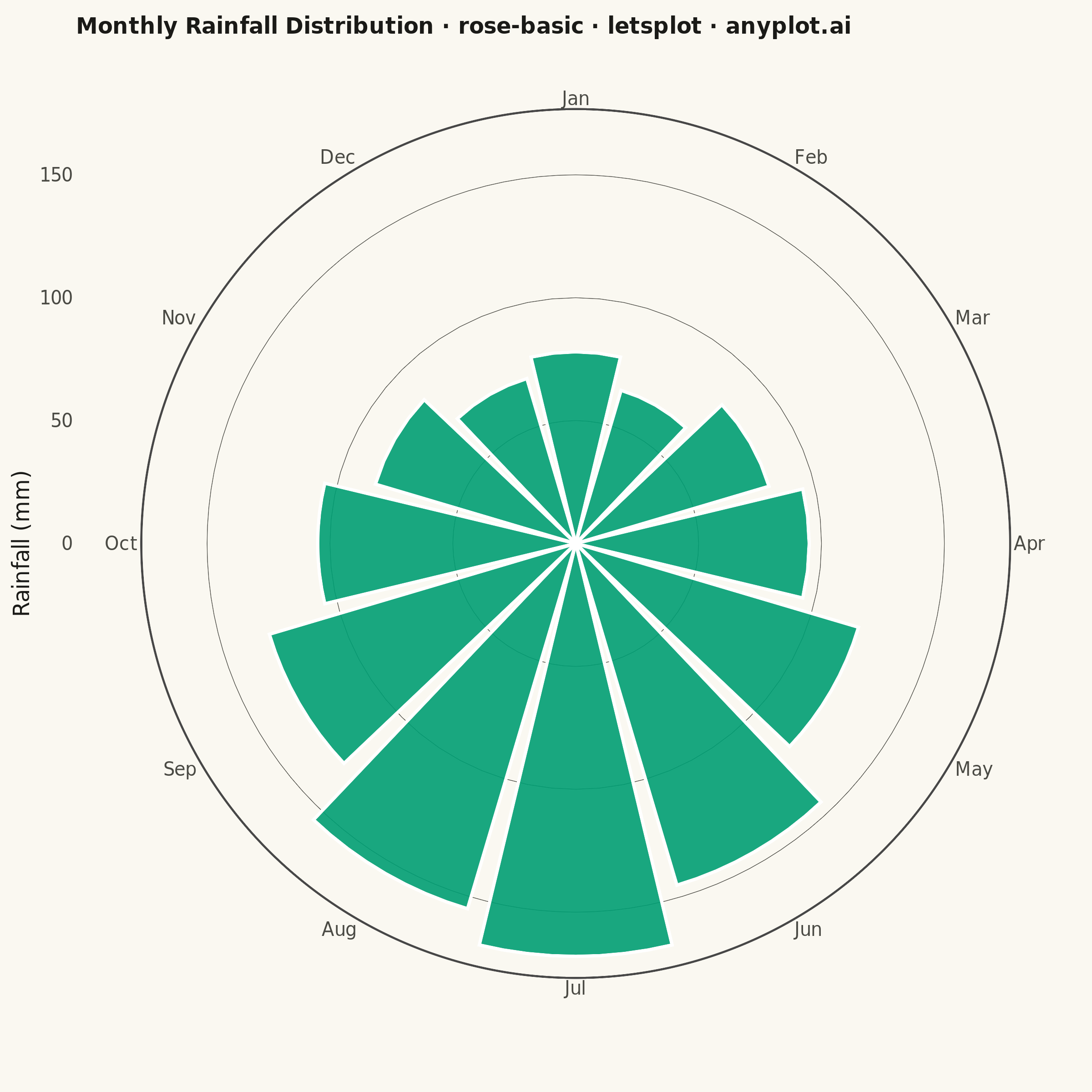
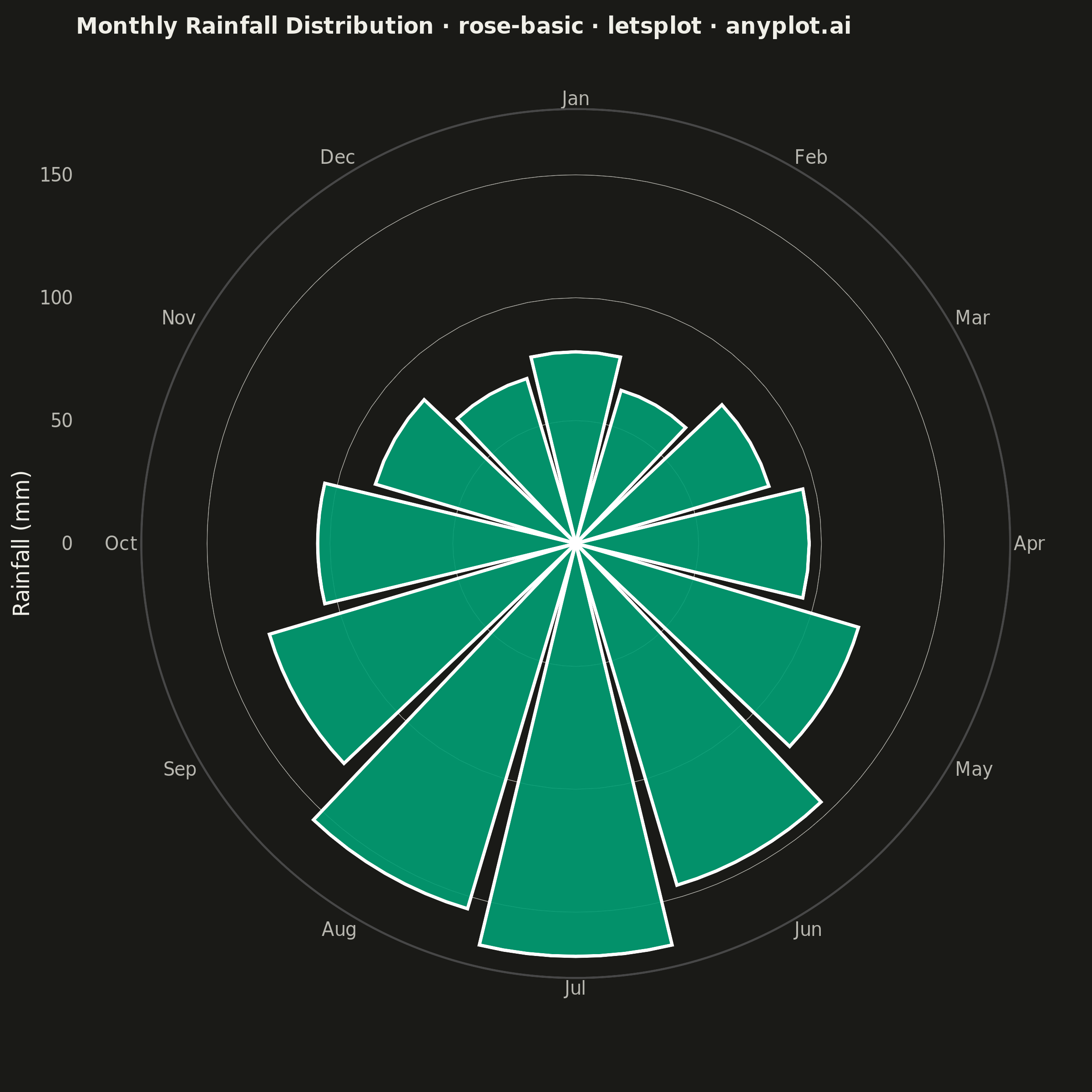
A rose chart (also called Nightingale or coxcomb diagram) displays categorical data in a circular format where segments are arranged around the center like pie slices, but with radius proportional to the value rather than angle. This visualization excels at showing cyclical or directional patterns where the circular arrangement has natural meaning. The equal-angle wedges make comparison of values across categories intuitive while emphasizing the periodic nature of the data.
""" anyplot.ai
rose-basic: Basic Rose Chart
Library: letsplot 4.11.0 | Python 3.13.14
Quality: 86/100 | Updated: 2026-07-25
"""

import os

import pandas as pd
from lets_plot import (
    LetsPlot,
    aes,
    coord_polar,
    element_blank,
    element_line,
    element_rect,
    element_text,
    geom_bar,
    ggplot,
    ggsize,
    labs,
    theme,
    theme_minimal,
)
from lets_plot.export import ggsave
from PIL import Image


LetsPlot.setup_html()

# Theme-adaptive chrome (Imprint)
THEME = os.getenv("ANYPLOT_THEME", "light")
PAGE_BG = "#FAF8F1" if THEME == "light" else "#1A1A17"
PAGE_BG_RGB = (250, 248, 241) if THEME == "light" else (26, 26, 23)
INK = "#1A1A17" if THEME == "light" else "#F0EFE8"
INK_SOFT = "#4A4A44" if THEME == "light" else "#B8B7B0"
BRAND = "#009E73"  # Imprint palette position 1 — always first/only series

# Data - Monthly rainfall (mm) showing seasonal patterns
months = ["Jan", "Feb", "Mar", "Apr", "May", "Jun", "Jul", "Aug", "Sep", "Oct", "Nov", "Dec"]
rainfall = [78, 65, 82, 95, 120, 145, 168, 155, 130, 105, 85, 70]

df = pd.DataFrame({"month": months, "rainfall": rainfall})
# Maintain natural month ordering
df["month"] = pd.Categorical(df["month"], categories=months, ordered=True)

# Plot - Rose chart using polar coordinates; single metric uses one Imprint hue
plot = (
    ggplot(df, aes(x="month", y="rainfall"))
    + geom_bar(stat="identity", width=0.9, fill=BRAND, alpha=0.9)
    + coord_polar()
    + labs(title="Monthly Rainfall Distribution · rose-basic · letsplot · anyplot.ai", x="", y="Rainfall (mm)")
    + theme_minimal()
    + theme(
        plot_background=element_rect(fill=PAGE_BG, color=PAGE_BG),
        panel_background=element_rect(fill=PAGE_BG),
        panel_border=element_blank(),
        panel_grid_major=element_line(color=INK_SOFT, size=0.3),
        panel_grid_major_x=element_blank(),  # drop angular spokes, keep radial rings
        panel_grid_minor=element_blank(),  # minor gridlines also draw angular spokes in polar coords
        # Title fontsize scaled for the narrower 600px-wide square canvas (2400px final)
        plot_title=element_text(size=12, face="bold", color=INK),
        axis_title_y=element_text(size=12, color=INK),
        axis_text_x=element_text(size=10, color=INK_SOFT),
        axis_text_y=element_text(size=10, color=INK_SOFT),
    )
    + ggsize(600, 600)
)

# Save
ggsave(plot, f"plot-{THEME}.png", path=".", scale=4)

# coord_polar()'s layout pass leaves a transparent margin around the plot when a
# title is present; flatten it onto the theme background so PNG edges are opaque.
img = Image.open(f"plot-{THEME}.png").convert("RGBA")
bg = Image.new("RGBA", img.size, (*PAGE_BG_RGB, 255))
Image.alpha_composite(bg, img).convert("RGB").save(f"plot-{THEME}.png")

ggsave(plot, f"plot-{THEME}.html", path=".")
Runnable source as JSON, for any HTTP client: https://api.anyplot.ai/specs/rose-basic/letsplot/code. Any spec id and library id listed in llms-full.txt fit the same URL shape; every URL below is complete and callable.
{
  "spec_id": "rose-basic",
  "language": "python",
  "library": "letsplot",
  "page": "https://anyplot.ai/rose-basic/python/letsplot",
  "hub": "https://anyplot.ai/rose-basic",
  "code_json": "https://api.anyplot.ai/specs/rose-basic/letsplot/code",
  "spec_json": "https://api.anyplot.ai/specs/rose-basic",
  "render_light_png": "https://storage.googleapis.com/anyplot-images/plots/rose-basic/python/letsplot/plot-light.png",
  "render_dark_png": "https://storage.googleapis.com/anyplot-images/plots/rose-basic/python/letsplot/plot-dark.png",
  "interactive_light_html": "https://storage.googleapis.com/anyplot-images/plots/rose-basic/python/letsplot/plot-light.html",
  "interactive_dark_html": "https://storage.googleapis.com/anyplot-images/plots/rose-basic/python/letsplot/plot-dark.html",
  "quality_score": 86.0,
  "license": "MIT",
  "guide": "https://anyplot.ai/llms.txt"
}
Part of Basic Rose Chart on anyplot.ai.