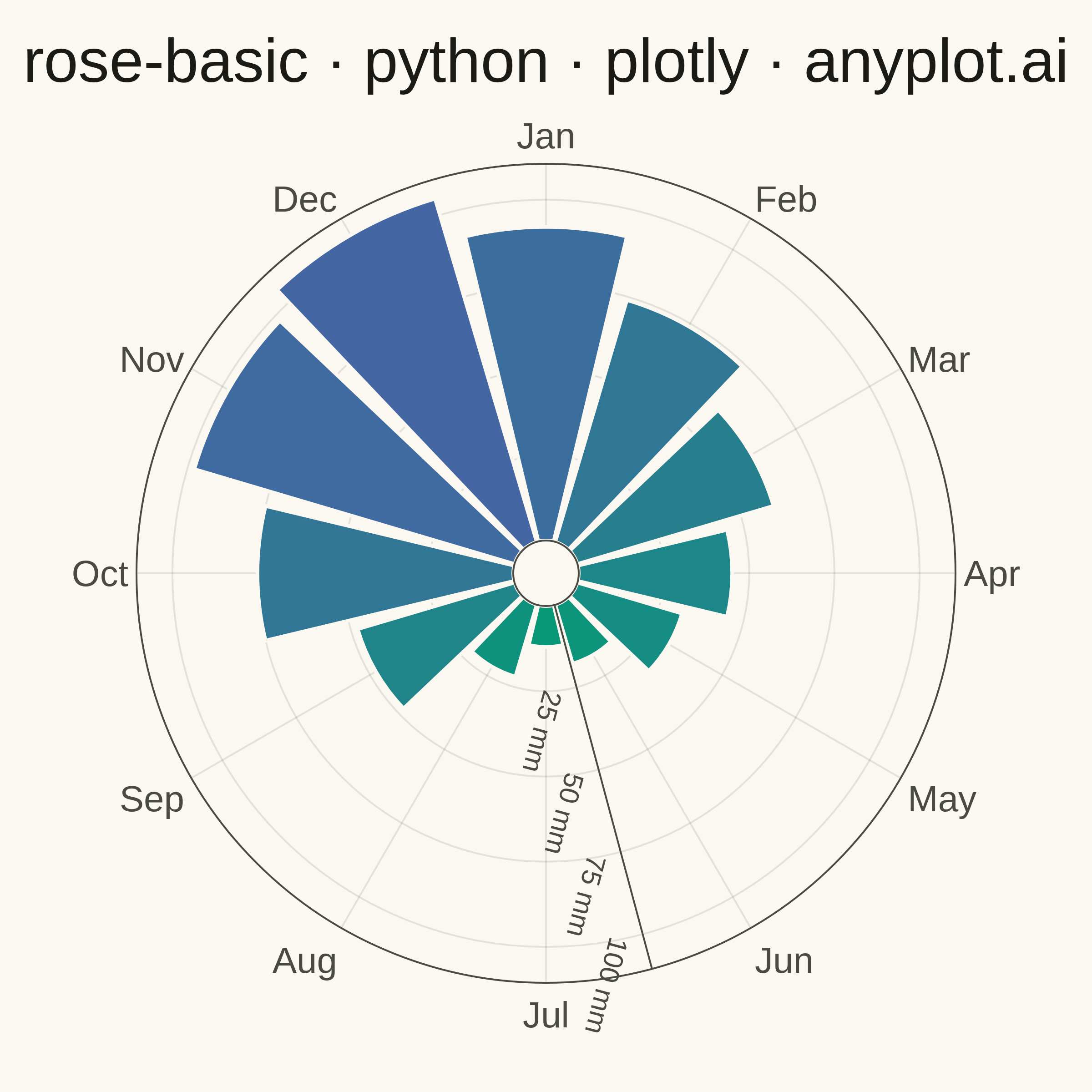
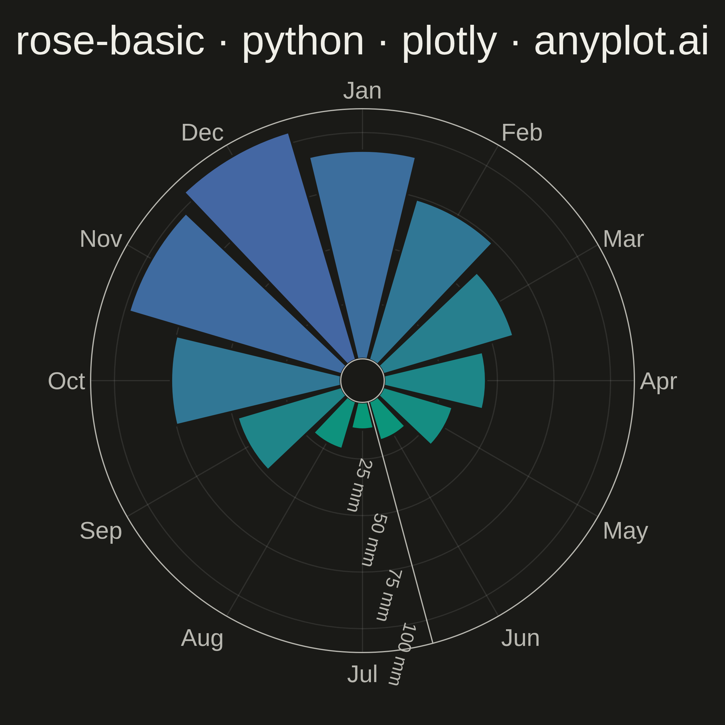
A rose chart (also called Nightingale or coxcomb diagram) displays categorical data in a circular format where segments are arranged around the center like pie slices, but with radius proportional to the value rather than angle. This visualization excels at showing cyclical or directional patterns where the circular arrangement has natural meaning. The equal-angle wedges make comparison of values across categories intuitive while emphasizing the periodic nature of the data.
""" anyplot.ai
rose-basic: Basic Rose Chart
Library: plotly 6.9.0 | Python 3.13.14
Quality: 90/100 | Updated: 2026-07-25
"""

import os

import plotly.graph_objects as go


# Theme tokens
THEME = os.getenv("ANYPLOT_THEME", "light")
PAGE_BG = "#FAF8F1" if THEME == "light" else "#1A1A17"
ELEVATED_BG = "#FFFDF6" if THEME == "light" else "#242420"
INK = "#1A1A17" if THEME == "light" else "#F0EFE8"
INK_SOFT = "#4A4A44" if THEME == "light" else "#B8B7B0"
GRID = "rgba(26,26,23,0.10)" if THEME == "light" else "rgba(240,239,232,0.10)"

# Imprint sequential colormap — brand green -> blue, single-polarity continuous data
imprint_seq = [[0.0, "#009E73"], [1.0, "#4467A3"]]

# Data - Monthly rainfall (mm) showing pronounced seasonal pattern
months = ["Jan", "Feb", "Mar", "Apr", "May", "Jun", "Jul", "Aug", "Sep", "Oct", "Nov", "Dec"]
rainfall = [92, 74, 60, 45, 32, 18, 12, 22, 48, 75, 98, 105]

# Plot
fig = go.Figure()

fig.add_trace(
    go.Barpolar(
        r=rainfall,
        theta=months,
        width=0.9,
        marker={
            "color": rainfall,
            "colorscale": imprint_seq,
            "line": {"color": PAGE_BG, "width": 2},
            "cmin": 0,
            "cmax": max(rainfall),
        },
        hovertemplate="<b>%{theta}</b><br>Rainfall: %{r} mm<extra></extra>",
    )
)

fig.update_layout(
    autosize=False,
    width=600,
    height=600,
    title={
        "text": "rose-basic · python · plotly · anyplot.ai",
        "font": {"size": 34, "color": INK},
        "x": 0.5,
        "xanchor": "center",
    },
    paper_bgcolor=PAGE_BG,
    polar={
        "bgcolor": PAGE_BG,
        "hole": 0.08,
        "angularaxis": {
            "tickfont": {"size": 20, "color": INK_SOFT},
            "direction": "clockwise",
            "rotation": 90,
            "gridcolor": GRID,
            "linecolor": INK_SOFT,
        },
        "radialaxis": {
            "tickfont": {"size": 15, "color": INK_SOFT},
            "gridcolor": GRID,
            "linecolor": INK_SOFT,
            "angle": 285,
            "tickmode": "array",
            "tickvals": [25, 50, 75, 100],
            "ticktext": ["25 mm", "50 mm", "75 mm", "100 mm"],
        },
    },
    showlegend=False,
    margin={"l": 60, "r": 60, "t": 90, "b": 60},
)

# Save
fig.write_image(f"plot-{THEME}.png", width=600, height=600, scale=4)
fig.write_html(f"plot-{THEME}.html", include_plotlyjs="cdn")
Runnable source as JSON, for any HTTP client: https://api.anyplot.ai/specs/rose-basic/plotly/code. Any spec id and library id listed in llms-full.txt fit the same URL shape; every URL below is complete and callable.
{
  "spec_id": "rose-basic",
  "language": "python",
  "library": "plotly",
  "page": "https://anyplot.ai/rose-basic/python/plotly",
  "hub": "https://anyplot.ai/rose-basic",
  "code_json": "https://api.anyplot.ai/specs/rose-basic/plotly/code",
  "spec_json": "https://api.anyplot.ai/specs/rose-basic",
  "render_light_png": "https://storage.googleapis.com/anyplot-images/plots/rose-basic/python/plotly/plot-light.png",
  "render_dark_png": "https://storage.googleapis.com/anyplot-images/plots/rose-basic/python/plotly/plot-dark.png",
  "interactive_light_html": "https://storage.googleapis.com/anyplot-images/plots/rose-basic/python/plotly/plot-light.html",
  "interactive_dark_html": "https://storage.googleapis.com/anyplot-images/plots/rose-basic/python/plotly/plot-dark.html",
  "quality_score": 90.0,
  "license": "MIT",
  "guide": "https://anyplot.ai/llms.txt"
}
Part of Basic Rose Chart on anyplot.ai.