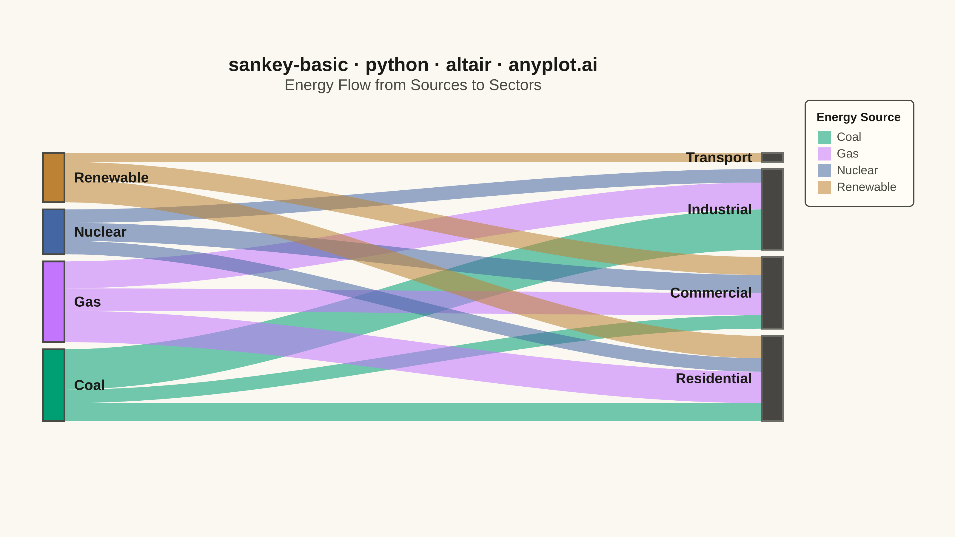
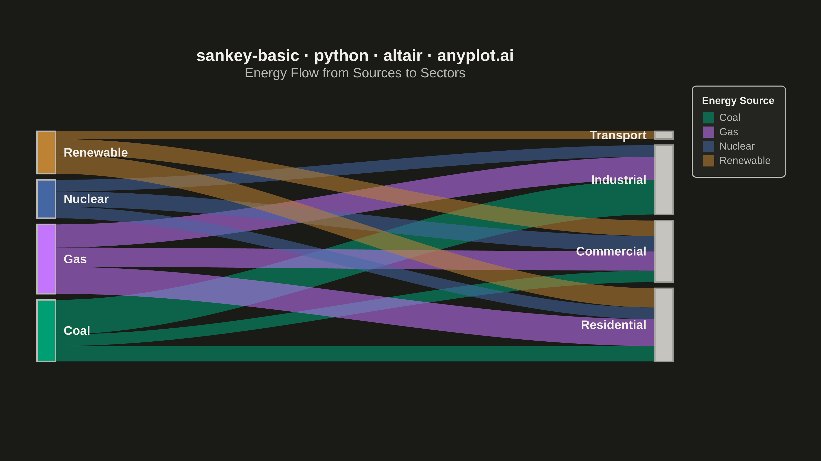
A Sankey diagram visualizes flow or transfer between nodes using links with widths proportional to flow values. It excels at showing how quantities distribute from sources to destinations, revealing patterns in resource allocation, process flows, and system transitions. The diagram makes it easy to identify major pathways and compare relative magnitudes of different flows.
""" anyplot.ai
sankey-basic: Basic Sankey Diagram
Library: altair 6.2.2 | Python 3.13.14
Quality: 89/100 | Updated: 2026-07-25
"""

import os

import altair as alt
import pandas as pd
from PIL import Image


# Theme tokens
THEME = os.getenv("ANYPLOT_THEME", "light")
PAGE_BG = "#FAF8F1" if THEME == "light" else "#1A1A17"
ELEVATED_BG = "#FFFDF6" if THEME == "light" else "#242420"
INK = "#1A1A17" if THEME == "light" else "#F0EFE8"
INK_SOFT = "#4A4A44" if THEME == "light" else "#B8B7B0"

# Data - Energy flow from sources to sectors
flows = [
    {"source": "Coal", "target": "Residential", "value": 20},
    {"source": "Coal", "target": "Commercial", "value": 15},
    {"source": "Coal", "target": "Industrial", "value": 45},
    {"source": "Gas", "target": "Residential", "value": 35},
    {"source": "Gas", "target": "Commercial", "value": 25},
    {"source": "Gas", "target": "Industrial", "value": 30},
    {"source": "Nuclear", "target": "Residential", "value": 15},
    {"source": "Nuclear", "target": "Commercial", "value": 20},
    {"source": "Nuclear", "target": "Industrial", "value": 15},
    {"source": "Renewable", "target": "Residential", "value": 25},
    {"source": "Renewable", "target": "Commercial", "value": 20},
    {"source": "Renewable", "target": "Transport", "value": 10},
]

df = pd.DataFrame(flows)

# Canvas: 620x320 inner view @ scale_factor=4.0 — vl-convert pads title/legend
# outside this view, landing near the 3200x1800 target (see prompts/library/altair.md).
width = 620
height = 320
node_width = 18
node_padding = 6
fill_ratio = 0.84  # leaves headroom so the last node never brushes the canvas edge

# Compute node positions
sources = df["source"].unique().tolist()
targets = df["target"].unique().tolist()

source_totals = df.groupby("source")["value"].sum().to_dict()
target_totals = df.groupby("target")["value"].sum().to_dict()
total_flow = df["value"].sum()

top_margin = 40
bottom_margin = 34
available_height = height - top_margin - bottom_margin

# Position source nodes on left, vertically centered
source_total_height = sum(source_totals.values()) / total_flow * available_height * fill_ratio
source_total_with_padding = source_total_height + node_padding * (len(sources) - 1)
start_y_sources = top_margin + (available_height - source_total_with_padding) / 2

source_positions = {}
current_y = start_y_sources
for src in sources:
    node_height = (source_totals[src] / total_flow) * available_height * fill_ratio
    source_positions[src] = {"y": current_y, "height": node_height}
    current_y += node_height + node_padding

# Position target nodes on right, vertically centered
target_total_height = sum(target_totals.values()) / total_flow * available_height * fill_ratio
target_total_with_padding = target_total_height + node_padding * (len(targets) - 1)
start_y_targets = top_margin + (available_height - target_total_with_padding) / 2

target_positions = {}
current_y = start_y_targets
for tgt in targets:
    node_height = (target_totals[tgt] / total_flow) * available_height * fill_ratio
    target_positions[tgt] = {"y": current_y, "height": node_height}
    current_y += node_height + node_padding

# Imprint palette positions 1-4 for source colors — distinct, colorblind-safe
source_colors = {
    "Coal": "#009E73",  # Imprint #1 (brand green) — ALWAYS first series
    "Gas": "#C475FD",  # Imprint #2 (lavender)
    "Nuclear": "#4467A3",  # Imprint #3 (blue)
    "Renewable": "#BD8233",  # Imprint #4 (ochre)
}

# Build node rectangles data
nodes_data = []
for src in sources:
    pos = source_positions[src]
    nodes_data.append(
        {
            "name": src,
            "x": 0,
            "y": pos["y"],
            "x2": node_width,
            "y2": pos["y"] + pos["height"],
            "color": source_colors[src],
            "label_x": node_width + 8,
            "label_y": pos["y"] + pos["height"] / 2,
            "total": source_totals[src],
            "side": "source",
        }
    )

for tgt in targets:
    pos = target_positions[tgt]
    nodes_data.append(
        {
            # Target nodes use the theme-adaptive neutral anchor, not a categorical
            # color — they are aggregation/baseline blocks, not their own data series.
            "name": tgt,
            "x": width - node_width,
            "y": pos["y"],
            "x2": width,
            "y2": pos["y"] + pos["height"],
            "color": INK,
            "label_x": width - node_width - 8,
            "label_y": pos["y"] + pos["height"] / 2,
            "total": target_totals[tgt],
            "side": "target",
        }
    )

nodes_df = pd.DataFrame(nodes_data)

# Generate smoothstep S-curve polygon points for each flow band
source_y_offsets = {src: source_positions[src]["y"] for src in sources}
target_y_offsets = {tgt: target_positions[tgt]["y"] for tgt in targets}

all_flow_data = []
num_curve_points = 40

for _, row in df.iterrows():
    src = row["source"]
    tgt = row["target"]
    val = row["value"]

    src_height = (val / source_totals[src]) * source_positions[src]["height"]
    tgt_height = (val / target_totals[tgt]) * target_positions[tgt]["height"]

    src_y_top = source_y_offsets[src]
    src_y_bottom = src_y_top + src_height
    tgt_y_top = target_y_offsets[tgt]
    tgt_y_bottom = tgt_y_top + tgt_height

    source_y_offsets[src] += src_height
    target_y_offsets[tgt] += tgt_height

    x_start = node_width
    x_end = width - node_width

    top_points = []
    for i in range(num_curve_points):
        t = i / (num_curve_points - 1)
        x = x_start + t * (x_end - x_start)
        bezier_t = t * t * (3 - 2 * t)
        y = src_y_top + bezier_t * (tgt_y_top - src_y_top)
        top_points.append((x, y))

    bottom_points = []
    for i in range(num_curve_points - 1, -1, -1):
        t = i / (num_curve_points - 1)
        x = x_start + t * (x_end - x_start)
        bezier_t = t * t * (3 - 2 * t)
        y = src_y_bottom + bezier_t * (tgt_y_bottom - src_y_bottom)
        bottom_points.append((x, y))

    all_points = top_points + bottom_points
    for pt_idx, (x, y) in enumerate(all_points):
        all_flow_data.append(
            {"flow_id": f"{src}-{tgt}", "source": src, "target": tgt, "value": val, "x": x, "y": y, "order": pt_idx}
        )

flows_df = pd.DataFrame(all_flow_data)

# Flow polygons colored by source — symbolType="square" so the legend swatch
# reads as a filled band rather than the line-mark default
links_chart = (
    alt.Chart(flows_df)
    .mark_line(filled=True, opacity=0.55, strokeWidth=0)
    .encode(
        x=alt.X("x:Q", scale=alt.Scale(domain=[0, width]), axis=None),
        y=alt.Y("y:Q", scale=alt.Scale(domain=[0, height]), axis=None),
        color=alt.Color(
            "source:N",
            scale=alt.Scale(domain=list(source_colors.keys()), range=list(source_colors.values())),
            legend=alt.Legend(
                title="Energy Source",
                titleFontSize=10,
                labelFontSize=10,
                orient="right",
                symbolType="square",
                symbolSize=120,
            ),
        ),
        detail="flow_id:N",
        order="order:Q",
    )
)

# Node rectangles
nodes_chart = (
    alt.Chart(nodes_df)
    .mark_rect(stroke=INK_SOFT, strokeWidth=1.5)
    .encode(
        x=alt.X("x:Q", scale=alt.Scale(domain=[0, width])),
        y=alt.Y("y:Q", scale=alt.Scale(domain=[0, height])),
        x2="x2:Q",
        y2="y2:Q",
        color=alt.Color("color:N", scale=None),
        opacity=alt.condition(alt.datum.side == "target", alt.value(0.8), alt.value(1.0)),
        tooltip=[alt.Tooltip("name:N", title="Node"), alt.Tooltip("total:Q", title="Total Flow (units)")],
    )
)

# Source labels (right of left nodes)
source_labels_df = nodes_df[nodes_df["side"] == "source"]
source_labels = (
    alt.Chart(source_labels_df)
    .mark_text(fontSize=12, fontWeight="bold", align="left", baseline="middle")
    .encode(
        x=alt.X("label_x:Q", scale=alt.Scale(domain=[0, width])),
        y=alt.Y("label_y:Q", scale=alt.Scale(domain=[0, height])),
        text="name:N",
        color=alt.value(INK),
    )
)

# Target labels (left of right nodes)
target_labels_df = nodes_df[nodes_df["side"] == "target"]
target_labels = (
    alt.Chart(target_labels_df)
    .mark_text(fontSize=12, fontWeight="bold", align="right", baseline="middle")
    .encode(
        x=alt.X("label_x:Q", scale=alt.Scale(domain=[0, width])),
        y=alt.Y("label_y:Q", scale=alt.Scale(domain=[0, height])),
        text="name:N",
        color=alt.value(INK),
    )
)

# Compose all layers with theme-adaptive chrome
chart = (
    alt.layer(links_chart, nodes_chart, source_labels, target_labels)
    .properties(
        width=width,
        height=height,
        background=PAGE_BG,
        title=alt.Title(
            text="sankey-basic · python · altair · anyplot.ai",
            subtitle="Energy Flow from Sources to Sectors",
            fontSize=16,
            subtitleFontSize=13,
            anchor="middle",
            color=INK,
            subtitleColor=INK_SOFT,
        ),
    )
    .configure_view(strokeWidth=0, fill=PAGE_BG)
    .configure_legend(
        padding=10, cornerRadius=4, fillColor=ELEVATED_BG, strokeColor=INK_SOFT, labelColor=INK_SOFT, titleColor=INK
    )
)

# Save outputs — PNG padded to the exact 3200x1800 target (see altair.md "Canvas")
chart.save(f"plot-{THEME}.png", scale_factor=4.0)

TW, TH = 3200, 1800
_img = Image.open(f"plot-{THEME}.png").convert("RGB")
_w, _h = _img.size
if _w > TW or _h > TH:
    raise SystemExit(
        f"altair vl-convert produced {_w}x{_h}, exceeds target {TW}x{TH}. "
        f"Shrink chart .properties(width=, height=) values and re-render."
    )
if _w < TW or _h < TH:
    _canvas = Image.new("RGB", (TW, TH), PAGE_BG)
    _canvas.paste(_img, ((TW - _w) // 2, (TH - _h) // 2))
    _canvas.save(f"plot-{THEME}.png")

chart.save(f"plot-{THEME}.html")
Runnable source as JSON, for any HTTP client: https://api.anyplot.ai/specs/sankey-basic/altair/code. Any spec id and library id listed in llms-full.txt fit the same URL shape; every URL below is complete and callable.
{
  "spec_id": "sankey-basic",
  "language": "python",
  "library": "altair",
  "page": "https://anyplot.ai/sankey-basic/python/altair",
  "hub": "https://anyplot.ai/sankey-basic",
  "code_json": "https://api.anyplot.ai/specs/sankey-basic/altair/code",
  "spec_json": "https://api.anyplot.ai/specs/sankey-basic",
  "render_light_png": "https://storage.googleapis.com/anyplot-images/plots/sankey-basic/python/altair/plot-light.png",
  "render_dark_png": "https://storage.googleapis.com/anyplot-images/plots/sankey-basic/python/altair/plot-dark.png",
  "interactive_light_html": "https://storage.googleapis.com/anyplot-images/plots/sankey-basic/python/altair/plot-light.html",
  "interactive_dark_html": "https://storage.googleapis.com/anyplot-images/plots/sankey-basic/python/altair/plot-dark.html",
  "quality_score": 89.0,
  "license": "MIT",
  "guide": "https://anyplot.ai/llms.txt"
}
Part of Basic Sankey Diagram on anyplot.ai.