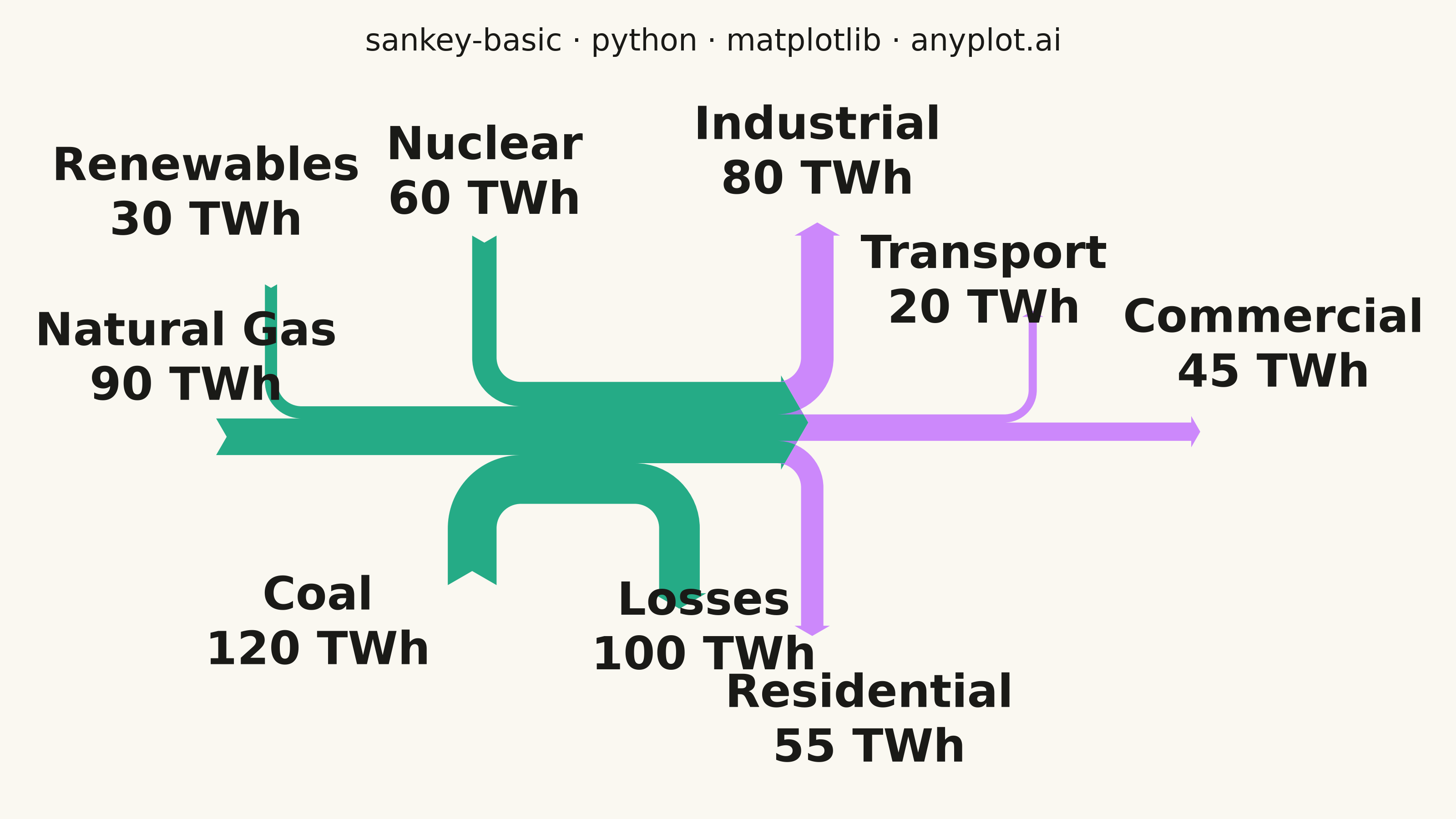
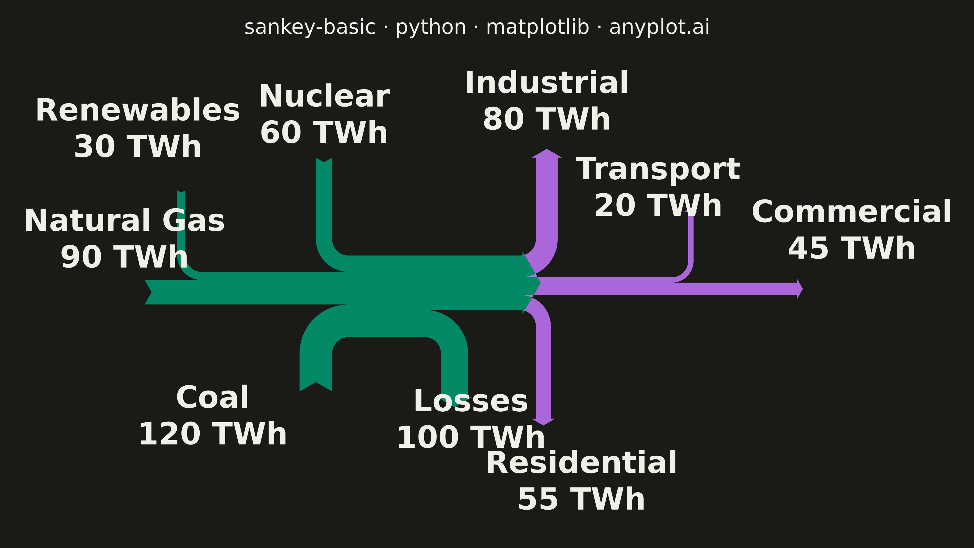
A Sankey diagram visualizes flow or transfer between nodes using links with widths proportional to flow values. It excels at showing how quantities distribute from sources to destinations, revealing patterns in resource allocation, process flows, and system transitions. The diagram makes it easy to identify major pathways and compare relative magnitudes of different flows.
""" anyplot.ai
sankey-basic: Basic Sankey Diagram
Library: matplotlib 3.11.1 | Python 3.13.14
Quality: 76/100 | Updated: 2026-07-25
"""

import os

import matplotlib.pyplot as plt
from matplotlib.sankey import Sankey


# Theme tokens (Imprint palette; see prompts/default-style-guide.md "Theme-adaptive Chrome")
THEME = os.getenv("ANYPLOT_THEME", "light")
PAGE_BG = "#FAF8F1" if THEME == "light" else "#1A1A17"
INK = "#1A1A17" if THEME == "light" else "#F0EFE8"
INK_SOFT = "#4A4A44" if THEME == "light" else "#B8B7B0"

# Imprint palette — chosen semantic mapping is stage-based rather than
# per-source: position 1 (brand) for the source/generation stage, position 2
# for the downstream end-use distribution stage. This keeps the two-stage
# flow structure (inputs -> hub -> sectors) visually legible as two families
# of ribbons instead of splintering it into eight near-identical hues.
BRAND = "#009E73"
SECONDARY = "#C475FD"

# Data - Energy flow example (in TWh - Terawatt-hours)
# This shows how energy from primary sources flows through generation
# to end-use sectors, demonstrating the typical Sankey flow pattern

# Primary energy sources (inputs)
coal = 120
natural_gas = 90
nuclear = 60
renewables = 30
total_primary = coal + natural_gas + nuclear + renewables  # 300 TWh

# Energy lost in generation/transmission
losses = 100

# Net energy delivered to sectors
residential = 55
commercial = 45
industrial = 80
transportation = 20
net_delivered = residential + commercial + industrial + transportation  # 200 TWh

# Verify balance: inputs = outputs + losses
assert total_primary == net_delivered + losses, "Energy balance must be maintained"

# Plot
fig, ax = plt.subplots(figsize=(8, 4.5), dpi=400, facecolor=PAGE_BG)
ax.set_facecolor(PAGE_BG)

sankey = Sankey(
    ax=ax,
    scale=0.0025,
    offset=0.25,
    head_angle=120,
    format="",
    unit="",
    gap=1.2,
    radius=0.15,
    shoulder=0.04,
    margin=0.6,
)

# Add primary sources to generation hub (first diagram)
# Positive flows = inputs (from sources)
# Negative flows = outputs (to next stage or losses)
# gap/pathlengths tuned so the label pairs that end up spatially close
# (Nuclear/Renewables both pointing up, Coal/Losses both pointing down)
# get enough separation to stay legible at this fontsize
sankey.add(
    flows=[coal, natural_gas, nuclear, renewables, -losses, -net_delivered],
    labels=["Coal\n120 TWh", "Natural Gas\n90 TWh", "Nuclear\n60 TWh", "Renewables\n30 TWh", "Losses\n100 TWh", ""],
    orientations=[-1, 0, 1, 1, -1, 0],
    pathlengths=[0.5, 0.3, 0.9, 0.75, 0.55, 0.5],
    facecolor=BRAND,
    edgecolor="none",
    alpha=0.85,
)

# Add distribution to end-use sectors (second diagram connected to first)
sankey.add(
    flows=[net_delivered, -residential, -commercial, -industrial, -transportation],
    labels=["", "Residential\n55 TWh", "Commercial\n45 TWh", "Industrial\n80 TWh", "Transport\n20 TWh"],
    orientations=[0, -1, 0, 1, 1],
    pathlengths=[0.3, 1.0, 0.95, 0.9, 0.6],
    prior=0,
    connect=(5, 0),
    facecolor=SECONDARY,
    edgecolor="none",
    alpha=0.85,
)

# Finish and get diagram objects
diagrams = sankey.finish()

# Style all labels with larger, theme-adaptive text for visibility
# A few default label positions sit on top of their own ribbon's curved bend
# or too close to a neighboring label — nudge those clear by hand (offsets
# tuned against the rendered PNG, same technique for every entry below).
LABEL_OFFSETS = {
    # Residential's default position sits close to Losses (both hubs break
    # away near the same seam) — nudge it clear to avoid a text collision
    "Residential": (0.35, -0.45),
    # Coal's label sits on the ribbon's downward bend into the hub
    "Coal": (-0.95, -0.25),
    # Losses' label sits on the ribbon's downward bend into the hub
    "Losses": (0.15, -0.05),
    # Renewables crowds edge-to-edge against the Nuclear/"60 TWh" label
    "Renewables": (-0.4, 0.15),
    # Commercial's straight horizontal flow passes directly through the
    # label at the same height — lift the label clear of the arrow tip
    "Commercial": (0.2, 0.35),
    # Natural Gas's "90 TWh" line sits on the Nuclear/Renewables ribbons'
    # downward bend into the hub — lift it into the gap between its own
    # flow-start arrow and that bend (kept within the label's existing
    # leftward extent so it doesn't push the figure's bounding box further
    # left and reflow every other label)
    "Natural Gas": (0.0, 0.3),
    # Industrial's "80 TWh" line touches Transport's label with no gap —
    # drop Transport down and slightly left to clear Industrial without
    # crowding into Commercial's label further right
    "Transport": (-0.3, -0.25),
}
for diagram in diagrams:
    for text in diagram.texts:
        text.set_fontsize(18)
        text.set_fontweight("bold")
        text.set_color(INK)
        label_name = text.get_text().split("\n")[0]
        if label_name in LABEL_OFFSETS:
            dx, dy = LABEL_OFFSETS[label_name]
            x, y = text.get_position()
            text.set_position((x + dx, y + dy))

# Title (mandated format; length is under the 67-char baseline, so default fontsize applies)
title = "sankey-basic · python · matplotlib · anyplot.ai"
ax.set_title(title, fontsize=12, fontweight="medium", color=INK, pad=30)

# Remove axes for cleaner look
ax.axis("off")

plt.tight_layout()
plt.savefig(f"plot-{THEME}.png", dpi=400, facecolor=PAGE_BG)  # bbox_inches MUST stay default (None)
Runnable source as JSON, for any HTTP client: https://api.anyplot.ai/specs/sankey-basic/matplotlib/code. Any spec id and library id listed in llms-full.txt fit the same URL shape; every URL below is complete and callable.
{
  "spec_id": "sankey-basic",
  "language": "python",
  "library": "matplotlib",
  "page": "https://anyplot.ai/sankey-basic/python/matplotlib",
  "hub": "https://anyplot.ai/sankey-basic",
  "code_json": "https://api.anyplot.ai/specs/sankey-basic/matplotlib/code",
  "spec_json": "https://api.anyplot.ai/specs/sankey-basic",
  "render_light_png": "https://storage.googleapis.com/anyplot-images/plots/sankey-basic/python/matplotlib/plot-light.png",
  "render_dark_png": "https://storage.googleapis.com/anyplot-images/plots/sankey-basic/python/matplotlib/plot-dark.png",
  "quality_score": 76.0,
  "license": "MIT",
  "guide": "https://anyplot.ai/llms.txt"
}
Part of Basic Sankey Diagram on anyplot.ai.