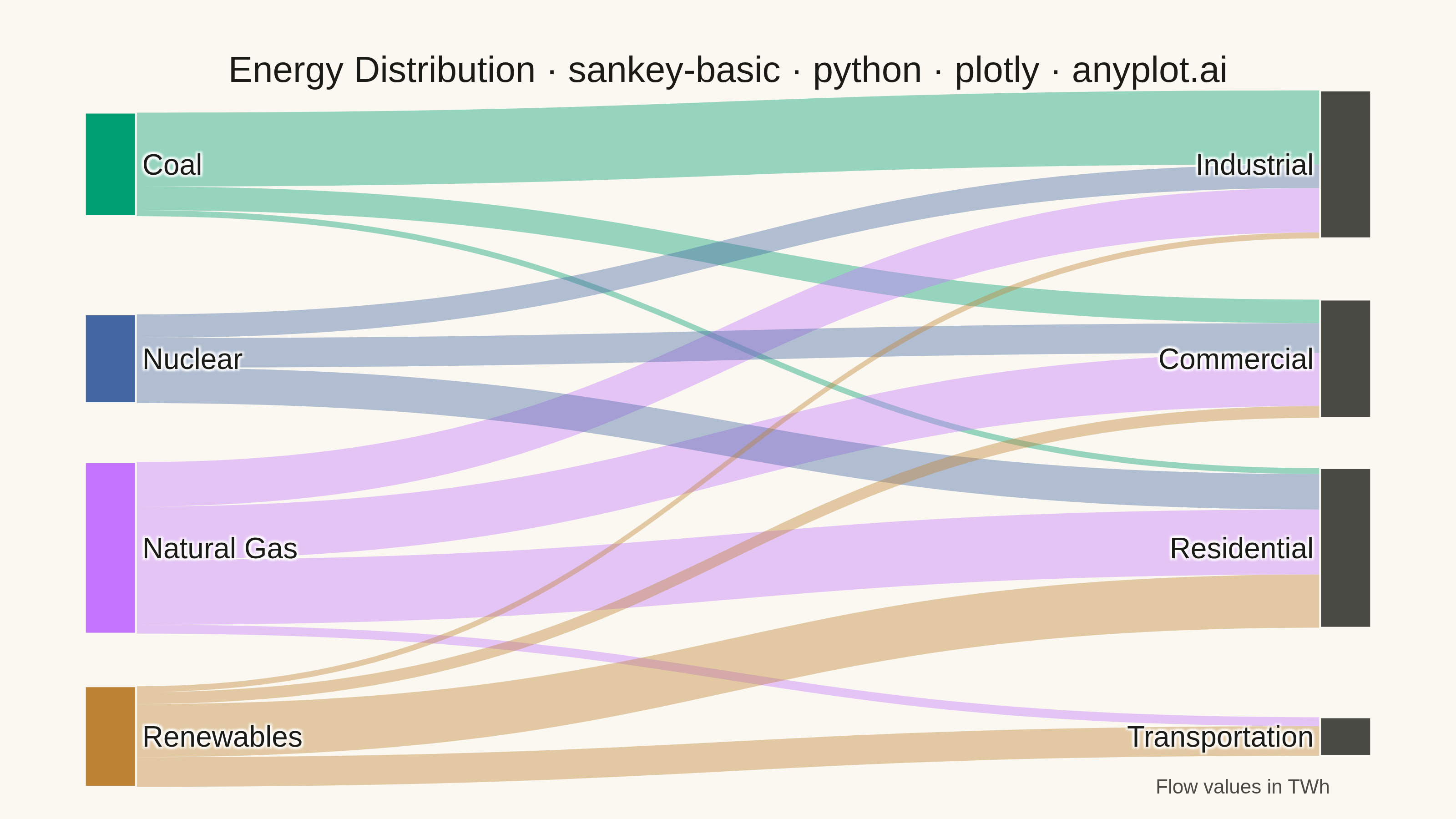
A Sankey diagram visualizes flow or transfer between nodes using links with widths proportional to flow values. It excels at showing how quantities distribute from sources to destinations, revealing patterns in resource allocation, process flows, and system transitions. The diagram makes it easy to identify major pathways and compare relative magnitudes of different flows.
""" anyplot.ai
sankey-basic: Basic Sankey Diagram
Library: plotly 6.9.0 | Python 3.13.14
Quality: 88/100 | Updated: 2026-07-25
"""

import os

import plotly.graph_objects as go


# Theme tokens
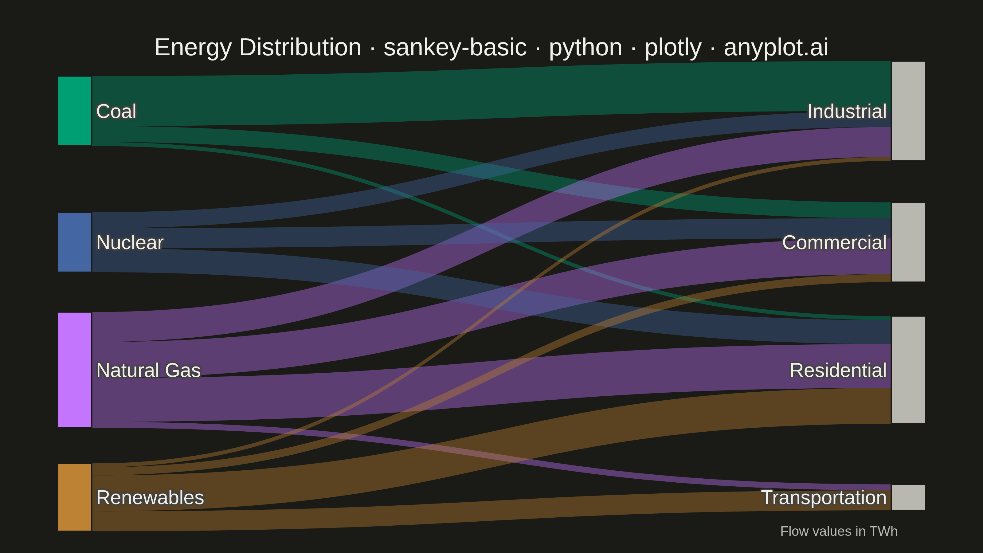
THEME = os.getenv("ANYPLOT_THEME", "light")
PAGE_BG = "#FAF8F1" if THEME == "light" else "#1A1A17"
INK = "#1A1A17" if THEME == "light" else "#F0EFE8"
INK_SOFT = "#4A4A44" if THEME == "light" else "#B8B7B0"

# Imprint palette keyed by source name (canonical order, position 1 = Coal)
SOURCE_COLOR = {"Coal": "#009E73", "Natural Gas": "#C475FD", "Nuclear": "#4467A3", "Renewables": "#BD8233"}
SOURCE_RGBA = {
    "Coal": "rgba(0, 158, 115, 0.4)",
    "Natural Gas": "rgba(196, 117, 253, 0.4)",
    "Nuclear": "rgba(68, 103, 163, 0.4)",
    "Renewables": "rgba(189, 130, 51, 0.4)",
}

# Node order chosen via barycenter heuristic (avg. position of connected flows,
# weighted by value) to reduce link crossings versus the default/alphabetical order.
sources = ["Coal", "Nuclear", "Natural Gas", "Renewables"]
targets = ["Industrial", "Commercial", "Residential", "Transportation"]
labels = sources + targets
label_index = {name: i for i, name in enumerate(labels)}

flows = [
    ("Coal", "Residential", 2),
    ("Coal", "Commercial", 8),
    ("Coal", "Industrial", 25),
    ("Natural Gas", "Residential", 22),
    ("Natural Gas", "Commercial", 18),
    ("Natural Gas", "Industrial", 15),
    ("Natural Gas", "Transportation", 3),
    ("Nuclear", "Residential", 12),
    ("Nuclear", "Commercial", 10),
    ("Nuclear", "Industrial", 8),
    ("Renewables", "Residential", 18),
    ("Renewables", "Commercial", 4),
    ("Renewables", "Industrial", 2),
    ("Renewables", "Transportation", 10),
]

source_indices = [label_index[f[0]] for f in flows]
target_indices = [label_index[f[1]] for f in flows]
values = [f[2] for f in flows]

# Source nodes use Imprint colors; target nodes use INK_SOFT
node_colors = [SOURCE_COLOR[name] for name in sources] + [INK_SOFT] * len(targets)
link_colors = [SOURCE_RGBA[f[0]] for f in flows]

# Rank-ordered y hints (per column) nudge the layout toward the low-crossing
# order above instead of Plotly's default alphabetical placement.
RANK_Y = [0.001, 0.34, 0.67, 0.999]
node_x = [0.001] * len(sources) + [0.999] * len(targets)
node_y = RANK_Y + RANK_Y

# Plot
fig = go.Figure(
    data=[
        go.Sankey(
            node={
                "pad": 20,
                "thickness": 28,
                "line": {"color": PAGE_BG, "width": 1},
                "label": labels,
                "color": node_colors,
                "x": node_x,
                "y": node_y,
                "hovertemplate": "%{label}: %{value} TWh<extra></extra>",
            },
            link={
                "source": source_indices,
                "target": target_indices,
                "value": values,
                "color": link_colors,
                "hovertemplate": "%{source.label} → %{target.label}: %{value} TWh<extra></extra>",
            },
        )
    ]
)

fig.update_layout(
    autosize=False,
    title={
        "text": "Energy Distribution · sankey-basic · python · plotly · anyplot.ai",
        "font": {"size": 20, "color": INK},
        "x": 0.5,
        "xanchor": "center",
    },
    paper_bgcolor=PAGE_BG,
    plot_bgcolor=PAGE_BG,
    font={"size": 16, "color": INK},
    margin={"l": 60, "r": 60, "t": 90, "b": 45},
    annotations=[
        {
            "text": "Flow values in TWh",
            "font": {"size": 11, "color": INK_SOFT},
            "x": 0.99,
            "y": -0.06,
            "xref": "paper",
            "yref": "paper",
            "xanchor": "right",
            "yanchor": "top",
            "showarrow": False,
        }
    ],
)

# Save
fig.write_image(f"plot-{THEME}.png", width=800, height=450, scale=4)
fig.write_html(f"plot-{THEME}.html", include_plotlyjs="cdn")
Runnable source as JSON, for any HTTP client: https://api.anyplot.ai/specs/sankey-basic/plotly/code. Any spec id and library id listed in llms-full.txt fit the same URL shape; every URL below is complete and callable.
{
  "spec_id": "sankey-basic",
  "language": "python",
  "library": "plotly",
  "page": "https://anyplot.ai/sankey-basic/python/plotly",
  "hub": "https://anyplot.ai/sankey-basic",
  "code_json": "https://api.anyplot.ai/specs/sankey-basic/plotly/code",
  "spec_json": "https://api.anyplot.ai/specs/sankey-basic",
  "render_light_png": "https://storage.googleapis.com/anyplot-images/plots/sankey-basic/python/plotly/plot-light.png",
  "render_dark_png": "https://storage.googleapis.com/anyplot-images/plots/sankey-basic/python/plotly/plot-dark.png",
  "interactive_light_html": "https://storage.googleapis.com/anyplot-images/plots/sankey-basic/python/plotly/plot-light.html",
  "interactive_dark_html": "https://storage.googleapis.com/anyplot-images/plots/sankey-basic/python/plotly/plot-dark.html",
  "quality_score": 88.0,
  "license": "MIT",
  "guide": "https://anyplot.ai/llms.txt"
}
Part of Basic Sankey Diagram on anyplot.ai.