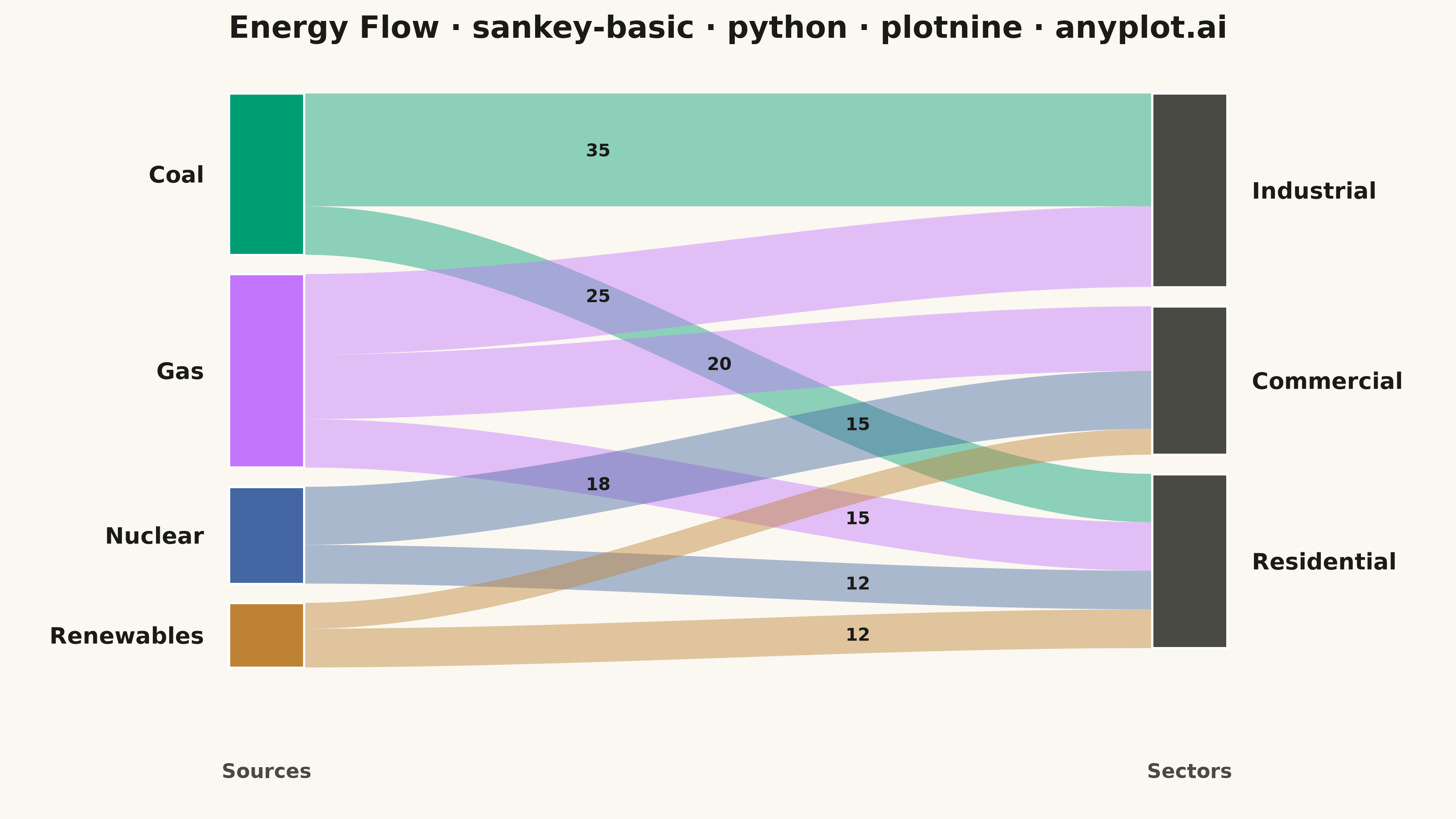
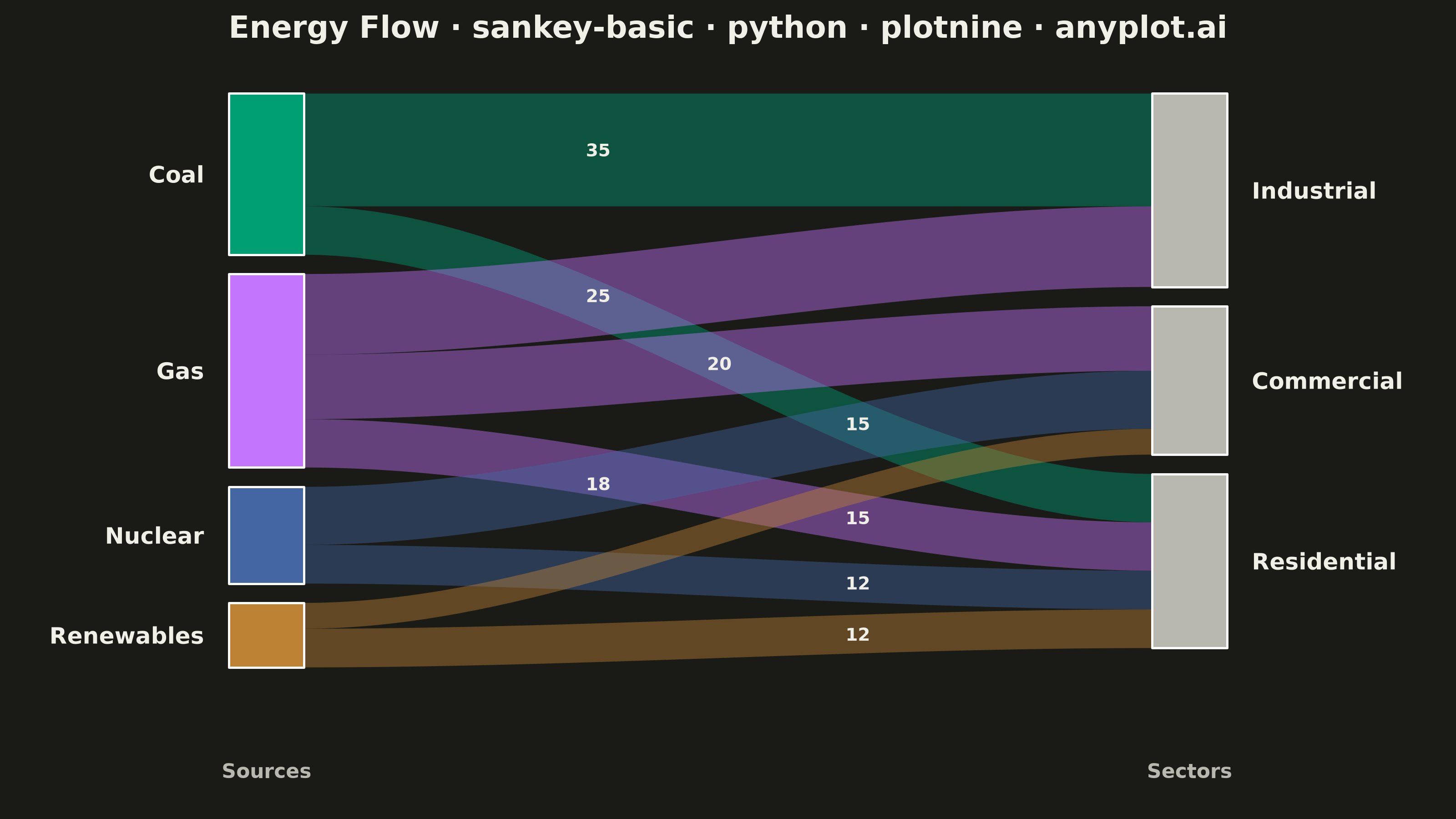
A Sankey diagram visualizes flow or transfer between nodes using links with widths proportional to flow values. It excels at showing how quantities distribute from sources to destinations, revealing patterns in resource allocation, process flows, and system transitions. The diagram makes it easy to identify major pathways and compare relative magnitudes of different flows.
""" anyplot.ai
sankey-basic: Basic Sankey Diagram
Library: plotnine 0.15.7 | Python 3.13.14
Quality: 91/100 | Updated: 2026-07-25
"""

import os
import sys


sys.path = [p for p in sys.path if os.path.abspath(p) != os.path.dirname(os.path.abspath(__file__))]

import numpy as np
import pandas as pd
from plotnine import (
    aes,
    annotate,
    coord_cartesian,
    element_blank,
    element_rect,
    element_text,
    geom_polygon,
    geom_rect,
    geom_text,
    ggplot,
    labs,
    scale_fill_manual,
    theme,
    theme_minimal,
)


THEME = os.getenv("ANYPLOT_THEME", "light")
PAGE_BG = "#FAF8F1" if THEME == "light" else "#1A1A17"
INK = "#1A1A17" if THEME == "light" else "#F0EFE8"
INK_SOFT = "#4A4A44" if THEME == "light" else "#B8B7B0"

# Imprint palette (canonical order) for source categories
IMPRINT = ["#009E73", "#C475FD", "#4467A3", "#BD8233"]

# Data - Energy flow from sources to sectors
flows = pd.DataFrame(
    {
        "source": ["Coal", "Coal", "Gas", "Gas", "Gas", "Nuclear", "Nuclear", "Renewables", "Renewables"],
        "target": [
            "Industrial",
            "Residential",
            "Industrial",
            "Commercial",
            "Residential",
            "Commercial",
            "Residential",
            "Commercial",
            "Residential",
        ],
        "value": [35, 15, 25, 20, 15, 18, 12, 8, 12],
    }
)

# Define node positions
sources = ["Coal", "Gas", "Nuclear", "Renewables"]
targets = ["Industrial", "Commercial", "Residential"]

# X positions with margins for labels
x_left = 0.10
x_right = 0.90
node_width = 0.06
node_gap = 0.03

# Calculate node sizes based on total flow
source_totals = flows.groupby("source")["value"].sum().to_dict()
target_totals = flows.groupby("target")["value"].sum().to_dict()
total_flow = flows["value"].sum()

# Calculate source node positions (left side)
source_positions = {}
current_y = 1.0
for src in sources:
    height = source_totals[src] / total_flow * 0.8
    source_positions[src] = {
        "x": x_left,
        "y_top": current_y,
        "y_bottom": current_y - height,
        "height": height,
        "flow_offset": 0,
    }
    current_y = current_y - height - node_gap

# Calculate target node positions (right side)
target_positions = {}
current_y = 1.0
for tgt in targets:
    height = target_totals[tgt] / total_flow * 0.8
    target_positions[tgt] = {
        "x": x_right,
        "y_top": current_y,
        "y_bottom": current_y - height,
        "height": height,
        "flow_offset": 0,
    }
    current_y = current_y - height - node_gap

# Imprint colors for sources; theme-adaptive neutral for targets
source_colors_map = {"Coal": IMPRINT[0], "Gas": IMPRINT[1], "Nuclear": IMPRINT[2], "Renewables": IMPRINT[3]}
target_colors_map = {"Industrial": INK_SOFT, "Commercial": INK_SOFT, "Residential": INK_SOFT}

# Build node rectangles dataframe
node_data = []
for src in sources:
    pos = source_positions[src]
    node_data.append(
        {
            "name": src,
            "xmin": pos["x"],
            "xmax": pos["x"] + node_width,
            "ymin": pos["y_bottom"],
            "ymax": pos["y_top"],
            "label_x": pos["x"] - 0.02,
            "label_y": (pos["y_top"] + pos["y_bottom"]) / 2,
            "side": "source",
            "node_color": src,
        }
    )

for tgt in targets:
    pos = target_positions[tgt]
    node_data.append(
        {
            "name": tgt,
            "xmin": pos["x"] - node_width,
            "xmax": pos["x"],
            "ymin": pos["y_bottom"],
            "ymax": pos["y_top"],
            "label_x": pos["x"] + 0.02,
            "label_y": (pos["y_top"] + pos["y_bottom"]) / 2,
            "side": "target",
            "node_color": tgt,
        }
    )

nodes_df = pd.DataFrame(node_data)

# Build flow polygons (curved paths between nodes)
flow_polygons = []
flow_labels = []
flow_x_left = x_left + node_width
flow_x_right = x_right - node_width
n_points = 50

# Stagger the label sample point along each source's outgoing flows so
# labels for flows sharing a source/target pair don't collide, while still
# sitting exactly on that flow's own curve (not an arbitrary offset).
for src in sources:
    src_flows = flows[flows["source"] == src].reset_index(drop=True)
    n_src_flows = len(src_flows)
    for i, row in src_flows.iterrows():
        tgt = row["target"]
        val = row["value"]

        flow_height = val / total_flow * 0.8

        src_pos = source_positions[src]
        src_y_top = src_pos["y_top"] - src_pos["flow_offset"]
        src_y_bottom = src_y_top - flow_height
        src_pos["flow_offset"] += flow_height

        tgt_pos = target_positions[tgt]
        tgt_y_top = tgt_pos["y_top"] - tgt_pos["flow_offset"]
        tgt_y_bottom = tgt_y_top - flow_height
        tgt_pos["flow_offset"] += flow_height

        # Smooth cubic Hermite interpolation for flow curves
        t = np.linspace(0, 1, n_points)
        x_top = flow_x_left + (flow_x_right - flow_x_left) * t
        y_top = src_y_top + (tgt_y_top - src_y_top) * (3 * t**2 - 2 * t**3)

        x_bottom = flow_x_right + (flow_x_left - flow_x_right) * t
        y_bottom = tgt_y_bottom + (src_y_bottom - tgt_y_bottom) * (3 * t**2 - 2 * t**3)

        x_polygon = np.concatenate([x_top, x_bottom])
        y_polygon = np.concatenate([y_top, y_bottom])

        for j in range(len(x_polygon)):
            flow_polygons.append({"x": x_polygon[j], "y": y_polygon[j], "flow_id": f"{src}_{tgt}", "source": src})

        # Sample the label position from a point that actually lies on this
        # flow's ribbon, staggered by index so co-sourced flows don't overlap.
        t_label = 0.35 + (i / max(n_src_flows - 1, 1)) * 0.3 if n_src_flows > 1 else 0.5
        label_idx = int(round(t_label * (n_points - 1)))
        label_x = x_top[label_idx]
        label_y = (y_top[label_idx] + y_bottom[n_points - 1 - label_idx]) / 2
        flow_labels.append({"x": label_x, "y": label_y, "value": str(val), "flow_height": flow_height})

flows_df = pd.DataFrame(flow_polygons)
flow_labels_df = pd.DataFrame(flow_labels)

# Create the plot
plot = (
    ggplot()
    # Flow polygons with transparency
    + geom_polygon(flows_df, aes(x="x", y="y", group="flow_id", fill="source"), alpha=0.44)
    # Node rectangles
    + geom_rect(
        nodes_df, aes(xmin="xmin", xmax="xmax", ymin="ymin", ymax="ymax", fill="node_color"), color="white", size=0.5
    )
    # Flow value labels (only for larger flows to avoid clutter)
    + geom_text(
        flow_labels_df[flow_labels_df["flow_height"] >= 0.05],
        aes(x="x", y="y", label="value"),
        ha="center",
        va="center",
        size=7,
        color=INK,
        fontweight="bold",
    )
    # Source labels (right-aligned)
    + geom_text(
        nodes_df[nodes_df["side"] == "source"],
        aes(x="label_x", y="label_y", label="name"),
        ha="right",
        size=9,
        color=INK,
        fontweight="bold",
    )
    # Target labels (left-aligned)
    + geom_text(
        nodes_df[nodes_df["side"] == "target"],
        aes(x="label_x", y="label_y", label="name"),
        ha="left",
        size=9,
        color=INK,
        fontweight="bold",
    )
    + scale_fill_manual(values={**source_colors_map, **target_colors_map})
    + labs(title="Energy Flow · sankey-basic · python · plotnine · anyplot.ai", x="", y="")
    + coord_cartesian(xlim=(-0.02, 1.02))
    + theme_minimal()
    + theme(
        figure_size=(8, 4.5),
        plot_background=element_rect(fill=PAGE_BG, color=PAGE_BG),
        panel_background=element_rect(fill=PAGE_BG),
        plot_title=element_text(size=12, ha="center", weight="bold", color=INK),
        axis_text=element_blank(),
        axis_ticks=element_blank(),
        panel_grid=element_blank(),
        legend_position="none",
    )
    + annotate("text", x=x_left + node_width / 2, y=-0.05, label="Sources", size=8, color=INK_SOFT, fontweight="bold")
    + annotate("text", x=x_right - node_width / 2, y=-0.05, label="Sectors", size=8, color=INK_SOFT, fontweight="bold")
)

plot.save(f"plot-{THEME}.png", dpi=400, width=8, height=4.5, units="in", verbose=False)
Runnable source as JSON, for any HTTP client: https://api.anyplot.ai/specs/sankey-basic/plotnine/code. Any spec id and library id listed in llms-full.txt fit the same URL shape; every URL below is complete and callable.
{
  "spec_id": "sankey-basic",
  "language": "python",
  "library": "plotnine",
  "page": "https://anyplot.ai/sankey-basic/python/plotnine",
  "hub": "https://anyplot.ai/sankey-basic",
  "code_json": "https://api.anyplot.ai/specs/sankey-basic/plotnine/code",
  "spec_json": "https://api.anyplot.ai/specs/sankey-basic",
  "render_light_png": "https://storage.googleapis.com/anyplot-images/plots/sankey-basic/python/plotnine/plot-light.png",
  "render_dark_png": "https://storage.googleapis.com/anyplot-images/plots/sankey-basic/python/plotnine/plot-dark.png",
  "quality_score": 91.0,
  "license": "MIT",
  "guide": "https://anyplot.ai/llms.txt"
}
Part of Basic Sankey Diagram on anyplot.ai.