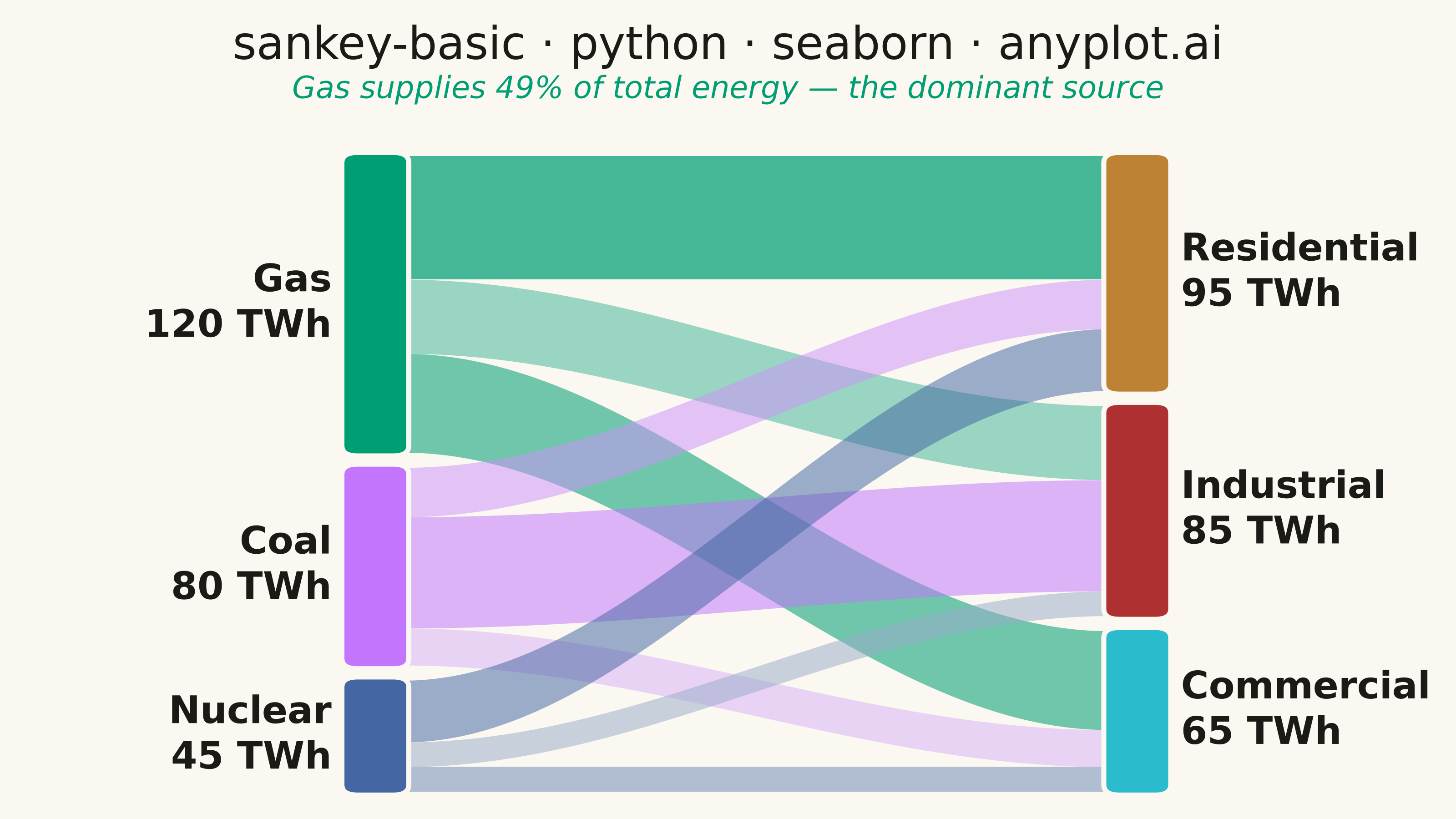
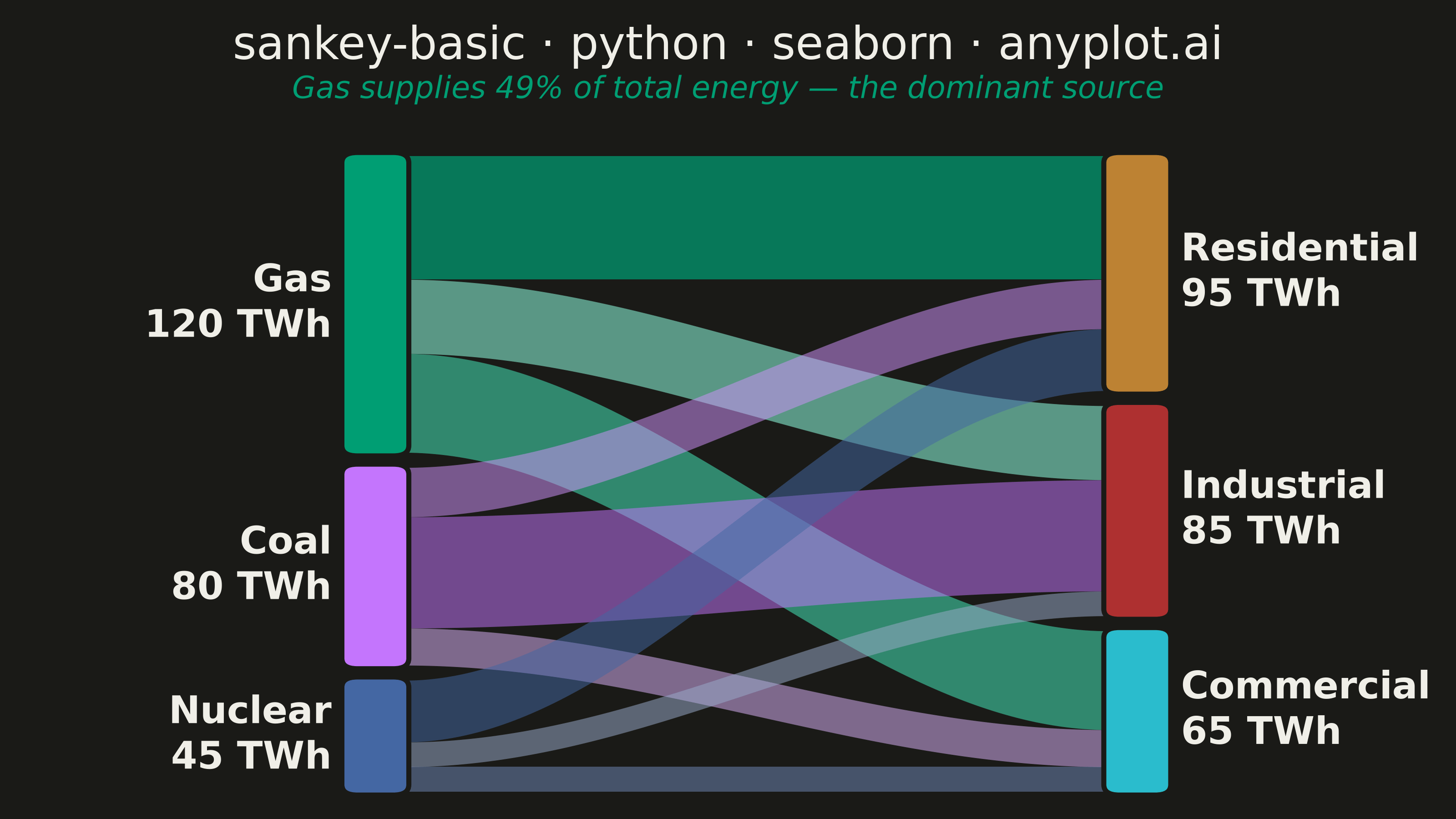
A Sankey diagram visualizes flow or transfer between nodes using links with widths proportional to flow values. It excels at showing how quantities distribute from sources to destinations, revealing patterns in resource allocation, process flows, and system transitions. The diagram makes it easy to identify major pathways and compare relative magnitudes of different flows.
""" anyplot.ai
sankey-basic: Basic Sankey Diagram
Library: seaborn 0.13.2 | Python 3.13.14
Quality: 92/100 | Updated: 2026-07-25
"""

import os

import matplotlib.patches as mpatches
import matplotlib.pyplot as plt
import pandas as pd
import seaborn as sns


# Theme tokens
THEME = os.getenv("ANYPLOT_THEME", "light")
PAGE_BG = "#FAF8F1" if THEME == "light" else "#1A1A17"
INK = "#1A1A17" if THEME == "light" else "#F0EFE8"

IMPRINT = ["#009E73", "#C475FD", "#4467A3", "#BD8233", "#AE3030", "#2ABCCD"]

sns.set_theme(style="white", rc={"figure.facecolor": PAGE_BG, "axes.facecolor": PAGE_BG, "text.color": INK})

# Data — energy flows in TWh (varied magnitudes for clear proportional scaling)
source_names = ["Gas", "Coal", "Nuclear"]
target_names = ["Residential", "Industrial", "Commercial"]
flows = [
    ("Gas", "Residential", 50),
    ("Gas", "Industrial", 30),
    ("Gas", "Commercial", 40),
    ("Coal", "Industrial", 45),
    ("Coal", "Residential", 20),
    ("Coal", "Commercial", 15),
    ("Nuclear", "Residential", 25),
    ("Nuclear", "Industrial", 10),
    ("Nuclear", "Commercial", 10),
]
df = pd.DataFrame(flows, columns=["source", "target", "value"])

source_colors = dict(zip(source_names, IMPRINT[:3], strict=True))
target_colors = dict(zip(target_names, IMPRINT[3:6], strict=True))

sources = df.groupby("source")["value"].sum().loc[source_names]
targets = df.groupby("target")["value"].sum().loc[target_names]

# Per-source flow shading — seaborn's light_palette blends each source's
# brand hue into value-ranked tints (larger flow = fuller color), a genuine
# seaborn palette feature layered on top of the Imprint categorical colors.
df["_rank"] = df.groupby("source")["value"].rank(method="first").astype(int) - 1
flow_shades = {src: sns.light_palette(source_colors[src], n_colors=len(target_names) + 2)[2:] for src in source_names}

# Layout (axes data coordinates, 0-1 logical span)
NODE_W = 0.055
X_LEFT, X_RIGHT = 0.13, 0.87
GAP = 0.022
TOTAL_H = 0.88
Y_START = 0.94

source_pos = {}
y = Y_START
for name in source_names:
    h = (sources[name] / sources.sum()) * TOTAL_H
    source_pos[name] = {"y": y - h, "h": h}
    y -= h + GAP

target_pos = {}
y = Y_START
for name in target_names:
    h = (targets[name] / targets.sum()) * TOTAL_H
    target_pos[name] = {"y": y - h, "h": h}
    y -= h + GAP

src_y = {n: source_pos[n]["y"] + source_pos[n]["h"] for n in source_names}
tgt_y = {n: target_pos[n]["y"] + target_pos[n]["h"] for n in target_names}

# Figure — canonical 3200x1800 canvas (figsize x dpi), no bbox_inches="tight"
fig, ax = plt.subplots(figsize=(8, 4.5), dpi=400, facecolor=PAGE_BG)
ax.set_facecolor(PAGE_BG)
fig.subplots_adjust(left=0.005, right=0.995, top=0.86, bottom=0.02)

t = [i / 119 for i in range(120)]
s = [v * v * (3 - 2 * v) for v in t]  # smoothstep: zero tangents at both endpoints

# Sort flows by source order then target order to minimise crossings
src_ord = {n: i for i, n in enumerate(source_names)}
tgt_ord = {n: i for i, n in enumerate(target_names)}
df["_si"] = df["source"].map(src_ord)
df["_ti"] = df["target"].map(tgt_ord)
df_sorted = df.sort_values(["_si", "_ti"])

# Draw flows
for _, row in df_sorted.iterrows():
    src, tgt, val, rank = row["source"], row["target"], row["value"], row["_rank"]
    bh_src = (val / sources[src]) * source_pos[src]["h"]
    bh_tgt = (val / targets[tgt]) * target_pos[tgt]["h"]

    y0t, y0b = src_y[src], src_y[src] - bh_src
    src_y[src] = y0b
    y1t, y1b = tgt_y[tgt], tgt_y[tgt] - bh_tgt
    tgt_y[tgt] = y1b

    x0, x1 = X_LEFT + NODE_W, X_RIGHT
    cx0, cx1 = x0 + (x1 - x0) * 0.35, x0 + (x1 - x0) * 0.65
    xs = [(1 - v) ** 3 * x0 + 3 * (1 - v) ** 2 * v * cx0 + 3 * (1 - v) * v**2 * cx1 + v**3 * x1 for v in t]
    ylo = [y0b + (y1b - y0b) * sv for sv in s]
    yhi = [y0t + (y1t - y0t) * sv for sv in s]

    # Gas (dominant source) rendered with heavier alpha for visual emphasis
    flow_alpha = 0.72 if src == "Gas" else 0.52
    ax.fill_between(xs, ylo, yhi, color=flow_shades[src][rank], alpha=flow_alpha, linewidth=0)

# Draw source nodes and labels
for name in source_names:
    pos = source_pos[name]
    ax.add_patch(
        mpatches.FancyBboxPatch(
            (X_LEFT, pos["y"]),
            NODE_W,
            pos["h"],
            boxstyle="round,pad=0.005,rounding_size=0.015",
            facecolor=source_colors[name],
            edgecolor=PAGE_BG,
            linewidth=2,
        )
    )
    ax.text(
        X_LEFT - 0.015,
        pos["y"] + pos["h"] / 2,
        f"{name}\n{sources[name]:.0f} TWh",
        ha="right",
        va="center",
        fontsize=15,
        fontweight="bold",
        color=INK,
    )

# Draw target nodes and labels
for name in target_names:
    pos = target_pos[name]
    ax.add_patch(
        mpatches.FancyBboxPatch(
            (X_RIGHT, pos["y"]),
            NODE_W,
            pos["h"],
            boxstyle="round,pad=0.005,rounding_size=0.015",
            facecolor=target_colors[name],
            edgecolor=PAGE_BG,
            linewidth=2,
        )
    )
    ax.text(
        X_RIGHT + NODE_W + 0.015,
        pos["y"] + pos["h"] / 2,
        f"{name}\n{targets[name]:.0f} TWh",
        ha="left",
        va="center",
        fontsize=15,
        fontweight="bold",
        color=INK,
    )

ax.set_xlim(-0.20, 1.20)
ax.set_ylim(0, 1)
ax.axis("off")

# Title + subtitle live in the figure's reserved top margin (not axes data
# space) so they never compete with the diagram for room.
fig.suptitle("sankey-basic · python · seaborn · anyplot.ai", fontsize=18, fontweight="medium", color=INK, y=0.97)
fig.text(
    0.5,
    0.89,
    "Gas supplies 49% of total energy — the dominant source",
    ha="center",
    va="center",
    fontsize=12,
    color=source_colors["Gas"],
    fontstyle="italic",
)

plt.savefig(f"plot-{THEME}.png", dpi=400, facecolor=PAGE_BG)
Runnable source as JSON, for any HTTP client: https://api.anyplot.ai/specs/sankey-basic/seaborn/code. Any spec id and library id listed in llms-full.txt fit the same URL shape; every URL below is complete and callable.
{
  "spec_id": "sankey-basic",
  "language": "python",
  "library": "seaborn",
  "page": "https://anyplot.ai/sankey-basic/python/seaborn",
  "hub": "https://anyplot.ai/sankey-basic",
  "code_json": "https://api.anyplot.ai/specs/sankey-basic/seaborn/code",
  "spec_json": "https://api.anyplot.ai/specs/sankey-basic",
  "render_light_png": "https://storage.googleapis.com/anyplot-images/plots/sankey-basic/python/seaborn/plot-light.png",
  "render_dark_png": "https://storage.googleapis.com/anyplot-images/plots/sankey-basic/python/seaborn/plot-dark.png",
  "quality_score": 92.0,
  "license": "MIT",
  "guide": "https://anyplot.ai/llms.txt"
}
Part of Basic Sankey Diagram on anyplot.ai.