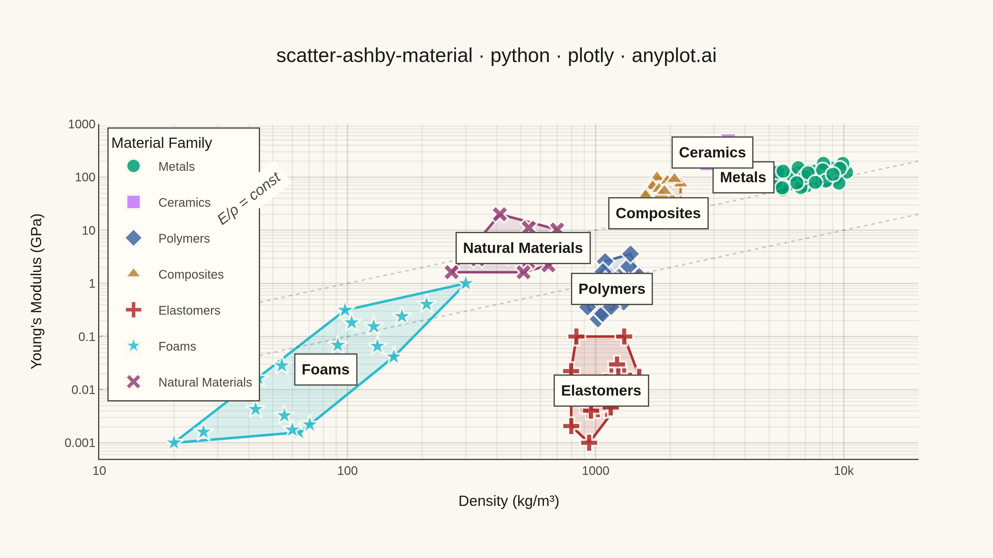
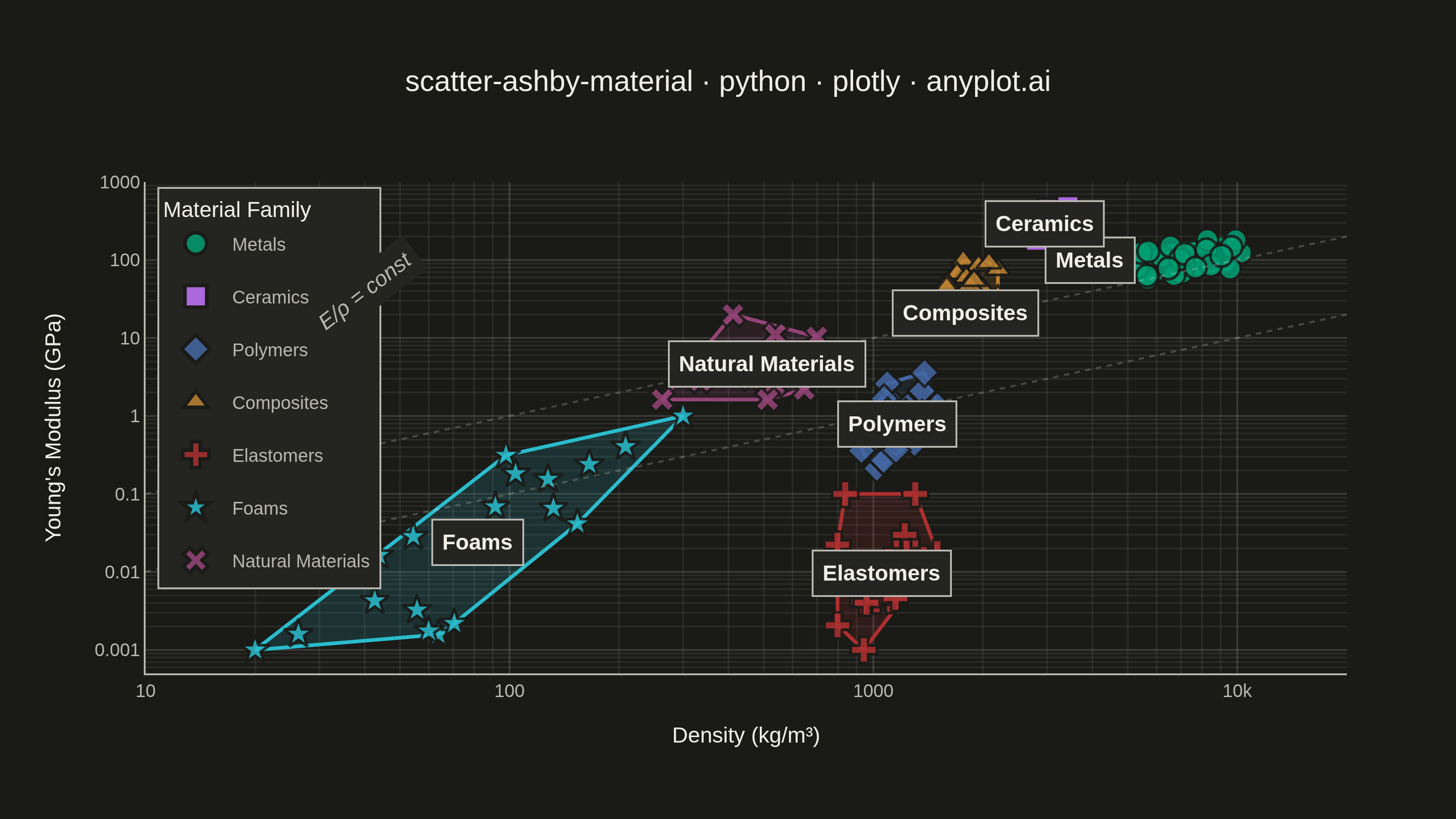
A log-log scatter plot comparing two material properties (e.g., Young's modulus vs. density) with material families displayed as labeled bubble regions. Developed by Michael Ashby for systematic material selection in engineering design, this chart enables rapid visual comparison of material classes across multiple property dimensions. It is a standard tool in materials science and mechanical engineering education.
""" anyplot.ai
scatter-ashby-material: Ashby Material Selection Chart
Library: plotly 6.7.0 | Python 3.13.13
Quality: 87/100 | Updated: 2026-06-03
"""

import os

import numpy as np
import plotly.graph_objects as go
from scipy.spatial import ConvexHull


# Theme tokens (Imprint palette — see prompts/default-style-guide.md)
THEME = os.getenv("ANYPLOT_THEME", "light")
PAGE_BG = "#FAF8F1" if THEME == "light" else "#1A1A17"
ELEVATED_BG = "#FFFDF6" if THEME == "light" else "#242420"
INK = "#1A1A17" if THEME == "light" else "#F0EFE8"
INK_SOFT = "#4A4A44" if THEME == "light" else "#B8B7B0"
GRID = "rgba(26,26,23,0.15)" if THEME == "light" else "rgba(240,239,232,0.15)"
MINOR_GRID = "rgba(26,26,23,0.07)" if THEME == "light" else "rgba(240,239,232,0.07)"
GUIDE_LINE = "rgba(26,26,23,0.20)" if THEME == "light" else "rgba(240,239,232,0.20)"

# Imprint categorical palette — canonical order, 7 families
IMPRINT_PALETTE = ["#009E73", "#C475FD", "#4467A3", "#BD8233", "#AE3030", "#2ABCCD", "#954477"]

# Data — Density (kg/m³) vs Young's Modulus (GPa) for material families
np.random.seed(42)

families = {
    "Metals": {
        "density": (5000, 11000),
        "modulus": (50, 220),
        "n": 30,
        "color": IMPRINT_PALETTE[0],
        "corr": 0.4,
        "symbol": "circle",
    },
    "Ceramics": {
        "density": (2200, 4000),
        "modulus": (180, 500),
        "n": 25,
        "color": IMPRINT_PALETTE[1],
        "corr": 0.3,
        "symbol": "square",
    },
    "Polymers": {
        "density": (900, 1500),
        "modulus": (0.2, 4),
        "n": 25,
        "color": IMPRINT_PALETTE[2],
        "corr": 0.5,
        "symbol": "diamond",
    },
    "Composites": {
        "density": (1400, 2200),
        "modulus": (10, 180),
        "n": 22,
        "color": IMPRINT_PALETTE[3],
        "corr": 0.6,
        "symbol": "triangle-up",
    },
    "Elastomers": {
        "density": (700, 1500),
        "modulus": (0.001, 0.1),
        "n": 20,
        "color": IMPRINT_PALETTE[4],
        "corr": 0.3,
        "symbol": "cross",
    },
    "Foams": {
        "density": (20, 300),
        "modulus": (0.001, 1),
        "n": 20,
        "color": IMPRINT_PALETTE[5],
        "corr": 0.7,
        "symbol": "star",
    },
    "Natural Materials": {
        "density": (150, 1300),
        "modulus": (0.5, 20),
        "n": 18,
        "color": IMPRINT_PALETTE[6],
        "corr": 0.5,
        "symbol": "x",
    },
}

# Generate log-uniform data with realistic intra-family correlations
data = {}
for family, props in families.items():
    log_d_min = np.log10(props["density"][0])
    log_d_max = np.log10(props["density"][1])
    log_m_min = np.log10(props["modulus"][0])
    log_m_max = np.log10(props["modulus"][1])
    n = props["n"]
    r = props["corr"]
    mean = [0.5 * (log_d_min + log_d_max), 0.5 * (log_m_min + log_m_max)]
    std_d = (log_d_max - log_d_min) / 4
    std_m = (log_m_max - log_m_min) / 4
    cov = [[std_d**2, r * std_d * std_m], [r * std_d * std_m, std_m**2]]
    pts = np.random.multivariate_normal(mean, cov, n)
    log_density = np.clip(pts[:, 0], log_d_min, log_d_max)
    log_modulus = np.clip(pts[:, 1], log_m_min, log_m_max)
    data[family] = {"density": 10**log_density, "modulus": 10**log_modulus}

# Plot
fig = go.Figure()

for family, props in families.items():
    d = data[family]["density"]
    m = data[family]["modulus"]
    color = props["color"]
    symbol = props["symbol"]

    r_val = int(color[1:3], 16)
    g_val = int(color[3:5], 16)
    b_val = int(color[5:7], 16)
    fill_color = f"rgba({r_val}, {g_val}, {b_val}, 0.15)"

    # Convex hull envelope for each family region
    log_pts = np.column_stack([np.log10(d), np.log10(m)])
    if len(log_pts) >= 3:
        hull = ConvexHull(log_pts)
        hull_indices = np.append(hull.vertices, hull.vertices[0])
        hull_d = 10 ** log_pts[hull_indices, 0]
        hull_m = 10 ** log_pts[hull_indices, 1]
        fig.add_trace(
            go.Scatter(
                x=hull_d,
                y=hull_m,
                mode="lines",
                line={"color": color, "width": 2},
                fill="toself",
                fillcolor=fill_color,
                showlegend=False,
                hoverinfo="skip",
            )
        )

    # Scatter points — distinct shape per family (7 series requires redundant encoding)
    e_over_rho = m / (d / 1000)
    fig.add_trace(
        go.Scatter(
            x=d,
            y=m,
            mode="markers",
            name=family,
            legendgroup=family,
            marker={
                "size": 12,
                "color": color,
                "symbol": symbol,
                "line": {"width": 1.5, "color": PAGE_BG},
                "opacity": 0.85,
            },
            customdata=np.column_stack([e_over_rho]),
            hovertemplate=(
                f"<b>{family}</b><br>"
                "Density: %{x:.0f} kg/m³<br>"
                "Modulus: %{y:.3g} GPa<br>"
                "E/ρ: %{customdata[0]:.3g} GPa·m³/Mg"
                "<extra></extra>"
            ),
        )
    )

    # Family label at log-space centroid
    centroid_d = 10 ** np.mean(np.log10(d))
    centroid_m = 10 ** np.mean(np.log10(m))
    # Adjust labels to avoid crowding — Composites lower, Metals further left
    if family == "Composites":
        centroid_m /= 2.0
    if family == "Metals":
        centroid_d /= 1.8
    fig.add_annotation(
        x=np.log10(centroid_d),
        y=np.log10(centroid_m),
        xref="x",
        yref="y",
        text=f"<b>{family}</b>",
        showarrow=False,
        font={"size": 12, "color": INK, "family": "Arial, Helvetica, sans-serif"},
        bgcolor=ELEVATED_BG,
        borderpad=5,
        bordercolor=INK_SOFT,
        borderwidth=1,
    )

# Performance index guide lines: E/rho = constant (lightweight stiffness)
guide_values = [0.001, 0.01, 0.1, 1, 10]
density_range = np.array([10, 20000])
for gv in guide_values:
    modulus_line = gv * density_range
    mask = (modulus_line >= 0.0005) & (modulus_line <= 1000)
    if mask.any():
        fig.add_trace(
            go.Scatter(
                x=density_range[mask],
                y=modulus_line[mask],
                mode="lines",
                line={"color": GUIDE_LINE, "width": 1.2, "dash": "dot"},
                showlegend=False,
                hoverinfo="skip",
            )
        )

# Guide line label
fig.add_annotation(
    x=np.log10(40),
    y=np.log10(40 * 1),
    xref="x",
    yref="y",
    text="<i>E/ρ = const</i>",
    showarrow=False,
    font={"size": 12, "color": INK_SOFT, "family": "Arial, Helvetica, sans-serif"},
    bgcolor=ELEVATED_BG,
    borderpad=4,
    textangle=-38,
)

# Title length scaling (floor 11px per plotly family rule)
title = "scatter-ashby-material · python · plotly · anyplot.ai"
title_fontsize = max(11, round(16 * min(1.0, 67 / len(title))))

# Layout — canvas 800×450 @ scale=4 → 3200×1800
fig.update_layout(
    autosize=False,
    paper_bgcolor=PAGE_BG,
    plot_bgcolor=PAGE_BG,
    template="plotly_white",
    margin={"l": 80, "r": 60, "t": 100, "b": 80},
    title={
        "text": title,
        "font": {"size": title_fontsize, "color": INK, "family": "Arial, Helvetica, sans-serif"},
        "x": 0.5,
        "xanchor": "center",
    },
    xaxis={
        "title": {"text": "Density (kg/m³)", "font": {"size": 12, "color": INK}},
        "tickfont": {"size": 10, "color": INK_SOFT},
        "type": "log",
        "showgrid": True,
        "gridcolor": GRID,
        "gridwidth": 1,
        "showline": True,
        "linecolor": INK_SOFT,
        "linewidth": 1,
        "mirror": False,
        "range": [np.log10(10), np.log10(20000)],
        "dtick": 1,
        "minor": {"showgrid": True, "gridcolor": MINOR_GRID},
        "zerolinecolor": INK_SOFT,
    },
    yaxis={
        "title": {"text": "Young's Modulus (GPa)", "font": {"size": 12, "color": INK}},
        "tickfont": {"size": 10, "color": INK_SOFT},
        "type": "log",
        "showgrid": True,
        "gridcolor": GRID,
        "gridwidth": 1,
        "showline": True,
        "linecolor": INK_SOFT,
        "linewidth": 1,
        "mirror": False,
        "range": [np.log10(0.0005), np.log10(1000)],
        "minor": {"showgrid": True, "gridcolor": MINOR_GRID},
        "zerolinecolor": INK_SOFT,
    },
    legend={
        "title": {"text": "Material Family", "font": {"size": 12, "color": INK}},
        "font": {"size": 10, "color": INK_SOFT},
        "bgcolor": ELEVATED_BG,
        "bordercolor": INK_SOFT,
        "borderwidth": 1,
        "x": 0.01,
        "y": 0.99,
        "xanchor": "left",
        "yanchor": "top",
        "itemsizing": "constant",
    },
    font={"family": "Arial, Helvetica, sans-serif", "color": INK},
)

# Save — canvas: 3200×1800 (landscape)
fig.write_image(f"plot-{THEME}.png", width=800, height=450, scale=4)
fig.write_html(f"plot-{THEME}.html", include_plotlyjs="cdn")
Runnable source as JSON, for any HTTP client: https://api.anyplot.ai/specs/scatter-ashby-material/plotly/code. Any spec id and library id listed in llms-full.txt fit the same URL shape; every URL below is complete and callable.
{
  "spec_id": "scatter-ashby-material",
  "language": "python",
  "library": "plotly",
  "page": "https://anyplot.ai/scatter-ashby-material/python/plotly",
  "hub": "https://anyplot.ai/scatter-ashby-material",
  "code_json": "https://api.anyplot.ai/specs/scatter-ashby-material/plotly/code",
  "spec_json": "https://api.anyplot.ai/specs/scatter-ashby-material",
  "render_light_png": "https://storage.googleapis.com/anyplot-images/plots/scatter-ashby-material/python/plotly/plot-light.png",
  "render_dark_png": "https://storage.googleapis.com/anyplot-images/plots/scatter-ashby-material/python/plotly/plot-dark.png",
  "interactive_light_html": "https://storage.googleapis.com/anyplot-images/plots/scatter-ashby-material/python/plotly/plot-light.html",
  "interactive_dark_html": "https://storage.googleapis.com/anyplot-images/plots/scatter-ashby-material/python/plotly/plot-dark.html",
  "quality_score": 87.0,
  "license": "MIT",
  "guide": "https://anyplot.ai/llms.txt"
}
Part of Ashby Material Selection Chart on anyplot.ai.