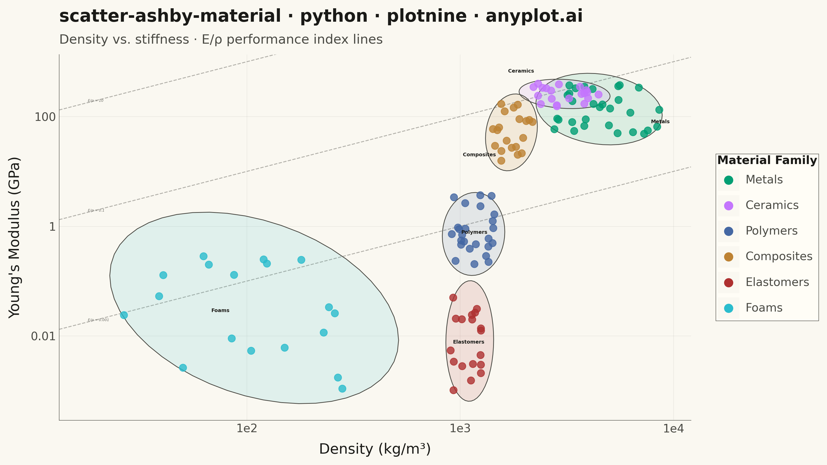
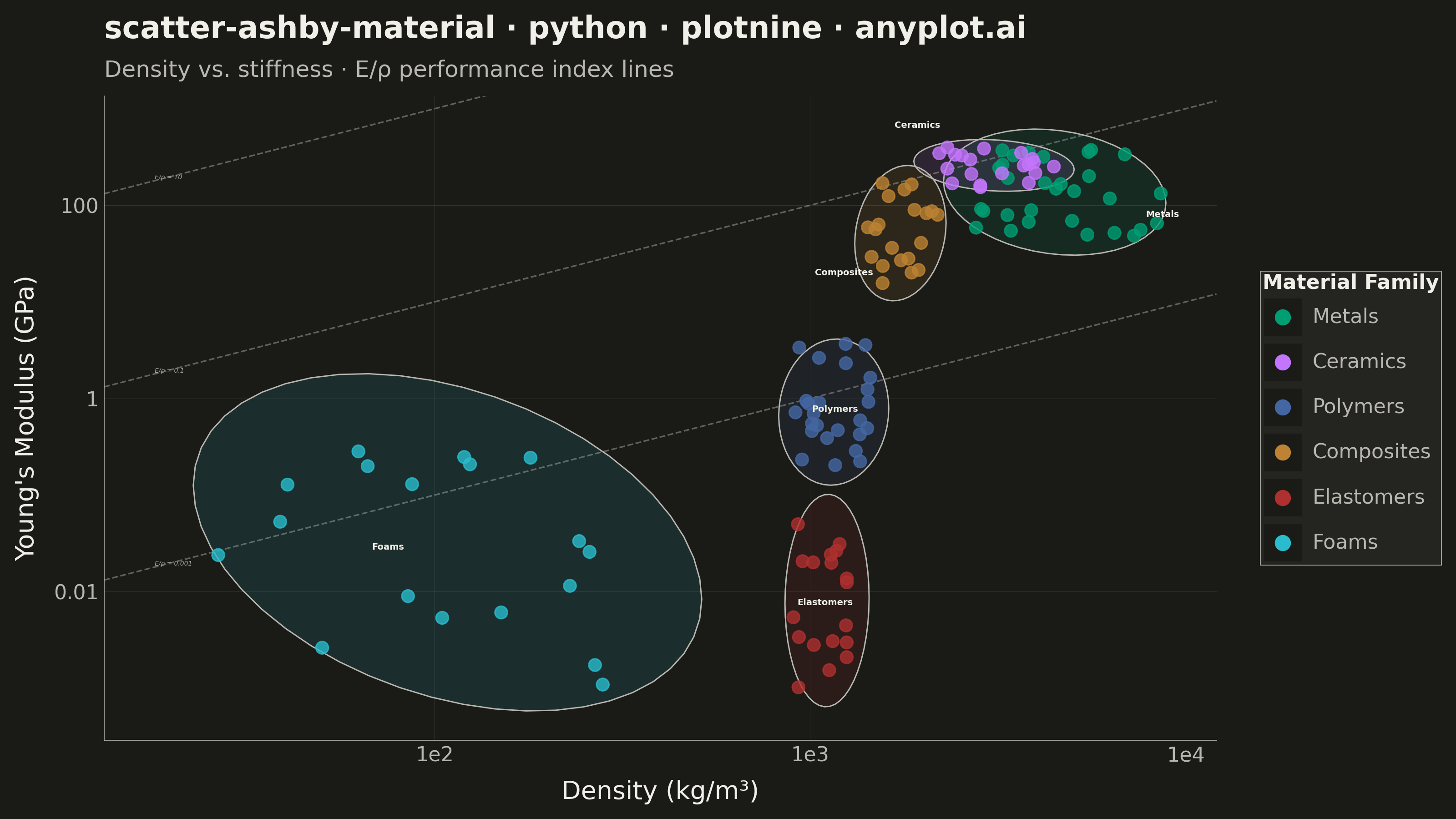
A log-log scatter plot comparing two material properties (e.g., Young's modulus vs. density) with material families displayed as labeled bubble regions. Developed by Michael Ashby for systematic material selection in engineering design, this chart enables rapid visual comparison of material classes across multiple property dimensions. It is a standard tool in materials science and mechanical engineering education.
""" anyplot.ai
scatter-ashby-material: Ashby Material Selection Chart
Library: plotnine 0.15.5 | Python 3.13.13
Quality: 90/100 | Updated: 2026-06-03
"""

import os

import numpy as np
import pandas as pd
from plotnine import (
    aes,
    element_blank,
    element_line,
    element_rect,
    element_text,
    geom_abline,
    geom_point,
    geom_text,
    ggplot,
    guide_legend,
    guides,
    labs,
    scale_color_manual,
    scale_fill_manual,
    scale_x_log10,
    scale_y_log10,
    stat_ellipse,
    theme,
    theme_minimal,
)


# Theme tokens — Imprint palette (see prompts/default-style-guide.md)
THEME = os.getenv("ANYPLOT_THEME", "light")
PAGE_BG = "#FAF8F1" if THEME == "light" else "#1A1A17"
ELEVATED_BG = "#FFFDF6" if THEME == "light" else "#242420"
INK = "#1A1A17" if THEME == "light" else "#F0EFE8"
INK_SOFT = "#4A4A44" if THEME == "light" else "#B8B7B0"
INK_MUTED = "#6B6A63" if THEME == "light" else "#A8A79F"

# Imprint categorical palette — positions 1–6 for 6 material families
IMPRINT = ["#009E73", "#C475FD", "#4467A3", "#BD8233", "#AE3030", "#2ABCCD"]

# Data — Density (kg/m³) vs. Young's Modulus (GPa) for common engineering materials
np.random.seed(42)

families = {
    "Metals": {"density": (2700, 8900), "modulus": (45, 400), "n": 30},
    "Ceramics": {"density": (2200, 4500), "modulus": (150, 450), "n": 20},
    "Polymers": {"density": (900, 1500), "modulus": (0.2, 4.0), "n": 25},
    "Composites": {"density": (1400, 2200), "modulus": (15, 200), "n": 20},
    "Elastomers": {"density": (900, 1300), "modulus": (0.001, 0.1), "n": 18},
    "Foams": {"density": (25, 300), "modulus": (0.001, 0.3), "n": 18},
}

materials = []
for family, props in families.items():
    log_d_min = np.log10(props["density"][0])
    log_d_max = np.log10(props["density"][1])
    log_m_min = np.log10(props["modulus"][0])
    log_m_max = np.log10(props["modulus"][1])
    density = 10 ** np.random.uniform(log_d_min, log_d_max, props["n"])
    modulus = 10 ** np.random.uniform(log_m_min, log_m_max, props["n"])
    for d, m in zip(density, modulus, strict=True):
        materials.append({"family": family, "density": d, "modulus": m})

df = pd.DataFrame(materials)
family_order = list(families.keys())

# Label positions — group centroids in log space with nudges to reduce upper-right crowding
label_rows = []
for family in family_order:
    subset = df[df["family"] == family]
    cx = np.log10(subset["density"].values).mean()
    cy = np.log10(subset["modulus"].values).mean()

    nudge_x, nudge_y = 0.0, 0.0
    if family == "Ceramics":
        nudge_y = 0.42  # push well above Metals cluster
        nudge_x = -0.20
    elif family == "Metals":
        nudge_x = 0.28  # push right and slightly down from Ceramics
        nudge_y = -0.22
    elif family == "Composites":
        nudge_y = -0.42  # push below the Ceramics/Metals zone
        nudge_x = -0.15
    elif family == "Foams":
        nudge_x = -0.15

    label_rows.append({"family": family, "density": 10 ** (cx + nudge_x), "modulus": 10 ** (cy + nudge_y)})

df_labels = pd.DataFrame(label_rows)
palette = dict(zip(family_order, IMPRINT, strict=True))

df["family"] = pd.Categorical(df["family"], categories=family_order, ordered=True)
df_labels["family"] = pd.Categorical(df_labels["family"], categories=family_order, ordered=True)

# E/ρ performance index guide lines: log10(E) = log10(ρ) + log10(C), slope=1 in log-log space
guide_intercepts = [np.log10(c) for c in [0.001, 0.1, 10]]
guide_labels_df = pd.DataFrame(
    {
        "density": [18.0, 18.0, 18.0],
        "modulus": [18 * 0.001, 18 * 0.1, 18 * 10],
        "label": ["E/ρ = 0.001", "E/ρ = 0.1", "E/ρ = 10"],
    }
)

title = "scatter-ashby-material · python · plotnine · anyplot.ai"

# Plot
plot = (
    ggplot(df, aes(x="density", y="modulus"))
    # E/ρ guide lines (behind data)
    + geom_abline(intercept=guide_intercepts[0], slope=1, linetype="dashed", color=INK_MUTED, size=0.35, alpha=0.5)
    + geom_abline(intercept=guide_intercepts[1], slope=1, linetype="dashed", color=INK_MUTED, size=0.35, alpha=0.5)
    + geom_abline(intercept=guide_intercepts[2], slope=1, linetype="dashed", color=INK_MUTED, size=0.35, alpha=0.5)
    + geom_text(
        guide_labels_df,
        aes(x="density", y="modulus", label="label"),
        size=2.5,
        color=INK_MUTED,
        fontstyle="italic",
        ha="left",
        va="bottom",
        show_legend=False,
    )
    # Family envelope ellipses — idiomatic plotnine for material region boundaries
    + stat_ellipse(
        aes(fill="family", group="family"),
        geom="polygon",
        level=0.90,
        alpha=0.12,
        color=INK_SOFT,
        size=0.3,
        linetype="solid",
    )
    # Scatter points
    + geom_point(aes(color="family"), size=2.5, alpha=0.8, stroke=0.3)
    + scale_x_log10()
    + scale_y_log10()
    + scale_color_manual(values=palette, name="Material Family")
    + scale_fill_manual(values=palette)
    + labs(
        x="Density (kg/m³)",
        y="Young's Modulus (GPa)",
        title=title,
        subtitle="Density vs. stiffness · E/ρ performance index lines",
    )
    # Family name labels at nudged centroids
    + geom_text(
        df_labels,
        aes(x="density", y="modulus", label="family"),
        size=3.5,
        fontweight="bold",
        color=INK,
        show_legend=False,
    )
    + guides(color=guide_legend(override_aes={"size": 3, "alpha": 1}), fill="none")
    + theme_minimal()
    + theme(
        figure_size=(8, 4.5),
        plot_title=element_text(size=12, weight="bold", color=INK),
        plot_subtitle=element_text(size=9, color=INK_SOFT),
        axis_title=element_text(size=10, color=INK),
        axis_text=element_text(size=8, color=INK_SOFT),
        legend_title=element_text(size=8, weight="bold", color=INK),
        legend_text=element_text(size=8, color=INK_SOFT),
        legend_position="right",
        legend_background=element_rect(fill=ELEVATED_BG, color=INK_SOFT, size=0.3),
        legend_key=element_rect(fill=PAGE_BG, color=PAGE_BG),
        panel_grid_minor=element_blank(),
        panel_grid_major=element_line(color=INK, size=0.2, alpha=0.12),
        panel_background=element_rect(fill=PAGE_BG),
        panel_border=element_blank(),
        axis_line=element_line(color=INK_SOFT, size=0.3),
        plot_background=element_rect(fill=PAGE_BG, color=PAGE_BG),
    )
)

# Save
plot.save(f"plot-{THEME}.png", dpi=400, width=8, height=4.5, units="in", verbose=False)
Runnable source as JSON, for any HTTP client: https://api.anyplot.ai/specs/scatter-ashby-material/plotnine/code. Any spec id and library id listed in llms-full.txt fit the same URL shape; every URL below is complete and callable.
{
  "spec_id": "scatter-ashby-material",
  "language": "python",
  "library": "plotnine",
  "page": "https://anyplot.ai/scatter-ashby-material/python/plotnine",
  "hub": "https://anyplot.ai/scatter-ashby-material",
  "code_json": "https://api.anyplot.ai/specs/scatter-ashby-material/plotnine/code",
  "spec_json": "https://api.anyplot.ai/specs/scatter-ashby-material",
  "render_light_png": "https://storage.googleapis.com/anyplot-images/plots/scatter-ashby-material/python/plotnine/plot-light.png",
  "render_dark_png": "https://storage.googleapis.com/anyplot-images/plots/scatter-ashby-material/python/plotnine/plot-dark.png",
  "quality_score": 90.0,
  "license": "MIT",
  "guide": "https://anyplot.ai/llms.txt"
}
Part of Ashby Material Selection Chart on anyplot.ai.