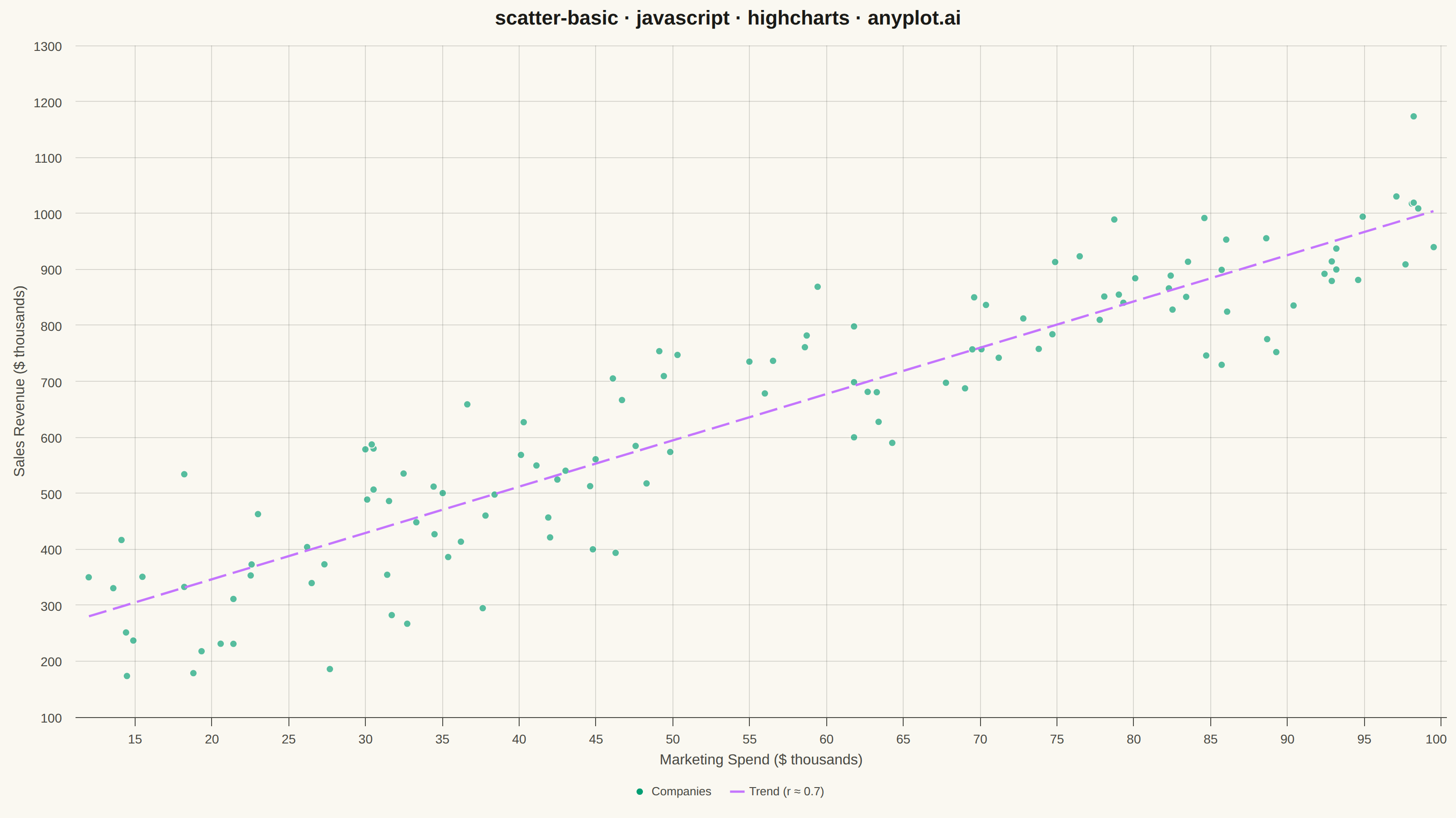
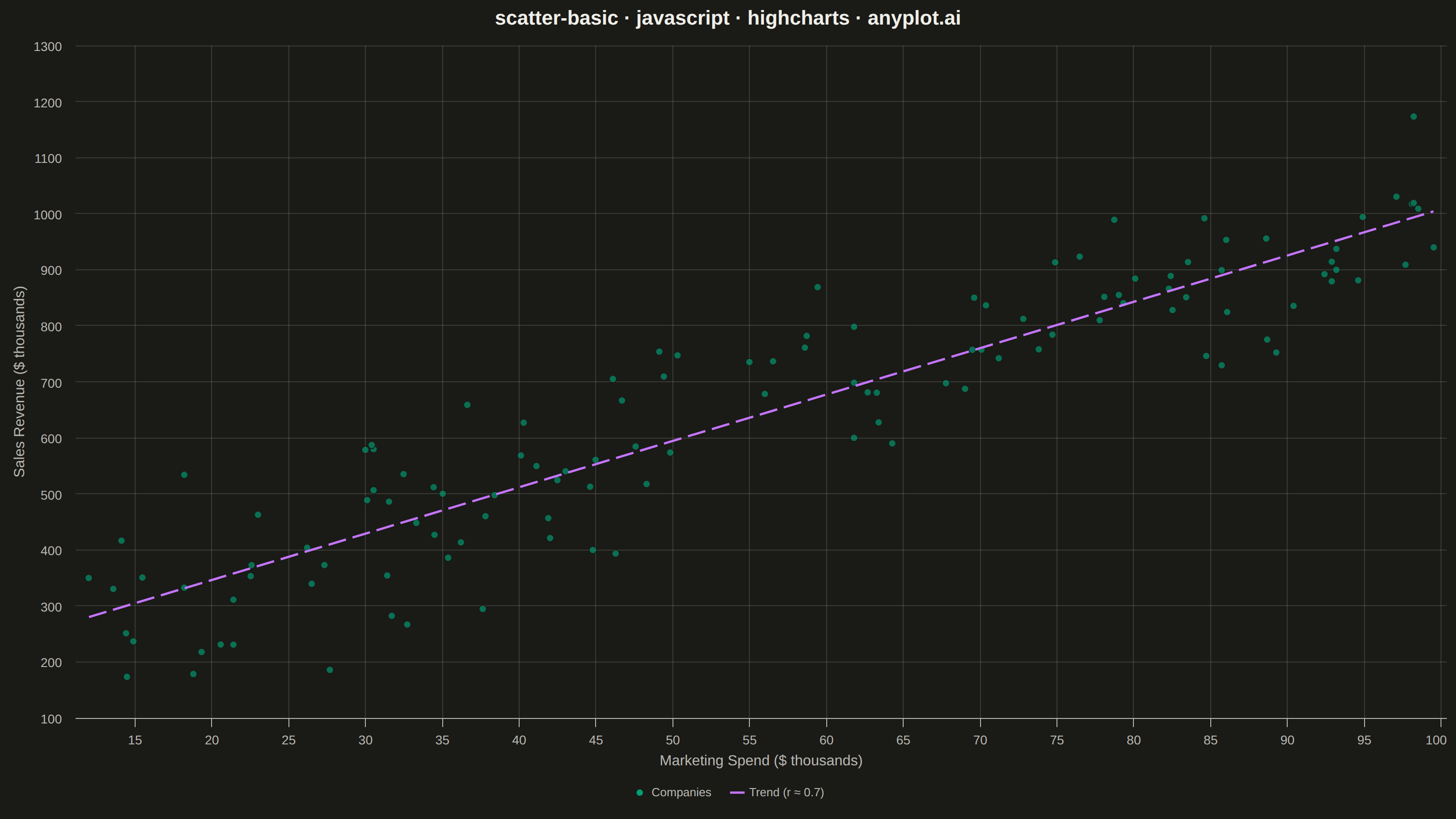
The same plot in 14 other libraries — JavaScript: Chart.js, D3.js, Apache ECharts, MUI X Charts; Python: Altair, Bokeh, lets-plot, Matplotlib, Plotly, plotnine, Pygal, Seaborn; R: ggplot2; Julia: Makie.jl. Compare all 15 side by side: Basic Scatter Plot in Python, R, Julia and JavaScript.
A fundamental 2D scatter plot that displays the relationship between two numeric variables by plotting points on a Cartesian coordinate system. This visualization is essential for exploring correlations, identifying patterns, detecting outliers, and understanding the distribution of paired data points.
// anyplot.ai
// scatter-basic: Basic Scatter Plot
// Library: highcharts 12.6.0 | JavaScript 22.22.3
// Quality: 87/100 | Created: 2026-06-25

//# anyplot-orientation: landscape
const t = window.ANYPLOT_TOKENS;

// Data — marketing spend vs sales revenue, 120 companies, r ≈ 0.7
let seed = 42;
function lcg() {
    seed = (seed * 1664525 + 1013904223) & 0xffffffff;
    return (seed >>> 0) / 0xffffffff;
}
function randn() {
    const u = lcg() + 1e-10;
    return Math.sqrt(-2 * Math.log(u)) * Math.cos(2 * Math.PI * lcg());
}

const N = 120;
const data = [];
for (let i = 0; i < N; i++) {
    const spend = 10 + lcg() * 90;
    const revenue = 200 + 8 * spend + randn() * 100;
    data.push([
        Math.round(spend * 10) / 10,
        Math.round(revenue * 10) / 10
    ]);
}

// OLS regression line
const sumX = data.reduce((s, [x]) => s + x, 0);
const sumY = data.reduce((s, [, y]) => s + y, 0);
const sumXY = data.reduce((s, [x, y]) => s + x * y, 0);
const sumX2 = data.reduce((s, [x]) => s + x * x, 0);
const slope = (N * sumXY - sumX * sumY) / (N * sumX2 - sumX * sumX);
const intercept = (sumY - slope * sumX) / N;
const xVals = data.map(([x]) => x);
const xMin = Math.min.apply(null, xVals);
const xMax = Math.max.apply(null, xVals);
const trendLine = [
    [Math.round(xMin * 10) / 10, Math.round((slope * xMin + intercept) * 10) / 10],
    [Math.round(xMax * 10) / 10, Math.round((slope * xMax + intercept) * 10) / 10]
];

// Chart
Highcharts.chart("container", {
    chart: {
        type: "scatter",
        backgroundColor: "transparent",
        animation: false,
        style: { fontFamily: "inherit" }
    },
    credits: { enabled: false },
    colors: t.palette,
    title: {
        text: "scatter-basic · javascript · highcharts · anyplot.ai",
        style: { color: t.ink, fontSize: "22px", fontWeight: "600" }
    },
    xAxis: {
        title: {
            text: "Marketing Spend ($ thousands)",
            style: { color: t.inkSoft, fontSize: "16px" }
        },
        lineColor: t.inkSoft,
        tickColor: t.inkSoft,
        gridLineColor: t.grid,
        gridLineWidth: 1,
        labels: { style: { color: t.inkSoft, fontSize: "14px" } }
    },
    yAxis: {
        title: {
            text: "Sales Revenue ($ thousands)",
            style: { color: t.inkSoft, fontSize: "16px" }
        },
        lineColor: t.inkSoft,
        tickColor: t.inkSoft,
        gridLineColor: t.grid,
        labels: { style: { color: t.inkSoft, fontSize: "14px" } }
    },
    legend: {
        enabled: true,
        itemStyle: { color: t.inkSoft, fontSize: "13px" },
        itemHoverStyle: { color: t.ink }
    },
    tooltip: {
        backgroundColor: t.elevatedBg,
        borderColor: t.grid,
        style: { color: t.ink, fontSize: "13px" },
        formatter: function () {
            if (this.series.type === "line") {
                return false;
            }
            return "<b>" + this.series.name + "</b><br>" +
                   "Spend: <b>$" + this.x + "k</b><br>" +
                   "Revenue: <b>$" + this.y + "k</b>";
        }
    },
    plotOptions: {
        series: { animation: false },
        scatter: {
            opacity: 0.65,
            marker: {
                radius: 4,
                symbol: "circle",
                lineWidth: 1,
                lineColor: t.pageBg
            }
        },
        line: {
            marker: { enabled: false },
            enableMouseTracking: false,
            states: { hover: { lineWidthPlus: 0 } }
        }
    },
    responsive: {
        rules: [{
            condition: { maxWidth: 800 },
            chartOptions: {
                title: { style: { fontSize: "16px" } },
                xAxis: {
                    title: { style: { fontSize: "12px" } },
                    labels: { style: { fontSize: "11px" } }
                },
                yAxis: {
                    title: { style: { fontSize: "12px" } },
                    labels: { style: { fontSize: "11px" } }
                }
            }
        }]
    },
    series: [
        {
            type: "scatter",
            name: "Companies",
            data: data,
            color: t.palette[0]
        },
        {
            type: "line",
            name: "Trend (r ≈ 0.7)",
            data: trendLine,
            color: t.palette[1],
            dashStyle: "LongDash",
            lineWidth: 2.5,
            marker: { enabled: false },
            enableMouseTracking: false
        }
    ]
});
Runnable source as JSON, for any HTTP client: https://api.anyplot.ai/specs/scatter-basic/highcharts/code. Any spec id and library id listed in llms-full.txt fit the same URL shape; every URL below is complete and callable.
{
  "spec_id": "scatter-basic",
  "language": "javascript",
  "library": "highcharts",
  "page": "https://anyplot.ai/scatter-basic/javascript/highcharts",
  "hub": "https://anyplot.ai/scatter-basic",
  "code_json": "https://api.anyplot.ai/specs/scatter-basic/highcharts/code",
  "spec_json": "https://api.anyplot.ai/specs/scatter-basic",
  "render_light_png": "https://storage.googleapis.com/anyplot-images/plots/scatter-basic/javascript/highcharts/plot-light.png",
  "render_dark_png": "https://storage.googleapis.com/anyplot-images/plots/scatter-basic/javascript/highcharts/plot-dark.png",
  "interactive_light_html": "https://storage.googleapis.com/anyplot-images/plots/scatter-basic/javascript/highcharts/plot-light.html",
  "interactive_dark_html": "https://storage.googleapis.com/anyplot-images/plots/scatter-basic/javascript/highcharts/plot-dark.html",
  "quality_score": 87.0,
  "license": "MIT",
  "guide": "https://anyplot.ai/llms.txt"
}
Part of Basic Scatter Plot on anyplot.ai.