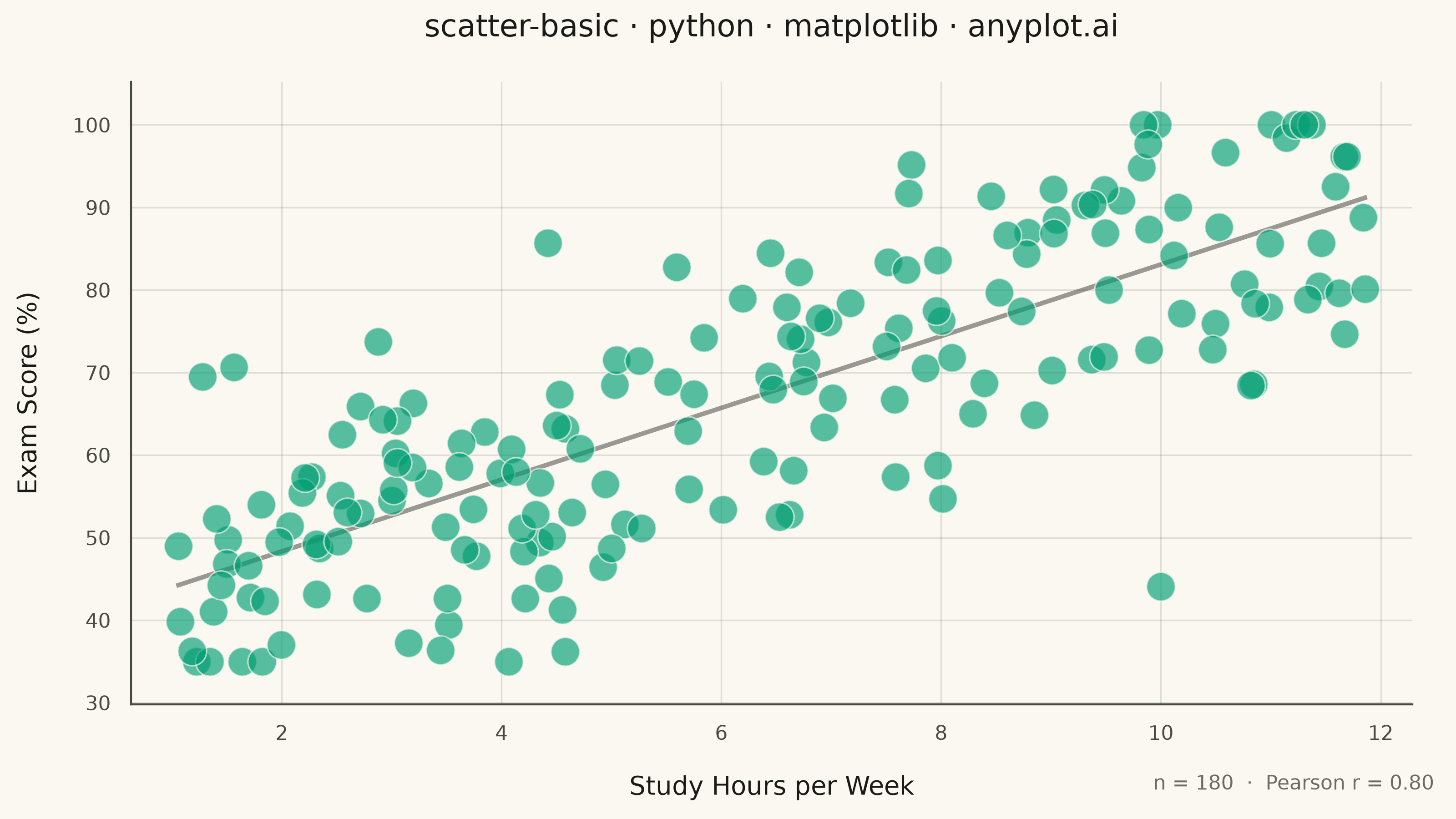
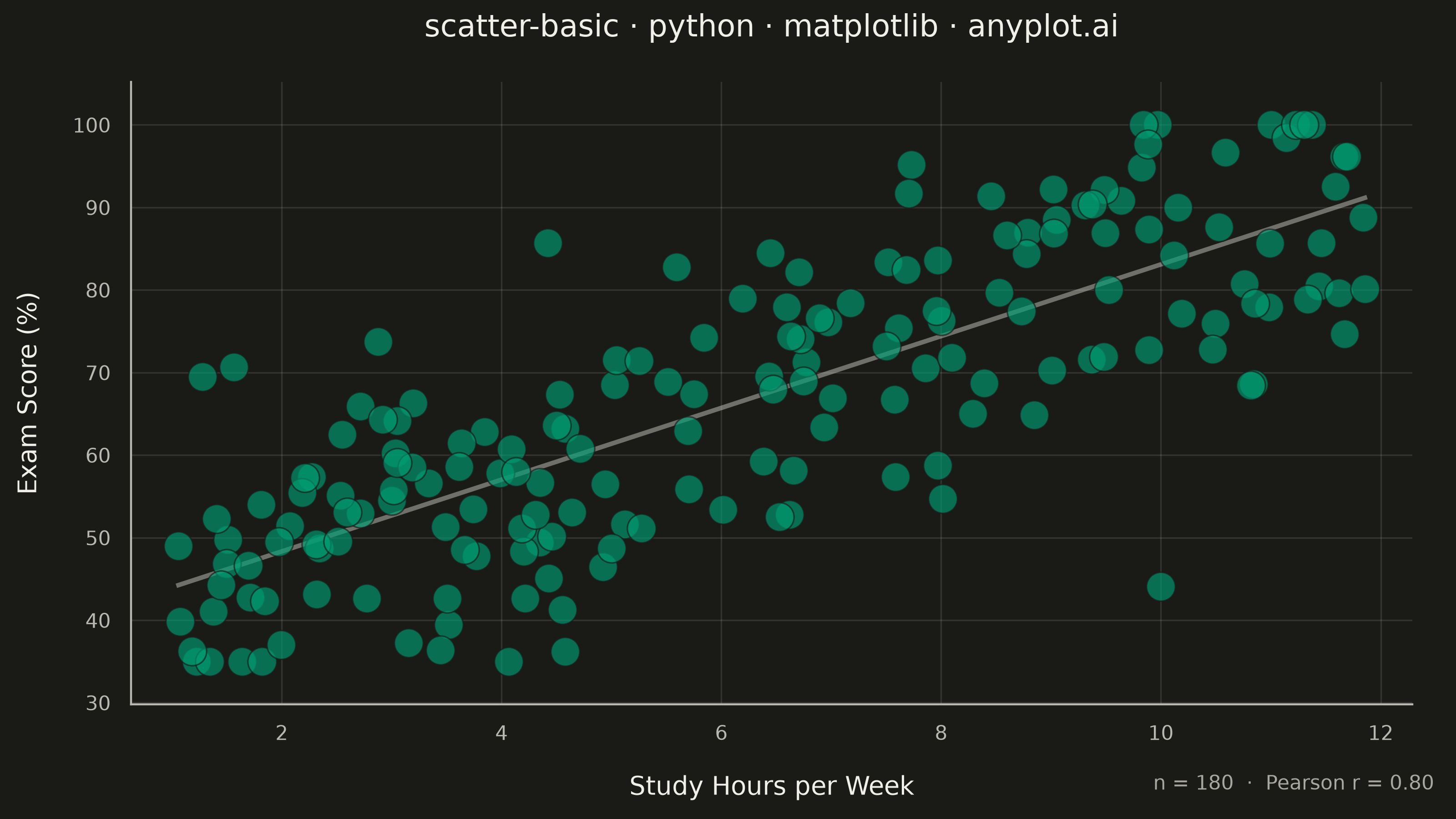
A fundamental 2D scatter plot that displays the relationship between two numeric variables by plotting points on a Cartesian coordinate system. This visualization is essential for exploring correlations, identifying patterns, detecting outliers, and understanding the distribution of paired data points.
""" anyplot.ai
scatter-basic: Basic Scatter Plot
Library: matplotlib 3.11.0 | Python 3.13.14
Quality: 91/100 | Updated: 2026-06-25
"""

import os

import matplotlib as mpl
import matplotlib.pyplot as plt
import numpy as np


# Theme tokens
THEME = os.getenv("ANYPLOT_THEME", "light")
PAGE_BG = "#FAF8F1" if THEME == "light" else "#1A1A17"
INK = "#1A1A17" if THEME == "light" else "#F0EFE8"
INK_SOFT = "#4A4A44" if THEME == "light" else "#B8B7B0"
INK_MUTED = "#6B6A63" if THEME == "light" else "#A8A79F"
BRAND = "#009E73"  # Imprint palette position 1 — ALWAYS first series

mpl.rcParams.update(
    {"font.family": "DejaVu Sans", "axes.titlepad": 18, "axes.labelpad": 12, "axes.unicode_minus": True}
)

# Data — study hours vs exam scores (r ~ 0.7)
np.random.seed(42)
study_hours = np.random.uniform(1, 12, 180)
exam_scores = np.clip(38 + study_hours * 4.5 + np.random.normal(0, 12, 180), 35, 100)

# Title
title = "scatter-basic · python · matplotlib · anyplot.ai"
n = len(title)
title_fontsize = max(8, round(12 * 67 / n)) if n > 67 else 12

# Plot
fig, ax = plt.subplots(figsize=(8, 4.5), dpi=400, facecolor=PAGE_BG)
ax.set_facecolor(PAGE_BG)

ax.scatter(study_hours, exam_scores, s=130, alpha=0.65, color=BRAND, edgecolors=PAGE_BG, linewidths=0.6, zorder=3)

# Trend line + 95% confidence band — showcase fill_between analytical capability
coeffs = np.polyfit(study_hours, exam_scores, 1)
x_line = np.linspace(study_hours.min(), study_hours.max(), 200)
y_line = np.polyval(coeffs, x_line)

n_pts = len(study_hours)
x_mean = np.mean(study_hours)
Sxx = np.sum((study_hours - x_mean) ** 2)
s_res = np.sqrt(np.sum((exam_scores - np.polyval(coeffs, study_hours)) ** 2) / (n_pts - 2))
se_band = s_res * np.sqrt(1 / n_pts + (x_line - x_mean) ** 2 / Sxx)
ax.fill_between(x_line, y_line - 1.96 * se_band, y_line + 1.96 * se_band, color=INK_SOFT, alpha=0.12, zorder=0)
ax.plot(x_line, y_line, color=INK_SOFT, linewidth=2.2, alpha=0.75, zorder=1)

# Style
ax.set_xlabel("Study Hours per Week", fontsize=10, color=INK)
ax.set_ylabel("Exam Score (%)", fontsize=10, color=INK)
ax.set_title(title, fontsize=title_fontsize, fontweight="medium", color=INK)

ax.tick_params(axis="both", which="both", labelsize=8, colors=INK_SOFT, length=0, pad=8)
ax.spines["top"].set_visible(False)
ax.spines["right"].set_visible(False)
for spine in ("left", "bottom"):
    ax.spines[spine].set_color(INK_SOFT)
    ax.spines[spine].set_linewidth(0.8)

ax.yaxis.grid(True, alpha=0.12, linewidth=0.6, color=INK)
ax.set_axisbelow(True)
ax.margins(x=0.04, y=0.08)

# Pearson r footnote
r = np.corrcoef(study_hours, exam_scores)[0, 1]
fig.text(
    0.985, 0.03, f"n = {len(study_hours)}  ·  Pearson r = {r:.2f}", fontsize=8, color=INK_MUTED, ha="right", va="bottom"
)

fig.subplots_adjust(left=0.09, right=0.97, top=0.90, bottom=0.14)
plt.savefig(f"plot-{THEME}.png", dpi=400, facecolor=PAGE_BG)
Runnable source as JSON, for any HTTP client: https://api.anyplot.ai/specs/scatter-basic/matplotlib/code. Any spec id and library id listed in llms-full.txt fit the same URL shape; every URL below is complete and callable.
{
  "spec_id": "scatter-basic",
  "language": "python",
  "library": "matplotlib",
  "page": "https://anyplot.ai/scatter-basic/python/matplotlib",
  "hub": "https://anyplot.ai/scatter-basic",
  "code_json": "https://api.anyplot.ai/specs/scatter-basic/matplotlib/code",
  "spec_json": "https://api.anyplot.ai/specs/scatter-basic",
  "render_light_png": "https://storage.googleapis.com/anyplot-images/plots/scatter-basic/python/matplotlib/plot-light.png",
  "render_dark_png": "https://storage.googleapis.com/anyplot-images/plots/scatter-basic/python/matplotlib/plot-dark.png",
  "quality_score": 91.0,
  "license": "MIT",
  "guide": "https://anyplot.ai/llms.txt"
}
Part of Basic Scatter Plot on anyplot.ai.