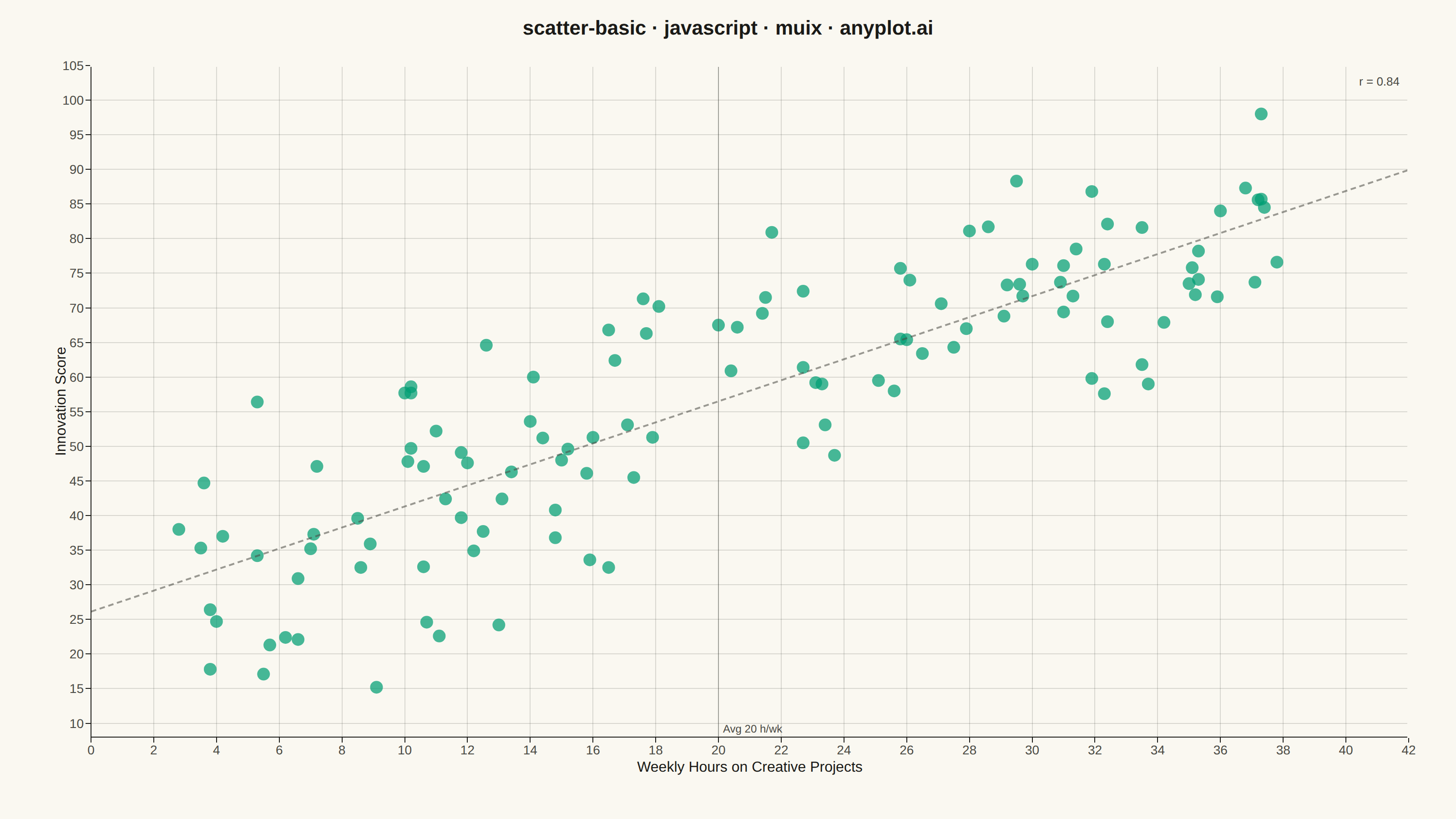
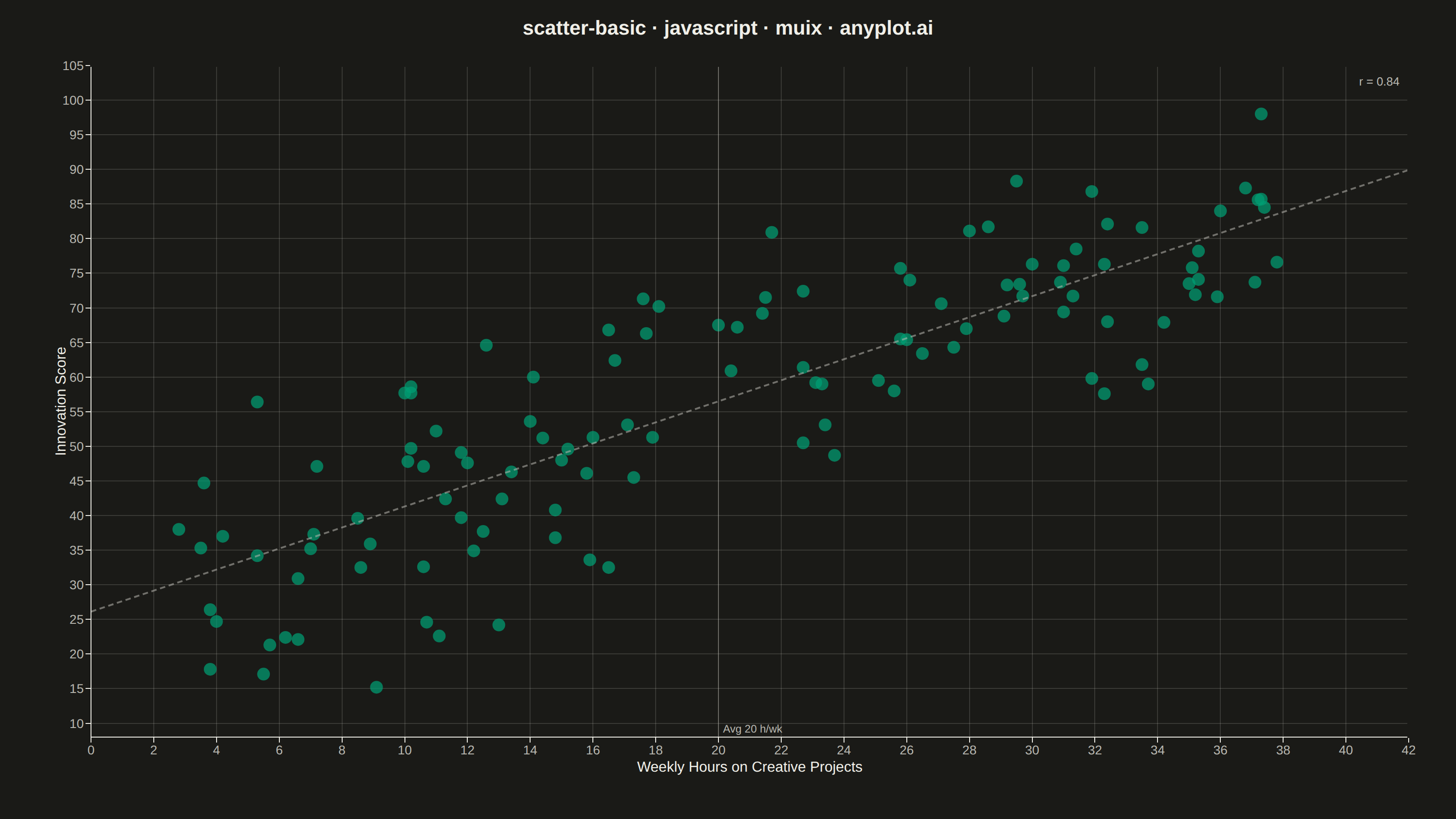
The same plot in 14 other libraries — JavaScript: Chart.js, D3.js, Apache ECharts, Highcharts; Python: Altair, Bokeh, lets-plot, Matplotlib, Plotly, plotnine, Pygal, Seaborn; R: ggplot2; Julia: Makie.jl. Compare all 15 side by side: Basic Scatter Plot in Python, R, Julia and JavaScript.
A fundamental 2D scatter plot that displays the relationship between two numeric variables by plotting points on a Cartesian coordinate system. This visualization is essential for exploring correlations, identifying patterns, detecting outliers, and understanding the distribution of paired data points.
// anyplot.ai
// scatter-basic: Basic Scatter Plot
// Library: muix 7.29.1 | JavaScript 22.22.3
// Quality: 88/100 | Created: 2026-06-25
//# anyplot-orientation: landscape
// anyplot.ai
// scatter-basic: Basic Scatter Plot
// Library: MUI X Charts | React | Node 22
// License: @mui/x-charts — MIT (community). Pro/Premium are out of scope.
// Quality: pending | Created: 2026-06-25

import { ChartContainer } from "@mui/x-charts/ChartContainer";
import { ScatterPlot } from "@mui/x-charts/ScatterChart";
import { ChartsXAxis } from "@mui/x-charts/ChartsXAxis";
import { ChartsYAxis } from "@mui/x-charts/ChartsYAxis";
import { ChartsGrid } from "@mui/x-charts/ChartsGrid";
import { ChartsReferenceLine } from "@mui/x-charts/ChartsReferenceLine";

const t = window.ANYPLOT_TOKENS;
const { width, height } = window.ANYPLOT_SIZE;

// Deterministic LCG (seed 42) — no Math.random() in browser harness
let _seed = 42;
function lcg() {
  _seed = (1664525 * _seed + 1013904223) >>> 0;
  return _seed / 4294967296;
}
function randn() {
  const u = lcg(), v = lcg();
  return Math.sqrt(-2 * Math.log(u + 1e-15)) * Math.cos(2 * Math.PI * v);
}

// Data: Weekly creative project hours vs employee innovation score
// Scenario: 120 tech-sector employees; moderate positive correlation (r ≈ 0.72)
const N = 120;
const scatterData = Array.from({ length: N }, (_, id) => {
  const hours = 2 + lcg() * 36;
  const score = 28 + (hours / 40) * 58 + randn() * 11;
  return {
    id,
    x: Math.round(hours * 10) / 10,
    y: Math.min(98, Math.max(12, Math.round(score * 10) / 10)),
  };
});

// OLS linear regression for trend line overlay
const sumX  = scatterData.reduce((s, p) => s + p.x, 0);
const sumY  = scatterData.reduce((s, p) => s + p.y, 0);
const sumXY = scatterData.reduce((s, p) => s + p.x * p.y, 0);
const sumX2 = scatterData.reduce((s, p) => s + p.x * p.x, 0);
const sumY2 = scatterData.reduce((s, p) => s + p.y * p.y, 0);
const meanX = sumX / N;
const meanY = sumY / N;
const slope     = (sumXY - N * meanX * meanY) / (sumX2 - N * meanX * meanX);
const intercept = meanY - slope * meanX;
const r = (N * sumXY - sumX * sumY) /
  Math.sqrt((N * sumX2 - sumX * sumX) * (N * sumY2 - sumY * sumY));

// Pixel-space helpers — CSS px in the 1600×900 mount
const MARGIN = { top: 72, right: 52, bottom: 90, left: 100 };
const X_MIN = 0, X_MAX = 42, Y_MIN = 8, Y_MAX = 105;
const PLOT_W = width  - MARGIN.left - MARGIN.right;
const PLOT_H = height - MARGIN.top  - MARGIN.bottom;
const xPx = (x) => MARGIN.left + ((x - X_MIN) / (X_MAX - X_MIN)) * PLOT_W;
const yPx = (y) => height - MARGIN.bottom - ((y - Y_MIN) / (Y_MAX - Y_MIN)) * PLOT_H;

// Trend line endpoints (clamped to y-axis domain)
const trendY0   = Math.max(Y_MIN, Math.min(Y_MAX, intercept));
const trendY42  = Math.max(Y_MIN, Math.min(Y_MAX, slope * X_MAX + intercept));

// Brand green at 72% opacity — satisfies "alpha ~0.7" spec requirement
const BRAND_RGBA = "rgba(0, 158, 115, 0.72)";
const TITLE = "scatter-basic · javascript · muix · anyplot.ai";

export default function Chart() {
  return (
    <ChartContainer
      width={width}
      height={height}
      margin={MARGIN}
      series={[{
        type: "scatter",
        id: "employees",
        label: "Employee",
        color: BRAND_RGBA,
        markerSize: 7,
        data: scatterData,
        valueFormatter: (v) => v ? `${v.x} h/wk · score ${v.y}` : "",
      }]}
      xAxis={[{
        scaleType: "linear",
        min: X_MIN,
        max: X_MAX,
        label: "Weekly Hours on Creative Projects",
        tickLabelStyle: { fontSize: 14, fill: t.inkSoft },
        labelStyle: { fontSize: 16, fill: t.ink },
      }]}
      yAxis={[{
        scaleType: "linear",
        min: Y_MIN,
        max: Y_MAX,
        label: "Innovation Score",
        tickLabelStyle: { fontSize: 14, fill: t.inkSoft },
        labelStyle: { fontSize: 16, fill: t.ink },
      }]}
    >
      <ChartsGrid horizontal vertical />
      <ScatterPlot skipAnimation />

      {/* OLS trend line — dashed SVG path, highlights the positive correlation */}
      <line
        x1={xPx(X_MIN)} y1={yPx(trendY0)}
        x2={xPx(X_MAX)} y2={yPx(trendY42)}
        stroke={t.inkSoft}
        strokeWidth={2}
        strokeDasharray="6 4"
        opacity={0.55}
      />

      {/* MUI X ChartsReferenceLine — vertical marker at mean creative hours */}
      <ChartsReferenceLine
        x={Math.round(meanX)}
        label={`Avg ${Math.round(meanX)} h/wk`}
        labelAlign="end"
        lineStyle={{ stroke: t.inkSoft, opacity: 0.4 }}
        labelStyle={{ fontSize: 12, fill: t.inkSoft }}
      />

      <ChartsXAxis />
      <ChartsYAxis />

      {/* L-frame: suppress top and right axis lines for clean L-shape */}
      <line
        x1={MARGIN.left - 1} y1={MARGIN.top}
        x2={width - MARGIN.right + 1} y2={MARGIN.top}
        stroke={t.pageBg}
        strokeWidth={3}
      />
      <line
        x1={width - MARGIN.right} y1={MARGIN.top - 1}
        x2={width - MARGIN.right} y2={height - MARGIN.bottom + 1}
        stroke={t.pageBg}
        strokeWidth={3}
      />

      {/* Title */}
      <text
        x={width / 2}
        y={38}
        textAnchor="middle"
        fontSize={22}
        fontWeight={600}
        fill={t.ink}
      >
        {TITLE}
      </text>

      {/* Correlation annotation — focal point for the storytelling */}
      <text
        x={width - MARGIN.right - 10}
        y={MARGIN.top + 22}
        textAnchor="end"
        fontSize={13}
        fill={t.inkSoft}
      >
        {`r = ${r.toFixed(2)}`}
      </text>
    </ChartContainer>
  );
}
Runnable source as JSON, for any HTTP client: https://api.anyplot.ai/specs/scatter-basic/muix/code. Any spec id and library id listed in llms-full.txt fit the same URL shape; every URL below is complete and callable.
{
  "spec_id": "scatter-basic",
  "language": "javascript",
  "library": "muix",
  "page": "https://anyplot.ai/scatter-basic/javascript/muix",
  "hub": "https://anyplot.ai/scatter-basic",
  "code_json": "https://api.anyplot.ai/specs/scatter-basic/muix/code",
  "spec_json": "https://api.anyplot.ai/specs/scatter-basic",
  "render_light_png": "https://storage.googleapis.com/anyplot-images/plots/scatter-basic/javascript/muix/plot-light.png",
  "render_dark_png": "https://storage.googleapis.com/anyplot-images/plots/scatter-basic/javascript/muix/plot-dark.png",
  "interactive_light_html": "https://storage.googleapis.com/anyplot-images/plots/scatter-basic/javascript/muix/plot-light.html",
  "interactive_dark_html": "https://storage.googleapis.com/anyplot-images/plots/scatter-basic/javascript/muix/plot-dark.html",
  "quality_score": 88.0,
  "license": "MIT",
  "guide": "https://anyplot.ai/llms.txt"
}
Part of Basic Scatter Plot on anyplot.ai.