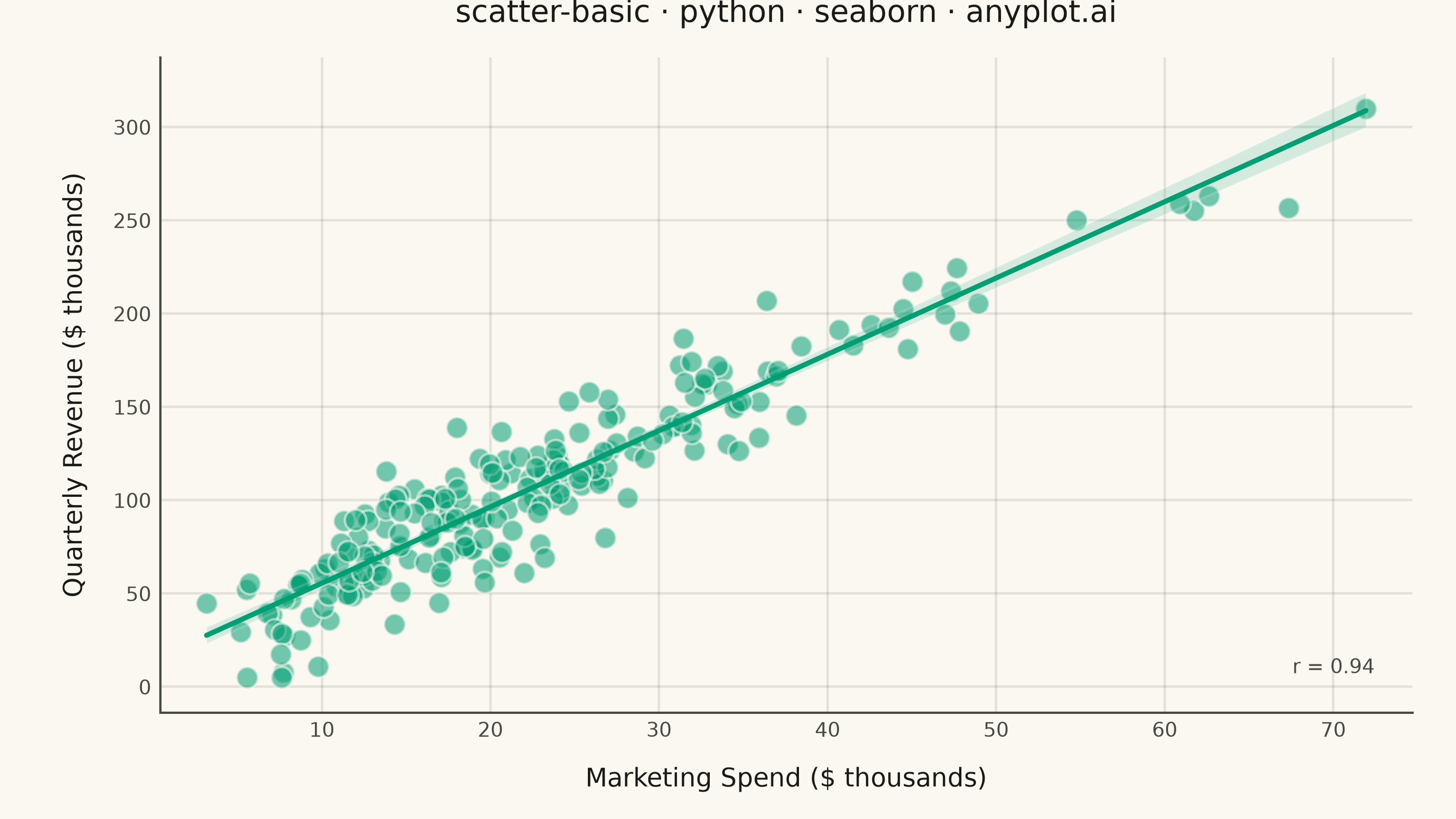
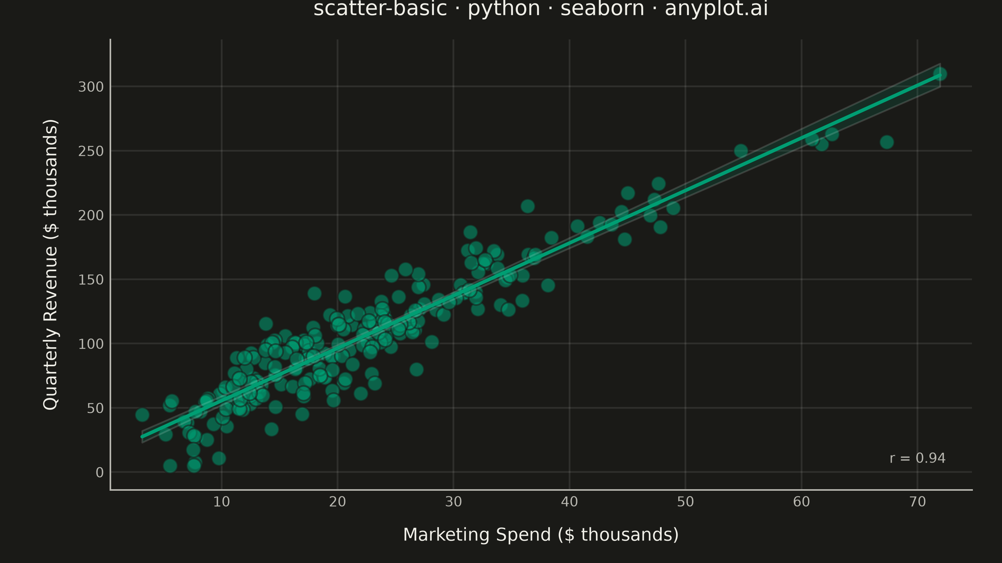
A fundamental 2D scatter plot that displays the relationship between two numeric variables by plotting points on a Cartesian coordinate system. This visualization is essential for exploring correlations, identifying patterns, detecting outliers, and understanding the distribution of paired data points.
""" anyplot.ai
scatter-basic: Basic Scatter Plot
Library: seaborn 0.13.2 | Python 3.13.14
Quality: 90/100 | Updated: 2026-06-25
"""

import os

import matplotlib.pyplot as plt
import numpy as np
import pandas as pd
import seaborn as sns


# Theme tokens
THEME = os.getenv("ANYPLOT_THEME", "light")
PAGE_BG = "#FAF8F1" if THEME == "light" else "#1A1A17"
ELEVATED_BG = "#FFFDF6" if THEME == "light" else "#242420"
INK = "#1A1A17" if THEME == "light" else "#F0EFE8"
INK_SOFT = "#4A4A44" if THEME == "light" else "#B8B7B0"
BRAND = "#009E73"  # Imprint palette position 1

# Data — marketing spend vs. quarterly sales revenue (r~0.75)
np.random.seed(42)
n = 220
marketing_spend = np.random.gamma(shape=2.2, scale=9.0, size=n) + 3
sales_revenue = 4.1 * marketing_spend + np.random.normal(0, 18, n) + 15
sales_revenue = np.clip(sales_revenue, 5, None)

df = pd.DataFrame({"Marketing Spend ($ thousands)": marketing_spend, "Quarterly Revenue ($ thousands)": sales_revenue})

# Plot
sns.set_theme(
    style="ticks",
    rc={
        "figure.facecolor": PAGE_BG,
        "axes.facecolor": PAGE_BG,
        "axes.edgecolor": INK_SOFT,
        "axes.labelcolor": INK,
        "text.color": INK,
        "xtick.color": INK_SOFT,
        "ytick.color": INK_SOFT,
        "grid.color": INK,
        "grid.alpha": 0.10,
        "axes.linewidth": 0.9,
        "axes.grid": True,
        "axes.axisbelow": True,
        "legend.facecolor": ELEVATED_BG,
        "legend.edgecolor": INK_SOFT,
    },
)

fig, ax = plt.subplots(figsize=(8, 4.5), dpi=400, facecolor=PAGE_BG)
ax.set_facecolor(PAGE_BG)

# regplot adds regression line + 95% CI band — seaborn's distinctive statistical layer
sns.regplot(
    data=df,
    x="Marketing Spend ($ thousands)",
    y="Quarterly Revenue ($ thousands)",
    ax=ax,
    color=BRAND,
    scatter_kws={"s": 72, "alpha": 0.55, "edgecolors": PAGE_BG},
    line_kws={"linewidth": 2.0},
    ci=95,
)

# Pearson r annotation surfaces the correlation insight
r = np.corrcoef(marketing_spend, sales_revenue)[0, 1]
ax.annotate(f"r = {r:.2f}", xy=(0.97, 0.06), xycoords="axes fraction", ha="right", fontsize=8, color=INK_SOFT)

# Style
ax.set_title("scatter-basic · python · seaborn · anyplot.ai", fontsize=12, fontweight="medium", color=INK, pad=14)
ax.set_xlabel("Marketing Spend ($ thousands)", fontsize=10, color=INK, labelpad=10)
ax.set_ylabel("Quarterly Revenue ($ thousands)", fontsize=10, color=INK, labelpad=10)
ax.tick_params(axis="both", labelsize=8, colors=INK_SOFT, length=0)
ax.margins(x=0.04, y=0.06)
sns.despine(ax=ax)

fig.subplots_adjust(left=0.11, right=0.97, top=0.93, bottom=0.13)

# Save — no bbox_inches='tight' (would trim the 3200×1800 canvas)
plt.savefig(f"plot-{THEME}.png", dpi=400, facecolor=PAGE_BG)
Runnable source as JSON, for any HTTP client: https://api.anyplot.ai/specs/scatter-basic/seaborn/code. Any spec id and library id listed in llms-full.txt fit the same URL shape; every URL below is complete and callable.
{
  "spec_id": "scatter-basic",
  "language": "python",
  "library": "seaborn",
  "page": "https://anyplot.ai/scatter-basic/python/seaborn",
  "hub": "https://anyplot.ai/scatter-basic",
  "code_json": "https://api.anyplot.ai/specs/scatter-basic/seaborn/code",
  "spec_json": "https://api.anyplot.ai/specs/scatter-basic",
  "render_light_png": "https://storage.googleapis.com/anyplot-images/plots/scatter-basic/python/seaborn/plot-light.png",
  "render_dark_png": "https://storage.googleapis.com/anyplot-images/plots/scatter-basic/python/seaborn/plot-dark.png",
  "quality_score": 90.0,
  "license": "MIT",
  "guide": "https://anyplot.ai/llms.txt"
}
Part of Basic Scatter Plot on anyplot.ai.