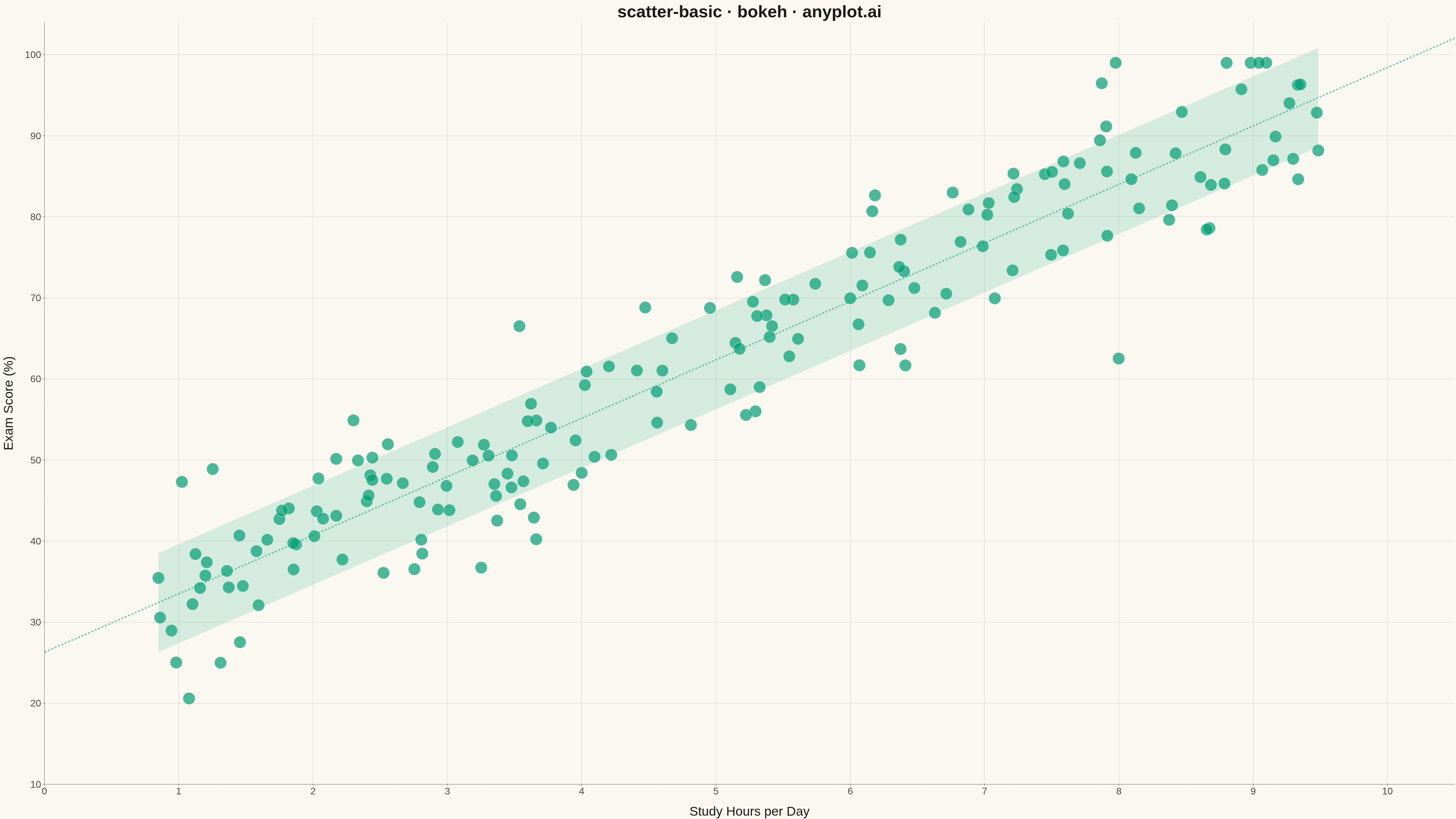
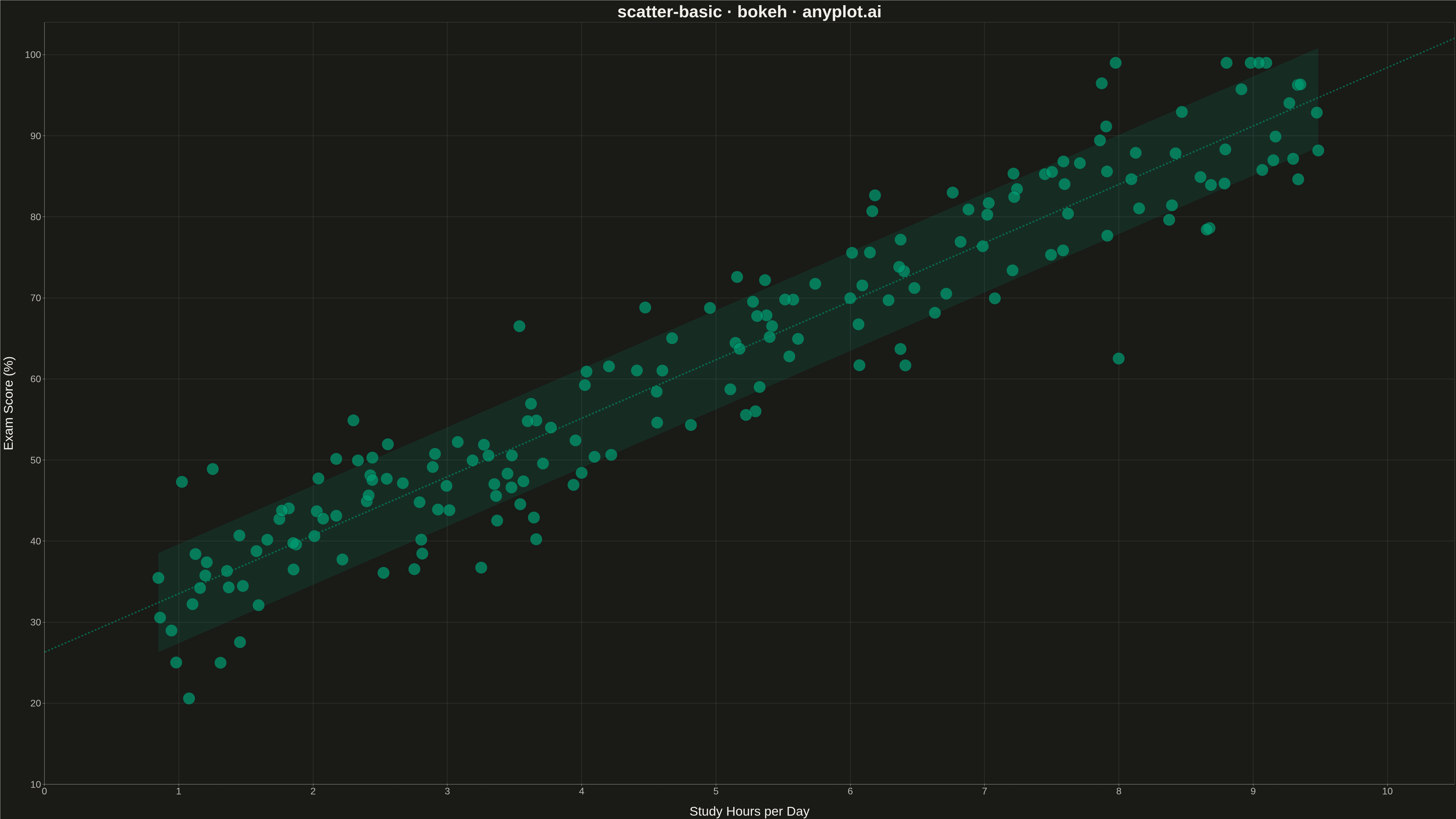
A fundamental 2D scatter plot that displays the relationship between two numeric variables by plotting points on a Cartesian coordinate system. This visualization is essential for exploring correlations, identifying patterns, detecting outliers, and understanding the distribution of paired data points.
""" anyplot.ai
scatter-basic: Basic Scatter Plot
Library: bokeh 3.9.0 | Python 3.14.4
Quality: 90/100 | Updated: 2026-04-23
"""

import os

import numpy as np
from bokeh.io import export_png, output_file, save
from bokeh.models import ColumnDataSource, HoverTool
from bokeh.plotting import figure


THEME = os.getenv("ANYPLOT_THEME", "light")
PAGE_BG = "#FAF8F1" if THEME == "light" else "#1A1A17"
INK = "#1A1A17" if THEME == "light" else "#F0EFE8"
INK_SOFT = "#4A4A44" if THEME == "light" else "#B8B7B0"
BRAND = "#009E73"

# Data — study hours vs exam scores, moderate positive correlation
np.random.seed(42)
n_points = 180
study_hours = np.random.uniform(0.8, 9.6, n_points)
exam_scores = study_hours * 7.2 + np.random.normal(0, 6.5, n_points) + 26
exam_scores = np.clip(exam_scores, 18, 99)

source = ColumnDataSource(data={"study_hours": study_hours, "exam_scores": exam_scores})

# Plot
p = figure(
    width=4800,
    height=2700,
    title="scatter-basic · bokeh · anyplot.ai",
    x_axis_label="Study Hours per Day",
    y_axis_label="Exam Score (%)",
    toolbar_location=None,
    x_range=(0, 10.5),
    y_range=(10, 104),
)

scatter_renderer = p.scatter(
    x="study_hours", y="exam_scores", source=source, size=34, color=BRAND, alpha=0.7, line_color=PAGE_BG, line_width=1.2
)

# HoverTool — Bokeh's distinctive interactive feature (HTML only; PNG stays clean)
hover = HoverTool(
    renderers=[scatter_renderer],
    tooltips=[("Study Hours", "@study_hours{0.1} hrs"), ("Exam Score", "@exam_scores{0.0}%")],
)
p.add_tools(hover)

# Typography — sized for 4800×2700 canvas
p.title.text_font_size = "42pt"
p.title.text_font_style = "bold"
p.title.text_color = INK
p.title.align = "center"

p.xaxis.axis_label_text_font_size = "32pt"
p.yaxis.axis_label_text_font_size = "32pt"
p.xaxis.axis_label_text_font_style = "normal"
p.yaxis.axis_label_text_font_style = "normal"
p.xaxis.major_label_text_font_size = "24pt"
p.yaxis.major_label_text_font_size = "24pt"
p.xaxis.axis_label_standoff = 28
p.yaxis.axis_label_standoff = 28

# Theme-adaptive chrome
p.background_fill_color = PAGE_BG
p.border_fill_color = PAGE_BG
p.outline_line_color = None

p.xaxis.axis_label_text_color = INK
p.yaxis.axis_label_text_color = INK
p.xaxis.major_label_text_color = INK_SOFT
p.yaxis.major_label_text_color = INK_SOFT
p.xaxis.axis_line_color = INK_SOFT
p.yaxis.axis_line_color = INK_SOFT
p.xaxis.major_tick_line_color = INK_SOFT
p.yaxis.major_tick_line_color = INK_SOFT
p.xaxis.minor_tick_line_color = None
p.yaxis.minor_tick_line_color = None

# Clean L-frame: keep left+bottom axis lines only (handled above via axis_line_color)
p.xgrid.grid_line_color = INK
p.ygrid.grid_line_color = INK
p.xgrid.grid_line_alpha = 0.10
p.ygrid.grid_line_alpha = 0.10
p.xgrid.grid_line_width = 2
p.ygrid.grid_line_width = 2

p.xaxis.ticker.desired_num_ticks = 10
p.yaxis.ticker.desired_num_ticks = 8

# Save
export_png(p, filename=f"plot-{THEME}.png")
output_file(f"plot-{THEME}.html", title="scatter-basic · bokeh · anyplot.ai")
save(p)
Runnable source as JSON, for any HTTP client: https://api.anyplot.ai/specs/scatter-basic/bokeh/code. Any spec id and library id listed in llms-full.txt fit the same URL shape; every URL below is complete and callable.
{
  "spec_id": "scatter-basic",
  "language": "python",
  "library": "bokeh",
  "page": "https://anyplot.ai/scatter-basic/python/bokeh",
  "hub": "https://anyplot.ai/scatter-basic",
  "code_json": "https://api.anyplot.ai/specs/scatter-basic/bokeh/code",
  "spec_json": "https://api.anyplot.ai/specs/scatter-basic",
  "render_light_png": "https://storage.googleapis.com/anyplot-images/plots/scatter-basic/python/bokeh/plot-light.png",
  "render_dark_png": "https://storage.googleapis.com/anyplot-images/plots/scatter-basic/python/bokeh/plot-dark.png",
  "interactive_light_html": "https://storage.googleapis.com/anyplot-images/plots/scatter-basic/python/bokeh/plot-light.html",
  "interactive_dark_html": "https://storage.googleapis.com/anyplot-images/plots/scatter-basic/python/bokeh/plot-dark.html",
  "quality_score": 90.0,
  "license": "MIT",
  "guide": "https://anyplot.ai/llms.txt"
}
Part of Basic Scatter Plot on anyplot.ai.