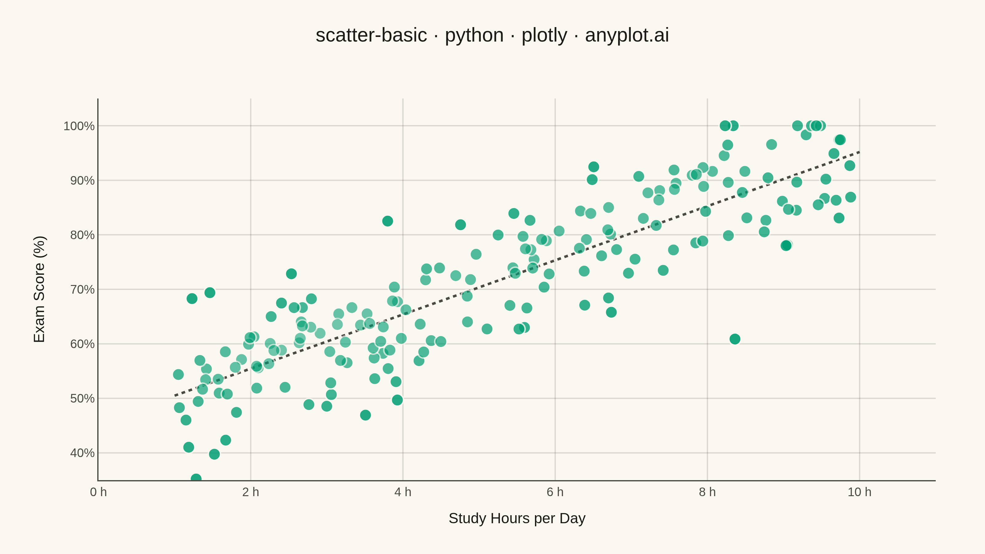
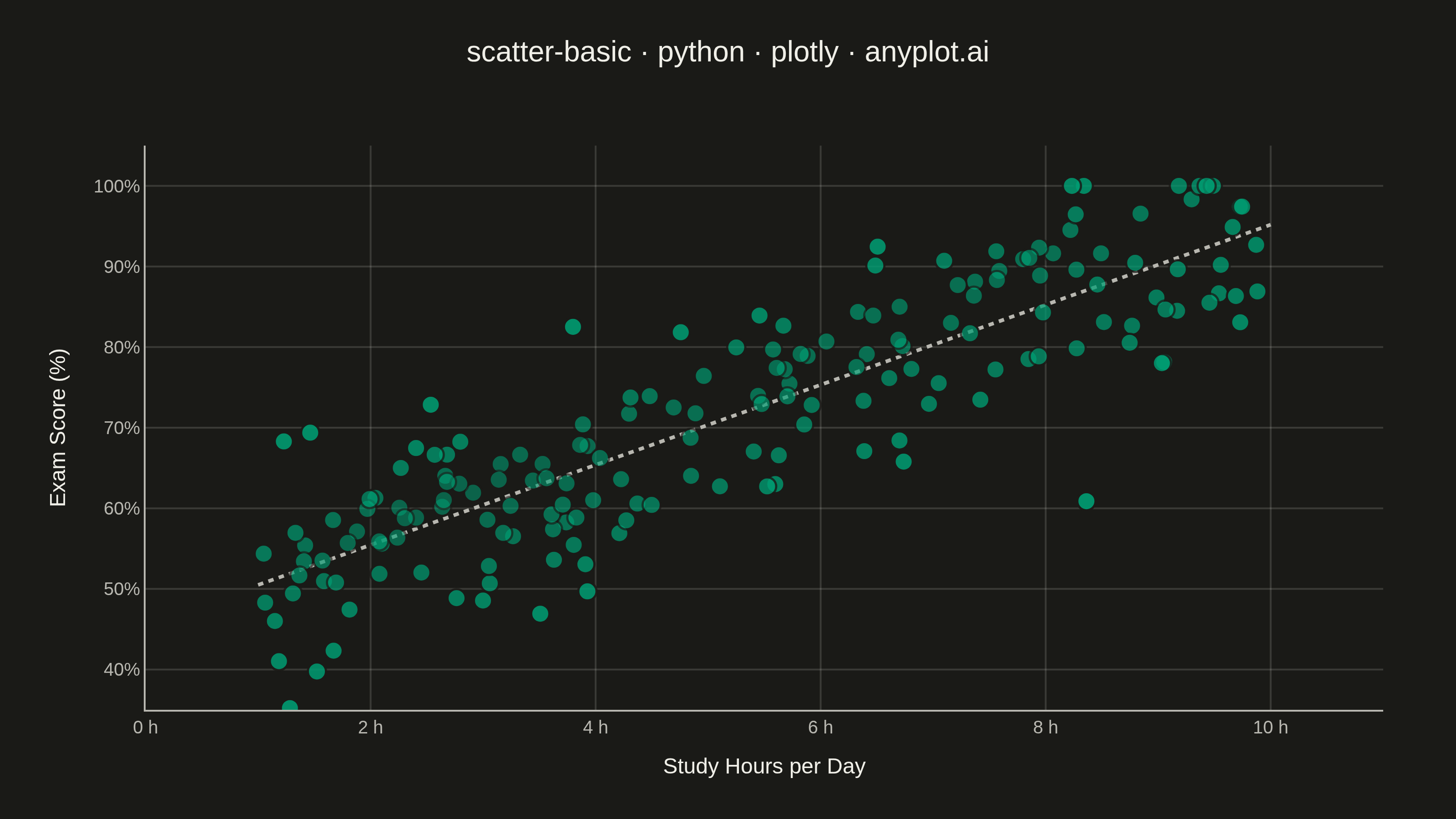
A fundamental 2D scatter plot that displays the relationship between two numeric variables by plotting points on a Cartesian coordinate system. This visualization is essential for exploring correlations, identifying patterns, detecting outliers, and understanding the distribution of paired data points.
""" anyplot.ai
scatter-basic: Basic Scatter Plot
Library: plotly 6.8.0 | Python 3.13.14
Quality: 90/100 | Updated: 2026-06-25
"""

import os

import numpy as np
import plotly.graph_objects as go
from scipy.stats import gaussian_kde
from scipy.stats import t as t_dist


# Theme tokens
THEME = os.getenv("ANYPLOT_THEME", "light")
PAGE_BG = "#FAF8F1" if THEME == "light" else "#1A1A17"
ELEVATED_BG = "#FFFDF6" if THEME == "light" else "#242420"
INK = "#1A1A17" if THEME == "light" else "#F0EFE8"
INK_SOFT = "#4A4A44" if THEME == "light" else "#B8B7B0"
GRID = "rgba(26,26,23,0.15)" if THEME == "light" else "rgba(240,239,232,0.15)"
BRAND = "#009E73"  # Imprint palette position 1 — always first series

# Data: study hours vs exam scores, moderate positive correlation
np.random.seed(42)
n_students = 180
study_hours = np.random.uniform(1, 10, n_students)
exam_scores = 45 + study_hours * 5 + np.random.randn(n_students) * 8
exam_scores = np.clip(exam_scores, 0, 100)

# Per-point local density → subtle alpha variation so sparse outliers gain
# presence while dense clusters reveal overlap through transparency.
density = gaussian_kde(np.vstack([study_hours, exam_scores]))(np.vstack([study_hours, exam_scores]))
density_rank = (density - density.min()) / (density.max() - density.min())
point_alpha = 0.90 - 0.35 * density_rank  # sparse: 0.90, dense: 0.55

# Percentile rank for richer hover context
score_percentile = np.argsort(np.argsort(exam_scores)) / (n_students - 1) * 100

# Linear regression trendline + 95% CI band
slope, intercept = np.polyfit(study_hours, exam_scores, 1)
x_line = np.linspace(1.0, 10.0, 100)
y_line = slope * x_line + intercept
xbar = np.mean(study_hours)
Sxx = np.sum((study_hours - xbar) ** 2)
y_hat = slope * study_hours + intercept
s_res = np.sqrt(np.sum((exam_scores - y_hat) ** 2) / (n_students - 2))
t_crit = t_dist.ppf(0.975, df=n_students - 2)
se_ci = s_res * np.sqrt(1 / n_students + (x_line - xbar) ** 2 / Sxx)
ci_half = t_crit * se_ci

# Plot
fig = go.Figure()

# 95% CI band (drawn first, behind trendline and points)
fig.add_trace(
    go.Scatter(
        x=np.concatenate([x_line, x_line[::-1]]),
        y=np.concatenate([y_line + ci_half, (y_line - ci_half)[::-1]]),
        fill="toself",
        fillcolor="rgba(0,158,115,0.10)",
        line={"color": "rgba(0,0,0,0)"},
        hoverinfo="skip",
        showlegend=False,
    )
)

# Regression trendline
fig.add_trace(
    go.Scatter(
        x=x_line,
        y=y_line,
        mode="lines",
        line={"color": INK_SOFT, "width": 2, "dash": "dot"},
        hoverinfo="skip",
        showlegend=False,
    )
)

# Scatter points
fig.add_trace(
    go.Scatter(
        x=study_hours,
        y=exam_scores,
        mode="markers",
        marker={"size": 10, "color": BRAND, "opacity": point_alpha, "line": {"width": 1.2, "color": ELEVATED_BG}},
        customdata=np.stack([score_percentile], axis=-1),
        hovertemplate=(
            "<b>Study Hours</b>: %{x:.1f} h/day<br>"
            "<b>Exam Score</b>: %{y:.1f}%<br>"
            "<b>Percentile</b>: %{customdata[0]:.0f}<extra></extra>"
        ),
        showlegend=False,
    )
)

# Layout
fig.update_layout(
    autosize=False,
    title={
        "text": "scatter-basic · python · plotly · anyplot.ai",
        "font": {"size": 16, "color": INK},
        "x": 0.5,
        "xanchor": "center",
        "y": 0.95,
    },
    xaxis={
        "title": {"text": "Study Hours per Day", "font": {"size": 12, "color": INK}, "standoff": 12},
        "tickfont": {"size": 10, "color": INK_SOFT},
        "gridcolor": GRID,
        "gridwidth": 1,
        "zeroline": False,
        "showline": False,
        "range": [0, 11],
        "dtick": 2,
        "ticksuffix": " h",
    },
    yaxis={
        "title": {"text": "Exam Score (%)", "font": {"size": 12, "color": INK}, "standoff": 12},
        "tickfont": {"size": 10, "color": INK_SOFT},
        "gridcolor": GRID,
        "gridwidth": 1,
        "zeroline": False,
        "showline": False,
        "range": [35, 105],
        "dtick": 10,
        "ticksuffix": "%",
    },
    paper_bgcolor=PAGE_BG,
    plot_bgcolor=PAGE_BG,
    font={"color": INK, "family": "Inter, Helvetica Neue, Arial, sans-serif"},
    margin={"l": 80, "r": 40, "t": 80, "b": 60},
    hovermode="closest",
    hoverlabel={"bgcolor": ELEVATED_BG, "bordercolor": INK_SOFT, "font": {"color": INK, "size": 13}, "align": "left"},
)

# Save — landscape 3200×1800 (width=800, height=450, scale=4)
fig.write_image(f"plot-{THEME}.png", width=800, height=450, scale=4)
fig.write_html(
    f"plot-{THEME}.html",
    include_plotlyjs="cdn",
    config={
        "displaylogo": False,
        "modeBarButtonsToRemove": ["lasso2d", "select2d", "autoScale2d"],
        "toImageButtonOptions": {"format": "png", "filename": "scatter-basic-plotly"},
    },
)
Runnable source as JSON, for any HTTP client: https://api.anyplot.ai/specs/scatter-basic/plotly/code. Any spec id and library id listed in llms-full.txt fit the same URL shape; every URL below is complete and callable.
{
  "spec_id": "scatter-basic",
  "language": "python",
  "library": "plotly",
  "page": "https://anyplot.ai/scatter-basic/python/plotly",
  "hub": "https://anyplot.ai/scatter-basic",
  "code_json": "https://api.anyplot.ai/specs/scatter-basic/plotly/code",
  "spec_json": "https://api.anyplot.ai/specs/scatter-basic",
  "render_light_png": "https://storage.googleapis.com/anyplot-images/plots/scatter-basic/python/plotly/plot-light.png",
  "render_dark_png": "https://storage.googleapis.com/anyplot-images/plots/scatter-basic/python/plotly/plot-dark.png",
  "interactive_light_html": "https://storage.googleapis.com/anyplot-images/plots/scatter-basic/python/plotly/plot-light.html",
  "interactive_dark_html": "https://storage.googleapis.com/anyplot-images/plots/scatter-basic/python/plotly/plot-dark.html",
  "quality_score": 90.0,
  "license": "MIT",
  "guide": "https://anyplot.ai/llms.txt"
}
Part of Basic Scatter Plot on anyplot.ai.