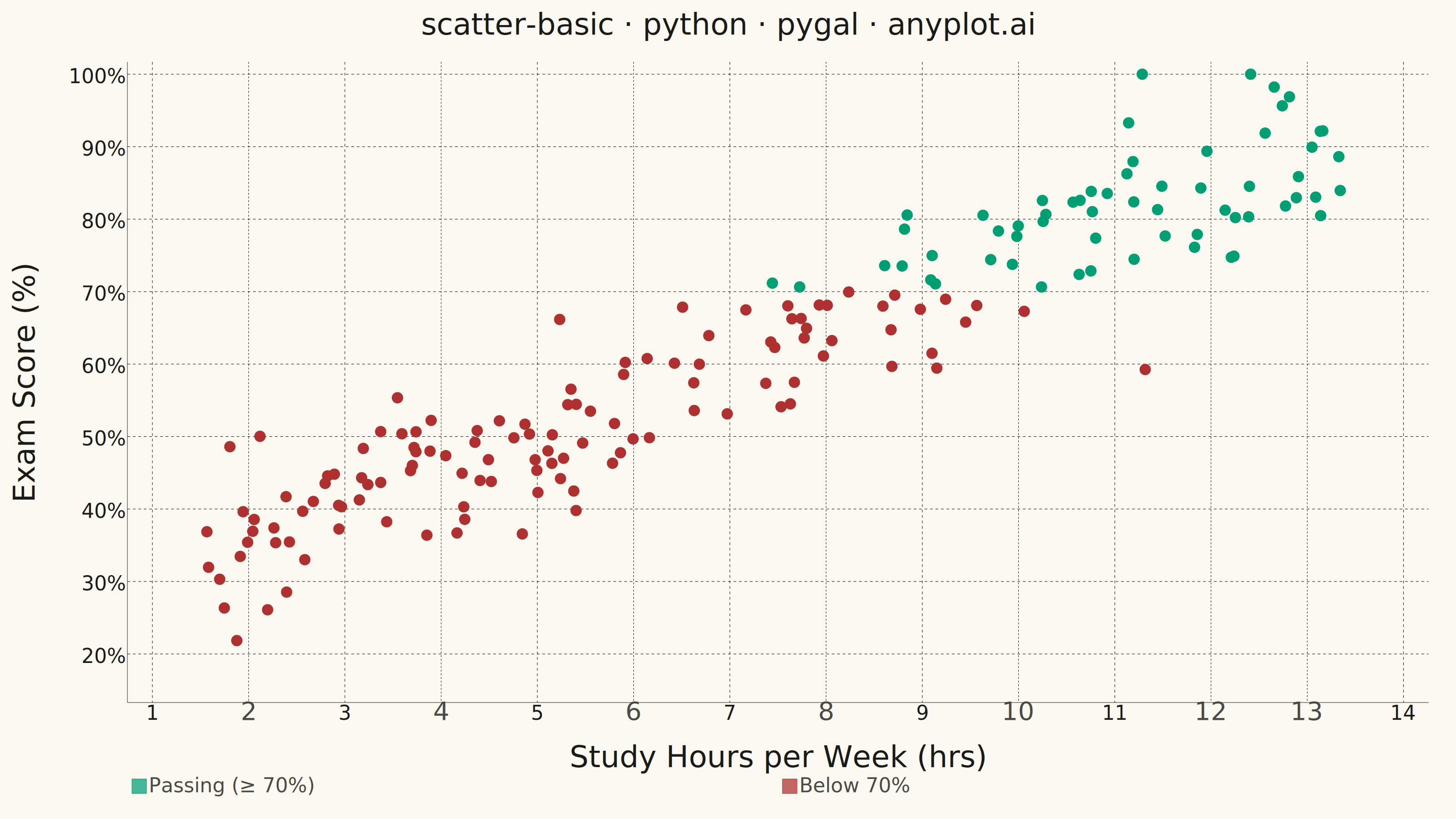
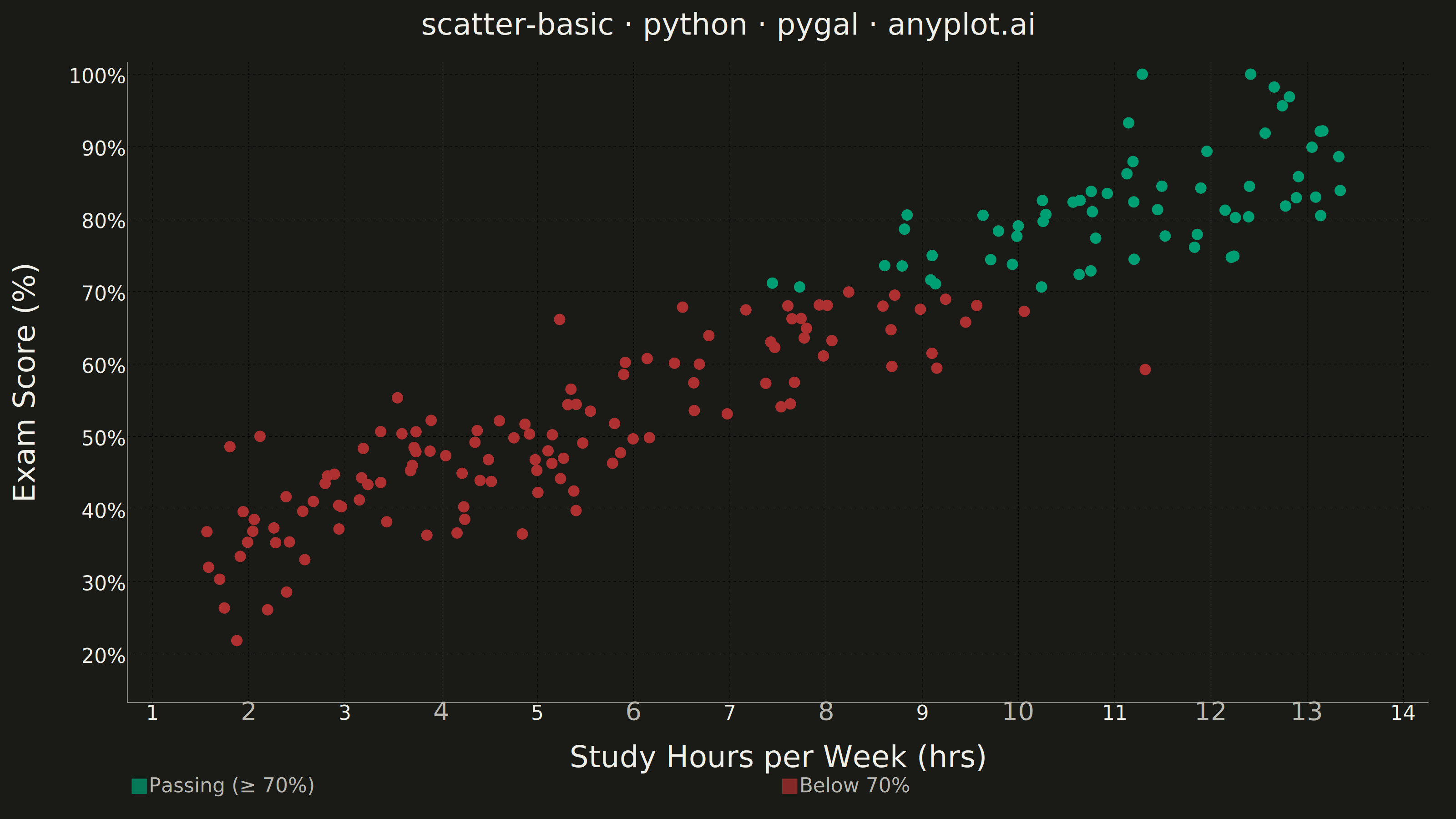
A fundamental 2D scatter plot that displays the relationship between two numeric variables by plotting points on a Cartesian coordinate system. This visualization is essential for exploring correlations, identifying patterns, detecting outliers, and understanding the distribution of paired data points.
""" anyplot.ai
scatter-basic: Basic Scatter Plot
Library: pygal 3.1.3 | Python 3.13.14
Quality: 87/100 | Updated: 2026-06-25
"""

import os
import sys


# Script filename shadows the installed `pygal` package when run as `python pygal.py`;
# dropping the script directory from sys.path lets the real package resolve.
sys.path.pop(0)

import numpy as np
import pygal
from pygal.style import Style


# Theme tokens
THEME = os.getenv("ANYPLOT_THEME", "light")
PAGE_BG = "#FAF8F1" if THEME == "light" else "#1A1A17"
INK = "#1A1A17" if THEME == "light" else "#F0EFE8"
INK_SOFT = "#4A4A44" if THEME == "light" else "#B8B7B0"
INK_MUTED = "#6B6A63" if THEME == "light" else "#A8A79F"

# Imprint palette — canonical order; semantic positions used for pass/fail split
# First series = brand green (#009E73), fail = matte red (#AE3030)
IMPRINT = (
    "#009E73",  # position 1: brand green → Passing
    "#AE3030",  # position 5: matte red (semantic anchor for bad/fail) → Below 70%
    "#C475FD",
    "#4467A3",
    "#BD8233",
    "#2ABCCD",
    "#954477",
    "#99B314",
)

# Data — study hours vs exam scores, moderate positive correlation
np.random.seed(42)
n = 180
study_hours = np.random.uniform(1.5, 13.5, n)
exam_scores = study_hours * 4.8 + np.random.normal(0, 6.5, n) + 26
exam_scores = np.clip(exam_scores, 20, 100)

# Visual hierarchy: split at conventional 70% passing threshold to guide the
# viewer's eye and convey the "hours → outcome" narrative beyond a raw cloud.
PASSING = 70.0
above = [(float(h), float(s)) for h, s in zip(study_hours, exam_scores, strict=True) if s >= PASSING]
below = [(float(h), float(s)) for h, s in zip(study_hours, exam_scores, strict=True) if s < PASSING]

font = "DejaVu Sans, Helvetica, Arial, sans-serif"

custom_style = Style(
    background=PAGE_BG,
    plot_background=PAGE_BG,
    foreground=INK_SOFT,
    foreground_strong=INK,
    foreground_subtle=INK_MUTED,
    colors=IMPRINT,
    font_family=font,
    title_font_family=font,
    label_font_family=font,
    major_label_font_family=font,
    legend_font_family=font,
    tooltip_font_family=font,
    title_font_size=66,
    label_font_size=56,
    major_label_font_size=44,
    legend_font_size=44,
    tooltip_font_size=36,
    value_font_size=36,
    opacity=0.72,
    opacity_hover=0.95,
    stroke_opacity=1,
    stroke_opacity_hover=1,
)

chart = pygal.XY(
    width=3200,
    height=1800,
    style=custom_style,
    title="scatter-basic · python · pygal · anyplot.ai",
    x_title="Study Hours per Week (hrs)",
    y_title="Exam Score (%)",
    stroke=False,
    dots_size=12,
    show_legend=True,
    legend_at_bottom=True,
    legend_at_bottom_columns=2,
    legend_box_size=32,
    show_x_guides=True,
    show_y_guides=True,
    x_value_formatter=lambda v: f"{v:.0f}",
    value_formatter=lambda v: f"{v:.0f}%",
    range=(15, 100),
    xrange=(1, 14),
    x_labels_major_count=7,
    y_labels_major_count=9,
    margin=60,
    print_values=False,
    js=[],
)

chart.add("Passing (≥ 70%)", above)
chart.add("Below 70%", below)

chart.render_to_png(f"plot-{THEME}.png")
with open(f"plot-{THEME}.html", "wb") as f:
    f.write(chart.render())
Runnable source as JSON, for any HTTP client: https://api.anyplot.ai/specs/scatter-basic/pygal/code. Any spec id and library id listed in llms-full.txt fit the same URL shape; every URL below is complete and callable.
{
  "spec_id": "scatter-basic",
  "language": "python",
  "library": "pygal",
  "page": "https://anyplot.ai/scatter-basic/python/pygal",
  "hub": "https://anyplot.ai/scatter-basic",
  "code_json": "https://api.anyplot.ai/specs/scatter-basic/pygal/code",
  "spec_json": "https://api.anyplot.ai/specs/scatter-basic",
  "render_light_png": "https://storage.googleapis.com/anyplot-images/plots/scatter-basic/python/pygal/plot-light.png",
  "render_dark_png": "https://storage.googleapis.com/anyplot-images/plots/scatter-basic/python/pygal/plot-dark.png",
  "interactive_light_html": "https://storage.googleapis.com/anyplot-images/plots/scatter-basic/python/pygal/plot-light.html",
  "interactive_dark_html": "https://storage.googleapis.com/anyplot-images/plots/scatter-basic/python/pygal/plot-dark.html",
  "quality_score": 87.0,
  "license": "MIT",
  "guide": "https://anyplot.ai/llms.txt"
}
Part of Basic Scatter Plot on anyplot.ai.