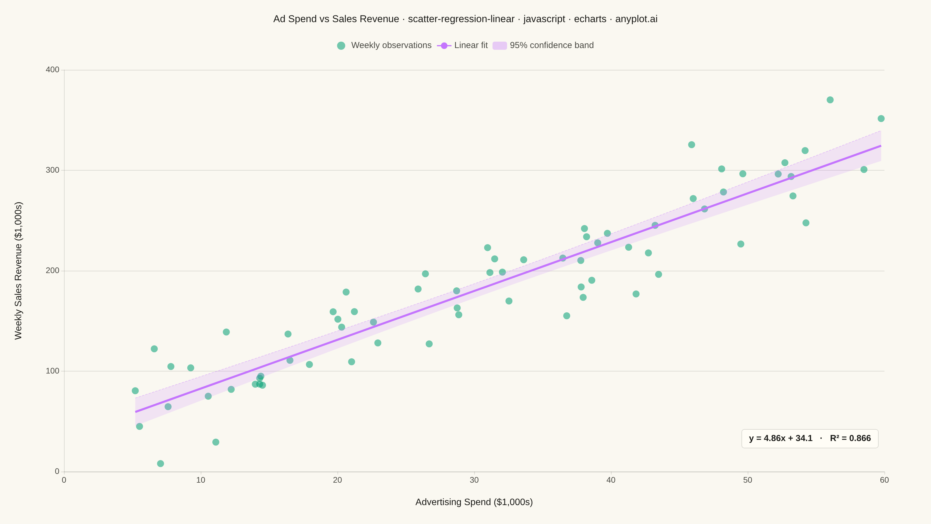
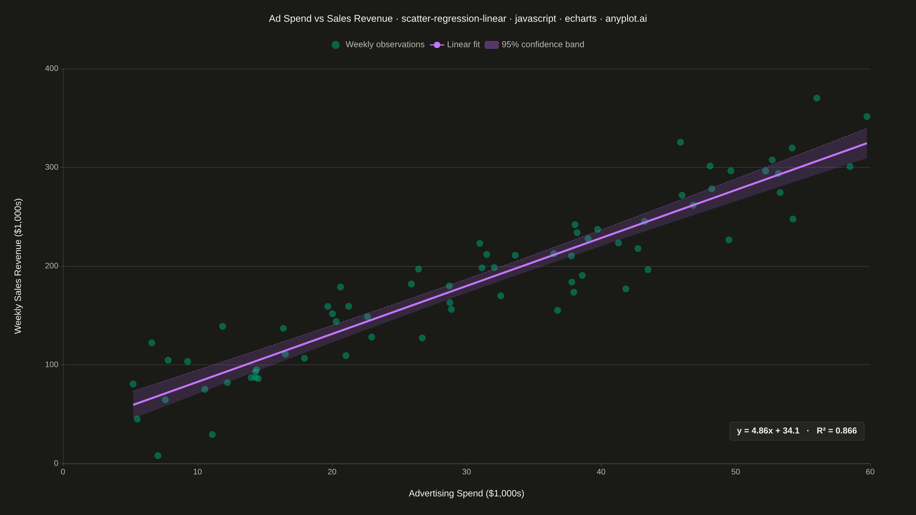
The same plot in 14 other libraries — JavaScript: Chart.js, D3.js, Highcharts, MUI X Charts; Python: Altair, Bokeh, lets-plot, Matplotlib, Plotly, plotnine, Pygal, Seaborn; R: ggplot2; Julia: Makie.jl. Compare all 15 side by side: Scatter Plot with Linear Regression in Python, R, Julia and JavaScript.
A scatter plot that displays the relationship between two numeric variables with a fitted linear regression line and confidence interval band. This visualization extends the basic scatter plot by adding statistical modeling elements, making it ideal for understanding linear relationships, assessing model fit, and communicating the strength of correlations with visual uncertainty quantification.
// anyplot.ai
// scatter-regression-linear: Scatter Plot with Linear Regression
// Library: echarts 6.1.0 | JavaScript 22.23.1
// Quality: 89/100 | Created: 2026-08-05

const t = window.ANYPLOT_TOKENS;

// --- Data (in-memory, deterministic mulberry32 PRNG) ------------------------
function mulberry32(seed) {
  return function () {
    seed = (seed + 0x6d2b79f5) | 0;
    let x = Math.imul(seed ^ (seed >>> 15), 1 | seed);
    x = (x + Math.imul(x ^ (x >>> 7), 61 | x)) ^ x;
    return ((x ^ (x >>> 14)) >>> 0) / 4294967296;
  };
}
const rng = mulberry32(42);
const randNormal = () => {
  const u1 = Math.max(rng(), 1e-9);
  const u2 = rng();
  return Math.sqrt(-2 * Math.log(u1)) * Math.cos(2 * Math.PI * u2);
};

const n = 70;
const trueSlope = 4.8;
const trueIntercept = 35;
const adSpend = [];
const salesRevenue = [];
for (let i = 0; i < n; i++) {
  const spend = 5 + rng() * 55; // $1,000s of weekly ad spend
  const revenue = Math.max(
    8,
    trueIntercept + trueSlope * spend + randNormal() * 32,
  );
  adSpend.push(spend);
  salesRevenue.push(revenue);
}

// --- Ordinary least squares fit + 95% confidence band -----------------------
const meanX = adSpend.reduce((a, b) => a + b, 0) / n;
const meanY = salesRevenue.reduce((a, b) => a + b, 0) / n;
let sumXY = 0;
let sumXX = 0;
for (let i = 0; i < n; i++) {
  sumXY += (adSpend[i] - meanX) * (salesRevenue[i] - meanY);
  sumXX += (adSpend[i] - meanX) ** 2;
}
const slope = sumXY / sumXX;
const intercept = meanY - slope * meanX;

let sse = 0;
for (let i = 0; i < n; i++) {
  sse += (salesRevenue[i] - (slope * adSpend[i] + intercept)) ** 2;
}
const sst = salesRevenue.reduce((a, y) => a + (y - meanY) ** 2, 0);
const rSquared = 1 - sse / sst;
const df = n - 2;
const residualSe = Math.sqrt(sse / df);
// 95% two-sided t-quantile via Cornish-Fisher expansion (avoids a t-table)
const z = 1.959964;
const tCrit = z + (z ** 3 + z) / (4 * df);

const xMin = Math.min(...adSpend);
const xMax = Math.max(...adSpend);
const gridPoints = 40;
const fitLine = [];
const ciLower = [];
const ciBand = [];
for (let i = 0; i <= gridPoints; i++) {
  const x = xMin + (i / gridPoints) * (xMax - xMin);
  const yFit = slope * x + intercept;
  const se = residualSe * Math.sqrt(1 / n + (x - meanX) ** 2 / sumXX);
  const margin = tCrit * se;
  fitLine.push([x, yFit]);
  ciLower.push([x, yFit - margin]);
  ciBand.push([x, 2 * margin]);
}

const equation = `y = ${slope.toFixed(2)}x + ${intercept.toFixed(1)}   ·   R² = ${rSquared.toFixed(3)}`;

// --- Init ---------------------------------------------------------------
const chart = echarts.init(document.getElementById("container"));

// --- Option ---------------------------------------------------------------
chart.setOption({
  animation: false,
  color: t.palette,
  backgroundColor: "transparent",
  title: {
    text: "Ad Spend vs Sales Revenue · scatter-regression-linear · javascript · echarts · anyplot.ai",
    left: "center",
    top: 20,
    textStyle: { color: t.ink, fontSize: 17, fontWeight: 500 },
  },
  legend: {
    data: [
      "Weekly observations",
      "Linear fit",
      { name: "95% confidence band", icon: "roundRect" },
    ],
    top: 66,
    left: "center",
    textStyle: { color: t.inkSoft, fontSize: 15 },
  },
  grid: { left: 110, right: 80, top: 120, bottom: 90 },
  xAxis: {
    type: "value",
    name: "Advertising Spend ($1,000s)",
    nameLocation: "middle",
    nameGap: 45,
    nameTextStyle: { color: t.ink, fontSize: 16 },
    axisLabel: { color: t.inkSoft, fontSize: 14 },
    axisLine: { lineStyle: { color: t.grid } },
    splitLine: { show: false },
  },
  yAxis: {
    type: "value",
    name: "Weekly Sales Revenue ($1,000s)",
    nameLocation: "middle",
    nameGap: 70,
    nameTextStyle: { color: t.ink, fontSize: 16 },
    axisLabel: { color: t.inkSoft, fontSize: 14 },
    axisLine: { lineStyle: { color: t.grid } },
    splitLine: { lineStyle: { color: t.grid } },
  },
  series: [
    {
      name: "ci-lower",
      type: "line",
      data: ciLower,
      stack: "ci-band",
      symbol: "none",
      lineStyle: { opacity: 0 },
      silent: true,
    },
    {
      name: "95% confidence band",
      type: "line",
      data: ciBand,
      stack: "ci-band",
      symbol: "none",
      lineStyle: { color: t.palette[1], opacity: 0.4, width: 1, type: "dashed" },
      areaStyle: { color: t.palette[1], opacity: 0.16 },
      itemStyle: { color: t.palette[1], opacity: 0.35 },
      silent: true,
    },
    {
      name: "Weekly observations",
      type: "scatter",
      data: adSpend.map((x, i) => [x, salesRevenue[i]]),
      symbolSize: 12,
      itemStyle: { color: t.palette[0], opacity: 0.55 },
    },
    {
      name: "Linear fit",
      type: "line",
      data: fitLine,
      symbol: "none",
      lineStyle: { color: t.palette[1], width: 3.5 },
      z: 3,
    },
  ],
  graphic: {
    type: "text",
    right: 90,
    bottom: 130,
    style: {
      text: equation,
      fill: t.ink,
      fontSize: 15,
      fontWeight: 600,
      backgroundColor: t.elevatedBg,
      padding: [8, 12],
      borderRadius: 4,
      borderColor: t.grid,
      borderWidth: 1,
    },
  },
});
Runnable source as JSON, for any HTTP client: https://api.anyplot.ai/specs/scatter-regression-linear/echarts/code. Any spec id and library id listed in llms-full.txt fit the same URL shape; every URL below is complete and callable.
{
  "spec_id": "scatter-regression-linear",
  "language": "javascript",
  "library": "echarts",
  "page": "https://anyplot.ai/scatter-regression-linear/javascript/echarts",
  "hub": "https://anyplot.ai/scatter-regression-linear",
  "code_json": "https://api.anyplot.ai/specs/scatter-regression-linear/echarts/code",
  "spec_json": "https://api.anyplot.ai/specs/scatter-regression-linear",
  "render_light_png": "https://storage.googleapis.com/anyplot-images/plots/scatter-regression-linear/javascript/echarts/plot-light.png",
  "render_dark_png": "https://storage.googleapis.com/anyplot-images/plots/scatter-regression-linear/javascript/echarts/plot-dark.png",
  "interactive_light_html": "https://storage.googleapis.com/anyplot-images/plots/scatter-regression-linear/javascript/echarts/plot-light.html",
  "interactive_dark_html": "https://storage.googleapis.com/anyplot-images/plots/scatter-regression-linear/javascript/echarts/plot-dark.html",
  "quality_score": 89.0,
  "license": "MIT",
  "guide": "https://anyplot.ai/llms.txt"
}
Part of Scatter Plot with Linear Regression on anyplot.ai.