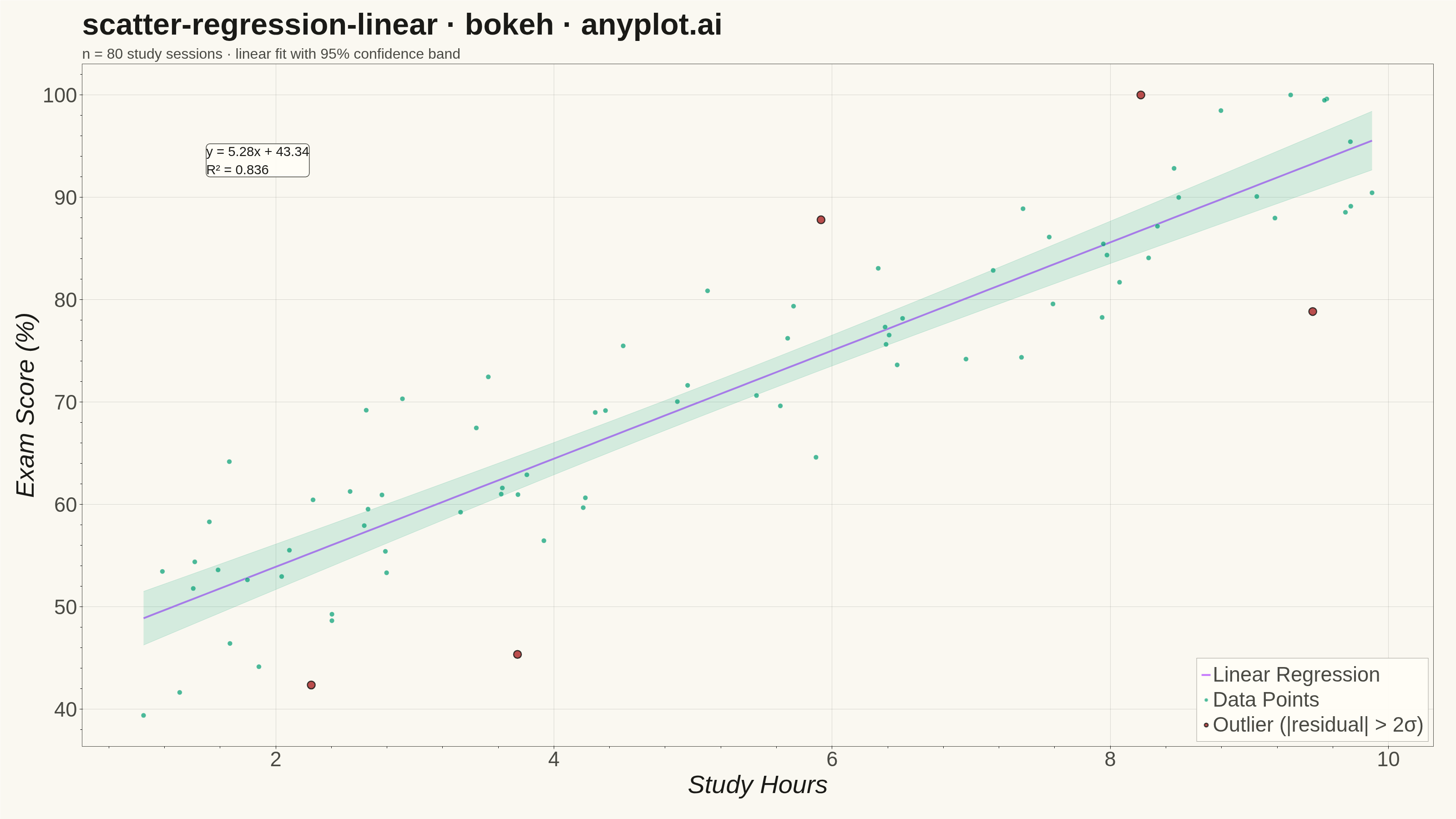
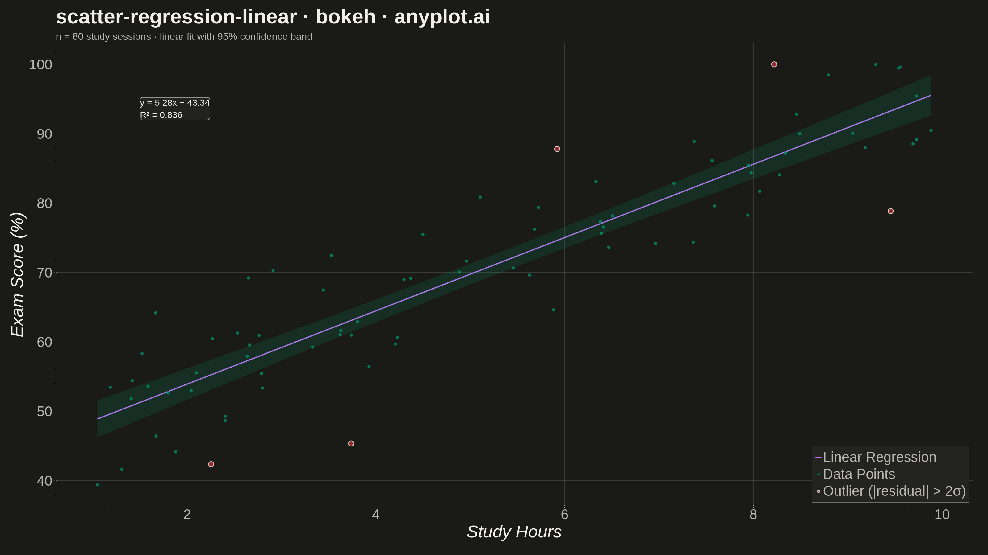
A scatter plot that displays the relationship between two numeric variables with a fitted linear regression line and confidence interval band. This visualization extends the basic scatter plot by adding statistical modeling elements, making it ideal for understanding linear relationships, assessing model fit, and communicating the strength of correlations with visual uncertainty quantification.
""" anyplot.ai
scatter-regression-linear: Scatter Plot with Linear Regression
Library: bokeh 3.9.2 | Python 3.13.14
Quality: 93/100 | Updated: 2026-08-05
"""

import os
import sys
import time
from pathlib import Path


sys.path.pop(0)

import numpy as np
from bokeh.io import output_file, save
from bokeh.models import Band, ColumnDataSource, HoverTool, Label, Title
from bokeh.plotting import figure
from selenium import webdriver
from selenium.webdriver.chrome.options import Options


# Theme tokens
THEME = os.getenv("ANYPLOT_THEME", "light")
PAGE_BG = "#FAF8F1" if THEME == "light" else "#1A1A17"
ELEVATED_BG = "#FFFDF6" if THEME == "light" else "#242420"
INK = "#1A1A17" if THEME == "light" else "#F0EFE8"
INK_SOFT = "#4A4A44" if THEME == "light" else "#B8B7B0"

# Imprint palette
IMPRINT = ["#009E73", "#C475FD", "#4467A3", "#BD8233", "#AE3030", "#2ABCCD", "#954477"]
OUTLIER_COLOR = IMPRINT[4]  # matte red — semantic anchor for "anomalous / off-model" points

# Data - Study hours vs exam scores
np.random.seed(42)
n_points = 80
x = np.random.uniform(1, 10, n_points)  # Study hours
noise = np.random.normal(0, 7, n_points)
y = 45 + 5 * x + noise  # Exam scores
y = np.clip(y, 0, 100)  # Ensure realistic scores (0-100%)

# Linear regression calculation
slope, intercept = np.polyfit(x, y, 1)
y_pred = slope * x + intercept

# Calculate R-squared
ss_res = np.sum((y - y_pred) ** 2)
ss_tot = np.sum((y - np.mean(y)) ** 2)
r_squared = 1 - (ss_res / ss_tot)

# Flag statistical outliers (|residual| > 2 std) to surface model fit quality
residuals = y - y_pred
residual_std = np.std(residuals)
is_outlier = np.abs(residuals) > 2 * residual_std

# Calculate 95% confidence interval
n = len(x)
x_mean = np.mean(x)
se = np.sqrt(ss_res / (n - 2))
t_value = 1.99  # t-value for 95% CI with ~78 degrees of freedom

# Create sorted x values for smooth regression line and confidence band
x_line = np.linspace(x.min(), x.max(), 100)
y_line = slope * x_line + intercept

# Standard error of prediction for confidence interval
se_y = se * np.sqrt(1 / n + (x_line - x_mean) ** 2 / np.sum((x - x_mean) ** 2))
ci_upper = y_line + t_value * se_y
ci_lower = y_line - t_value * se_y

# Create figure
# `width`/`height` are the TOTAL canvas; min_border_* reserve room for the
# 34-50pt native-pixel chrome so nothing clips at the PNG edges.
p = figure(
    width=3200,
    height=1800,
    title="scatter-regression-linear · bokeh · anyplot.ai",
    x_axis_label="Study Hours",
    y_axis_label="Exam Score (%)",
    toolbar_location=None,  # default toolbar adds ~30-50px above the plot, shrinking the PNG below 1800px
    min_border_bottom=160,
    min_border_left=180,
    min_border_top=140,
    min_border_right=50,
)

# Subtitle giving the sample size + fit quality at a glance (bokeh Title layout)
p.add_layout(
    Title(
        text=f"n = {n_points} study sessions · linear fit with 95% confidence band",
        text_font_size="24pt",
        text_font_style="normal",
        text_color=INK_SOFT,
    ),
    "above",
)

# Create data sources — outliers get their own source so they can carry a
# redundant non-color channel (larger size + heavier outline), since red-vs-green
# alone is a CVD confusion pair
normal_source = ColumnDataSource(
    data={"x": x[~is_outlier], "y": y[~is_outlier], "y_pred": y_pred[~is_outlier], "residual": residuals[~is_outlier]}
)
outlier_source = ColumnDataSource(
    data={"x": x[is_outlier], "y": y[is_outlier], "y_pred": y_pred[is_outlier], "residual": residuals[is_outlier]}
)
line_source = ColumnDataSource(data={"x": x_line, "y": y_line})
band_source = ColumnDataSource(data={"x": x_line, "lower": ci_lower, "upper": ci_upper})

# Add confidence interval band
band = Band(
    base="x",
    lower="lower",
    upper="upper",
    source=band_source,
    fill_color=IMPRINT[0],
    fill_alpha=0.15,
    line_color=IMPRINT[0],
    line_alpha=0.2,
    line_width=1,
)
p.add_layout(band)

# Add regression line
p.line("x", "y", source=line_source, line_color=IMPRINT[1], line_width=4, legend_label="Linear Regression")

# Add scatter points
normal_scatter = p.scatter(
    "x",
    "y",
    source=normal_source,
    size=11,
    color=IMPRINT[0],
    alpha=0.7,
    line_color=PAGE_BG,
    line_width=1,
    legend_label="Data Points",
)

# Outliers beyond 2 std of the residual get the matte-red semantic anchor PLUS a
# redundant non-color channel (larger size, heavier ink-colored outline) so the
# distinction survives when red/green cannot be resolved (CVD-safe)
outlier_scatter = p.scatter(
    "x",
    "y",
    source=outlier_source,
    size=17,
    color=OUTLIER_COLOR,
    alpha=0.85,
    line_color=INK,
    line_width=2.5,
    legend_label="Outlier (|residual| > 2σ)",
)

# Add hover tooltip to both point layers
hover = HoverTool(
    renderers=[normal_scatter, outlier_scatter],
    tooltips=[
        ("Study Hours", "@x{0.0}"),
        ("Exam Score", "@y{0.0}"),
        ("Predicted", "@y_pred{0.0}"),
        ("Residual", "@residual{+0.0}"),
    ],
)
p.add_tools(hover)

# Add R² and equation annotation
r2_text = f"R² = {r_squared:.3f}"
equation_text = f"y = {slope:.2f}x + {intercept:.2f}"
annotation = Label(
    x=1.5,
    y=92,
    text=f"{equation_text}\n{r2_text}",
    text_font_size="22pt",
    text_color=INK,
    background_fill_color=ELEVATED_BG,
    background_fill_alpha=0.9,
    border_line_color=INK_SOFT,
    border_line_width=1.5,
    border_radius=8,
)
p.add_layout(annotation)

# Styling - theme-adaptive chrome
p.background_fill_color = PAGE_BG
p.border_fill_color = PAGE_BG
p.outline_line_color = INK_SOFT

p.title.text_font_size = "50pt"
p.title.text_color = INK

p.xaxis.axis_label_text_font_size = "42pt"
p.yaxis.axis_label_text_font_size = "42pt"
p.xaxis.axis_label_text_color = INK
p.yaxis.axis_label_text_color = INK

p.xaxis.major_label_text_font_size = "34pt"
p.yaxis.major_label_text_font_size = "34pt"
p.xaxis.major_label_text_color = INK_SOFT
p.yaxis.major_label_text_color = INK_SOFT

p.xaxis.axis_line_color = INK_SOFT
p.yaxis.axis_line_color = INK_SOFT
p.xaxis.major_tick_line_color = INK_SOFT
p.yaxis.major_tick_line_color = INK_SOFT

p.xgrid.grid_line_color = INK
p.ygrid.grid_line_color = INK
p.xgrid.grid_line_alpha = 0.15
p.ygrid.grid_line_alpha = 0.15

p.legend.label_text_font_size = "34pt"
p.legend.location = "bottom_right"
p.legend.background_fill_color = ELEVATED_BG
p.legend.border_line_color = INK_SOFT
p.legend.label_text_color = INK_SOFT
p.legend.click_policy = "hide"  # interactive: click a legend entry to toggle it (HTML view)

# Save HTML
output_file(f"plot-{THEME}.html")
save(p)

# Screenshot with Selenium
W, H = 3200, 1800
opts = Options()
for arg in (
    "--headless=new",
    "--no-sandbox",
    "--disable-dev-shm-usage",
    "--disable-gpu",
    f"--window-size={W},{H}",
    "--hide-scrollbars",
):
    opts.add_argument(arg)

driver = webdriver.Chrome(options=opts)
driver.set_window_size(W, H)
driver.get(f"file://{Path(f'plot-{THEME}.html').resolve()}")
# headless Chrome's --window-size sets the OUTER window, which still reserves
# a phantom title-bar height even headless — pin the viewport exactly via CDP.
driver.execute_cdp_cmd(
    "Emulation.setDeviceMetricsOverride", {"width": W, "height": H, "deviceScaleFactor": 1, "mobile": False}
)
time.sleep(3)
driver.save_screenshot(f"plot-{THEME}.png")
driver.quit()
Runnable source as JSON, for any HTTP client: https://api.anyplot.ai/specs/scatter-regression-linear/bokeh/code. Any spec id and library id listed in llms-full.txt fit the same URL shape; every URL below is complete and callable.
{
  "spec_id": "scatter-regression-linear",
  "language": "python",
  "library": "bokeh",
  "page": "https://anyplot.ai/scatter-regression-linear/python/bokeh",
  "hub": "https://anyplot.ai/scatter-regression-linear",
  "code_json": "https://api.anyplot.ai/specs/scatter-regression-linear/bokeh/code",
  "spec_json": "https://api.anyplot.ai/specs/scatter-regression-linear",
  "render_light_png": "https://storage.googleapis.com/anyplot-images/plots/scatter-regression-linear/python/bokeh/plot-light.png",
  "render_dark_png": "https://storage.googleapis.com/anyplot-images/plots/scatter-regression-linear/python/bokeh/plot-dark.png",
  "interactive_light_html": "https://storage.googleapis.com/anyplot-images/plots/scatter-regression-linear/python/bokeh/plot-light.html",
  "interactive_dark_html": "https://storage.googleapis.com/anyplot-images/plots/scatter-regression-linear/python/bokeh/plot-dark.html",
  "quality_score": 93.0,
  "license": "MIT",
  "guide": "https://anyplot.ai/llms.txt"
}
Part of Scatter Plot with Linear Regression on anyplot.ai.