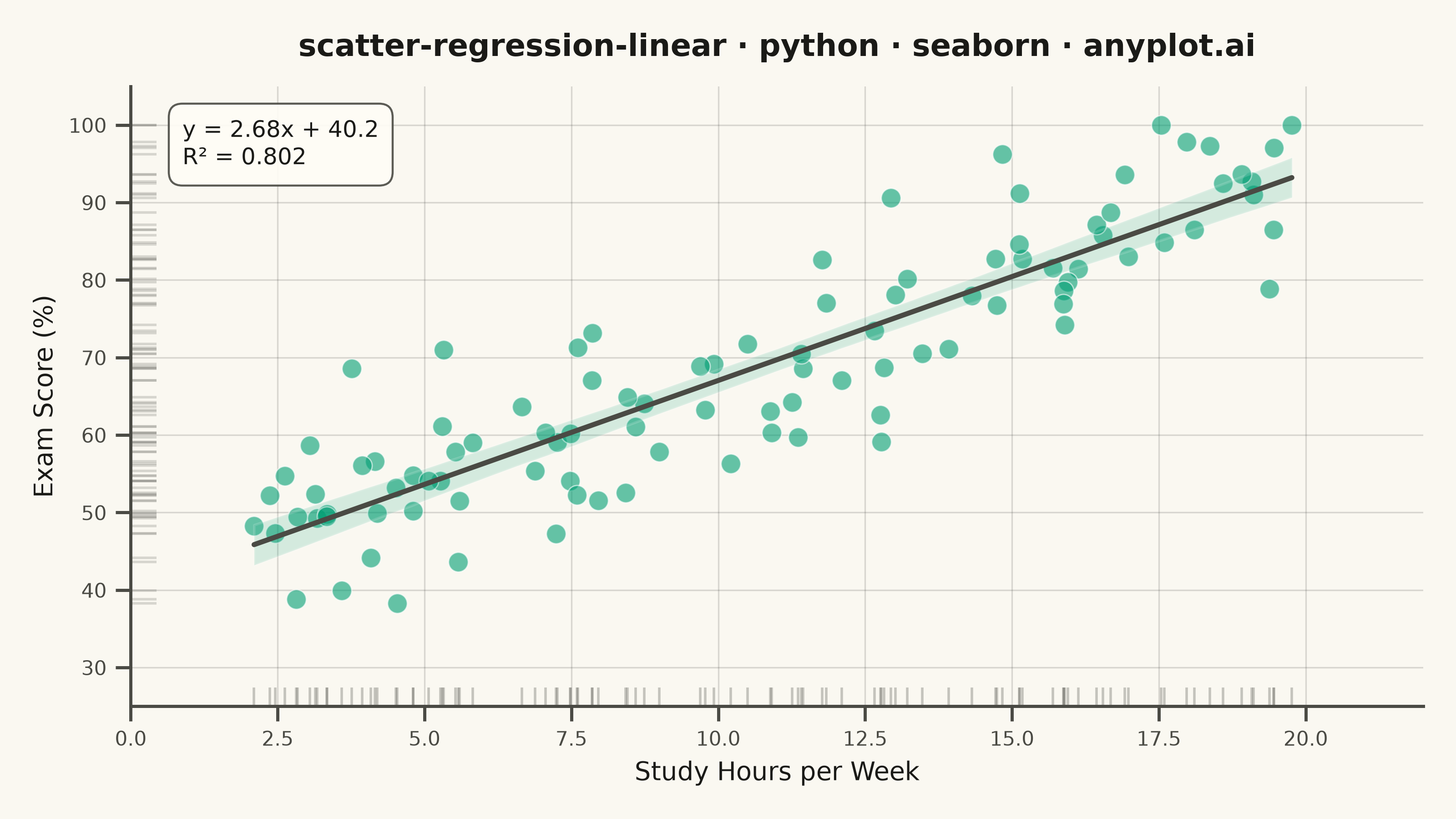
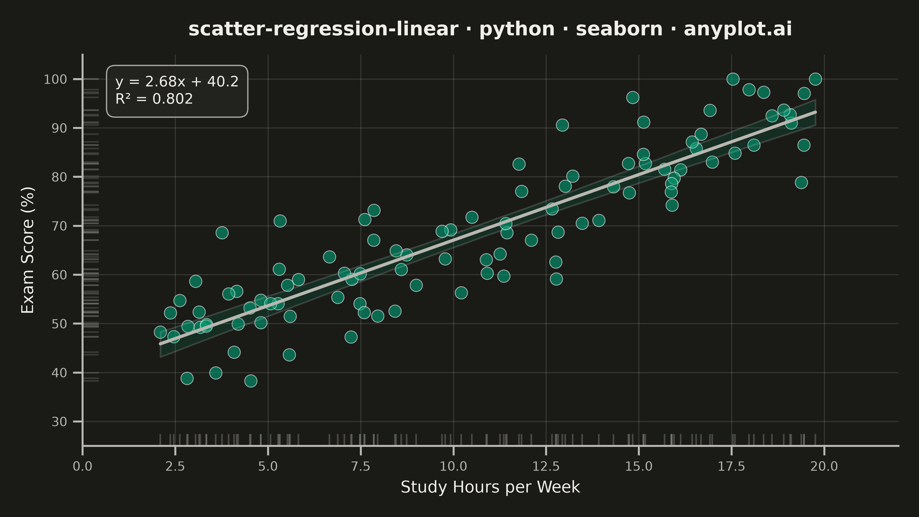
A scatter plot that displays the relationship between two numeric variables with a fitted linear regression line and confidence interval band. This visualization extends the basic scatter plot by adding statistical modeling elements, making it ideal for understanding linear relationships, assessing model fit, and communicating the strength of correlations with visual uncertainty quantification.
""" anyplot.ai
scatter-regression-linear: Scatter Plot with Linear Regression
Library: seaborn 0.13.2 | Python 3.13.14
Quality: 94/100 | Updated: 2026-08-05
"""

import os

import matplotlib.pyplot as plt
import numpy as np
import seaborn as sns
from scipy import stats


# Theme tokens (see prompts/default-style-guide.md "Background" + "Theme-adaptive Chrome")
THEME = os.getenv("ANYPLOT_THEME", "light")
PAGE_BG = "#FAF8F1" if THEME == "light" else "#1A1A17"
ELEVATED_BG = "#FFFDF6" if THEME == "light" else "#242420"
INK = "#1A1A17" if THEME == "light" else "#F0EFE8"
INK_SOFT = "#4A4A44" if THEME == "light" else "#B8B7B0"
BRAND = "#009E73"  # Imprint palette position 1 — ALWAYS first series

# Configure seaborn theme (see prompts/library/seaborn.md "Theme-adaptive Chrome")
sns.set_theme(
    style="ticks",
    rc={
        "figure.facecolor": PAGE_BG,
        "axes.facecolor": PAGE_BG,
        "axes.edgecolor": INK_SOFT,
        "axes.labelcolor": INK,
        "text.color": INK,
        "xtick.color": INK_SOFT,
        "ytick.color": INK_SOFT,
        "grid.color": INK,
        "grid.alpha": 0.15,
        "legend.facecolor": ELEVATED_BG,
        "legend.edgecolor": INK_SOFT,
    },
)

# Data - Weekly study hours vs exam score, with realistic positive correlation.
# (Domain switched from temperature/energy per cross-library diversity audit —
# altair already covers that pairing; this keeps the same regression shape.)
np.random.seed(42)
n_points = 100
study_hours = np.random.uniform(2, 20, n_points)
exam_score = 38 + 2.9 * study_hours + np.random.normal(0, 8, n_points)
exam_score = np.clip(exam_score, 30, 100)

# Regression statistics for the annotation (sns.regplot draws the fit + CI band itself)
slope, intercept, r_value, p_value, std_err = stats.linregress(study_hours, exam_score)
r_squared = r_value**2

# Create figure and axis — canonical landscape canvas (see prompts/library/seaborn.md "Canvas")
fig, ax = plt.subplots(figsize=(8, 4.5), dpi=400)

# Idiomatic seaborn regression plot: scatter + linear fit + 95% CI band in one call
sns.regplot(
    x=study_hours,
    y=exam_score,
    ax=ax,
    ci=95,
    scatter_kws={"s": 60, "alpha": 0.6, "color": BRAND, "edgecolor": "white", "linewidths": 0.5},
    line_kws={"color": INK_SOFT, "linewidth": 2},
)
# regplot fills the CI band with the line color by default — recolor to brand teal
# so it reads as "uncertainty around the data" rather than "uncertainty around the line".
ax.collections[-1].set_facecolor(BRAND)
ax.collections[-1].set_alpha(0.15)

# Marginal rug plot — seaborn-native touch that shows each variable's density along its axis
sns.rugplot(x=study_hours, ax=ax, color=INK_SOFT, alpha=0.3, height=0.03)
sns.rugplot(y=exam_score, ax=ax, color=INK_SOFT, alpha=0.2, height=0.02)

# Regression equation + R² annotation
equation_text = f"y = {slope:.2f}x + {intercept:.1f}\nR² = {r_squared:.3f}"
ax.annotate(
    equation_text,
    xy=(0.04, 0.95),
    xycoords="axes fraction",
    fontsize=9,
    verticalalignment="top",
    color=INK,
    bbox={"boxstyle": "round,pad=0.6", "facecolor": ELEVATED_BG, "alpha": 0.9, "edgecolor": INK_SOFT, "linewidth": 0.8},
)

# Labels and title
ax.set_xlabel("Study Hours per Week", fontsize=10, color=INK)
ax.set_ylabel("Exam Score (%)", fontsize=10, color=INK)
ax.set_title(
    "scatter-regression-linear · python · seaborn · anyplot.ai", fontsize=12, color=INK, fontweight="bold", pad=12
)
ax.tick_params(axis="both", labelsize=8, colors=INK_SOFT)

# Grid — both axes for scatter plots (see default-style-guide.md "Grid Guidelines")
ax.grid(True, alpha=0.15, linewidth=0.6, color=INK)
ax.set_axisbelow(True)

# Spines — L-shaped frame
sns.despine(ax=ax)

# Axis limits with padding
ax.set_xlim(0, 22)
ax.set_ylim(25, 105)

plt.tight_layout()
plt.savefig(f"plot-{THEME}.png", dpi=400, facecolor=PAGE_BG)
plt.close()
Runnable source as JSON, for any HTTP client: https://api.anyplot.ai/specs/scatter-regression-linear/seaborn/code. Any spec id and library id listed in llms-full.txt fit the same URL shape; every URL below is complete and callable.
{
  "spec_id": "scatter-regression-linear",
  "language": "python",
  "library": "seaborn",
  "page": "https://anyplot.ai/scatter-regression-linear/python/seaborn",
  "hub": "https://anyplot.ai/scatter-regression-linear",
  "code_json": "https://api.anyplot.ai/specs/scatter-regression-linear/seaborn/code",
  "spec_json": "https://api.anyplot.ai/specs/scatter-regression-linear",
  "render_light_png": "https://storage.googleapis.com/anyplot-images/plots/scatter-regression-linear/python/seaborn/plot-light.png",
  "render_dark_png": "https://storage.googleapis.com/anyplot-images/plots/scatter-regression-linear/python/seaborn/plot-dark.png",
  "quality_score": 94.0,
  "license": "MIT",
  "guide": "https://anyplot.ai/llms.txt"
}
Part of Scatter Plot with Linear Regression on anyplot.ai.