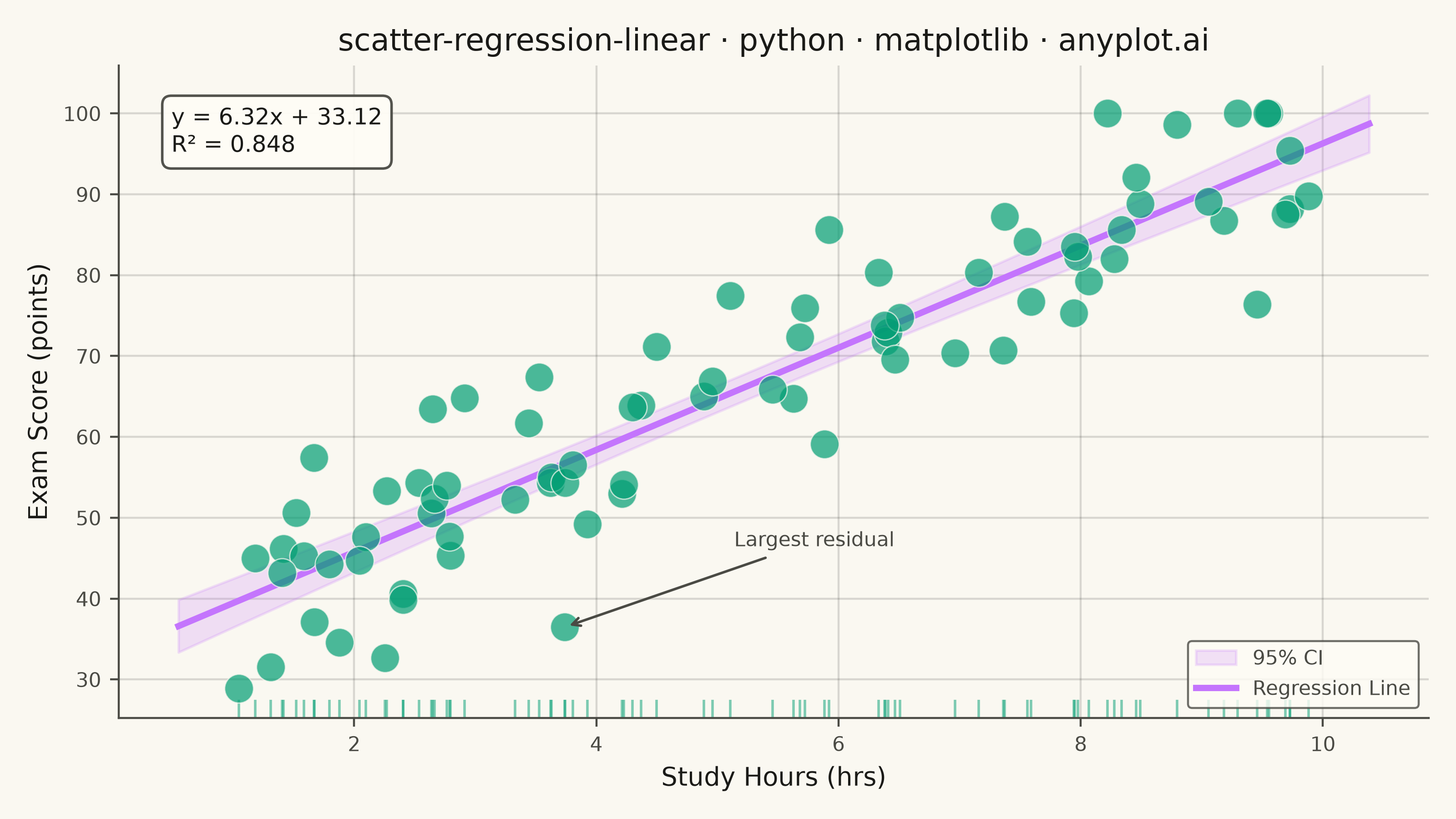
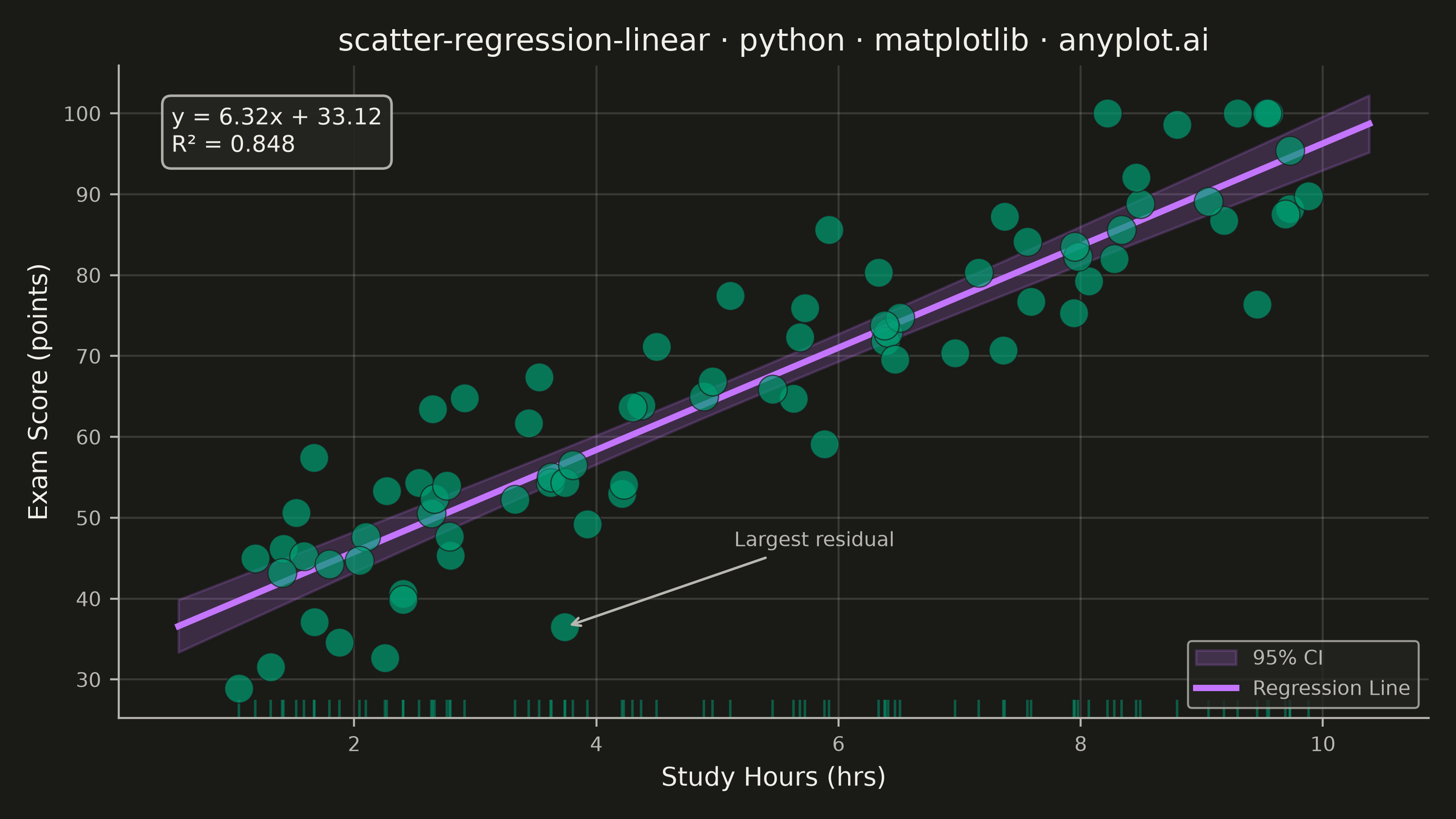
A scatter plot that displays the relationship between two numeric variables with a fitted linear regression line and confidence interval band. This visualization extends the basic scatter plot by adding statistical modeling elements, making it ideal for understanding linear relationships, assessing model fit, and communicating the strength of correlations with visual uncertainty quantification.
""" anyplot.ai
scatter-regression-linear: Scatter Plot with Linear Regression
Library: matplotlib 3.11.1 | Python 3.13.14
Quality: 92/100 | Updated: 2026-08-05
"""

import os

import matplotlib.pyplot as plt
import numpy as np
from matplotlib.transforms import blended_transform_factory


# Theme tokens (Imprint)
THEME = os.getenv("ANYPLOT_THEME", "light")
PAGE_BG = "#FAF8F1" if THEME == "light" else "#1A1A17"
ELEVATED_BG = "#FFFDF6" if THEME == "light" else "#242420"
INK = "#1A1A17" if THEME == "light" else "#F0EFE8"
INK_SOFT = "#4A4A44" if THEME == "light" else "#B8B7B0"
BRAND = "#009E73"  # Imprint palette position 1
SECONDARY = "#C475FD"  # Imprint palette position 2, for regression line

# Data: study hours vs exam scores (realistic educational context)
np.random.seed(42)
n_points = 80
x = np.random.uniform(1, 10, n_points)  # Study hours
noise = np.random.normal(0, 8, n_points)
y = 35 + 6 * x + noise  # Exam scores
y = np.clip(y, 20, 100)  # Realistic score range

# Linear regression using numpy polyfit (leveraging library ecosystem)
coefficients = np.polyfit(x, y, 1)
slope, intercept = coefficients[0], coefficients[1]

# Coefficient of determination
y_pred = np.polyval(coefficients, x)
ss_res = np.sum((y - y_pred) ** 2)
ss_tot = np.sum((y - np.mean(y)) ** 2)
r_squared = 1 - (ss_res / ss_tot)

# Largest residual: notable outlier worth calling out
outlier_idx = np.argmax(np.abs(y - y_pred))

# Regression line and 95% confidence interval
x_line = np.linspace(x.min() - 0.5, x.max() + 0.5, 100)
y_line = np.polyval(coefficients, x_line)

x_mean = np.mean(x)
ss_xx = np.sum((x - x_mean) ** 2)
se_y = np.sqrt(ss_res / (n_points - 2))
se_line = se_y * np.sqrt(1 / n_points + (x_line - x_mean) ** 2 / ss_xx)
t_val = 1.99  # 95% CI, df ~ 78
ci_upper = y_line + t_val * se_line
ci_lower = y_line - t_val * se_line

# Plot
fig, ax = plt.subplots(figsize=(8, 4.5), dpi=400, facecolor=PAGE_BG)
ax.set_facecolor(PAGE_BG)

# Confidence interval band (SECONDARY color, low alpha)
ax.fill_between(x_line, ci_lower, ci_upper, alpha=0.2, color=SECONDARY, label="95% CI", zorder=1)

# Rug plot: marginal x-distribution along the bottom, drawn in a blended
# transform (data x, axes y) so it hugs the axis regardless of y-range.
trans_x = blended_transform_factory(ax.transData, ax.transAxes)
ax.plot(x, np.full_like(x, 0.015), "|", transform=trans_x, color=BRAND, alpha=0.5, markersize=7, zorder=1)

# Scatter points (BRAND green as first series)
ax.scatter(x, y, s=130, alpha=0.7, color=BRAND, edgecolors=PAGE_BG, linewidth=0.5, zorder=3)

# Regression line (SECONDARY color)
ax.plot(x_line, y_line, color=SECONDARY, linewidth=2.5, label="Regression Line", zorder=2)

# Callout for the largest residual, showing how far the point strays from the fit
ax.annotate(
    "Largest residual",
    xy=(x[outlier_idx], y[outlier_idx]),
    xytext=(x[outlier_idx] + 1.4, y[outlier_idx] + 10),
    fontsize=8,
    color=INK_SOFT,
    arrowprops={"arrowstyle": "->", "color": INK_SOFT, "linewidth": 1},
    zorder=4,
)

# Annotation: equation and R-squared
equation = f"y = {slope:.2f}x + {intercept:.2f}"
r_text = f"R² = {r_squared:.3f}"
ax.text(
    0.04,
    0.94,
    f"{equation}\n{r_text}",
    transform=ax.transAxes,
    fontsize=9,
    verticalalignment="top",
    color=INK,
    bbox={"boxstyle": "round,pad=0.4", "facecolor": ELEVATED_BG, "edgecolor": INK_SOFT, "alpha": 0.95},
)

# Title and axis labels (title short enough to use the default 12pt)
title = "scatter-regression-linear · python · matplotlib · anyplot.ai"
ax.set_title(title, fontsize=12, fontweight="medium", color=INK)
ax.set_xlabel("Study Hours (hrs)", fontsize=10, color=INK)
ax.set_ylabel("Exam Score (points)", fontsize=10, color=INK)
ax.tick_params(axis="both", labelsize=8, colors=INK_SOFT)

# Grid: both axes, subtle (scatter convention)
ax.grid(True, alpha=0.15, linewidth=0.8, color=INK)
ax.set_axisbelow(True)

# Spine styling
ax.spines["top"].set_visible(False)
ax.spines["right"].set_visible(False)
for spine in ("left", "bottom"):
    ax.spines[spine].set_color(INK_SOFT)

# Legend styling
leg = ax.legend(fontsize=8, loc="lower right")
if leg:
    leg.get_frame().set_facecolor(ELEVATED_BG)
    leg.get_frame().set_edgecolor(INK_SOFT)
    leg.get_frame().set_linewidth(0.8)
    for text in leg.get_texts():
        text.set_color(INK_SOFT)

plt.tight_layout()
plt.savefig(f"plot-{THEME}.png", dpi=400, facecolor=PAGE_BG)
Runnable source as JSON, for any HTTP client: https://api.anyplot.ai/specs/scatter-regression-linear/matplotlib/code. Any spec id and library id listed in llms-full.txt fit the same URL shape; every URL below is complete and callable.
{
  "spec_id": "scatter-regression-linear",
  "language": "python",
  "library": "matplotlib",
  "page": "https://anyplot.ai/scatter-regression-linear/python/matplotlib",
  "hub": "https://anyplot.ai/scatter-regression-linear",
  "code_json": "https://api.anyplot.ai/specs/scatter-regression-linear/matplotlib/code",
  "spec_json": "https://api.anyplot.ai/specs/scatter-regression-linear",
  "render_light_png": "https://storage.googleapis.com/anyplot-images/plots/scatter-regression-linear/python/matplotlib/plot-light.png",
  "render_dark_png": "https://storage.googleapis.com/anyplot-images/plots/scatter-regression-linear/python/matplotlib/plot-dark.png",
  "quality_score": 92.0,
  "license": "MIT",
  "guide": "https://anyplot.ai/llms.txt"
}
Part of Scatter Plot with Linear Regression on anyplot.ai.